Exhaustive Framermigration | Free Website Template | Rocket
Migrate is a hub-and-spoke landing page template built for developer tools that need to earn trust before asking for a download. It covers six migration spec categories across anchored sections, uses a Tech Glass visual identity with void black and phosphor green, and drives toward a CLI download modal. Ideal for technical guides targeting senior frontend developers and agency teams.
by Rocket studio
Quick summary
Migrate is a single-page, anchor-navigated landing page template designed for a Framer migration CLI tool. It proves exhaustive technical coverage across six spec categories before asking for any commitment. The layout uses frosted glass panels, monospace typography, and a scroll-linked dot navigation rail to guide senior developers from first load to CLI download.
Who this template is for
This template is built for technical products that need to demonstrate depth before driving a conversion. It suits teams where the buyer is also the builder.
- Senior frontend developers managing large projects they need to move off a no-code platform
- Freelancers who have inherited client projects and cannot deploy them to custom infrastructure
- Agency technical leads under compliance pressure from a dependency on third-party build tooling
What problem this template solves
Technical audiences do not convert on vague promises. They need to see coverage before they trust a tool. This template solves the problem of earning that trust inside the page itself.
- It presents migration scope as structured spec content, not marketing claims, so developers can audit the tool before installing it
- It removes the mismatch between a tool's actual depth and the shallow landing page that usually represents it
- It gives buyers a secondary reading path for those not ready to download, capturing intent without forcing a form fill
What you get with this template
You get a complete, single-page layout with six anchored content sections, a scroll-linked navigation rail, and a download modal built around OS and package manager selection. Every section escalates in technical scope, mirroring a real engineering audit.
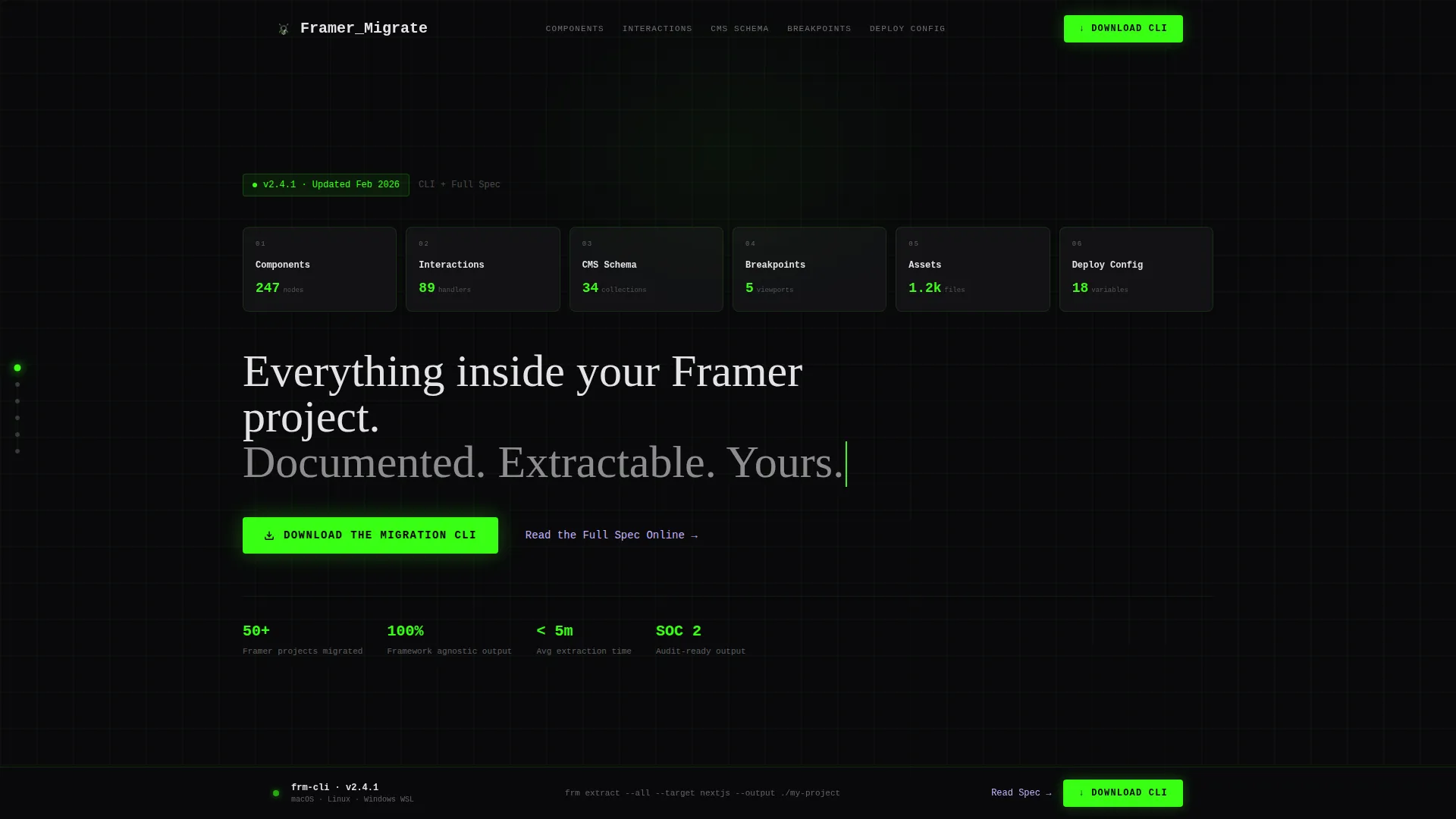
- A six-panel hero grid with a typewriter headline, a frosted glass aesthetic, and a primary phosphor green call-to-action button
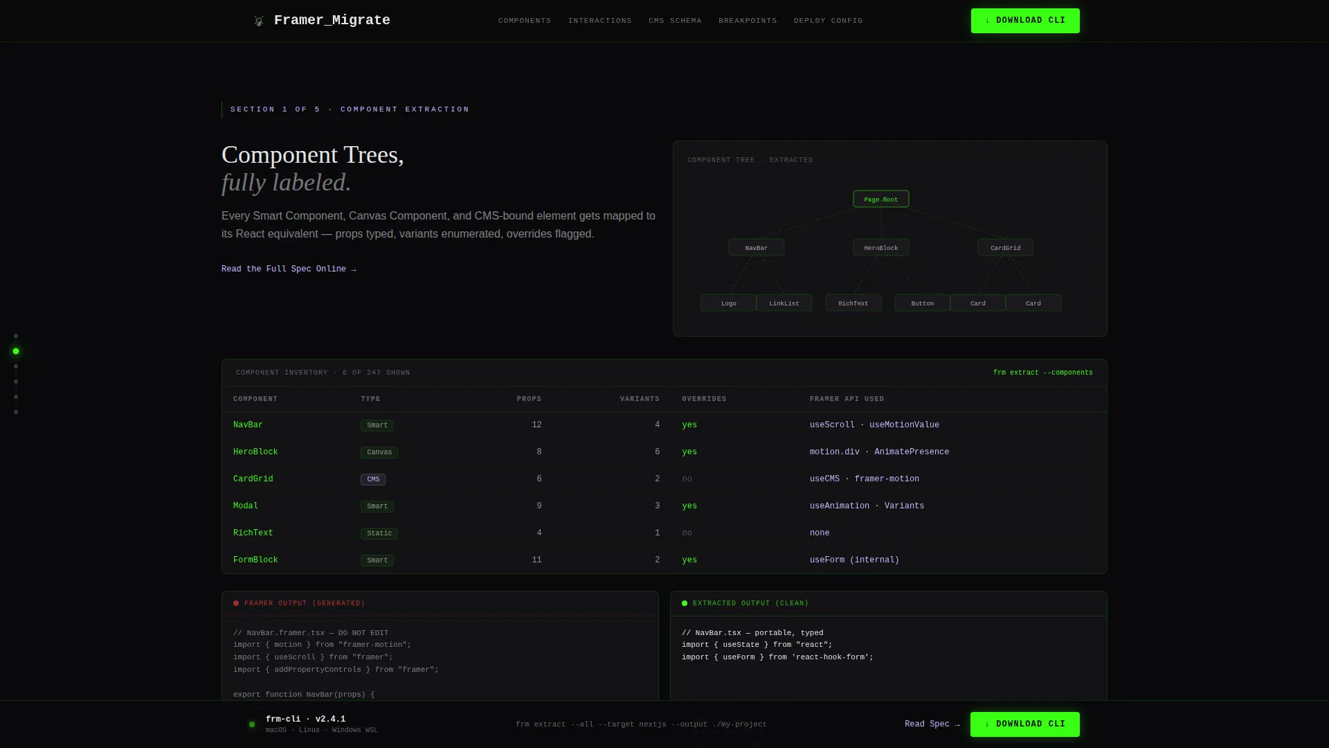
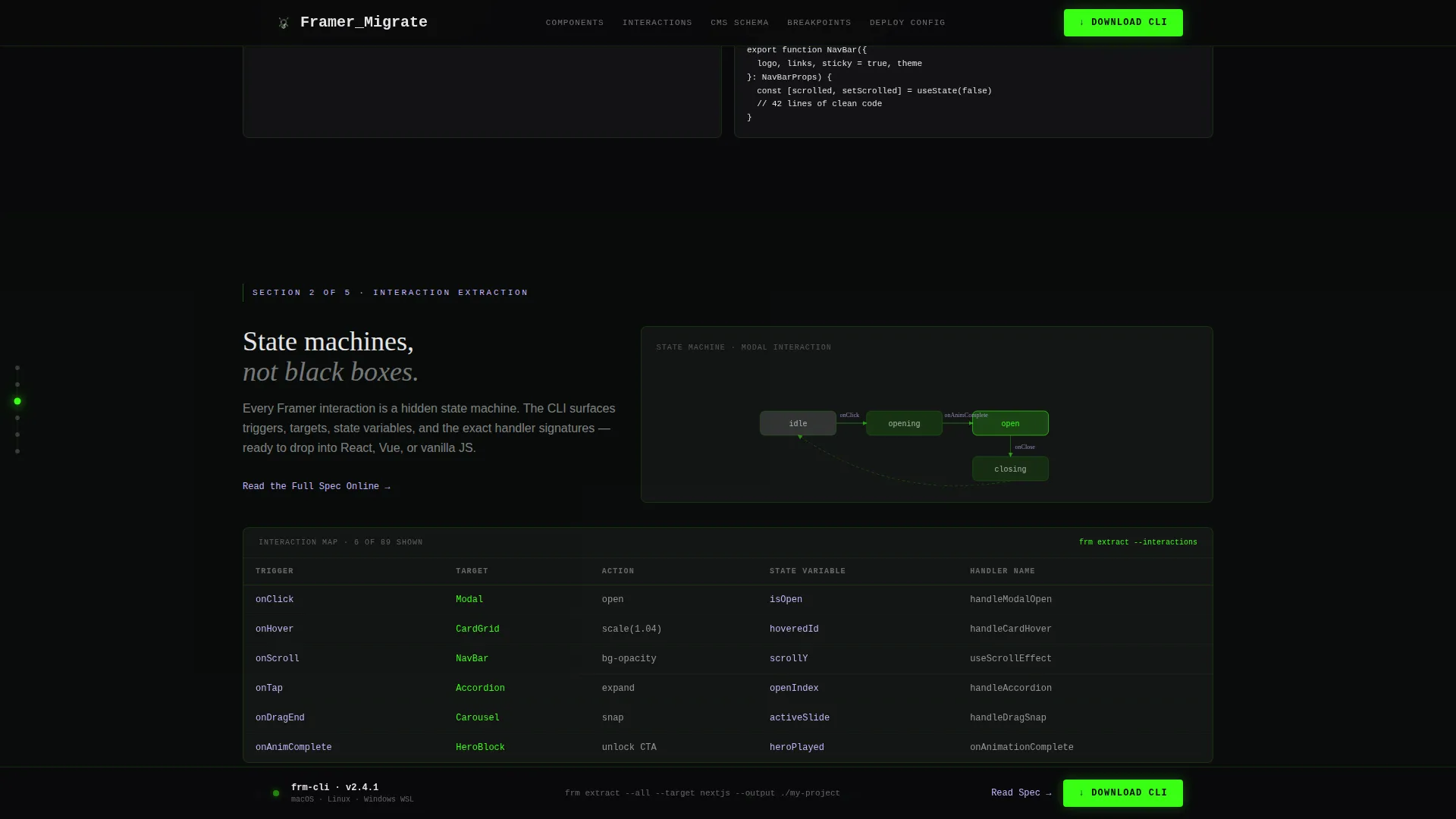
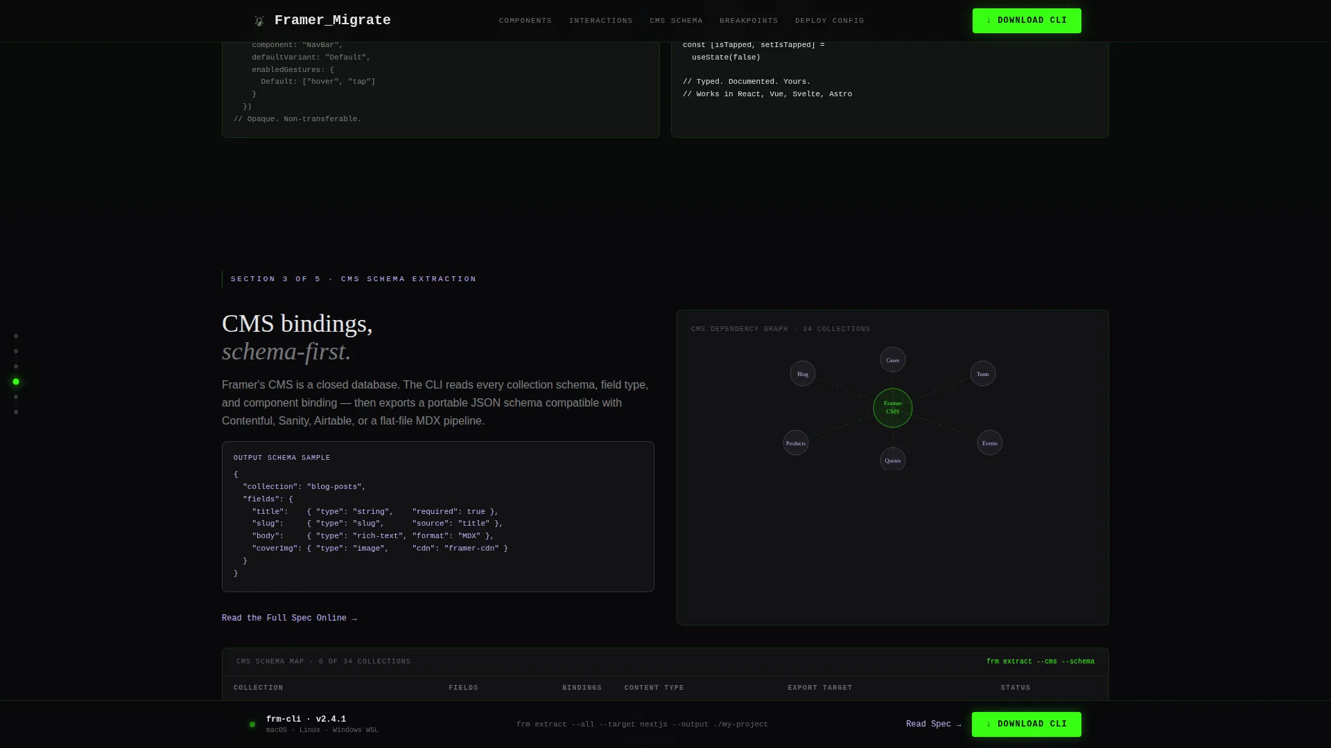
- Six spec-depth content sections covering components, interactions, CMS schema, breakpoints and assets, and deploy config, each with tables, diagrams, and code diff layouts
- A floating bottom bar that locks on after the second scroll section, keeping the CLI download always within reach
Feature list
This template ships with a focused set of layout and interaction features. Each one is described below.
Six-Panel Dark Glass Hero Grid
The header renders six translucent dark glass panels on a void black background. Each panel labels one migration spec category in monospace type. A 1px phosphor green edge pulses once on load, and faint blueprint grid lines drift slowly behind the grid.
Typewriter Headline Effect
The main headline types itself in below the panel grid on load. This animation signals that the content is live and versioned, matching the terminal aesthetic of the tool it promotes.
Scroll-Linked Anchor Navigation Rail
A vertical dot rail is pinned to the left edge of the page. Each dot corresponds to one of the six spec sections. The active dot glows green as the user scrolls, keeping orientation clear across a long technical page.
CLI Download Modal with OS and Package Manager Selector
The primary call-to-action opens a slim modal with three fields: operating system selector covering macOS, Linux, and Windows WSL; package manager preference covering npm, pnpm, and yarn; and an email field for changelog updates.
Floating Bottom Bar Call-to-Action
After the visitor scrolls past the second section, the download button locks into a floating bottom bar. It persists for the rest of the page without interrupting reading flow.
Lilac Secondary Reading Path
Each spec section includes a secondary text link styled in syntax lilac. This path leads to the full spec online and captures scroll-depth intent from visitors who are not ready to install the CLI yet.
Page sections overview
| Section | Purpose |
|---|---|
| Hero Panel Grid | Introduce six spec categories and set the visual register with the typewriter headline and primary call-to-action |
| Component Spec | Display property tables and a component tree SVG diagram for the components migration category |
| Interactions Spec | Show a state machine flat SVG and before-and-after code diffs for interaction extraction |
| CMS Schema Spec | Present data binding extraction tables and a schema map for CMS migration coverage |
| Breakpoints and Assets | Cover responsive logic tables and an asset manifest for breakpoint and asset extraction |
| Deploy Config Spec | Close the full surface area proof and activate the floating CLI download bar |
| GitHub-style Footer | Provide minimal developer footer using a GitHub Developer Minimal pattern |
Design & branding system
The visual identity is built on a Tech Glass theme using an Acid Digital color system. It reads like a terminal window set inside frosted acrylic, dark enough for late-night auditing and electric enough to signal that the content is current.
- Core palette: void black (#09090B) for backgrounds, phosphor green (#39FF14) for interactive states and the primary call-to-action, syntax lilac (#C4B5FD) for inline code highlights and secondary actions, and off-white (#E4E4E7) for body text
- Glass panels use white at 4% opacity (#FFFFFF0A) separated by 1px phosphor green borders at 12% opacity, creating a layered frosted depth
- Typography uses JetBrains Mono for code labels, Fraunces for display headlines, and DM Sans for body copy, each serving a distinct reading register
Mobile & speed optimization
The template is built desktop-first to match the primary audience of developers auditing at workstations. A mobile fallback is included for secondary access scenarios.
- Scroll behavior uses CSS scroll-behavior for smooth anchor jumps without JavaScript overhead
- Section visibility tracking uses the Intersection Observer API to trigger the floating call-to-action bar and dot nav glow states
- Animations include the typewriter effect, panel pulse on load, and scroll-linked glow states, all scoped to avoid layout thrash on resize
How this template helps you convert
The page earns the download by demonstrating coverage first. Every design and content decision is sequenced to build confidence before showing the conversion element.
- The six-panel hero and typewriter headline establish scope immediately, so the visitor understands the full surface area of the tool within seconds of landing
- Each escalating spec section adds a layer of technical proof, moving from simple component tables to full deploy config coverage, so by the time the floating CLI bar appears, the visitor has already seen enough extraction detail to trust the tool
Other information about this template
This template sits inside the Documentation and Support category, specifically within the Framer Documentation subcategory and the Framer Migration Guide niche. It is designed for teams evaluating a move away from Framer's hosted environment toward framework-agnostic, self-hosted code output.
- The Spec Sheet creative direction treats each section as an engineering audit page rather than a marketing section, which matches the decision-making style of senior technical buyers
- The App Download landing-page direction means every design choice, from the floating bar to the modal field order, is oriented toward a single conversion action: the CLI download
- The Hub and Spoke anchor navigation style makes it straightforward to link directly to any of the six spec sections from external documentation, blog posts, or developer community threads
- The footer follows a GitHub Developer Minimal pattern, which signals familiarity and credibility to open-source-aware technical readers
Theme
Tech Glass
Creative direction
Spec Sheet
Color system
Acid Digital
Style
Hub & Spoke (Anchor Nav)
Direction
App Download
Page Sections
Six-panel Dark Glass Hero Grid
Typewriter Headline Animation
Scroll-linked Anchor Navigation Rail
CLI Download Modal with OS and Package Manager Selector
Floating Bottom Bar Conversion Element
Lilac Secondary Reading Path
Related questions
What kind of product is this template designed to promote?
Can I adapt the six spec sections for a different migration tool or technical guide?
How does the secondary reading path work alongside the download call-to-action?
Is this template suited for mobile visitors?
What does the download modal collect from the user?


