Restaurant Blog & Media Specialist Blog Website Template
Mise is a single-column landing page built for an independent restaurant podcast and media brand. It pairs a cinematic split header with a founder's letter, mission statement, editorial pillars, episode archive grid, and email capture form. The warm artisan design speaks directly to kitchen workers, first-time owners, and food-obsessed listeners who want honest industry storytelling.
by Rocket studio
Quick summary
Mise is a landing page template designed for a restaurant podcast and media brand. It uses a warm artisan visual identity, a single-column scroll flow, and a content-first layout to turn first-time visitors into loyal listeners. Every section earns trust before asking for anything in return.
Who this template is for
This template is built for independent creators, small media brands, and industry insiders who have a real story to tell about restaurant life. It suits people who value authenticity over polish and need a page that matches their voice.
- Line cooks, kitchen workers, and first-time restaurant owners launching a podcast or media project
- Food-industry creators and journalists who want a content destination that feels lived-in and honest
- Hospitality professionals building an audience around long-form restaurant storytelling
What problem this template solves
Most podcast landing pages feel generic. They could belong to any show in any category. This template solves the disconnect between a kitchen-floor voice and a corporate-feeling web presence.
- Restaurant creators struggle to find a design that feels as raw and specific as their content
- Generic templates bury the episode player and newsletter form behind decorative clutter
- Visitors leave before trusting the show because no context or editorial identity is established
What you get with this template
You get a fully structured, single-column landing page that guides visitors from first impression to loyal subscriber. Every section is purposefully ordered so that trust builds before any call to action appears.
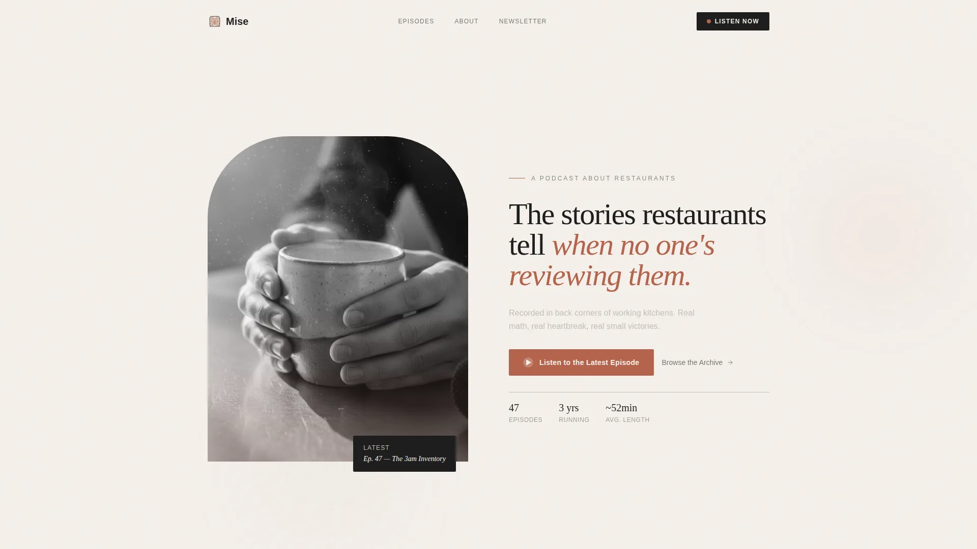
- A cinematic split header with a serif headline, subheading, and pulsing play button call to action
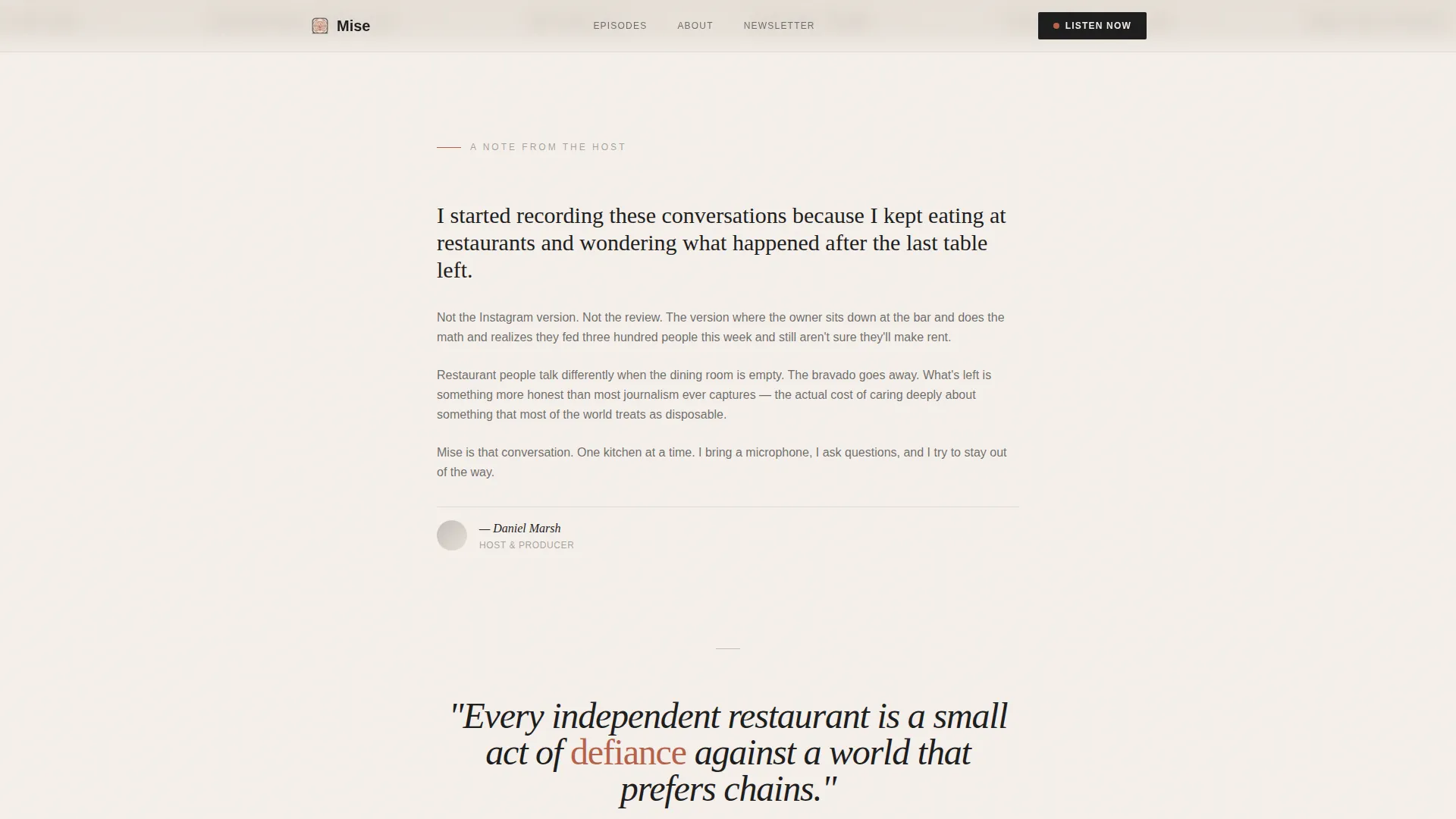
- A founder's letter and oversized mission statement section that establishes editorial voice
- Three editorial pillar blocks with illustrative details, a minimal episode archive grid, and a single-field email capture form
Feature list
This template includes six purposeful sections, each doing specific work for your audience and brand.
Cinematic Split Header
The header pairs a warm, grainy photograph on the left with a large serif headline on the right. A pulsing paprika play button sits below the headline, making the primary call to action impossible to miss.
Founder's Letter and Mission Block
A first-person founder's letter introduces the editorial voice before the mission statement appears as a single oversized sentence centered in whitespace. This section slows the visitor down and builds real connection.
Three Editorial Pillar Cards
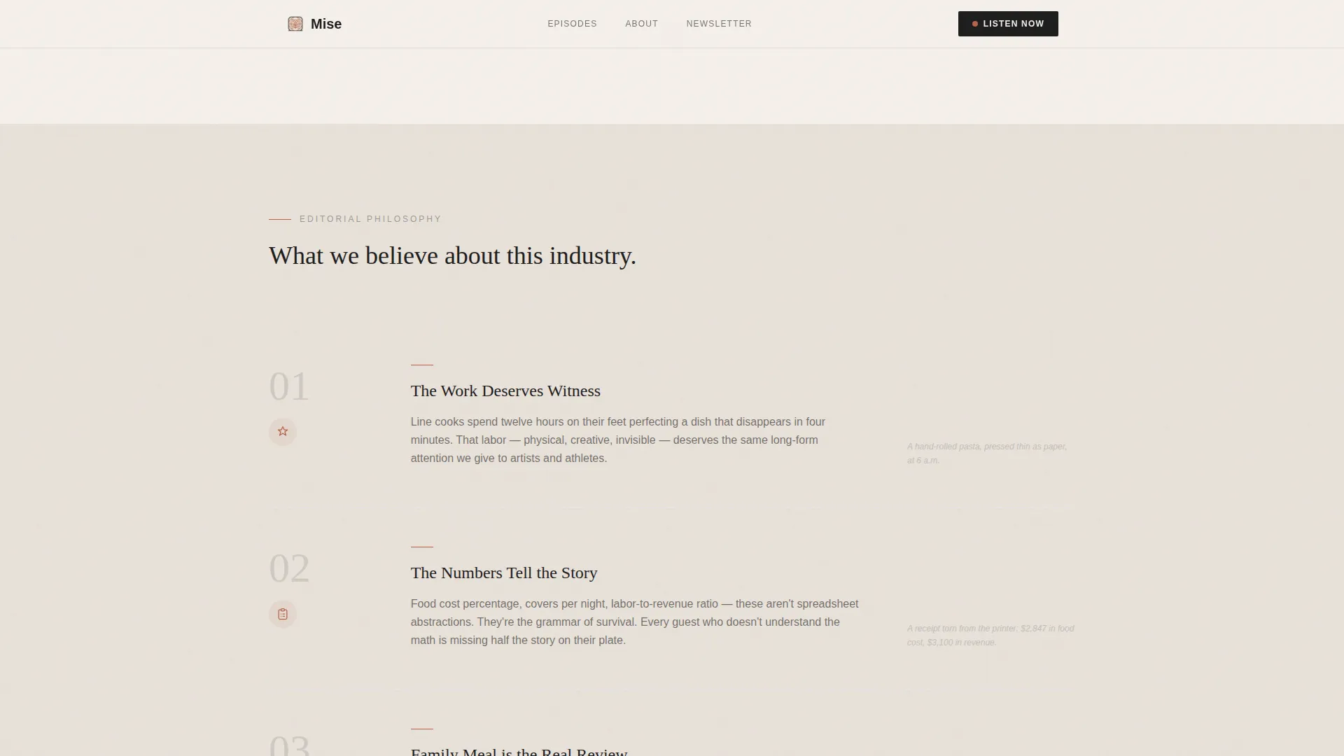
Three belief statements each carry a small illustrative detail, a hand-drawn knife, a receipt, or a family meal plate. They communicate the show's editorial philosophy without resorting to a bullet-point about page.
Minimal Episode Archive Grid
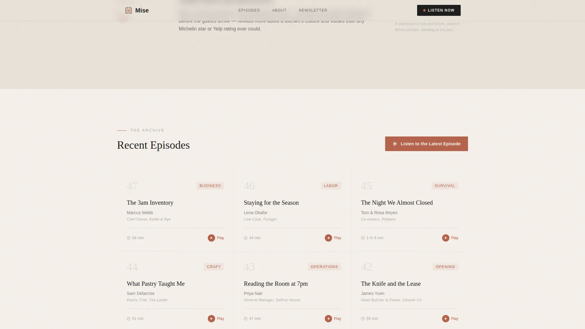
The episode archive displays title, guest name, and runtime in a clean, low-noise grid. Visitors can browse the back catalogue at a glance without being overwhelmed by thumbnails or category filters.
Single-Field Email Capture
A one-field, one-button newsletter form sits at the bottom of the page. The button reads "Get the Weekly Prep List," and the surrounding copy explains exactly what subscribers receive before they commit.
Staggered Scroll Animations
Film grain texture, staggered section reveals, and scroll-snap behavior give the page a considered, editorial rhythm. The pulsing play button and hover states on links use the muted paprika accent throughout.
Page sections overview
| Section | Purpose |
|---|---|
| Split Hero Header | Introduce the show and prompt the first listen |
| Founder's Letter | Establish personal voice and editorial intent |
| Mission Statement | Land the core belief in a single centered sentence |
| Editorial Pillar Cards | Communicate the show's three guiding principles |
| Episode Archive Grid | Let visitors browse titles, guests, and runtimes |
| Email Capture Form | Convert engaged readers into newsletter subscribers |
| Minimal Footer | Close the page with clean horizontal navigation |
Design & branding system
The visual language is Warm Artisan throughout. Nothing is glossy. Every color and typeface choice reflects the texture of a working kitchen rather than the brightness of a food-media brand trying to look expensive.
- Color palette: linen white (#F5F0EB) for backgrounds, steam gray (#C4BFBA) for secondary text, cast-iron black (#1E1E1E) for headings and body, and muted paprika (#B5634B) reserved for play buttons, links, and hover states
- Typography: Fraunces serif for headings and display text, DM Sans for body copy and labels
- Visual texture: film grain overlay, slightly grainy photography at a shallow depth of field, and whitespace used intentionally as breathing room between sections
Mobile & speed optimization
The template is built mobile-first, which reflects where most of the target audience reads. Line cooks scrolling between doubles need a page that loads fast and reads cleanly on a small screen.
- Single-column flow adapts naturally to every screen size without requiring layout changes
- Native CSS scroll and Intersection Observer drive reveals and scroll-snap behavior, keeping the page lean
- Animations are set to medium intensity: enough to feel considered, not so heavy as to interrupt the experience on slower connections
How this template helps you convert
The page is structured so that every conversion action is preceded by something of value. Visitors hear the voice, read the philosophy, and browse real episodes before they are ever asked to subscribe.
- The pulsing play button beneath the header and again after the mission section gives listeners two natural entry points to the show without requiring any commitment
- The episode archive lets browsers self-select, finding a guest or topic that matches their own kitchen experience before they decide whether to follow the show
- The email capture form appears only after the founder's letter, mission, pillars, and archive have already earned the visitor's attention, making the ask feel earned and natural
Other information about this template
This template is part of a broader category of editorial and content destination landing pages designed for niche media brands. It draws on a Vision and Mission creative direction, a Soft Mist color system, and a Half-Page Photo and Text header concept that together create a distinctive and purposeful first impression. The Warm Artisan theme makes it well suited for any restaurant podcast or food-industry media project that wants to look independent and intentional rather than corporate. The footer follows a horizontal flow pattern that keeps the close of the page minimal and consistent with the overall editorial tone.
- Built on a Single Column Flow template style for linear, scroll-led storytelling
- Designed within the Restaurant Podcast and Media niche under the Blog and Editorial category
- The Content and Resource landing-page direction prioritizes listening and browsing over hard-sell conversion
Theme
Warm Artisan
Creative direction
Vision & Mission
Color system
Soft Mist
Style
Single Column Flow
Direction
Content/Resource
Page Sections
Cinematic Split Header with Play Button
Founder's Letter and Mission Statement
Three Editorial Pillar Blocks
Minimal Episode Archive Grid
Earned-trust Email Capture
Warm Artisan Animation and Texture
Related questions
Can I update the episode archive with new episodes easily?
Does the template include a working audio player?
Is this template suitable for a brand new podcast with only a few episodes?
Can I change the color palette to match a different brand identity?
What does the email capture form deliver to subscribers?



