Music Production Newsletter Landing Page Template
Mixdown is a landing page template built for music production and audio engineering newsletters. It uses a masonry card grid, a literary Ink and Paper visual identity, and a lead generation flow designed to turn curious visitors into email subscribers. The template blends warm parchment tones, serif typography, and torn-page card styling to make browsing feel like flipping through a well-worn studio notebook.
by Rocket studio
Quick summary
Mixdown is a single-page newsletter landing page template for music production and mixing content. It pairs a book-chapter header, a curated masonry archive grid, and a sticky email call-to-action bar to convert visitors into subscribers. The Ink and Paper design feels tactile, literary, and confident, making it ideal for editorial newsletters aimed at producers and audio engineers.
Who this template is for
This template is built for newsletter creators and audio educators who write seriously about music production and mixing. It suits independent publishers who want their landing page to reflect the depth and craft of their content.
- Bedroom producers running a newsletter or wanting to launch one
- Working mix engineers and assistant engineers sharing craft-focused writing
- Audio educators and content creators in the music production and mixing space
What problem this template solves
Most newsletter landing pages feel generic. They use stock hero images, shallow copy, and forgettable calls to action. For a music production newsletter with real editorial depth, that mismatch kills trust before a visitor even reads the headline.
- Visitors have no way to sample content quality before being asked to subscribe
- Generic templates fail to communicate a newsletter's voice, niche, or value
- There is no visual storytelling to guide a reader from curiosity to commitment
What you get with this template
You get a fully structured, single-page lead generation layout built around editorial storytelling and archive browsing. Every section works together to build conviction before asking for the email.
- A book-chapter hero section with a manifesto block and inline email capture form
- A twelve-card masonry archive grid with theme clusters and torn-page card styling
- A handwritten margin-note testimonial strip and a sticky bottom call-to-action bar
Feature list
This template includes a focused set of purpose-built components. Each one contributes directly to the lead generation goal.
Book-Chapter Hero Section
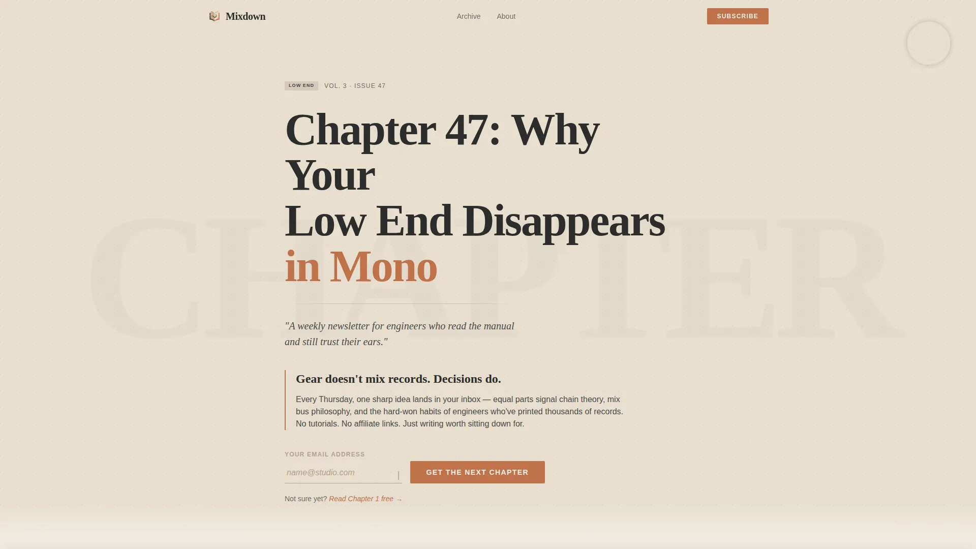
The header is styled as the interior title page of a hardcover volume. A large serif headline sits heavy against aged parchment, with a subtle paper grain texture and a faint coffee-ring detail in the corner. A short italic subline sets the tone immediately below.
Manifesto Block with Inline Email Form
Directly below the hero, a short declaration block states the newsletter's editorial stance. The email capture form sits right beneath it, styled as a ruled notebook line with a blinking cursor. This placement catches engaged visitors at peak interest.
Masonry Archive Grid
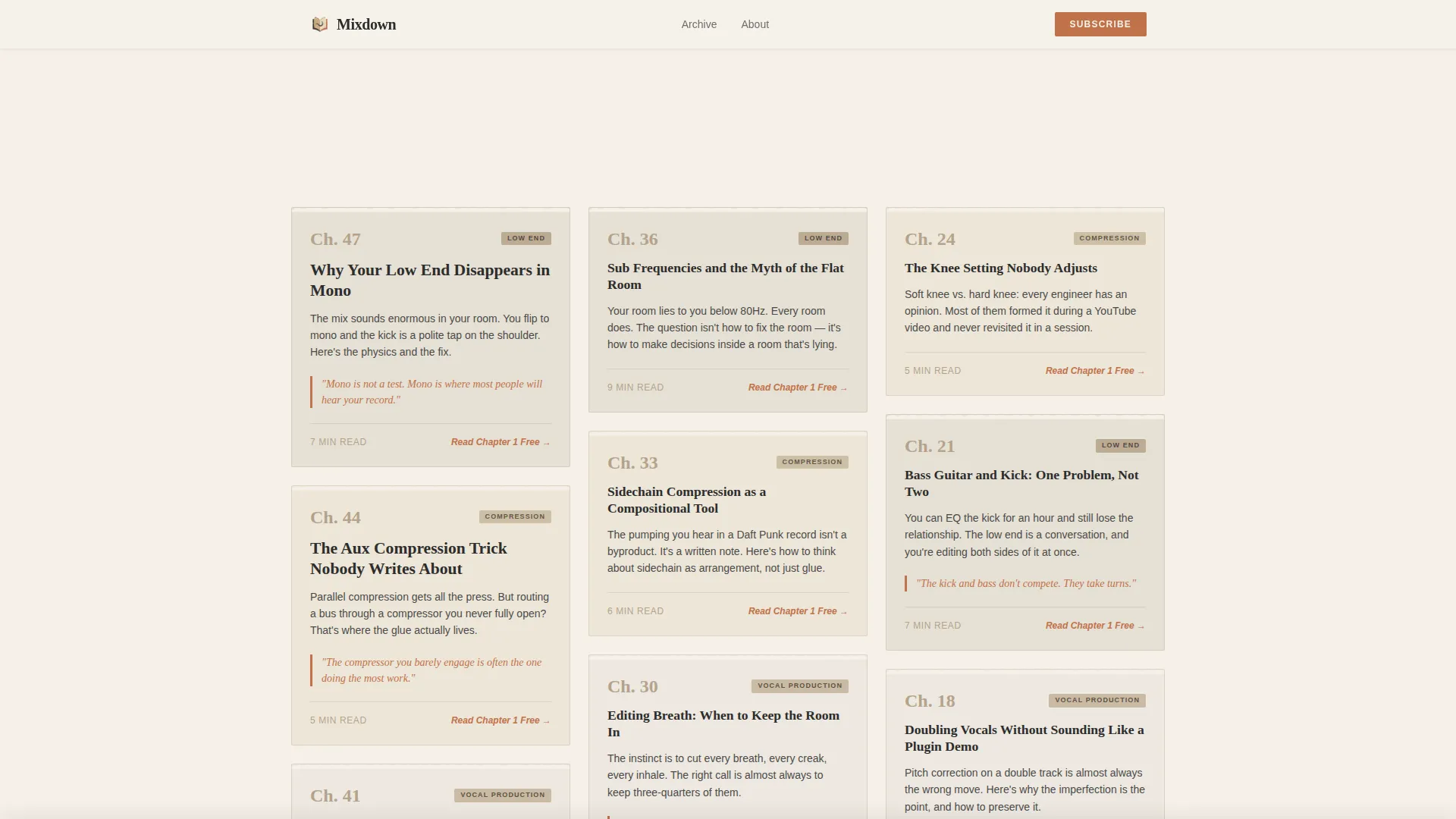
Twelve cards are arranged in a masonry layout organized by theme clusters: compression, vocal production, low end, and workflow. Each card is styled as a torn page showing a chapter number, a provocative title, a one-sentence hook, and a read-time stamp. An inline text link on every card offers a free first chapter, gating the full archive behind the email submit.
Handwritten Testimonial Strip
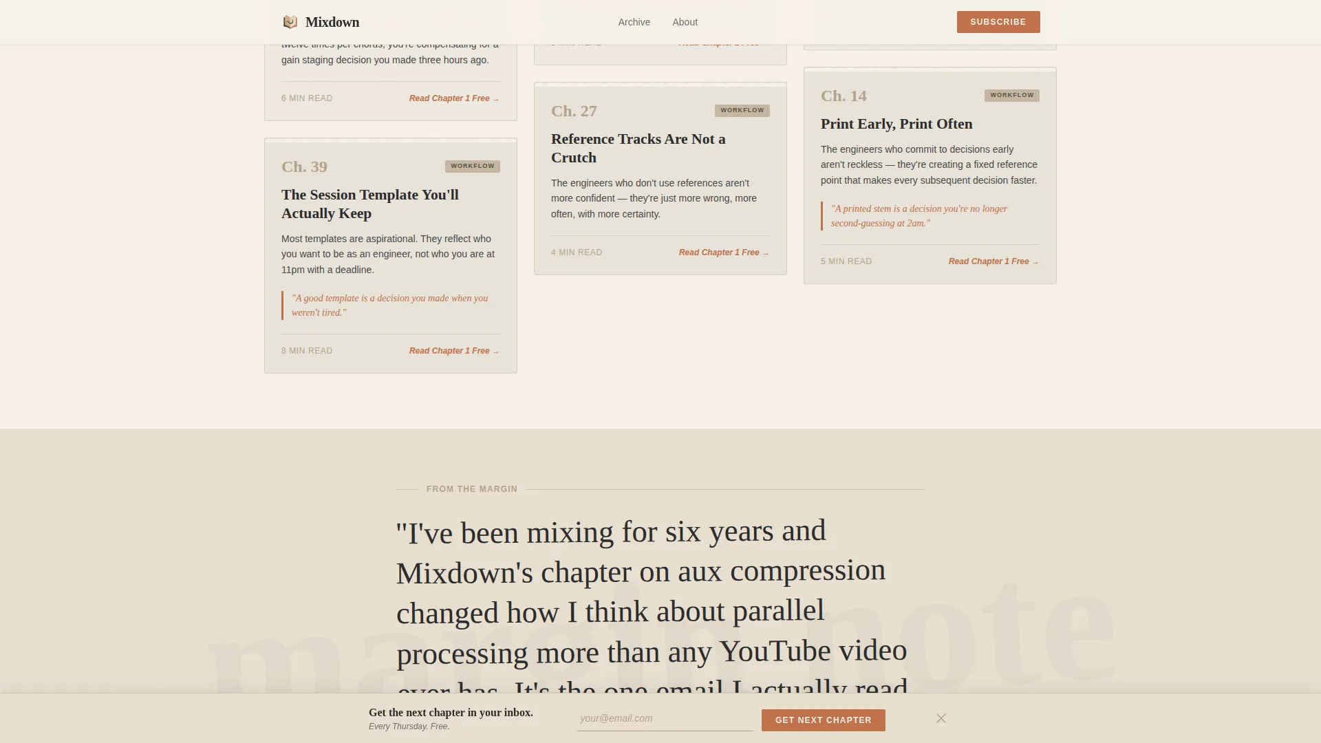
A single subscriber quote appears mid-scroll, rendered in a script typeface to mimic a handwritten margin note. This placement breaks the browsing rhythm and adds social proof at the moment a visitor is deepest in the archive.
Sticky Bottom Call-to-Action Bar
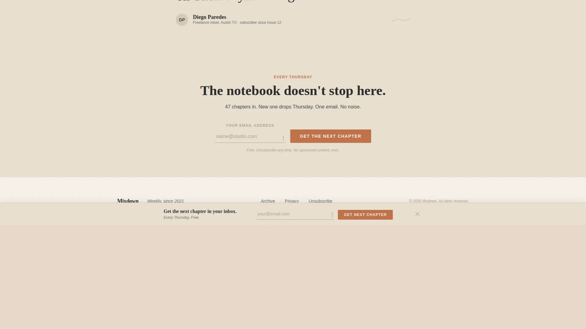
A fixed bar appears at the bottom of the viewport after the visitor has scrolled past at least six masonry cards. It repeats the primary call to action without interrupting the browsing experience, catching visitors who scroll without converting earlier.
Warm Stone Ink and Paper Design System
The visual identity uses a four-color palette built around aged parchment, charcoal ink, sandstone tan, and muted terracotta. Fraunces serif headlines and DM Sans body text give the page a typeset, printed-journal quality that matches the newsletter's editorial voice.
Page sections overview
| Section | Purpose |
|---|---|
| Book-Chapter Hero | Sets editorial tone and introduces the newsletter concept |
| Manifesto Block | States newsletter beliefs and anchors first email capture |
| Masonry Archive Grid | Lets visitors browse past issues by theme to build subscription intent |
| Testimonial Strip | Adds mid-scroll social proof styled as a handwritten margin note |
| Sticky call to action Bar | Repeats email capture after extended scroll engagement |
| Footer | Provides single-row linear navigation and closing context |
Design & branding system
The template uses an Ink and Paper theme built on the Warm Stone color system. Every visual choice reinforces a tactile, literary feeling, as if the page were a physical notebook left on a studio console.
- Four-color palette: aged parchment (#E8DFD0), charcoal ink (#2C2C2C), sandstone tan (#B5A28A), and muted terracotta (#C0714A) reserved for links, buttons, and pull quotes
- Alternating parchment and soft cream (#F5F0E8) section backgrounds with paper grain texture details
- Fraunces serif for headlines and DM Sans for body text, creating a typeset printed-journal feel
Mobile & speed optimization
The template is built desktop-first with a strong mobile experience layered on top. Scroll-triggered interactions and the sticky bar are handled as client components, while static content uses server-side rendering to keep initial load fast.
- Parallax and reveal-on-scroll animations are included for medium-motion visual depth
- Masonry hover states give desktop users tactile card feedback without slowing mobile rendering
- The sticky call-to-action bar and email form remain functional and usable across screen sizes
How this template helps you convert
The page is designed to earn the subscription click rather than demand it. Visitors build conviction through browsing before they ever see a hard ask.
- The manifesto block and free chapter link establish trust and demonstrate content quality before any commitment is required.
- The masonry archive grid organized by theme clusters lets visitors self-identify with the content, making the subscribe decision feel personally relevant.
- The sticky bottom bar recovers visitors who scrolled without converting at the first form placement, giving the page a second conversion opportunity without being intrusive.
Other information about this template
This template was designed specifically for the music production and mixing newsletter niche within the broader Blog and Editorial category. It is a strong fit for creators who publish regularly and want their archive to do selling work for them.
- Template style: Masonry and Pinterest layout
- Application type: Media publishing and newsletter, business-to-consumer lead generation
- Audience focus: Bedroom producers aged 18 to 35 and assistant audio engineers seeking career advancement
- The page is English-language and reflects a United States-centric audio industry context
- Footer follows Pattern 1, a linear single-row layout
Theme
Ink & Paper
Creative direction
Vision & Mission
Color system
Warm Stone
Style
Masonry/Pinterest
Direction
Lead Generation
Page Sections
Book-chapter Hero with Manifesto
Masonry Archive Card Grid
Handwritten Margin Note Testimonial
Sticky Bottom Call to Action Bar
Warm Stone Ink and Paper Identity
Scroll-triggered Animations
Related questions
Who is the Mixdown template designed for?
How does the masonry archive grid help convert visitors into subscribers?
Can I edit the card content and testimonial to match my own newsletter?
What does the sticky bottom call-to-action bar do?
What typefaces does this template use?



