Editorial Music Community Waitlist Landing Page
Mixdown is an editorial magazine landing page built for a private music production and mixing online community. It captures waitlist signups through a typographically bold, ink-on-linen design. The page combines a giant serif headline, a founder's letter spread, community pillar sections, pull-quotes, and a minimal email form to draw in bedroom producers, mixing engineers, and vocalists.
by Rocket studio
Quick summary
Mixdown is a single-page editorial landing page for a private, algorithm-free music production and mixing community. It leads with oversized serif typography, unfolds through a founder's letter and community pillar sections, and closes with a low-friction waitlist form. The design feels like a music magazine printed on linen, unhurried, confident, and built to earn trust before asking for anything.
Who this template is for
This template is made for founders, creators, and community builders in the music production and mixing space. It fits projects that need to build anticipation and capture early members before a full launch.
- Bedroom producers who want to find peer feedback without judgment or noise
- Mixing engineers between studio gigs who need honest ears and a focused community
- Vocalists or independent artists looking for affordable help with mastering and EP feedback
What problem this template solves
Most community landing pages rush toward conversion. They stack logos, throw in countdown timers, and treat the visitor like a number. That approach fails the music production audience, who can smell inauthenticity from the first paragraph.
- Generic waitlist pages lack the editorial depth that builds trust with a creative, discerning audience
- Producers and engineers need to feel the community's personality before they hand over their email
- A page without a clear identity gives visitors no reason to wait for something they cannot yet see
What you get with this template
This template delivers a complete editorial waitlist landing page. Every section is purpose-built to carry the reader from curiosity to signup at a deliberate, unhurried pace.
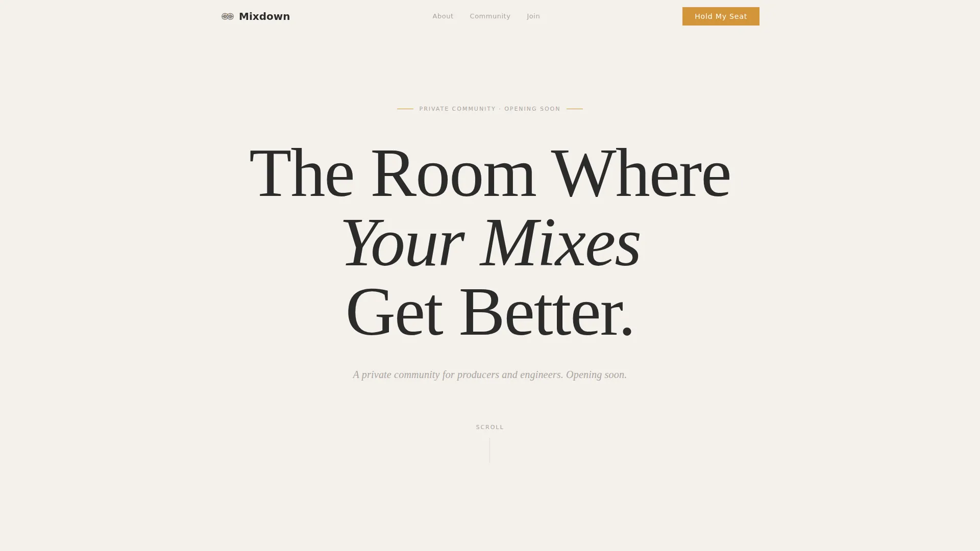
- A hero section with a giant centered editorial serif headline occupying roughly seventy percent of the viewport height
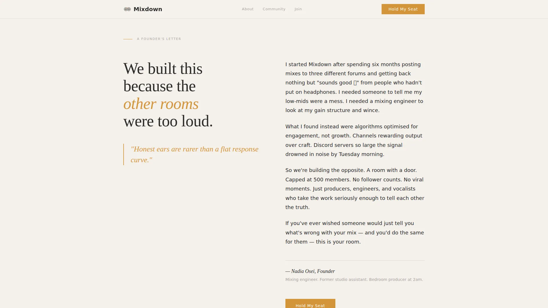
- A two-column founder's letter spread written in first-person to explain why the community exists
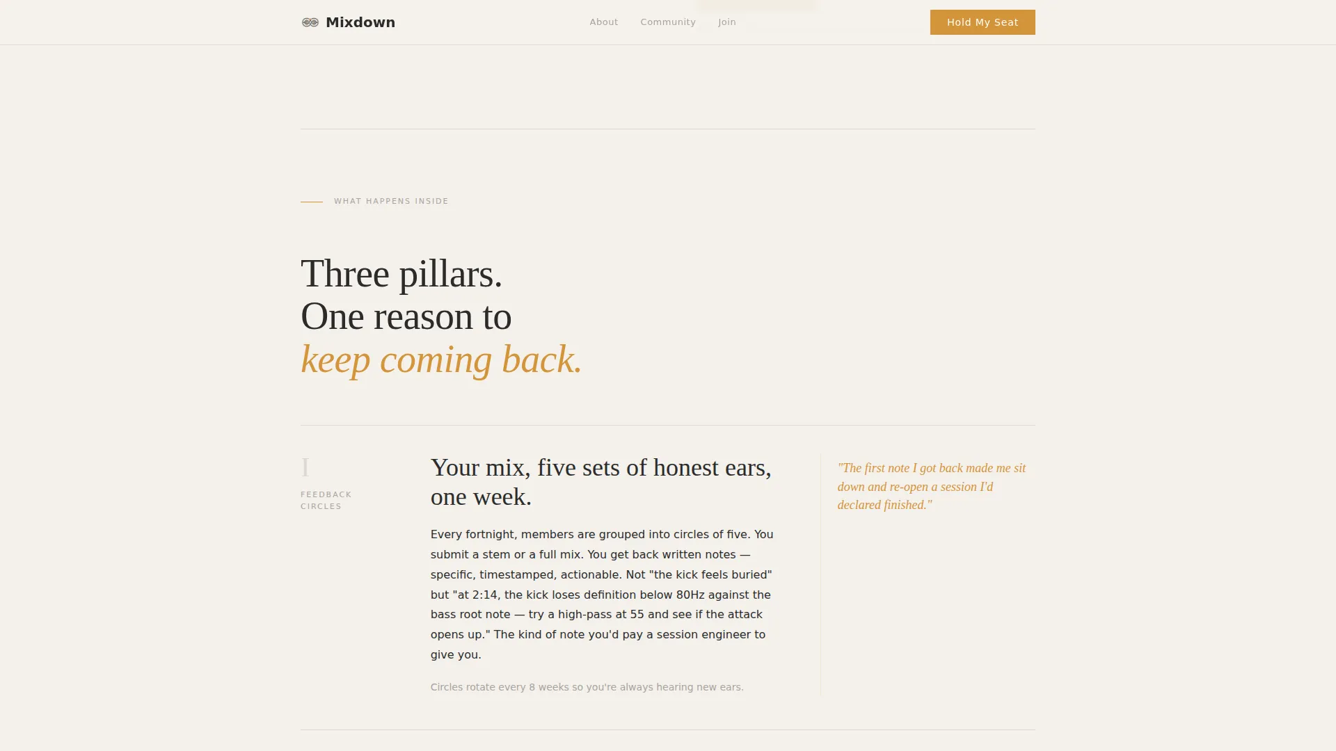
- Three community pillar blocks covering Feedback Circles, monthly Mix Challenges, and guest engineer Ask Me Anything sessions
- Amber-accented pull-quote sections with generous whitespace between ideas
- A waitlist form collecting email and a single role dropdown, with scarcity copy noting a 500-member limit
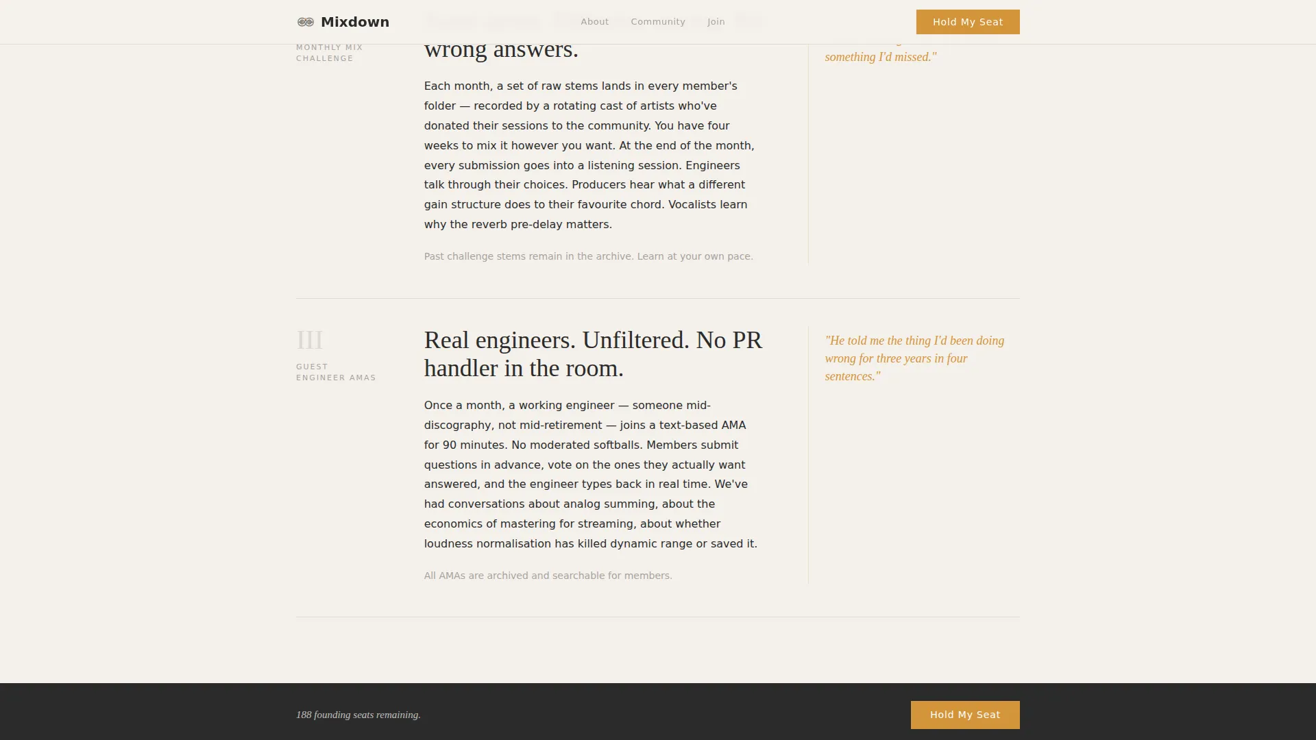
- A persistent bottom call-to-action bar that appears after the reader passes the halfway scroll point
Feature list
This template is built around a small set of carefully considered components. Each one serves the editorial pace and the waitlist conversion goal.
Giant Centered Hero Headline
The hero occupies roughly seventy percent of the viewport height using an oversized editorial serif typeface. It reads with architectural confidence, no images, no gradients, no animation. A single italicized subline in pencil gray sits below it to set tone and expectation.
Two-Column Founder's Letter
The second section breaks into a two-column editorial spread written in first person. It answers why this community exists before the reader has to ask. This format mirrors a magazine feature opener and makes the founder's voice feel considered rather than promotional.
Community Pillar Feature Blocks
Three distinct magazine-style feature blocks each introduce one pillar of the community: Feedback Circles, monthly Mix Challenges, and guest engineer Ask Me Anything sessions. Each block stands alone with generous whitespace, creating a slow, rewarding read.
Amber Pull-Quote Sections
Warm amber accents highlight simulated community voices as pull-quotes throughout the page. The spacing around each quote is deliberately wide, letting each voice land with weight rather than competing for attention.
Waitlist Form with Role Dropdown
The signup form asks only for an email address and one dropdown selection: "I mostly produce," "I mostly mix," or "I do both." A short scarcity line confirms the 500-member limit. The friction is intentionally minimal while the context is intentionally rich.
Persistent Bottom Call-to-Action Bar
After the visitor scrolls past the midpoint, a bottom bar locks into place carrying the "Hold My Seat" call to action in warm amber. It stays visible without interrupting the editorial reading flow, acting as a quiet but constant prompt.
Page sections overview
| Section | Purpose |
|---|---|
| Hero headline block | Sets editorial tone and announces the community |
| Founder's letter spread | Explains the community's purpose in first person |
| Feedback Circles pillar | Introduces peer critique as a core community feature |
| Mix Challenges pillar | Highlights the monthly creative competition format |
| Engineer AMA pillar | Showcases guest expert access as a membership benefit |
| Pull-quote voices | Adds social texture through amber-accented community quotes |
| Waitlist signup form | Collects email and role with minimal friction |
| Persistent bottom bar | Keeps the call to action visible after midpage scroll |
| Footer row | Provides a clean single-row close to the page |
Design & branding system
The visual identity follows an Editorial Magazine theme using a Cloud Canvas color system. Every color choice serves legibility and calm focus, keeping the typography as the dominant visual element.
- Cloudbank white (#F4F1EC) as the primary background, soft and warm like uncoated paper
- Typographic charcoal (#2B2B2B) for all headlines and body text, giving print-like sharpness
- Muted pencil gray (#A8A3A0) for secondary text, sublines, and dividers throughout the page
- Warm amber (#D4943A) reserved exclusively for interactive elements, pull-quotes, and the primary call-to-action button
- Fraunces editorial serif for headlines and pull-quotes; DM Sans for body text and interface copy
Mobile & speed optimization
The template is designed desktop-first, reflecting how music producers typically work at a desk setup. It adapts cleanly for mobile without losing its editorial character.
- Static content sections use server components to keep JavaScript to a minimum
- Subtle scroll reveals are the only animation present, keeping the page fast and distraction-free
- The persistent bottom bar and waitlist form remain fully accessible on smaller screens
How this template helps you convert
The editorial approach is the conversion strategy. Every design and copy decision earns the signup rather than demanding it.
- The giant headline and founder's letter create immediate identity alignment, so the right visitors know this community is for them before they reach the form
- Community pillar blocks and pull-quotes give the reader a concrete picture of membership, reducing uncertainty and lowering the psychological cost of signing up
- The persistent bottom bar and scarcity copy ("500 members, no algorithms, no noise") keep conversion pressure light but present throughout the reading experience
Other information about this template
This template is a strong fit for music production communities, creative membership sites, and niche online communities preparing for a waitlist or soft launch. It works equally well as a foundation for any editorial-style coming soon page where identity and tone matter more than feature lists.
- The footer follows a linear single-row pattern, keeping the page close clean and minimal
- Typography pairing uses Fraunces for editorial weight and DM Sans for clarity in form and interface elements
- The template is built for English (United States) copy with no currency or localization elements included
- Scarcity copy referencing the 500-member limit is built into the form section and can be updated to reflect your actual launch cap
Theme
Editorial Magazine
Creative direction
Vision & Mission
Color system
Cloud Canvas
Style
Editorial/Magazine
Direction
Waitlist/Coming Soon
Page Sections
Giant Centered Editorial Hero
Two-column Founder's Letter
Community Pillar Feature Blocks
Amber-accented Pull-quotes
Minimal Waitlist Signup Form
Persistent Bottom Call-to-action Bar
Related questions
Who is this landing page template designed for?
What does the waitlist form collect from visitors?
Can I change the scarcity copy and member limit?
Does this template include actual community or forum functionality?
Is the persistent bottom bar visible on mobile devices?



