Dental Blog & Media Pre-Launch Website Template
Molar is a waitlist landing page template built for a premium weekly dental industry newsletter. It pairs a broadsheet newspaper masthead with an asymmetric 60/40 editorial grid, a warm parchment and rust color palette, and a scroll-triggered email capture form. The result feels like a curated intelligence briefing, not a typical subscription page.
by Rocket studio
Quick summary
Molar is a desktop-first waitlist landing page for a dental industry intelligence newsletter. It opens with a full broadsheet masthead, moves readers through gallery-style editorial vignettes, and closes with a scroll-triggered sign-up bar. The design is typographic, analog in spirit, and built to signal authority to a professional dental audience from the first scroll.
Who this template is for
This template is designed for publishers and newsletter operators targeting a serious B2B dental audience. It suits anyone launching a premium industry dispatch who wants to build a waitlist before the first issue ships.
- Associate dentists weighing practice partnership offers or planning career moves
- Practice owners, brokers, and dental suppliers who track consolidation deals and reimbursement shifts
- Dental sector investors and newsletter founders who need a credible pre-launch presence
What problem this template solves
Most newsletter landing pages look like generic software sign-up forms. For a premium dental industry report, that generic look undercuts credibility before the reader reaches the first headline. This template solves that trust gap immediately.
- There is no ready-made editorial aesthetic for dental B2B publishing, leaving founders with templates that feel clinical or corporate
- A standard one-column sign-up page cannot communicate editorial depth, signal authority, or tease content the way a broadsheet layout can
- Without segmentation at the point of sign-up, early lists are unstructured and harder to use for targeted outreach
What you get with this template
You get a fully structured single-page layout that doubles as a brand statement and a conversion tool. Every section is purpose-built for the dental intelligence niche.
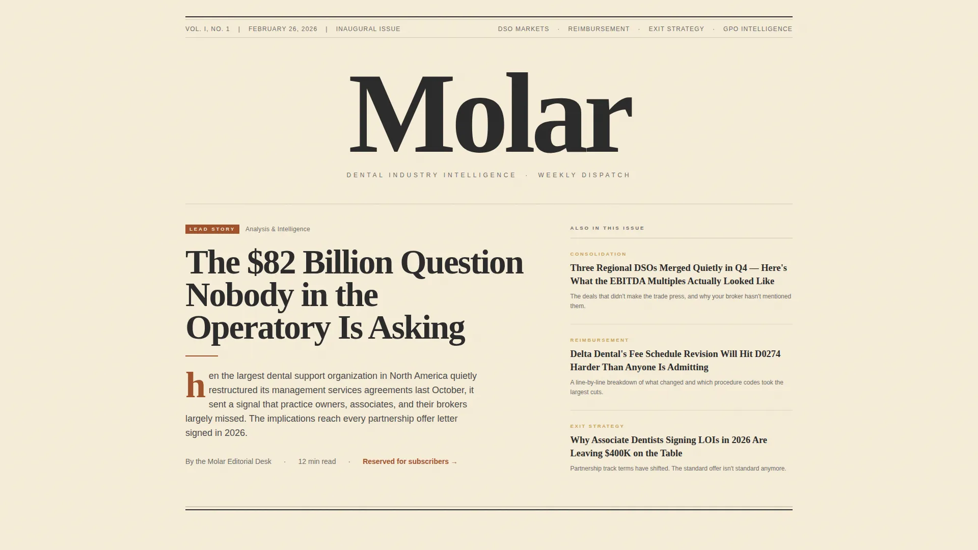
- A typographic hero masthead styled after a printed broadsheet, complete with a nameplate, dateline, volume number, and large serif lead headline
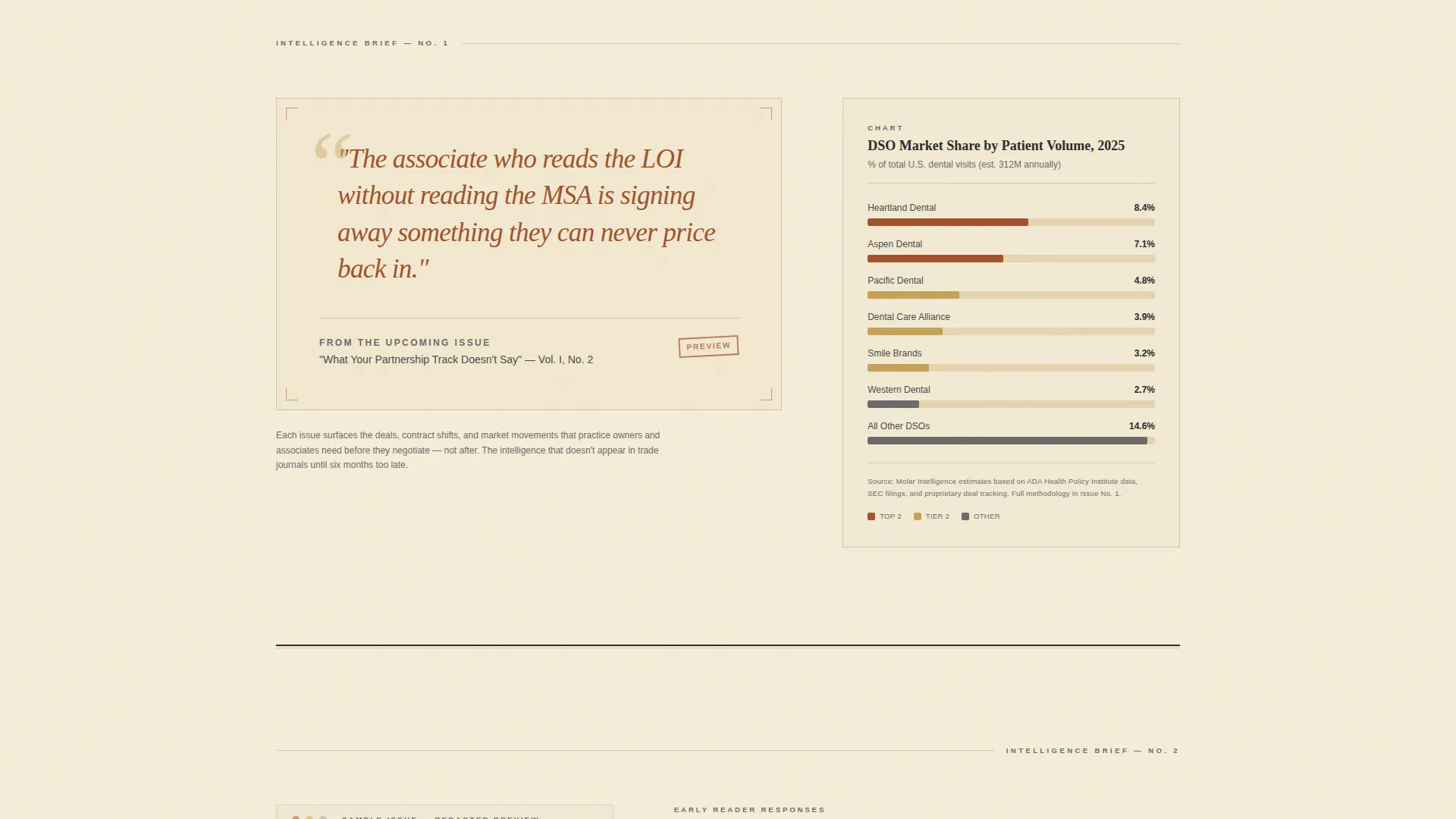
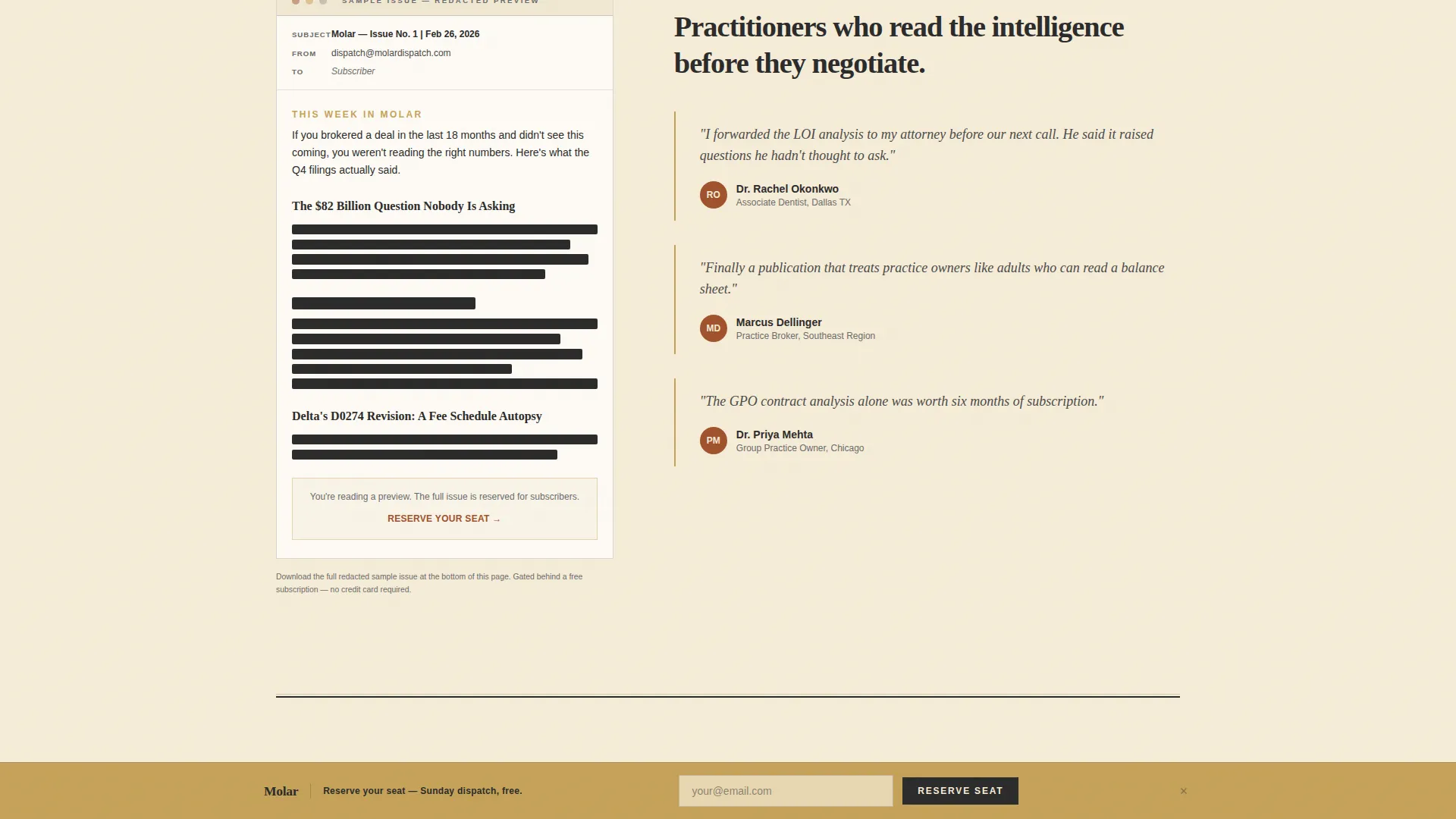
- Three asymmetric editorial vignettes arranged in a Gallery Walk flow, featuring pull quotes, a sample DSO market share chart, a redacted issue facsimile, and a reader credibility section
- A scroll-triggered fixed call-to-action bar in warm gold, an email capture field with a role dropdown, a live reader counter, and a secondary gated PDF download link
Feature list
This section describes the core built-in components included in the Molar template.
Broadsheet Hero Masthead
The hero section is styled after a full-width printed newspaper front page. It includes a hand-lettered nameplate, a dateline, a volume number, and a large serif lead headline. Three teaser columns sit below the fold line, each carrying a real-sounding industry story headline. No photography is used. The hierarchy comes entirely from type, fine rule lines, and generous whitespace.
Asymmetric 60/40 Editorial Grid
The page body uses a shifting asymmetric grid. The first vignette is left-heavy at 60/40, placing a pull quote museum placard on the wider column and a DSO market share chart rendered in rust and gold on the narrower side. Subsequent vignettes flip the alignment so the eye moves the way it does in a gallery, never rushed.
Scroll-Triggered Fixed Call-to-Action Bar
A warm gold bar is fixed to the bottom of the viewport. It does not appear until the visitor scrolls past the second editorial vignette, earning the ask with substance first. The bar contains the primary call-to-action prompt and the email capture form so conversion is always one scroll away.
Segmented Email Capture Form
The sign-up form uses a single email field paired with an optional role dropdown. Roles include practice owner, associate, broker, supplier, and investor. This segmentation captures audience intent from day one and structures the early subscriber list for targeted follow-up.
Live Reader Counter
A subtle counter below the sign-up form displays the current number of readers who have joined. It starts at zero and is designed to update live. The counter builds social proof early, before the newsletter has a track record to point to.
Gated PDF Sample Download
A secondary conversion path offers a redacted sample issue as a downloadable PDF. The download is gated behind the same email capture, giving readers a low-commitment reason to subscribe while reinforcing the editorial quality of the dispatch.
Page sections overview
| Section | Purpose |
|---|---|
| Hero Masthead | Establishes broadsheet editorial identity with nameplate, dateline, and lead headline |
| Editorial Vignette 1 | 60/40 grid with pull quote placard left and DSO chart right |
| Editorial Vignette 2 | 40/60 grid with redacted issue facsimile left and reader credibility right |
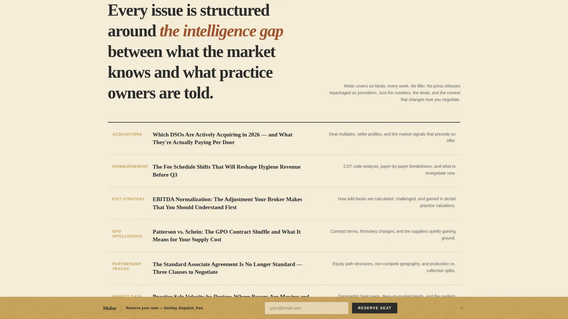
| Editorial Vignette 3 | Full-width topic index styled as an editorial contents page |
| Email Capture Section | Role dropdown form, reader counter, and PDF download link |
| Footer | Minimal horizontal flow layout |
Design & branding system
The Molar template uses a Warm Artisan visual identity built around a Parchment and Rust color system. Every design decision reinforces the feeling of a leather-bound ledger open beside a brass desk lamp. The type does the work that imagery would do elsewhere.
- Colors: aged parchment (#F5ECD7) as the dominant background, deep editorial rust (#A0522D) for headlines and pull quotes, charcoal (#2B2B2B) for body copy, and muted gold (#C5A258) for buttons, dividers, and hover states
- Typography: Fraunces is the display serif used for headlines and pull quotes; DM Sans handles body copy and interface elements for clean legibility
- Layout details include fine rule lines, generous negative space between vignettes, and grid alignment shifts that move from left-heavy to right-heavy sections across the page
Mobile & speed optimization
The template is designed desktop-first, built to render the broadsheet aesthetic at full width on larger screens. It adapts gracefully to smaller viewports without losing its editorial character.
- Scroll reveal animations and staggered text entrance effects are set to medium intensity, keeping motion purposeful rather than distracting
- The fixed call-to-action bar entrance is scroll-triggered, which keeps the mobile viewport uncluttered until the reader has engaged with enough content
- Static content uses server components with minimal JavaScript, keeping the interactive layer limited to the email form, role dropdown, and scroll-triggered bar
How this template helps you convert
The conversion architecture is layered so readers earn trust before they see the ask. Every section moves visitors closer to signing up without feeling pushy.
- The broadsheet masthead and editorial vignettes establish credibility and content quality before any sign-up prompt appears, so readers arrive at the form already curious.
- The scroll-triggered gold bar appears only after the second vignette, timing the call-to-action to the moment engagement is highest and resistance is lowest.
- The role dropdown and live reader counter give visitors two reasons to act: personal relevance through segmentation and social proof through visible community size.
Other information about this template
This section covers additional context that helps you understand how the Molar template fits into a broader publishing and pre-launch strategy.
- The template is built for a single-page waitlist flow, not a multi-page site, making it fast to deploy and easy to maintain before launch
- The Gallery Walk creative direction means each editorial vignette is a self-contained visual unit, so you can update or reorder content blocks without redesigning the full page
- The Newspaper/Publication header concept positions the brand as a media property from day one, which is especially useful for dental sector publishers differentiating from trade association newsletters
- The color system and typographic choices are deliberately analog in character, designed to stand apart from the blue and white SaaS dashboards that dominate digital health and dental software marketing
Theme
Warm Artisan
Creative direction
Gallery Walk
Color system
Parchment & Rust
Style
Asymmetric Grid (60/40)
Direction
Waitlist/Coming Soon
Page Sections
Broadsheet Hero Masthead
Asymmetric 60/40 Editorial Grid
Scroll-triggered Fixed Call to Action Bar
Segmented Email Capture Form
Live Reader Counter
Gated PDF Sample Download
Related questions
Who is this landing page template designed for?
Can I adjust the role options in the sign-up dropdown?
Does the scroll-triggered call-to-action bar work on mobile?
What is the secondary conversion path in this template?
Is this template suitable for a newsletter that has not launched yet?



