Live Behavior Transformation Landing Page Template
The Habit editorial scroll habit building landing page template is a single-page editorial experience built for habit and self-improvement blogs. It pairs a cinematic horizontal scroll of essay cards with a fixed email capture bar, guiding visitors from a bold serif hero section toward a weekly newsletter sign-up. Warm Stone palette, Fraunces typography, and deliberate white space create a reading environment that feels unhurried and trustworthy.
by Rocket studio
Quick summary
Habit is a landing page template designed for editorial self-improvement blogs. It uses horizontal scroll storytelling to present curated essay cards, moving readers from aspiration to honest self-examination before delivering a clear call to action. The layout earns the email address by giving genuine value first, then asking for a single, frictionless sign-up at the bottom of every scroll.
Who this template is for
This template is built for creators, writers, and publishers who want to grow a newsletter audience through long-form habit content. The landing page design targets people who care about craft as much as conversion.
- Habit and self-improvement bloggers launching or scaling a weekly newsletter
- Independent writers tired of generic productivity apps who want a distinct editorial identity
- Designers and content creators building focused, lead-generation landing pages for new habits content
What problem this template solves
Most habit tracker and self-improvement landing pages feel like mobile app store listings. They lead with feature grids and discount banners. Visitors who came for depth leave without reading a word. The first impression never communicates the value proposition, and the call to action arrives before trust is built.
This template solves those problems with a clear information hierarchy and editorial structure that holds attention from the hero section onward.
- Readers scroll past generic productivity apps content; this page gives them an essay taste before asking for anything
- A single conversion goal replaces cluttered navigation, keeping users focused on one action
- The visual hierarchy guides visitors from curiosity to commitment through a logical progression of themed essay cards
What you get with this template
You get a fully structured, single-page landing page with six distinct sections and every interactive element pre-built. The layout follows a conversion-driven structure that communicates the value proposition within seconds of landing.
- Hero section with a massive editorial serif headline, byline subhead, and horizontal rule on a linen field
- Horizontal scroll essay card row featuring four themed magazine-cover cards with read-time stamps
- Running marquee strip, Editor's Letter section, popular articles row, fixed email capture bar, and editorial footer
Feature list
This section outlines the key features built into this landing page template. Each feature is framed as a practical benefit so you can evaluate exactly what you are getting before you use it.
Giant Centered Headline Hero Section
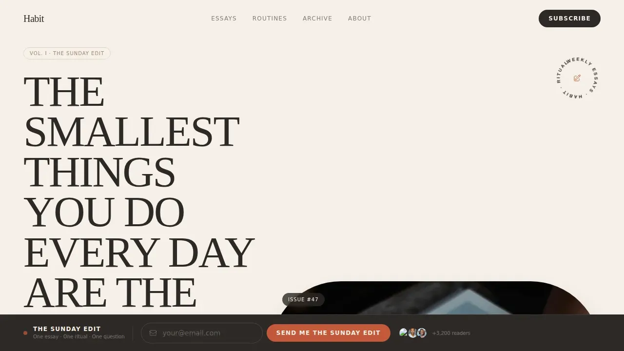
The hero section opens with a single massive headline set in Fraunces, a high-contrast editorial serif. Nothing competes with it. No image, no illustration, just charcoal ink on a linen field at a scale that communicates the value proposition in the first five seconds. A byline-style subhead and a thin horizontal rule sit below, adding editorial authority without visual noise.
Horizontal Snap Scroll Essay Cards
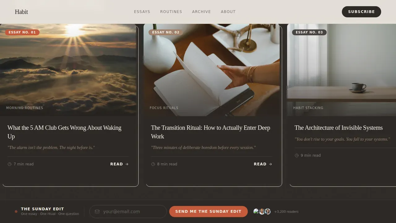
Four magazine-cover essay cards sit in a horizontal scroll lane with snap-scroll behavior. Each card carries a large editorial photograph, a bold serif article title, an italic one-line hook, and a read-time stamp. The card sequence moves from morning routines through focus rituals, habit stacking, and failure-and-restart, creating a logical progression that pulls users deeper with every swipe. This scroll-based storytelling structure unveils the value proposition one card at a time.
Fixed Bottom Email Capture Bar
A fixed bar along the bottom of the viewport holds the primary call to action throughout the entire page experience. The bar is styled like a magazine subscription card and asks only for an email address, reducing friction to the minimum. Strategic placement means the clear call to subscribe is always visible, and the inline form feels like a natural continuation of the reading experience rather than an interruption.
Editor's Letter and Newsletter Format Section
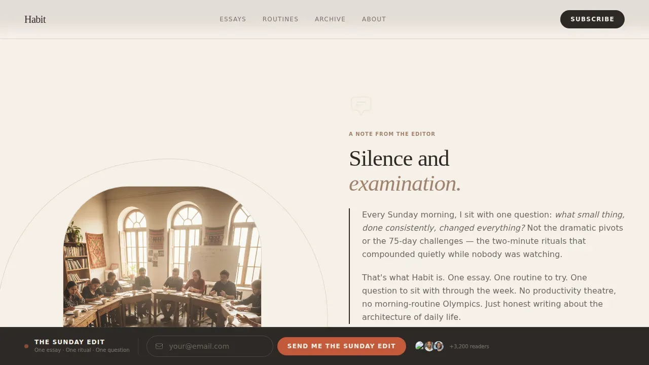
After the horizontal scroll, the page locks into a vertical section containing a personal editor's letter. This section explains the weekly newsletter format: one essay, one routine to try, one question to sit with. It functions as a "What Happens Next" statement that builds trust right before the secondary call to action, turning interest into commitment.
Running Marquee Editorial Topics Strip
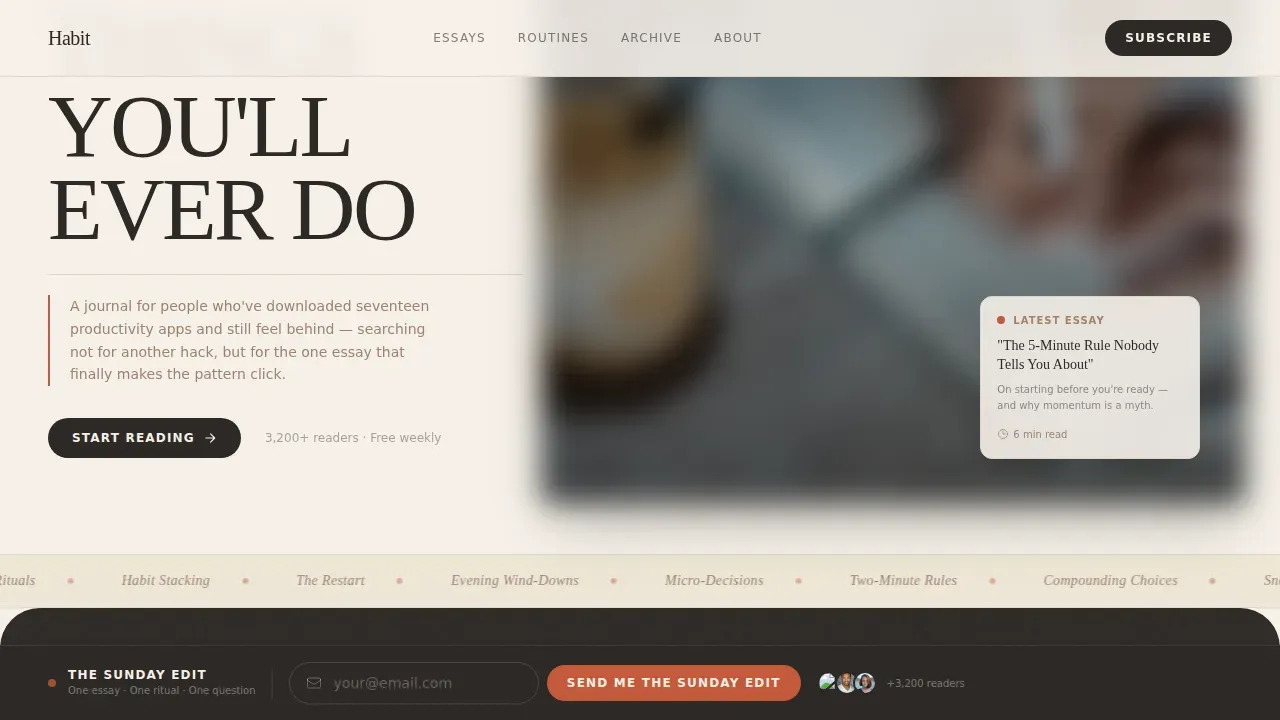
A marquee strip runs a continuous sequence of editorial topics across the page. It reinforces the breadth of the content library and acts as a visual cue that the publication is active and ongoing. The strip sits between the horizontal scroll and the editor's letter, maintaining visual balance and giving the eye a moment of motion before settling into the longer read.
Popular Articles Row with Secondary Call to Action
Three curated article cards appear after the editor's letter, each linking to a free piece of content. The row provides high quality visuals paired with titles, acting as social proof for the editorial standard of the newsletter. A secondary call to action, "Start Reading Free," sits below the row, guiding users toward depth before the final commitment.
Page sections overview
| Section | Purpose |
|---|---|
| Hero Headline Section | Opens with a giant serif headline on a linen background; establishes the value proposition immediately |
| Horizontal Scroll Cards | Four themed essay magazine covers with snap scroll; moves readers through an aspiration-to-honesty arc |
| Marquee Topics Strip | Running band of editorial topics; maintains visual balance and signals an active content library |
| Editor's Letter Block | Personal note explaining the newsletter format; builds trust at the key decision point |
| Popular Articles Row | Three free article cards with a secondary call to action; delivers value before asking for an email |
| Fixed Email Bar | Persistent bottom-viewport capture bar; keeps the primary call to action always one click away |
| Editorial Footer | Horizontal flow footer with dot separators; closes the page with consistent brand identity |
Design & branding system
The landing page design uses a Warm Stone color system that feels tactile and unhurried. Every color decision serves the information hierarchy. The typography pairing of Fraunces for headlines and DM Sans for body text keeps the editorial voice strong while maintaining legibility at all sizes. Generous leading and deliberate white space improve content hierarchy and make long paragraphs easier to read.
- Four-color palette: sun-bleached linen (#F5F0E8), wet clay (#A0826D), charcoal ink (#2D2926), and terracotta red (#C4593B) reserved for pull-quotes and active states
- Backgrounds alternate between linen and clay washes; terracotta appears only as a visual accent for contrasting colors on pull-quotes and hover states
- White space is used generously throughout the layout, maintaining visual balance between text-heavy editorial sections and image-led card blocks
Mobile & speed optimization
The landing page is built desktop-first with a graceful mobile adaptation that keeps every section functional and readable on smaller screens. App design decisions made for the desktop layout carry through cleanly to the mobile app view without losing the editorial feel. Mobile responsiveness is treated as essential, not optional, because a significant share of visitors will arrive from a mobile app or mobile browser.
- Horizontal scroll cards collapse gracefully on mobile, preserving the snap-scroll experience on touch devices
- Native CSS smooth scroll and intersection observer reveals are used for animation, avoiding heavy libraries and supporting load time optimization
- The fixed email capture bar remains visible on all screen sizes, keeping the call to action accessible throughout the mobile experience
How this template helps you convert
An effective landing page must move visitors from initial interest to a state of commitment. This template does that by structuring the page as an editorial journey rather than a sales pitch. Every element is arranged in a conversion-driven structure that guide users forward without pressure.
- The hero section grabs attention with a problem-solution headline that speaks directly to readers fatigued by productivity apps, communicating the value proposition before a single scroll occurs and setting up the logical progression of content that follows.
- The horizontal essay cards act as micro-conversions, each swipe building familiarity and trust through social proof via read-time stamps and high-quality editorial images, raising the conversion rate by warming users before they reach the email bar.
- The fixed email capture bar and the editor's letter work together at the decision point, delivering a clear call to subscribe with a transparent "What Happens Next" explanation, so users know exactly what they are signing up for and the conversion feels earned.
Other information about this template
This section covers additional practical details that help designers and developers evaluate the template for their specific needs. It also addresses compatibility, customization scope, and relevant third-party context.
- The template is categorized as Blog and Editorial, under the Habit Building and Self-Improvement Content subcategory, making it one of the more niche-specific digital products available for this content type
- App design customization is straightforward: swap the Warm Stone palette for any color system, replace the Fraunces headlines with your preferred editorial serif, and update the essay card images and copy to match your content library
- The page structure supports adding web analytics through a script tag in the document head; tools such as Google Analytics can be connected to track page metrics including scroll depth, conversion rate, and email form completions
- For teams evaluating landing page builders alongside this template, platforms such as Justinmind, Unbounce, Leadpages, HubSpot, and ConvertKit each offer their own landing page builder services; this template provides a custom-coded alternative that gives designers full control over the app design and layout without builder constraints
- Squarespace offers website and landing page creation services as well; this template is an appropriate choice for teams who want editorial-grade landing page design beyond what standard website builders deliver
- The template supports conversion optimization practices such as A/B testing headline variants, swapping the call to action copy, and adjusting the essay card sequence to evaluate which arc drives the highest conversion rate
- Read-time stamps on essay cards and a subscriber count in the editor's letter serve as built-in social proof elements that build credibility near the sign-up form
- The footer uses a horizontal flow pattern with dot separators, keeping the page's visual balance and ui design consistent to the final scroll position
- Interactive elements such as hover states on essay cards and the marquee strip drives engagement throughout the page without requiring heavy third-party scripts
- Essential content decisions, including essay card topics and the editor's letter copy, are yours to customize; the template provides the structure and app design; you supply the editorial voice
- The landing page template's app landing page structure is well-suited for teams who also manage a companion mobile app, since the horizontal card layout and fixed call to action bar translate cleanly to mobile app web views
Theme
Editorial Magazine
Creative direction
Curated Collection
Color system
Warm Stone
Style
Horizontal Scroll
Direction
Lead Generation
Page Sections
Giant Centered Serif Hero Section
Horizontal Snap Scroll Essay Cards
Fixed Bottom Email Capture Bar
Editor's Letter and Newsletter Explainer
Popular Articles Row
Running Marquee Topics Strip
Related questions
Can I change the essay card topics and copy?
Does the fixed email bar work on mobile devices?
How do I connect an email service to the capture form?
Is the horizontal scroll accessible on touch screens?
Can I add tracking or analytics to this landing page?



