Hobby & Passion Content Blog & Content Website Template
Mycelium is a hub-and-spoke anchor-nav landing page built for mushroom foraging blogs and communities. It guides visitors through curated editorial sections, from beginner species guides to toxic lookalike pairs, and converts them through an inline species-identification quiz. The cinematic dark palette and editorial typography give the page the feel of a hand-crafted field journal.
by Rocket studio
Quick summary
Mycelium is a single-page foraging community hub built around confident learning and email capture. Anchor navigation connects six themed content sections, and an inline quiz turns passive readers into engaged subscribers. The warm artisan visual identity, deep forest-floor colors, and generous serif typography make every scroll feel deliberate and immersive.
Who this template is for
This template is built for foraging bloggers, nature educators, and community organizers who need a content-rich landing page that earns trust before asking for an email. It works equally well for solo writers and small communities running seasonal guided walks.
- Weekend foragers and home cooks who want to publish beginner-friendly species guides
- Experienced mycologists building a regional community around seasonal walk calendars
- Nature bloggers who rely on editorial photography and want a layout that gives it space
What problem this template solves
Most foraging blogs lose visitors quickly because they present information without any sense of stakes or progression. Readers arrive curious, skim a few posts, and leave without subscribing. This template solves that by building a narrative arc across the scroll, each section quietly raising the visitor's awareness of what they do not yet know, so the quiz feels like a natural next step rather than an interruption.
- No clear path from casual reader to committed community member
- Photography-heavy content squeezed into generic blog layouts that waste visual impact
- No conversion mechanism that matches the trust level foraging content requires
What you get with this template
You get a fully structured, six-section landing page with a sticky anchor navigation bar, an inline species-identification quiz, and an email capture flow tied to regional walk registration. Every section is designed to carry editorial photography without compromise.
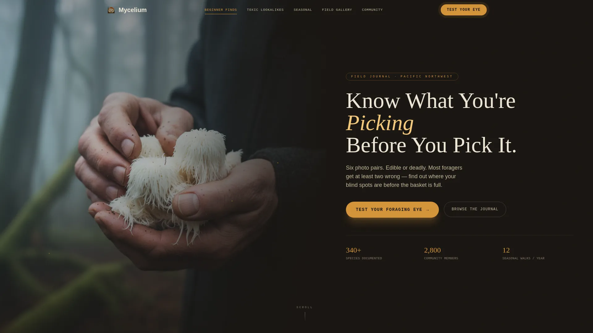
- Half-page hero split with a headline area and a primary call-to-action button
- Six anchor-linked content sections covering beginner finds, toxic lookalikes, a seasonal calendar, a field gallery, community walks, and a footer
- Inline quiz modal with a six-question photo-pair format, a confidence score result, and a personalized reading list tied to email capture
Feature list
A paragraph introduction to the features: each component in this template was chosen because foraging content demands a specific kind of reader experience, one that builds knowledge progressively and earns the conversion rather than demanding it.
Anchor Navigation Bar
A sticky anchor navigation element links directly to each of the six content sections. Gold hover states and active indicators reflect the chanterelle gold accent color, making orientation effortless as the visitor scrolls.
Inline Species-Identification Quiz
The quiz opens directly on the page without redirecting the visitor. Six high-resolution photo pairs ask the reader to distinguish edible species from toxic lookalikes. After the final answer, a forager confidence score and a personalized reading list appear before the email capture prompt.
Asymmetric Bento Grid for Beginner Finds
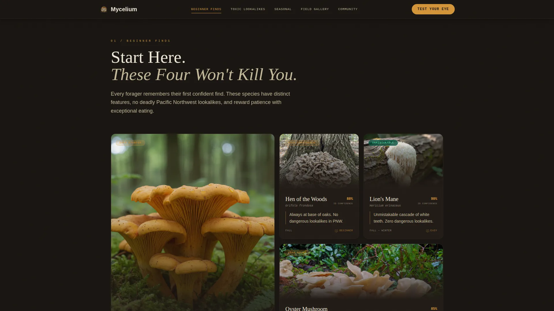
Six starter species are displayed in an asymmetric bento-style grid layout with individual identification notes per species. The grid balances visual weight across cells without forcing a rigid column structure.
Full-Bleed Alternating Photo Sections
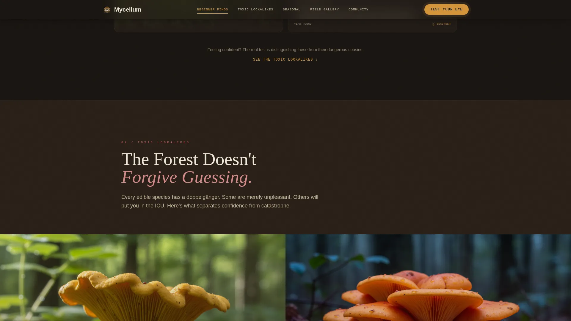
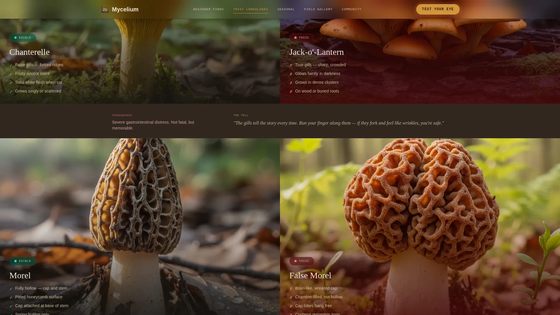
The Toxic Lookalikes section uses dark, full-bleed alternating photo-and-text pairs. Each pair contrasts an edible species with its dangerous doppelganger, building a slow, editorial tension that motivates quiz participation.
Illustrated Seasonal Calendar
A month-by-month illustrated grid shows species appearance windows across the foraging year. Visitors can see at a glance which mushrooms are in season and plan their outings accordingly.
Community Walks Section with Email Capture
Testimonials from community members, a region map, and an email capture form sit together in a single section. Visitors choose their region and subscribe to receive walk notifications and unlock full quiz results.
Page sections overview
| Section | Purpose |
|---|---|
| Hero Split | Editorial photo-text header with primary quiz call to action |
| Beginner Finds | Bento grid of six starter species with ID notes |
| Toxic Lookalikes | Full-bleed alternating pairs for dangerous species contrast |
| Seasonal Calendar | Month grid showing species appearance windows |
| Field ID Gallery | Photo pairs leading into the inline quiz modal |
| Community Walks | Testimonials, region map, and email capture |
| Footer | Logo, tagline, and navigation links split layout |
Design & branding system
The visual identity follows a Warm Artisan theme expressed through a Cinematic Dark color system. The palette is grounded in natural materials: deep loam, wet bark, wild gold, and pale cream. Typography pairs a generous display serif for headlines with a clean sans-serif for body text and a monospaced font for labels and species tags.
- Colors: deep forest floor (#1A1612) as background, wet-bark umber (#3B2F2A) for section dividers, chanterelle gold (#D4943A) for navigation anchors and hover states, and spore-dust cream (#EDE6D6) for all readable text
- Typography: Fraunces serif for editorial headlines, DM Sans for body copy, and JetBrains Mono for species labels and section tags
- Section rhythm alternates between dark full-bleed photography and cream-background illustrated guides, creating visual breathing space across the scroll
Mobile & speed optimization
The template is built desktop-first because editorial photography needs horizontal space to read well. Responsive breakpoints scale the bento grid, hero split, and quiz modal down to mobile without losing the cinematic atmosphere of the layout.
- Parallax scroll, stagger reveal animations, and quiz modal transitions are handled through client-side components while static sections use server-side rendering for faster initial loads
- The anchor navigation collapses cleanly on smaller screens so visitors can still jump between sections without losing orientation
How this template helps you convert
The page is designed so that every scroll action moves the visitor closer to the quiz, and the quiz itself earns the email rather than demanding it upfront.
- The hero places the primary call-to-action button, "Test Your Foraging Eye," at the very first moment of attention, and a sticky navigation element keeps it visible throughout the entire scroll.
- Each content section builds a quiet sense of how much the visitor does not yet know, so that by the time they reach the Field ID Gallery, taking the quiz feels like relief rather than obligation.
- The quiz delivers genuine value before asking for an email: wrong answers teach a real lesson, the confidence score is personalized, and the reading list is specific to the visitor's result.
Other information about this template
This template is a strong starting point for anyone building a mushroom foraging blog or nature-focused community hub. The hub-and-spoke structure works across a range of hobby and passion content niches, not just foraging, making it adaptable for other nature-education or field-guide projects.
- The footer follows a split layout with logo and tagline on the left and navigation links on the right, keeping the closing impression as editorial as the rest of the page
- The quiz conversion flow is designed to capture both email and region preference in a single step, giving community organizers the data they need to invite subscribers to local seasonal walks
- Animation intensity is high throughout: parallax scroll on hero imagery, stagger reveals on bento grid cards, and smooth modal transitions on the quiz overlay
Theme
Warm Artisan
Creative direction
Curated Collection
Color system
Cinematic Dark
Style
Hub & Spoke (Anchor Nav)
Direction
Quiz/Assessment
Page Sections
Sticky Anchor Navigation Bar
Inline Species-identification Quiz
Asymmetric Bento Species Grid
Full-bleed Alternating Lookalike Pairs
Illustrated Seasonal Calendar Grid
Community Walks and Email Capture
Related questions
What kind of content does this template support?
How does the quiz conversion flow work?
Is this template suitable for a beginner blogger?
Does the template work on mobile devices?
What is included in the community and email capture section?



