HealthTech Startup Professional Website Template
The Pulse enterprise healthcare integration platform landing page template is a dark, high-interactivity hub-and-spoke landing page built for VP and CTO-level buyers at health systems, payer organizations, and pharma companies. It presents a surgical-grade Void and Violet visual identity, animated comparison arenas, and a gated demo flow designed to move enterprise prospects from curiosity to a qualified sales conversation.
by Rocket studio
Quick summary
The Pulse landing page template gives healthtech startups a credibility-first, conversion-focused page that feels built for enterprise buyers. It pairs a frosted glass logo bar with an anchor nav, five investigative spoke sections, and two distinct calls to action. The result is a landing page that earns trust before it asks for a meeting.
Who this template is for
This template is designed for B2B healthtech teams that need to win over skeptical, senior-level buyers. It speaks directly to people who have watched previous integration projects fail and need clear proof before engaging a vendor.
- VPs of Digital Health and CTOs at regional health systems ranging from 500 to 5,000 beds
- CTOs at payer organizations that need reliable claims-to-EHR data bridges
- Digital health leads at pharma companies seeking patient portal connections and telehealth workflows
What problem this template solves
Healthcare integration projects routinely overrun timelines and budgets. Decision-makers arrive at a landing page already burned by prior vendors. They need specific, comparable information before they will take any action toward a sales call.
- Generic landing page designs fail to communicate technical depth to healthcare decision-makers
- Buyers cannot understand total cost of ownership from vague marketing copy alone
- No clear side-by-side comparison makes it hard to justify a new platform internally
What you get with this template
This template delivers a fully structured, dark-mode landing page with five anchor-linked sections, two conversion paths, and a full suite of animated comparison components. Every section is built to handle skeptical, data-driven healthcare buyers.
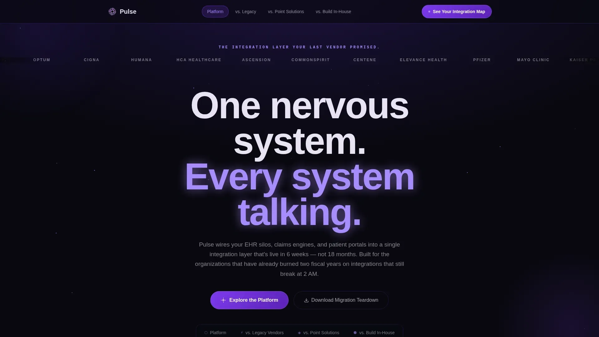
- A hero section with a drifting enterprise logo bar, a plasma lilac headline, and a glass anchor nav rail linking to four comparison spokes
- Three interactive versus arenas comparing the platform against legacy vendors, point solutions, and build-in-house scenarios, each with a draggable system-size toggle
- A dual call-to-action terminus and a gated PDF download path requiring only a work email
Feature list
This template ships with a precise set of features tuned for enterprise healthcare buyers. Each one addresses a specific moment in the buyer's decision process.
Anchor Navigation Glass Rail
The translucent nav rail sits persistently above the fold, allowing visitors to jump directly to any spoke. Labels read Platform, versus. Legacy, versus. Point Solutions, and versus. Build In-House. This keeps the landing page scannable without forcing a linear scroll.
Animated Hub and Spoke Connection Map
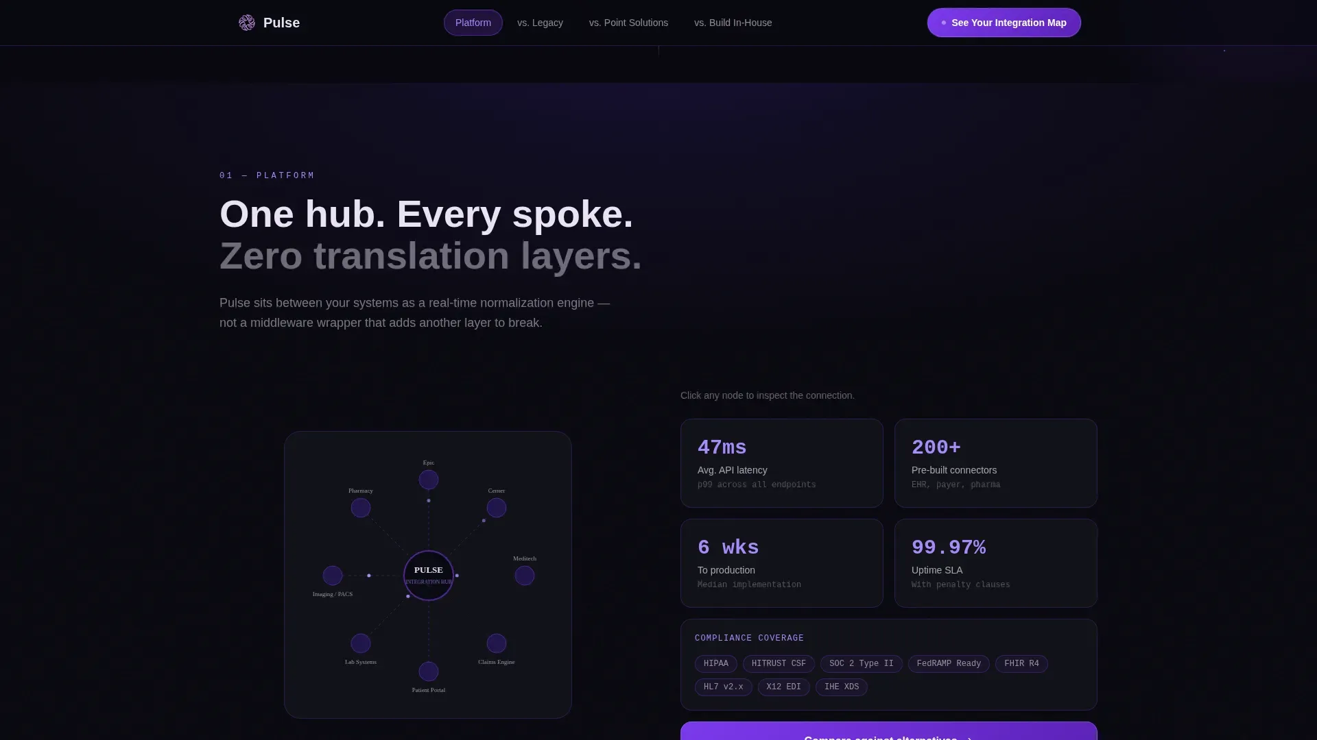
The Platform section features a live node visualization that animates data connections across the integration map. It gives visitors an immediate, visual way to understand how the platform stitches EHR silos, claims engines, and patient portals into one environment.
Interactive Comparison Arenas
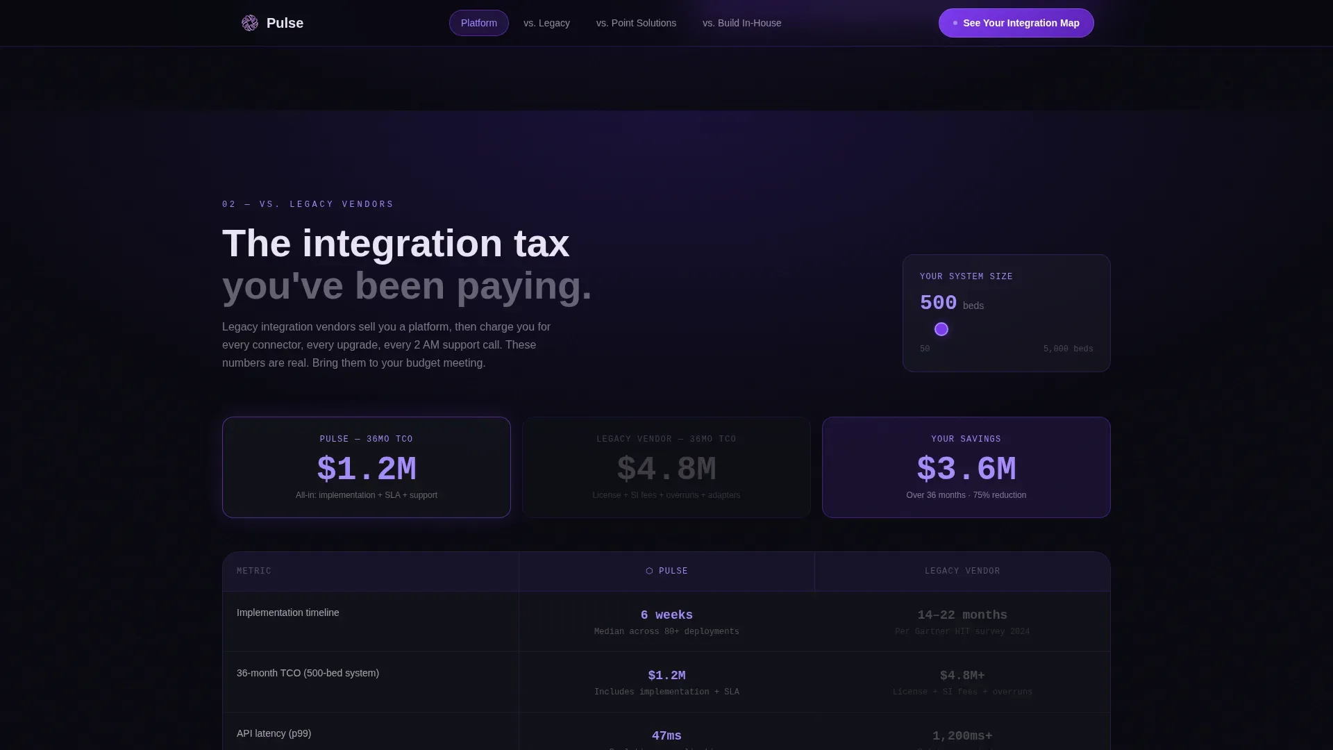
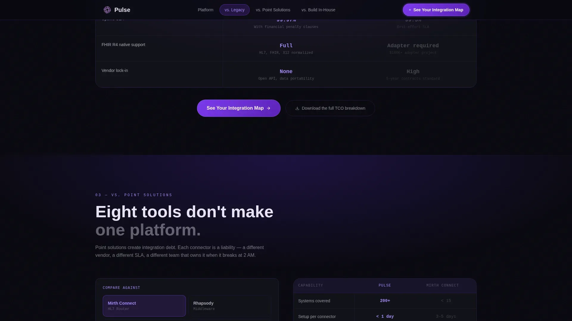
Each versus section places the platform beside an alternative and populates animated metrics in real time. Visitors set their own organization size using a draggable range slider. Displayed metrics include implementation time, API latency, compliance certifications, and 36-month total cost of ownership.
Qualifier Modal and Dual call to action
The primary call to action, "See Your Integration Map," opens a two-field qualifier modal. Visitors select their organization type and current EHR environment. A secondary action offers the Migration Teardown PDF download, gated behind a work email field.
Enterprise Logo Constellation Header
The header section renders partner and client logos in frosted glass white against a void black background. Logos drift slowly like constellations, acting as the sole social proof above the fold and setting institutional credibility before any copy is read.
Scroll-Velocity Background Transition
As visitors scroll deeper, the void background gradually brightens toward ultraviolet. This visual metaphor signals a shift from confusion to clarity. It reinforces the platform's narrative while keeping the landing page visually engaging throughout the full scroll journey.
Page sections overview
| Section | Purpose |
|---|---|
| Hero Logo Bar | Establishes enterprise credibility with drifting partner logos and the anchor nav glass rail |
| Platform Hub Map | Animated spoke diagram showing how data connections are visualized across the integration layer |
| versus. Legacy Vendors | Side-by-side comparison arena with 36-month total cost of ownership metrics |
| versus. Point Solutions | Metric comparison table with draggable system-size toggle for real-time recalculation |
| versus. Build In-House | Cost calculator with organization-type selector and dual call-to-action terminus |
| Minimal Footer | Copyright, links, and social icons in developer-minimal style |
Design & branding system
The visual identity follows a Tech Glass aesthetic built on a Void and Violet color system. Every surface is either void-deep or frosted glass, and the only light comes from data and interactive states.
- Color palette: absolute void black (#09090F) for backgrounds, electric violet (#7C3AED) for primary interactive states, plasma lilac (#A78BFA) for accent glows, and frosted glass white (#E8E3F3) for surfaces and text
- Typography: DM Sans for headings, JetBrains Mono for metrics and data readouts, and Manrope for body copy
- Glass panels carry violet-tinted borders with frosted blur; interactive states pulse with electric violet on hover
Mobile & speed optimization
The template is desktop-first, reflecting the enterprise buyer context where VPs and CTOs evaluate platforms on large screens. A mobile fallback is included to serve the growing share of healthcare searches that happen on mobile devices.
- Static-first build using CSS animations and Intersection Observer for scroll reveals, avoiding heavy JavaScript libraries
- Large touch targets and clear tap zones are preserved in the mobile fallback layout to maintain usability
- Fast-loading structure keeps the landing page responsive and supports a positive user experience across devices
How this template helps you convert
This landing page is engineered specifically for comparison-mode buyers. Every design decision removes a reason to leave before taking action.
- All comparison metrics are ungated and specific enough to carry into a budget meeting, building trust before the first sales call and encouraging visitors to self-qualify
- The "See Your Integration Map" call to action is placed at the terminus of every spoke and floats in the anchor nav, ensuring the primary action is always visible no matter how deep the visitor scrolls
- The secondary PDF download path captures email addresses from prospects who are not yet ready to book a demo, expanding the conversion funnel without adding friction
Other information about this template
This template is well-suited for healthcare software agencies that build and deliver landing page solutions for enterprise clients. Agencies can use it as a repeatable starting point to save time on complex healthtech projects. The template assigns a clear visual hierarchy to each section, so teams can adapt it quickly for different telehealth platforms or healthcare data products.
The template supports telehealth startups that need to communicate interoperability, display HIPAA compliance trust indicators, and centralize brand data in one focused page. It also fits teams building pharma engagement tools where understanding healthcare professionals at an individual level is the core value proposition. For any organization that needs to set up a polished marketing presence fast, this template delivers a production-ready source with minimal configuration.
- Useful for healthcare software agencies delivering landing page builds for VP and CTO audiences
- Supports telehealth and pharma use cases where data transparency and compliance trust badges are critical
- Assigns structured sections that help teams save time and launch faster without rebuilding from scratch
Theme
Tech Glass
Creative direction
Interactive Explorer
Color system
Void & Violet
Style
Hub & Spoke (Anchor Nav)
Direction
Comparison/Versus
Page Sections
Anchor Navigation Glass Rail
Animated Hub and Spoke Map
Interactive Comparison Arenas
Dual Conversion Path Design
Enterprise Logo Constellation Header
Scroll-velocity Background Transition
Related questions
Can this template be adapted for a telehealth platform?
Does the template include the interactive sliders and qualifier modal?
Is this landing page desktop-first or mobile-friendly?
How do healthcare software agencies typically use this template?
What conversion paths does this landing page include?



