Nexus — Interactive Learning Landing Page Template
Syllabus is a bento grid landing page template built for adaptive edtech startups. It uses a Dynamic Motion theme with an AI Iridescent color palette to walk visitors through a Problem-to-Solution arc. Animated code snippets, live-feeling grid transitions, and pilot-data metrics build trust fast and drive educators, coordinators, and parents toward a free pilot signup.
by Rocket studio
Quick summary
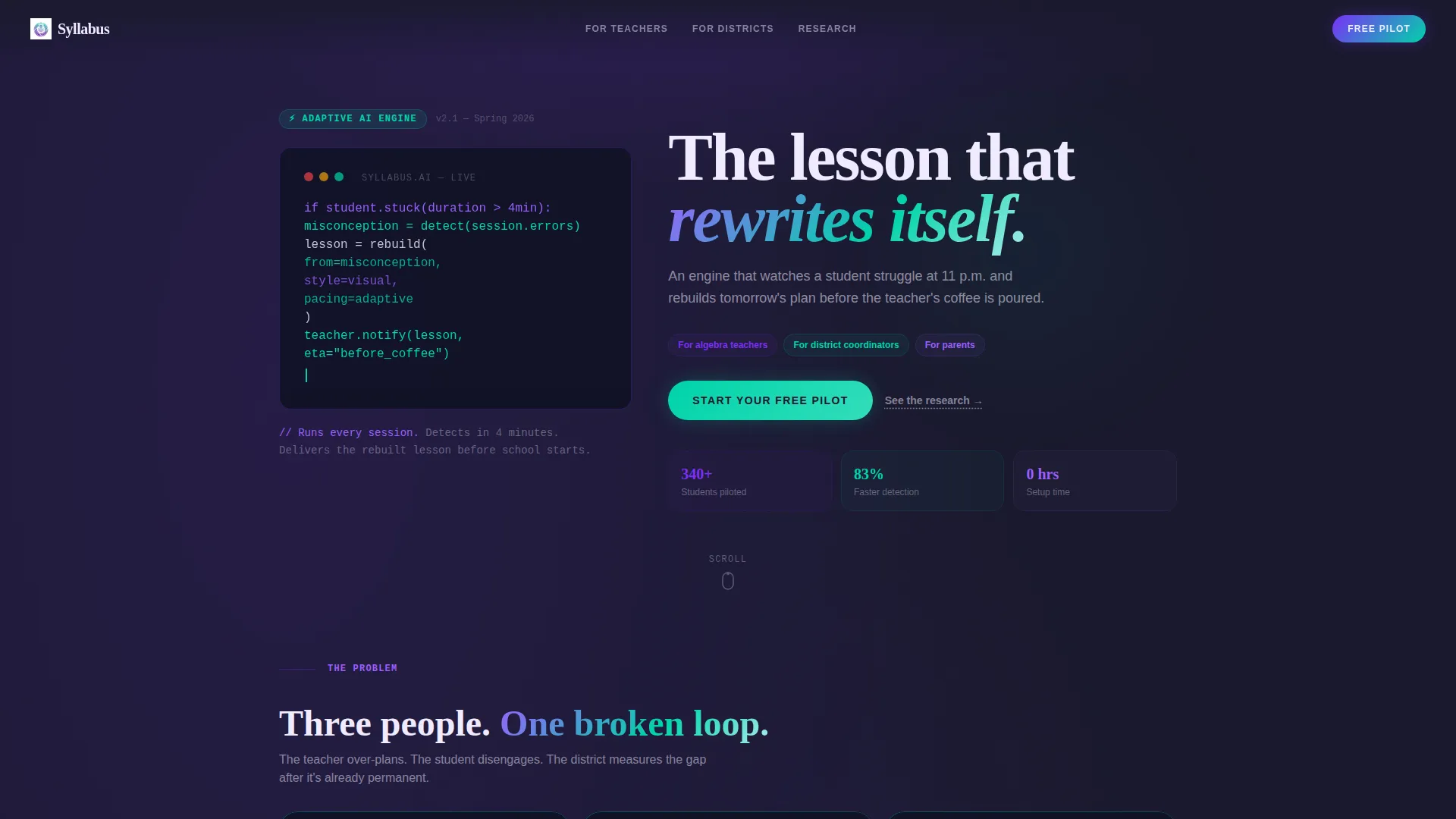
Syllabus is a single-page, bento grid landing page template for adaptive edtech startups. It opens with an animated code snippet header, moves through a structured Problem-to-Solution arc, and closes with a clear call to action. The design uses deep graphite, shifting violet, and holographic teal to make data feel alive and human at the same time.
Who this template is for
This template is built for edtech founders and product teams who need to communicate the value of AI-driven personalized learning to a mixed audience. It speaks directly to the people closest to the classroom and to those making district-level decisions.
- Ninth-grade algebra teachers who face daily differentiation mandates and need a tool that keeps up with each student
- District curriculum coordinators trying to close achievement gaps using modern software
- Parents who want to understand how the platform supports their child's learning journey
What problem this template solves
Most edtech landing pages fail because they look like every other education software site: a dashboard screenshot, a bullet list of features, and a sign-up button. Syllabus solves the credibility gap. It shows the AI thinking, not just promises that it works.
- Teachers and coordinators arrive skeptical; the animated code logic and real pilot metrics give them a concrete reason to believe
- Parents need an emotional moment of recognition before they trust a product with their child's learning
- Decision makers need evidence before a meeting; the secondary "See the research" link routes them directly to a white paper
What you get with this template
You get a fully structured bento grid landing page that builds its case section by section. Every element earns its place by moving the visitor one step closer to starting a free pilot.
- An animated monospaced code snippet header that reads like logic and feels like poetry
- A multi-row bento grid that visually reorganizes as the visitor scrolls, revealing AI responses to each pain point with supporting metrics
- Two layered calls to action: a primary "Start Your Free Pilot" button and a secondary research link for district-level buyers
Feature list
This section covers the core capabilities built into the Syllabus template.
Animated Code Snippet Header
The header renders pseudo-code in a monospaced font against a deep graphite background. Each line types itself in sequence with a blinking cursor, immediately signaling that this product thinks and responds rather than just displaying information.
Dynamic Bento Grid Layout
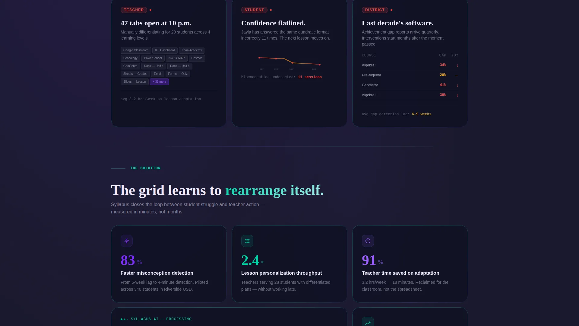
The bento grid is the central metaphor of the page. Cards in the first row pulse with violet to signal urgency around three problem states. As the visitor scrolls, the grid reorganizes: cards grow, merge, and reveal solution responses with micro-transition animations that make the layout feel adaptive.
Pilot Data Metric Cards
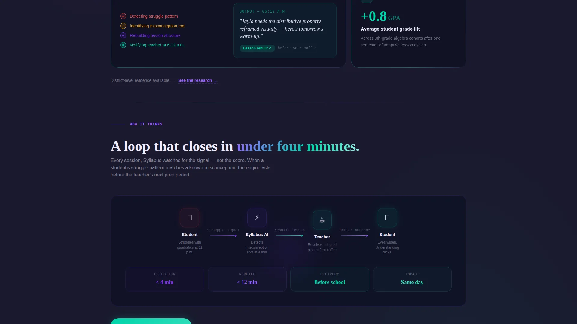
Each solution card carries a single grounded metric from pilot data, such as "83% faster misconception detection" or "2.4x lesson personalization throughput." These numbers are placed inside the bento grid so they arrive at the moment the visitor is most ready to believe them.
Layered Call-to-Action System
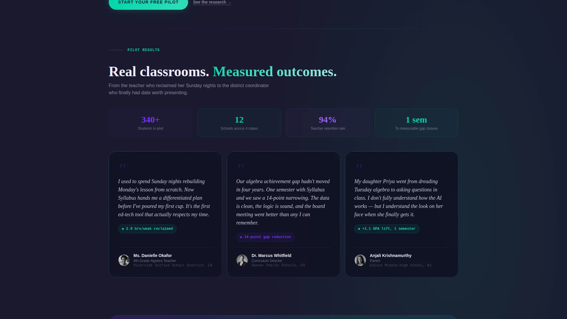
The primary call to action, "Start Your Free Pilot," first appears after the third bento row once the solution arc is complete. It then fixes to the bottom of the viewport on scroll. A secondary text link, "See the research," serves district-level decision makers who need a white paper before committing.
Problem-to-Solution Arc Structure
The page scroll is structured as a diagnostic unfolding. Three problem cards appear first, each representing a real user pain point. The grid then transitions to reveal AI-driven solutions, making the product's value visible through layout behavior rather than marketing language.
AI Iridescent Color System
The color palette uses deep graphite as the base, shifting violet for primary actions and data highlights, holographic teal for success states and progress indicators, and soft pearl for card surfaces and readable text blocks. Every color choice reinforces the feeling of machine intelligence in service of a human moment.
Page sections overview
| Section | Purpose |
|---|---|
| Animated Code Header | Opens with live pseudo-code to signal AI intelligence |
| Hero Headline Block | Single fading headline anchors the product promise |
| Problem Cards Row | Three bento cards present teacher, student, and district pain points |
| Solution Reveal Grid | Grid reorganizes to show AI responses with pilot metrics |
| Primary call to action Block | "Start Your Free Pilot" button appears after the solution arc |
| Fixed Viewport call to action | call to action stays visible at the bottom of the screen during scroll |
| Secondary Research Link | Routes district buyers to a supporting white paper |
Design & branding system
The visual identity follows a Dynamic Motion theme built on the AI Iridescent color system. The palette is designed to feel generated rather than chosen, with each color carrying a functional role on the page.
- Deep graphite (#1A1A2E) serves as the primary background, giving the page a focused, immersive feel that makes every other color pop
- Shifting violet (#7B2FF7) marks primary actions and data highlights, while holographic teal (#00D4AA) signals success states and progress indicators
- Soft pearl (#F0EAFF) keeps card surfaces and text blocks readable against the dark base without breaking the visual mood
Mobile & speed optimization
The bento grid layout is built with a scrolling experience in mind. The template's animations and grid reorganization are designed to translate naturally across screen sizes so the emotional arc of the page stays intact on smaller viewports.
- Micro-transition animations are scoped to scroll events, keeping motion purposeful and avoiding layout thrash on mobile devices
- The fixed viewport call-to-action is positioned to remain usable on mobile without covering critical content
- Card typography uses soft pearl on dark backgrounds, maintaining contrast and readability across device types
How this template helps you convert
The Syllabus template is structured so that trust is built before the ask is made. By the time the call to action appears, the visitor has already experienced the product's logic firsthand.
- The animated code header and problem cards establish emotional and rational credibility in the first scroll, so visitors arrive at the solution section already engaged rather than skeptical
- Pilot data metrics inside the bento grid give teachers and coordinators specific numbers to hold onto, making the case concrete before the "Start Your Free Pilot" button ever appears
Other information about this template
Syllabus is designed for the edtech startup category within the broader Startup and Launch space. It sits at the intersection of adaptive learning technology and persuasive landing page design.
- The template style is bento grid, a layout format that has become popular for product and startup pages because it communicates complexity without overwhelming the visitor
- The landing page direction is click-through, meaning its single goal is to move visitors toward one conversion action rather than presenting multiple navigation paths
- The header concept is a code snippet, a device that works especially well for AI-native products where showing the logic builds more trust than describing it
- This template is well-suited for pilot program launches, early-access campaigns, and district-level product evaluations where both emotional and evidence-based persuasion are needed
Theme
Dynamic Motion
Creative direction
Problem→Solution Arc
Color system
AI Iridescent
Style
Bento Grid
Direction
Click-Through
Page Sections
Animated Code Snippet Header
Dynamic Bento Grid Layout
Pilot Data Metric Cards
Layered Call-to-action System
Problem-to-solution Arc Structure
AI Iridescent Color System
Related questions
Who is the primary audience for this landing page template?
Does this template include real student data or pilot metrics?
Can I adapt the bento grid layout for a different edtech product?
What is the purpose of the secondary 'See the research' link?
Is this template suitable for a free pilot or early-access campaign?



