Elegant Stationery Newsletter Landing Page Template
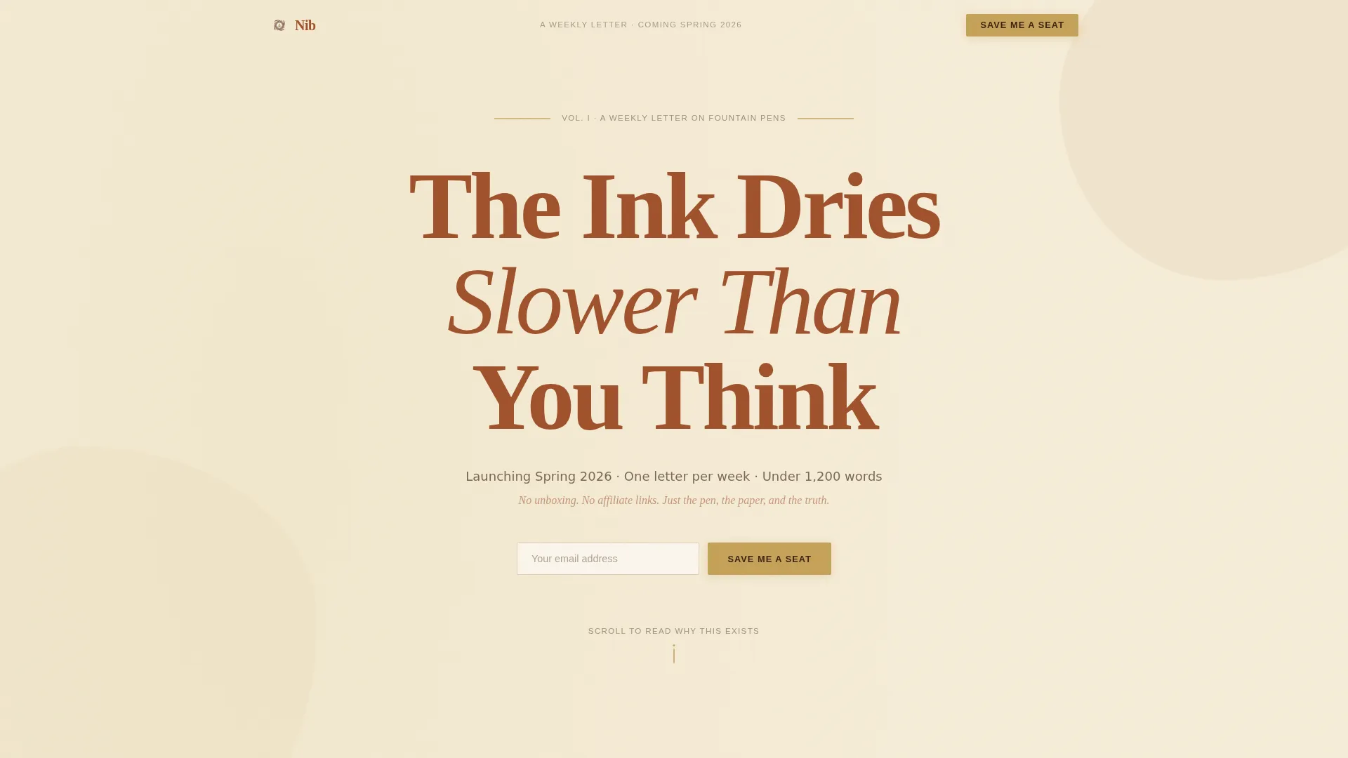
Nib is an editorial landing page template built for a fountain pen and stationery newsletter. It uses an immersive origin story layout, a warm Parchment and Rust color system, and a high-contrast serif typographic identity to capture waitlist signups. The page flows from a commanding centered headline through a first-person narrative down to two strategically placed email forms.
by Rocket studio
Quick summary
Nib is a single-page waitlist template for a fountain pen and stationery newsletter. It pairs a grand centered headline with a scroll-driven origin story, guiding readers through the writer's journey from first pen to editorial conviction. Two email signup forms and a live reader counter work quietly beneath prose that earns the conversion on its own.
Who this template is for
This template is built for writers, collectors, and independent publishers who want their newsletter's landing page to feel as considered as the work inside it. It suits creators who lead with voice and craft rather than bullet-point promises.
- Fountain pen enthusiasts and journalers launching a newsletter or waitlist
- Independent writers and editorial creators who rely on storytelling to build an audience
- Anyone building a coming-soon page where the prose itself is the pitch
What problem this template solves
Most newsletter landing pages default to feature grids, free-PDF lead magnets, and generic hero images. That approach feels hollow for a publication whose value is patience, specificity, and voice. Nib removes that friction entirely.
- Generic templates force a product framing that undercuts editorial credibility
- Coming-soon pages rarely hold attention long enough to justify a signup
- Most designs lack the typographic weight to signal that the writing is the product
What you get with this template
You get a fully structured, single-page editorial landing page with five distinct scroll sections, two email waitlist forms, and a reader counter component. Every element has been designed with the fountain pen and stationery audience in mind, from the ink-stained color palette to the narrative section order.
- A hero section with a giant centered serif headline and an early-access email form
- Four narrative scroll sections that carry the origin story from first pen to editorial philosophy
- A closing call-to-action section with a second email form and an animated reader counter
Feature list
This template covers every functional and aesthetic requirement for a high-conviction newsletter waitlist page.
Giant Centered Hero Headline
The hero opens with a single large-scale serif headline set in Fraunces. The scale and weight make each letterform feel drawn rather than typed. No image competes with the type. The whitespace surrounding it is intentional and acts as a signal of editorial restraint.
Scroll-Driven Origin Story Layout
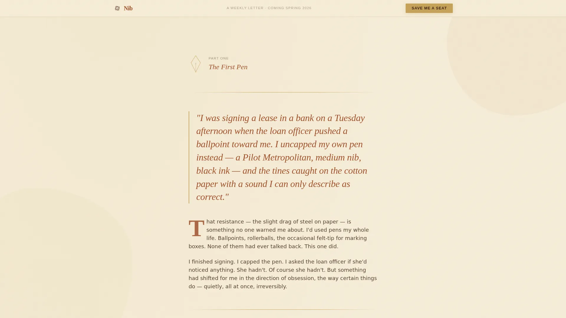
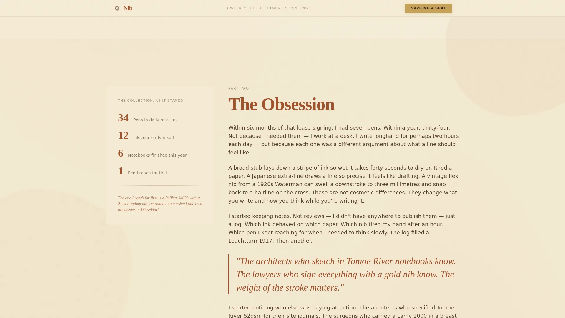
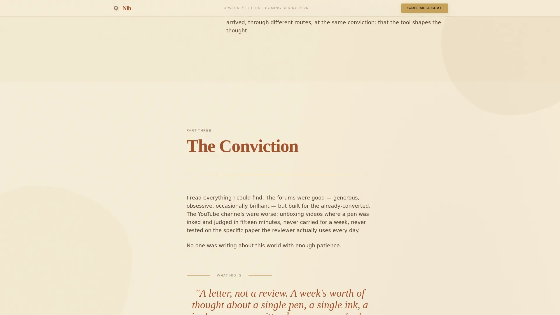
Five sequential scroll sections unroll a first-person narrative. The story moves from a specific first-pen moment through obsession, collection, and editorial conviction. Each section is designed to create recognition in the right reader before asking for anything.
Dual Waitlist Email Forms
Two email capture forms appear at key moments in the page flow. The first sits beneath the hero as a quiet early invitation. The second appears after the full origin story, where reader investment is highest. Both forms use a single field and a brass-colored submit button labeled "Save Me a Seat."
Animated Reader Counter
A hand-lettered-style counter beneath the final form shows how many readers have already joined the waitlist. The counter uses a lightweight animation on scroll entry. It provides social proof without testimonials, appropriate for a pre-launch page.
Ink-Bleed Scroll Animations
Section reveals use a staggered scroll animation styled as an ink-bleed gradient. Animated divider rules and hover states add tactile character to the reading experience. Animation weight is set to medium, preserving page clarity while rewarding attentive scrolling.
Minimal Editorial Footer
The footer follows an extreme-minimal pattern. It holds only what is necessary, keeping the focus on the writing above it and preventing visual clutter from undermining the page's tonal consistency.
Page sections overview
| Section | Purpose |
|---|---|
| Hero Headline | Anchor the page with a commanding serif statement and an early waitlist form |
| Origin, First Pen | Open the first-person narrative with a specific pen moment |
| The Obsession | Trace the arc from single pen to full collection |
| The Philosophy | State the editorial conviction and explain why this newsletter exists |
| Final Call to Action | Close with the second waitlist form and the animated reader counter |
| Minimal Footer | End the page cleanly without competing with the content above |
Design & branding system
The visual identity follows an Atelier Studio direction built around a Parchment and Rust color system. The palette evokes a calligrapher's worktable at golden hour. Typography pairs Fraunces as the display serif with DM Sans for body text, creating a clear hierarchy between narrative voice and structural copy.
- Warm vellum (#F5ECD7) as the primary background, oxidized iron (#A0522D) for headlines and accent strokes, deep walnut (#3B2314) for body text, and muted brass (#C5A258) reserved for buttons and divider rules
- Fraunces display serif at editorial scale for headlines, DM Sans for body paragraphs and form labels
- Ink-stained linen texture cues, rosewood pen rest references, and sepia-toned visual warmth throughout
Mobile & speed optimization
The template is built desktop-first, reflecting the wide reading experience the content demands. Mobile responsiveness is fully included so the page works cleanly on smaller screens without losing its editorial atmosphere.
- Desktop-first layout that preserves typographic hierarchy and narrative column width
- Fully responsive breakpoints so the page reads well on phones and tablets
- Server components used for all static content sections, with minimal JavaScript reserved for the counter animation
How this template helps you convert
Every structural decision on this page is aimed at earning trust before asking for an email address. The page does not rely on incentives or lead magnets. The writing and design are the offer.
- The origin story format builds personal connection across five sections, giving readers time to recognize themselves in the narrative before reaching the second call-to-action form.
- The dual placement of the "Save Me a Seat" form captures readers who decide early and readers who need the full story, without repeating the same ask in a way that feels pushy.
- The animated reader counter adds pre-launch social proof by showing real momentum, reinforcing the decision to join without requiring testimonials that do not yet exist.
Other information about this template
This template is categorized under Blog and Editorial with a Fountain Pen and Stationery Newsletter niche focus. It is a strong match for creators in the stationery, journaling, and writing instruments space who want a coming-soon or waitlist page that feels native to their craft.
- Template style: Editorial and Magazine
- Theme direction: Atelier Studio
- Color system: Parchment and Rust
- Creative direction: Origin Story
- Header concept: Giant Headline Centered
- Landing page direction: Waitlist and Coming Soon
- Intersection match score: 13, indicating strong niche and category alignment
- No lead magnets, free downloads, or external incentives are included by design; the page positions the writing itself as the sole proof of value
Theme
Atelier Studio
Creative direction
Origin Story
Color system
Parchment & Rust
Style
Editorial/Magazine
Direction
Waitlist/Coming Soon
Page Sections
Giant Centered Hero Headline
Scroll-driven Origin Story Layout
Dual Waitlist Email Forms
Animated Reader Counter
Ink-bleed Scroll Animations
Extreme Minimal Footer
Related questions
Can I change the headline and body copy to match my own newsletter?
Does the template include the email form logic or just the visual design?
Is this template only suited to fountain pen newsletters?
How does the reader counter work?
Can this page be used as an ongoing newsletter homepage after launch?



