SpaceTech Startup Advanced Professional Website Template
Orbit is a bold brutalist landing page template built for private space ventures raising Series B and beyond. It pairs Dark Glass Panel metrics, scroll-reveal section builds, and an Acid Digital color system to qualify serious investors before a single conversation happens. One conversion path. Zero distractions. Total authority.
by Rocket studio
Quick summary
Orbit is a single-page investor relations landing page built for spacetech ventures seeking institutional capital. It opens with six live-metric glass panels, unfolds a technical thesis, portfolio telemetry, and team flight paths through progressive scroll reveals, then closes on a single high-friction lead form designed to qualify capital allocators rather than collect email addresses.
Who this template is for
This template is built for founders and investor relations teams running a capital raise in the private space sector. It speaks directly to the professionals on the other side of that conversation.
- Spacetech startups raising Series B rounds and beyond who need a credibility-first investor landing page
- Venture studios and fund managers in launch infrastructure, satellite constellations, or in-orbit servicing
- Family office and institutional LP outreach teams who want to qualify inbound interest before opening the data room
What problem this template solves
Most investor pages look like marketing sites. They lead with mission statements and team headshots instead of evidence. For deep-tech capital raises, that mismatch kills credibility before the first scroll.
- Founders lose qualified leads because their page feels consumer-grade, not institutional-grade
- Sovereign wealth analysts and LP managers have no signal to pre-qualify themselves before requesting access
- Generic templates force founders to fight visual design instead of focusing on their capital narrative
What you get with this template
You get a fully structured, scroll-reveal landing page that builds its case section by section, the way a technical document declassifies itself. Every element earns its place.
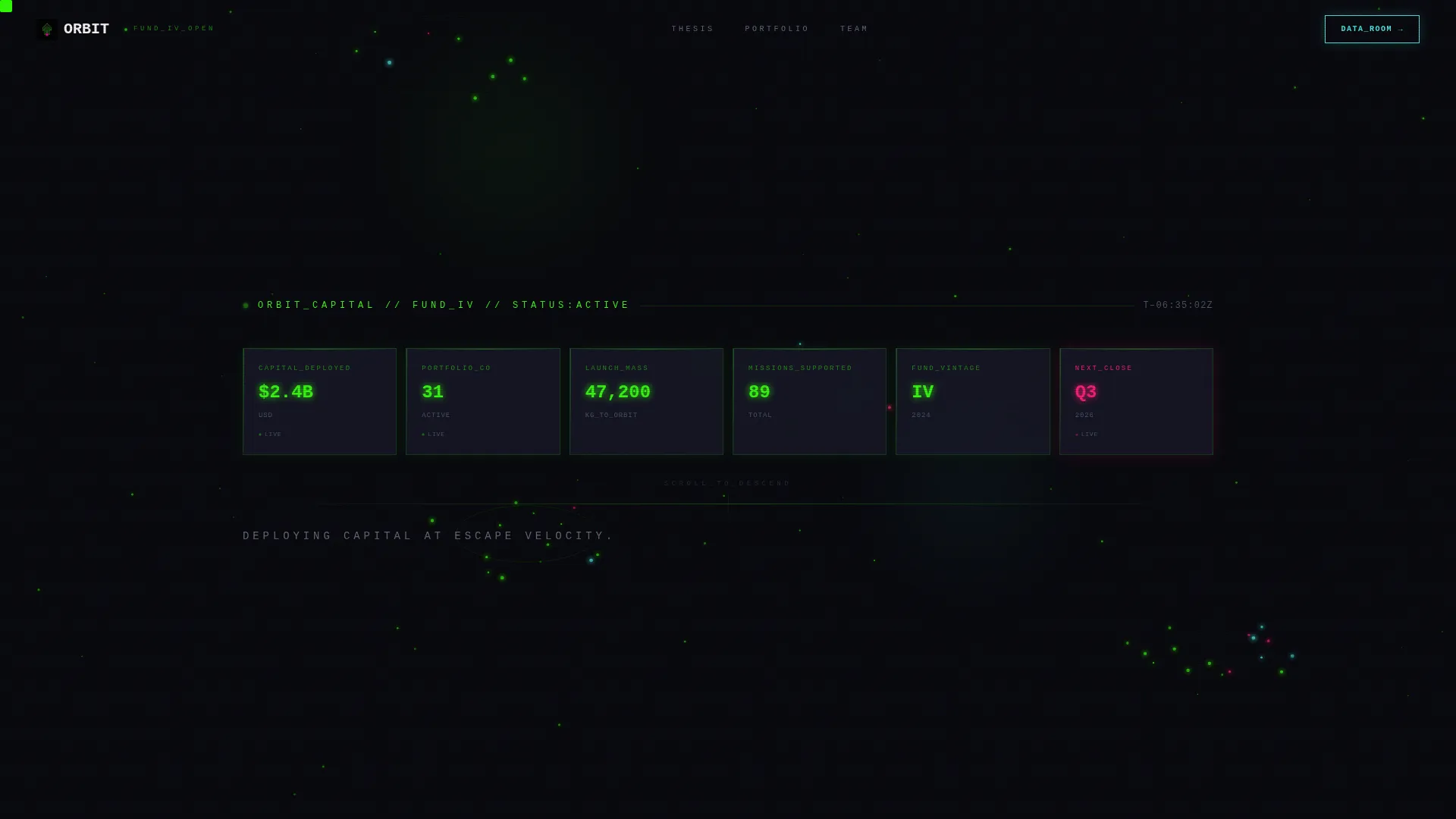
- A six-panel Dark Glass header displaying live key metrics in radiation green monospace type
- Progressive scroll-reveal sections covering thesis, portfolio performance tables, and team career timelines
- A single-conversion lead form with a deliberately high-friction qualification structure
Feature list
A paragraph introducing the feature set: Orbit is designed as a precision instrument for one purpose. Each feature below maps directly to a specific investor engagement outcome.
Six-Panel Dark Glass Metric Header
Six translucent brutalist rectangles float against pure black at the top of the page. Each panel holds one key fund metric: total capital deployed, active portfolio companies, aggregate launch mass to orbit, missions supported, current fund vintage, and next close date. Data renders in radiation green monospace type with a simulated upper-left light source for depth.
Progressive Scroll-Reveal Section Architecture
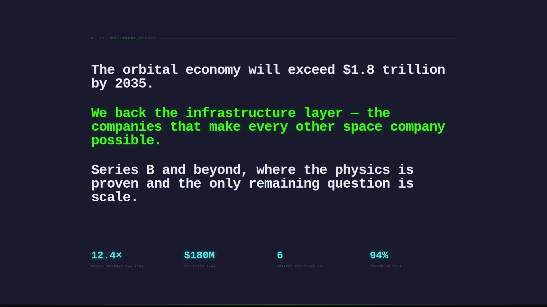
The page builds itself as the visitor scrolls. Each section fires a reveal trigger, starting with the thesis in massive type, then portfolio tables, then the team timeline. The pace of reveals accelerates toward the bottom, creating a countdown effect that mirrors mission control tension.
Acid Green Portfolio Performance Tables
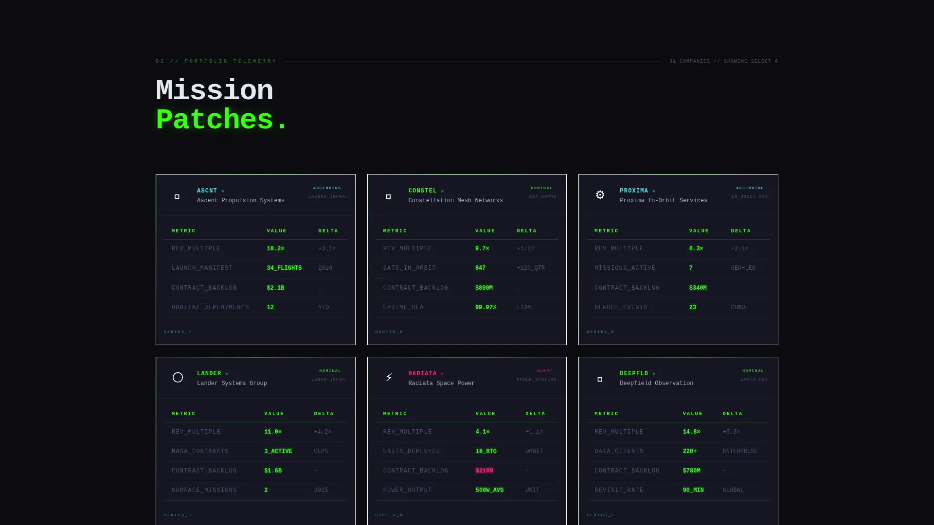
Portfolio companies are presented as mission patches paired with performance telemetry. Revenue multiples, orbital deployments, and contract backlog data render row by row in acid-green data tables as the visitor watches. The effect is deliberate: evidence accumulates in real time.
Team Career Flight Path Timelines
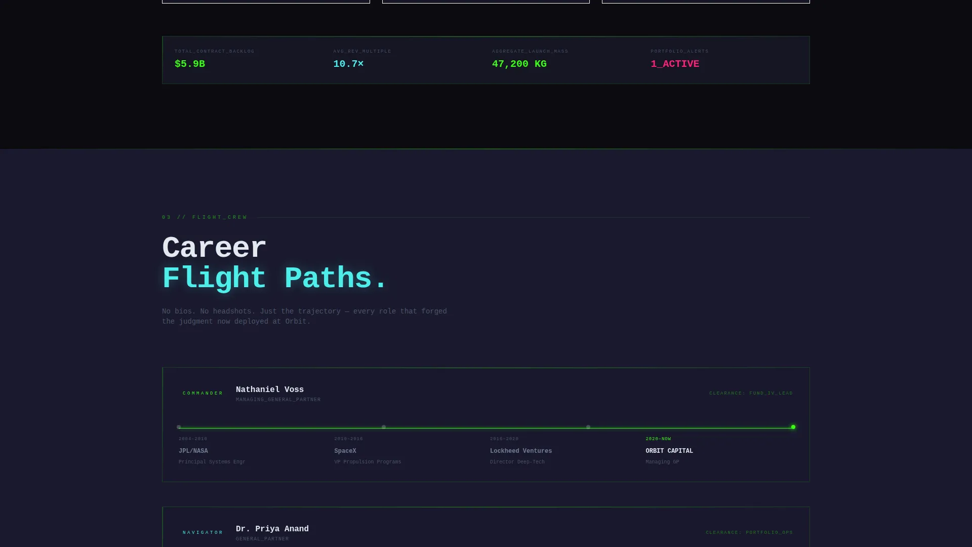
Bios are replaced with career flight paths. Former roles burn left to right as a horizontal timeline for each team member. Credentials from institutions like aerospace primes and launch programs read as a sequence of milestones, not a paragraph.
Single-Path Lead Generation Form
The page ends at one conversion point. The form collects full name, firm name, assets under management range via dropdown, and a single open field asking about current space allocation. No secondary calls to action exist. Qualification is built into the form's structure.
Bold Brutalist Visual Identity
Typography is oversized, monospaced, and unapologetic. Backgrounds stay near-black. Accent colors never blend; they collide. Buttons glow like reactor warnings. The Acid Digital palette treats color as signal, not decoration.
Page sections overview
| Section | Purpose |
|---|---|
| Dark Glass Header | Display six live fund metrics at page load |
| Fund Thesis Block | State investment thesis in massive, undecorated type |
| Portfolio Performance Tables | Show portfolio companies with acid-green telemetry data |
| Team Flight Paths | Present team credentials as left-to-right career timelines |
| Data Room call to action | Capture qualified investor leads through a single form |
Design & branding system
The visual identity is Bold Brutalist running on an Acid Digital color system. Every design decision is deliberate: colors are chosen for authority, not approachability.
- Core palette: void black (#0B0B0F) for backgrounds, radiation green (#39FF14) for primary data and type, xenon blue (#4DEEEA) for the primary call to action, slag gray (#1A1A2E) for panel backgrounds, and caustic magenta (#FF2079) reserved exclusively for alerts and data spikes
- Typography is oversized and monospaced throughout; no serif or humanist type appears anywhere on the page
- Visual rhythm relies on high-contrast collision rather than harmony; panels are razor-edged, buttons glow, and no element blends into another
Mobile & speed optimization
The scroll-reveal architecture and near-black backgrounds are inherently lightweight. Heavy visual effects are simulated through CSS and layout rather than large media assets.
- No hero photography or image-heavy sections means significantly reduced page weight at load
- Progressive reveal triggers fire on scroll position, so content below the fold does not load render-blocking assets upfront
- Panel and table layouts are structured to reflow cleanly at smaller viewport widths without breaking the brutalist grid
How this template helps you convert
Orbit converts by qualifying first and asking second. The page earns the lead form click through accumulated evidence, not persuasion copy.
- The header metrics establish fund authority within seconds of arrival, giving analysts an immediate signal of scale and seriousness before they read a single word of copy.
- The scroll-reveal structure controls the information sequence, ensuring portfolio performance and team credentials are fully visible before the call to action appears, so the form request feels earned rather than premature.
- The high-friction form design filters out non-qualifying visitors by asking for assets under management range and current space allocation, producing a smaller set of genuinely qualified leads.
Other information about this template
Orbit is purpose-built for a specific capital-raise context and is not a general-purpose startup template. A few additional details are worth noting before you decide.
- The template is categorized under Startup and Launch, specifically within the SpaceTech Startup subcategory and the SpaceTech Investor Relations Page niche
- The Spec Sheet creative direction means every section is intended to read like a technical document, not a marketing brochure
- The single conversion event design is intentional; adding secondary calls to action or newsletter opt-ins would break the qualification mechanism the page is built around
- The caustic magenta (#FF2079) accent is reserved only for alerts and data spike indicators; it should not be repurposed for general decorative use
- This template is well suited for fund managers and venture teams who are comfortable presenting hard performance data publicly, as the portfolio table section is structured around real telemetry-style figures
Theme
Bold Brutalist
Creative direction
Spec Sheet
Color system
Acid Digital
Style
Scroll Reveal (Progressive)
Direction
Lead Generation
Page Sections
Six-panel Dark Glass Metric Header
Progressive Scroll-reveal Architecture
Acid Green Portfolio Performance Tables
Team Career Flight Path Timelines
Single-path Qualification Lead Form
Bold Brutalist Visual Identity System
Related questions
Is this template suitable for early-stage startups?
Can I change the color palette to match my brand?
Why does the lead form ask for assets under management range?
How many conversion paths does this template include?
What type of investors is this page designed to attract?



