Elegant Decluttering Course Landing Page Template
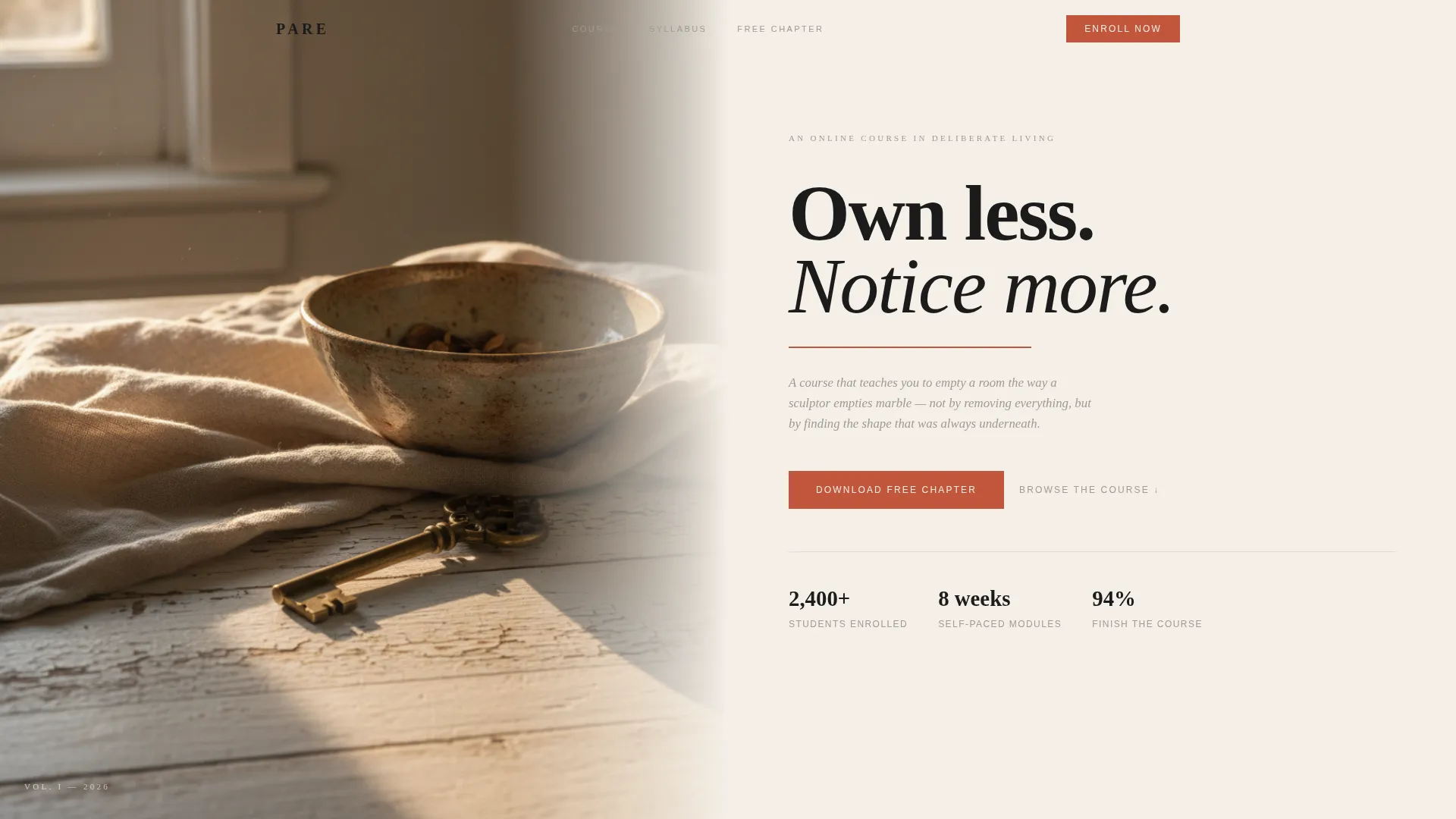
Pare is an editorial landing page template built for a minimalism and decluttering online course. It follows a magazine-style scroll with a half-page hero, three editorial module spreads, pull-quote dividers, and a chapter-download form. The design uses a warm parchment and carbon ink palette with terracotta accents, creating a calm, intentional reading experience that earns trust before asking for a signup.
by Rocket studio
Quick summary
Pare is a single-page editorial template designed for a minimalism and decluttering online course. It presents course content as a curated magazine spread, building reader trust through visible frameworks before any conversion ask. The design feels like a freshly printed journal: warm parchment backgrounds, heavy ink typography, and generous white space doing the heavy lifting.
Who this template is for
This template suits course creators and educators who teach practical life-simplification skills. It works especially well when the course has a distinct voice and a content-first approach to selling.
- Minimalism or decluttering course instructors who want to lead with editorial credibility before pitching enrollment
- Independent educators targeting overwhelmed professionals, new parents, or remote workers whose living spaces have blurred together
- Creators who prefer a proof-of-value approach rather than a hard-sell funnel
What problem this template solves
Most course landing pages ask visitors to trust a product they have not yet experienced. That gap creates hesitation, especially for buyers who are already overwhelmed. Pare closes that gap by letting the course speak first.
- Visitors scroll through real course frameworks before they ever see a form, so the ask feels earned rather than abrupt
- The editorial structure signals that this is a thoughtful, well-crafted course, not another generic checklist download
- The minimal two-field form reduces friction at the exact moment a visitor is most engaged
What you get with this template
You get a fully structured single-page layout that reads like an art-directed magazine issue. Every section is self-contained yet builds a cumulative argument for the course.
- A half-page editorial hero with a still-life photograph on the left and a magazine-cover headline on the right
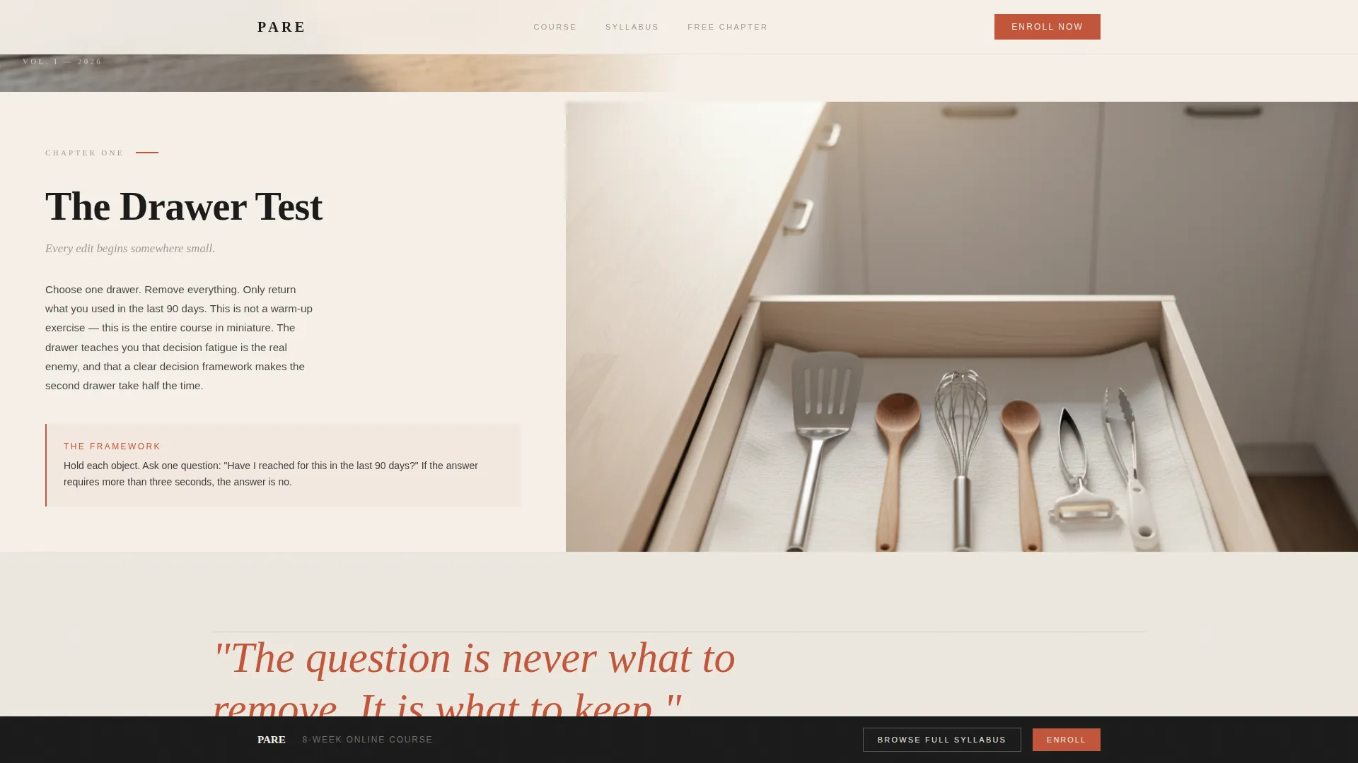
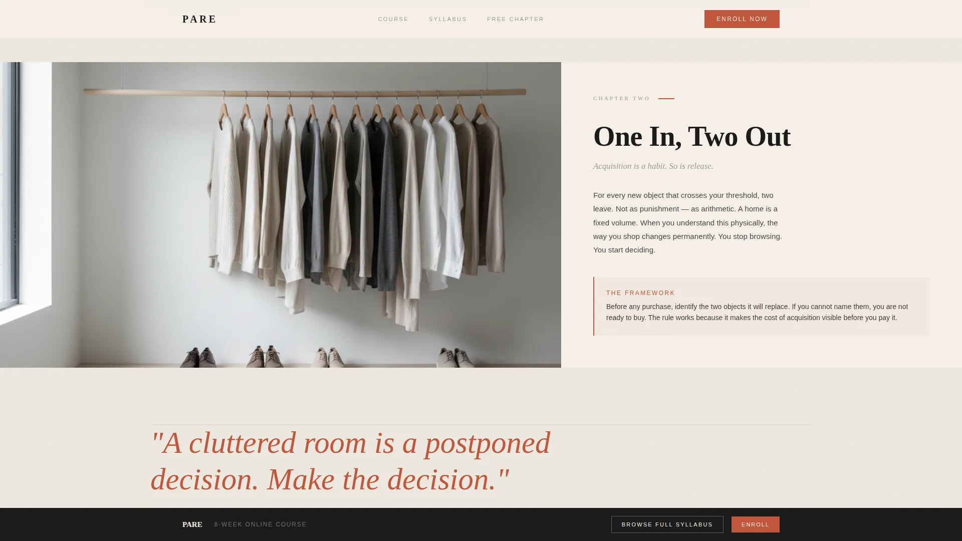
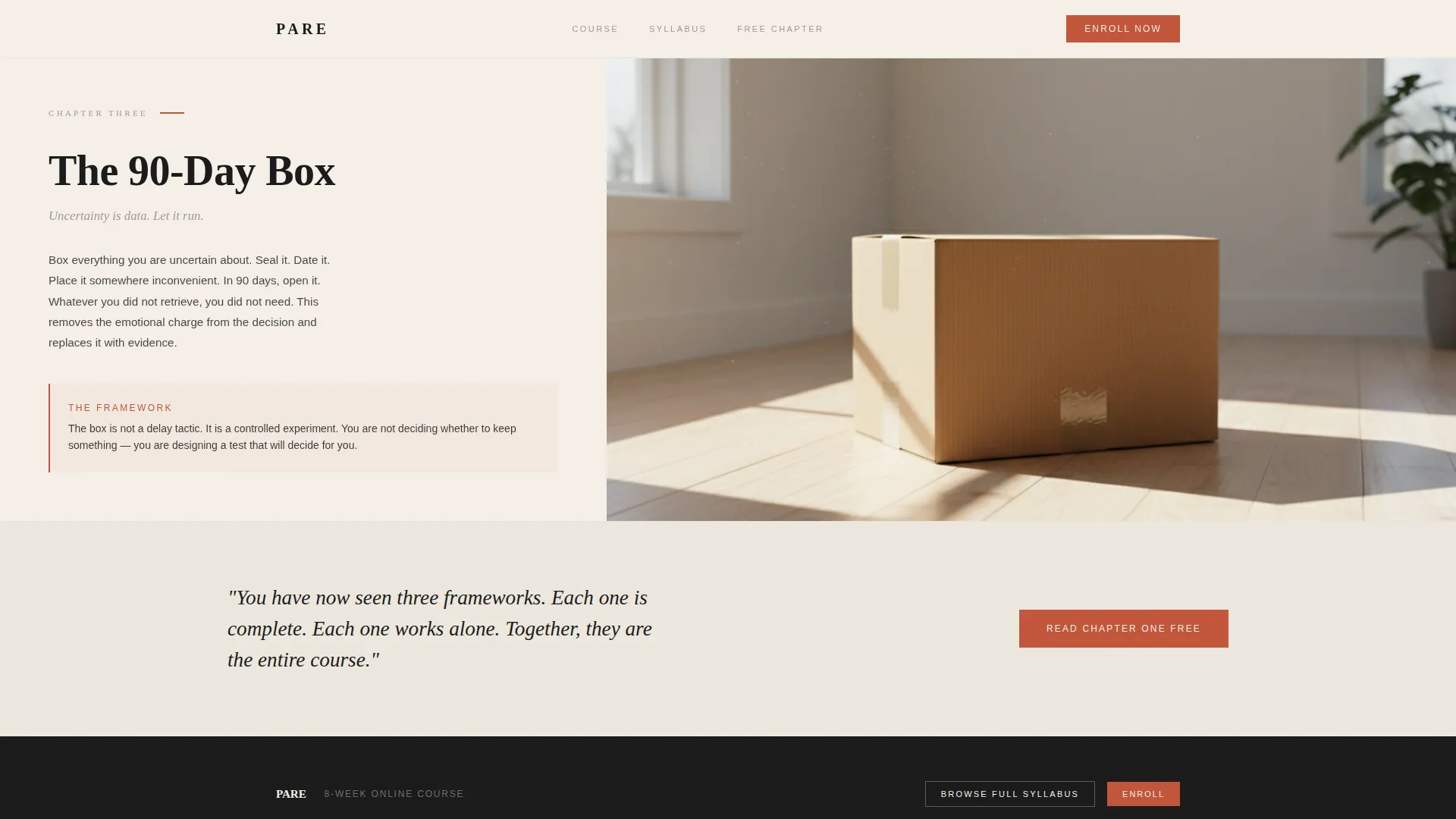
- Three editorial module spreads, each with a chapter number, principle name, photograph, and philosophy excerpt
- A terracotta-accented chapter download form, pull-quote dividers, a sticky syllabus bar, and an expandable course outline footer
Feature list
This template includes six core features grounded directly in its editorial design system and conversion structure.
Editorial Half-Page Hero
The hero splits the viewport into two deliberate halves. The left side holds a still-life photograph with long morning shadows. The right side presents the headline in large editorial serif type, followed by a single-sentence deck in pencil gray with a terracotta underline that doubles as a progress indicator.
Three-Module Editorial Spreads
Each course module appears as its own editorial spread. A chapter number, a principle name, a striking photograph, and a two-sentence philosophy excerpt make every section feel like a standalone magazine feature while building a cumulative case for enrollment.
Pull-Quote Dividers
Oversized terracotta serif pull-quotes break the scroll between modules. They act as section dividers that reset the reader's attention and reinforce the course's core ideas without adding visual clutter.
Chapter Download Form
A minimal conversion form appears after the third module spread. It asks only for a first name and an email address. Placement is intentional: the visitor has already consumed three real frameworks before the ask arrives.
Sticky Syllabus Bar
A persistent bottom bar stays visible as the user scrolls. It carries a secondary call to action that links to an expandable course outline, giving browsers a low-commitment way to explore the full syllabus without leaving the page.
Scroll-Linked Animation System
The template uses medium-intensity scroll-linked reveals, staggered entrance animations, and parallax photo movement. These interactions are handled through a split of static server-rendered content and client-side interactive components, keeping the editorial feel smooth on desktop and responsive on mobile.
Page sections overview
| Section | Purpose |
|---|---|
| Editorial hero split | Introduces the course voice with a still-life photo and magazine-cover headline |
| Module spread one | Presents "The Drawer Test" with chapter number, principle name, photo, and excerpt |
| Pull-quote divider | Resets reader attention with an oversized terracotta serif quote |
| Module spread two | Presents "One In, Two Out" as a self-contained editorial feature |
| Pull-quote divider | Provides a second rhythm break between module sections |
| Module spread three | Presents "The 90-Day Box" and closes the editorial argument |
| Chapter download form | Converts engaged readers with a two-field form after the third module |
| Sticky syllabus bar | Persists across scroll as a secondary conversion entry point |
| Expandable course outline | Lets visitors browse the full syllabus without navigating away |
| Editorial footer | Displays logo and tagline on the left, navigation links on the right |
Design & branding system
The template follows an Atelier Studio aesthetic. Every color decision is intentional, every margin carries meaning, and no element is purely decorative.
- Color palette: warm parchment (#F5F0E8) for backgrounds, carbon black (#1A1A1A) for body text, pencil-sketch gray (#9E9A94) for supporting copy, and terracotta red (#C2553A) reserved strictly for interactive elements and pull-quotes
- Typography: Fraunces is used for editorial serif headlines; DM Sans handles body copy for clean, readable contrast
- Generous margins and deliberate white space do more structural work than any graphic element on the page
Mobile & speed optimization
The template is designed desktop-first to honor the editorial magazine layout, but it is fully responsive for smaller screens.
- Scroll-linked reveals and stagger animations are built as client-side interactions, keeping static content rendered server-side for faster initial loads
- The parallax photo sections and sticky bottom bar adapt to mobile viewports without breaking the editorial reading flow
- The two-column hero and module spreads reflow gracefully into single-column layouts on narrower screens
How this template helps you convert
Pare earns conversions by giving value before asking for anything. The structure moves visitors from curiosity to trust to action in a single scroll.
- Each of the three module spreads delivers a real course framework in plain sight, proving the course teaches through clarity rather than withholding content
- The chapter download form appears only after the third module, at the point where a visitor has experienced enough editorial value to feel confident sharing their email
- The sticky syllabus bar keeps a low-commitment conversion option visible at all times, capturing visitors who want more detail before deciding
Other information about this template
This template sits in the Blog & Editorial category under the Minimalism and Decluttering Content subcategory. It is purpose-built for the online course niche where voice and editorial credibility matter as much as the offer itself.
- The template style is Editorial and Magazine, aligned with the Atelier Studio theme and the Curated Collection creative direction
- The Ink & Paper color system and the Half-Page Photo and Text header concept are defined intersection attributes that make this template distinctive within its category
- Localization defaults are set for English, United States dollar pricing, and the MM/DD/YYYY date format
Theme
Atelier Studio
Creative direction
Curated Collection
Color system
Ink & Paper
Style
Editorial/Magazine
Direction
Content/Resource
Page Sections
Editorial Half-page Hero
Three-module Editorial Spreads
Pull-quote Dividers
Minimal Chapter Download Form
Sticky Syllabus Bar
Scroll-linked Animation System
Related questions
Can I use this template for a course that is not about minimalism?
How many pages does this template include?
What happens when a visitor clicks Browse the Full Syllabus?
Is this template suitable for a course pre-launch or waitlist?
Do I need design experience to customize this template?



