Warm Artisan Minimalism Decluttering YouTube Channel Landing Page
Pare is a warm artisan minimalism decluttering YouTube channel landing page template built for content creators who want to grow an email list without hard-selling. A Cinematic Dark color palette, hand-drawn hero illustration, scroll-driven masonry layout, and a single-field lead capture form work together to let visitors feel the calm of a clutter-free life before they ever see the sign-up ask.
by Rocket studio
Quick summary
Pare is a masonry-style, single-page landing page template designed for minimalism and decluttering YouTube channels. It uses a Cinematic Dark palette, a hand-drawn hero illustration, a day-in-the-life scroll structure, and a lead generation form to turn curious visitors into email subscribers. The page earns the click through atmosphere and feeling, not pressure.
Who this template is for
This template is built for creators whose videos encourage people to get rid of excess, slow down, and live with only what truly matters. If your channel films the quiet process of letting go, this page matches your voice and your audience.
- Minimalism and decluttering YouTube creators who want to grow an email list
- Lifestyle bloggers and content creators moving from a general blog toward video-first content
- Anyone building a channel around simple life principles, intentional living, or mindful consumption
What problem this template solves
Most landing pages for content creators feel transactional. They list features, flash subscriber counts, and demand a click before the visitor has had a single reason to care. When your videos are about slowing down and living with less stuff, a pushy page is exactly the wrong first impression.
People who watch decluttering videos are often carrying real weight. They feel crushed by too much stuff in their house. They open a closet and feel a wave of exhaustion. They realize something has gone wrong, but they do not know where to start. A landing page that lectures them or shouts at them will lose them in seconds.
This template solves that mismatch. It makes the visitor feel something before it asks them to do anything.
- Visitors who carry the mental load of too much clutter in their house need to feel understood, not sold to
- Creators lose potential subscribers when their page does not match the calm, warm tone of their videos
- A lead generation page needs to earn the email address by delivering value through the experience itself
What you get with this template
You get a complete, single-page layout built for scroll-driven storytelling. Every section is designed to move a visitor from curious to calm to ready to sign up. The template covers everything from the hero moment to the final email capture card.
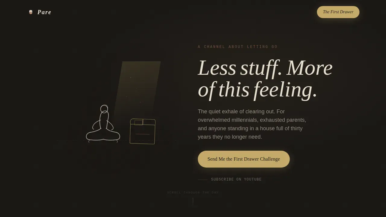
- A hand-drawn, ink-and-watercolor SVG hero illustration with a parchment headline materialization effect
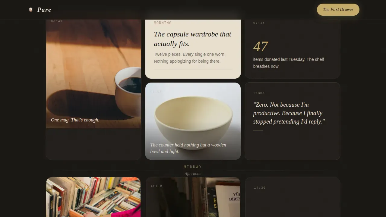
- A full day-in-the-life masonry scroll structure across morning, afternoon, and evening rows
- A mid-scroll embedded YouTube video link and a parchment-card lead generation form with brass call-to-action styling
Feature list
This template is built around a specific set of creative and functional choices. Each one serves the core purpose: make the visitor feel the calm of a clutter-free life so they are ready and glad to share their email address.
Hand-Drawn Hero Illustration with Headline Reveal
The hero section opens with a custom ink-and-watercolor SVG scene. A single figure sits cross-legged on a bare wooden floor beside a half-packed cardboard box, a parallelogram of warm window light falling across the boards. The line work is deliberately imperfect and human, like a journal sketch. The headline, "Less stuff. More of this feeling," materializes in parchment lettering as if written by the same hand, using a scroll-linked reveal animation with stagger delays.
Day-in-the-Life Masonry Grid
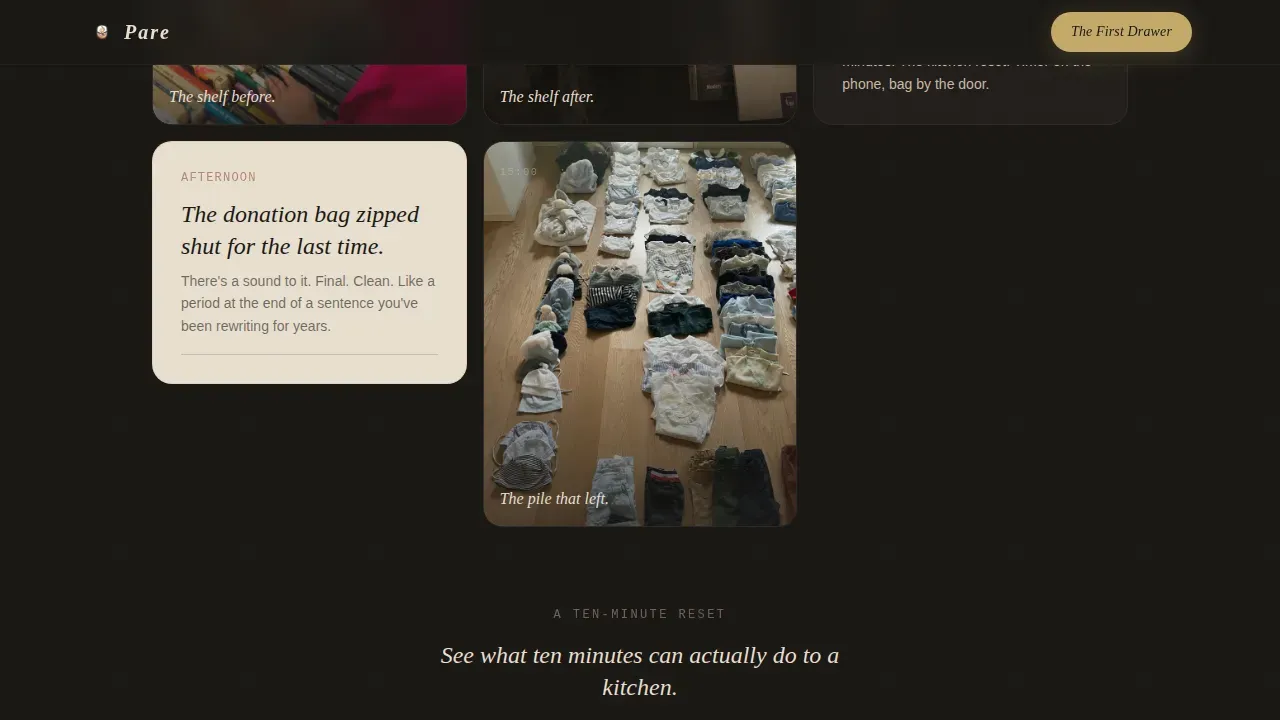
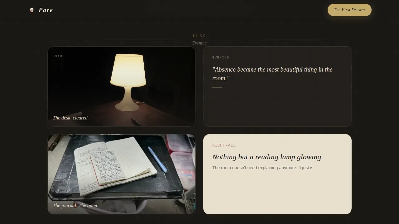
The page scrolls through a single day from dawn to nightfall. Morning cards show a single mug, a capsule wardrobe, and an empty inbox. Afternoon cards shift to process: before-and-after shelf pictures, a donation bag, a ten-minute declutter sprint. Evening cards slow the pace further: a cleared desk, a journal, a room lit by a single reading lamp. The final row is one centered card floating in charcoal darkness. The masonry gaps widen as the day empties out, giving the layout a physical sense of space opening up.
Mid-Scroll Embedded YouTube Video
A soft terracotta text link mid-scroll reads "Watch the 10-Minute Kitchen Reset" and opens an embedded YouTube video. This warms the visitor with real channel content before the email ask appears. Visitors get to watch an actual sample of your videos and experience your voice and your good lighting before committing to anything.
Parchment Lead Generation Form
The lead capture form sits on a warm parchment card after the evening row. It asks for a first name and an email address only, styled in a handwritten-font input field. The call-to-action button reads "Send Me the First Drawer Challenge" in soft brass on deep charcoal. A lead magnet phrased as a practical challenge is effective for converting visitors into subscribers because it promises a clear, immediate result.
Scroll-Linked Animation System
The template uses scroll-linked reveal animations, stagger delays, and a masonry gap-widening effect that physically mirrors the feeling of a house clearing out as you move down the page. Card reveals use an IntersectionObserver approach so that each vignette appears at the right moment in the scroll journey. The magnetic call-to-action button and hover states on all cards add a layer of tactile interactivity.
Cinematic Dark Color and Typography System
The color system pairs deep charcoal (#1A1714) as the dominant background with warm parchment (#E8DFD0) for text and card surfaces. Muted terracotta (#A0674B) handles hover states and accent borders. Soft brass (#C4A96A) is reserved for calls to action and interactive highlights. Typography uses Fraunces for serif display headings, DM Sans for body text, and IBM Plex Mono for accent labels. The combination feels like a candlelit ceramics studio: intimate, warm, and handmade.
Page sections overview
| Section | Purpose |
|---|---|
| Hero illustration | Opens with hand-drawn SVG art and animated parchment headline |
| Morning masonry row | Dawn vignette cards: single mug, capsule wardrobe, empty inbox |
| Afternoon masonry row | Process cards: before/after shelves, donation bag, declutter sprint |
| Mid-scroll video | Terracotta link opens embedded YouTube sample video |
| Evening masonry row | Slow cards: cleared desk, journal, reading lamp, single floating card |
| Lead generation form | Parchment card, first name and email, brass call to action button |
| Minimal footer | Pattern 4 superhuman extreme minimal footer strip |
Design & branding system
The design philosophy here is warm artisan minimalism expressed through a Cinematic Dark lens. The palette does not feel cold or clinical despite the subject being the removal of stuff. It feels like the inside of a ceramics studio after hours: dark enough to feel intimate, warm enough to feel handmade. Warm neutral tones like parchment and terracotta contribute to that welcoming artisan feel, and the typography reinforces it with a serif display face that feels modern yet warm.
- Colors: deep charcoal #1A1714 background, warm parchment #E8DFD0 for text and cards, muted terracotta #A0674B for hover and borders, soft brass #C4A96A for calls to action
- Typography: Fraunces serif display for headlines, DM Sans for readable body text, IBM Plex Mono for accent labels, all chosen to feel modern yet warm
- Illustration style: imperfect, trembling ink-and-watercolor line work rendered in the Cinematic Dark palette, evoking a journal sketch rather than polished commercial art
Mobile & speed optimization
The template is built with a mobile-first priority because most people who watch minimalism videos and discover a new channel will do so on a phone. The masonry layout adapts to a single column on smaller screens, keeping the day-in-the-life narrative intact without any loss of pacing. Images are lazy-loaded so the initial page load stays light. The scroll reveal system uses native CSS scroll behavior and IntersectionObserver, which avoids heavy JavaScript dependencies.
- Mobile-first single-column masonry layout preserves the full day-in-the-life scroll experience on phones
- Lazy-loaded images keep the initial load fast without sacrificing visual richness
- IntersectionObserver-driven reveals and native CSS scroll behavior keep the animation system lightweight
How this template helps you convert
The conversion strategy here is atmospheric. The page does not argue for minimalism or push the visitor toward a form. It lets them live inside the feeling of a clutter-free life for roughly sixty seconds of scroll time, so that by the time the lead generation form appears, they already want what it is offering. This is a fundamentally different idea from a standard creator landing page.
- The scroll journey moves from the chaos of too much stuff to the calm of an emptied evening room, creating an emotional arc that makes the email ask feel like a natural next step rather than an interruption
- The mid-scroll YouTube embed gives visitors a real sample of your videos before the ask, building trust through content rather than claims, so the call-to-action button lands on a visitor who is already engaged and inspired
- The "First Drawer Challenge" framing turns the lead magnet into a clear, actionable promise: one drawer, one challenge, one small step toward the simple life they just felt on the page
Other information about this template
This section covers additional practical context that is useful for creators who are evaluating whether this template fits their channel and their workflow.
Many creators who are drawn to this template are at a similar point in their journey. They have been posting videos for months ago or even years ago, they have a growing sense of what their channel is about, and they realize it is time to build something more intentional than a default channel page. The Pare template is designed for exactly that moment.
The template is built for a niche where the audience skews toward people who feel overwhelmed. A minimal mom trying to reclaim the daughter's room from a decade of accumulated toys. A newly retired couple standing in a house packed with thirty years of stuff they no longer need. A millennial who moved into a smaller apartment and cannot fill every corner the way they used to. These are people who do not want to spend money on more expensive stuff. They want to get rid of it. They want storage space to feel like breathing room, not overflow. They want a simple life, not a complicated system.
The channel concept behind this template draws on well-established decluttering ideas. Methods like the 15-minute decluttering technique, the Fly Lady zone cleaning approach, and category-based sorting rather than room-by-room sorting are all frameworks that can fill out your video content naturally. Decluttering frameworks like the "5-5-5 Rule" can outline a signature process and demonstrate channel expertise. These approaches encourage viewers to keep only what serves a daily purpose, thank items before letting them go, and use short, manageable bursts of effort rather than crazy all-day purges.
For YouTube channel creators, good lighting is one of the most useful things: visually appealing videos make a huge difference to whether someone watches past the first ten seconds. A consistent visual style across videos and across the landing page builds a recognizable brand. Featured playlists that organize content into clear thematic categories, such as "Mindful Decluttering" or "Artisan Thrift Hauls," help new viewers find the right starting point. Engaging with your audience through comments and encouraging them to write back about their own declutter journey builds the kind of community that grows a channel over time. Incorporating personal stories makes the content more relatable: the idea that a messy house is not a personal failure, but something that happened gradually, and something that can be undone gradually.
The template also sits within a practical no-code context. No-code and low-code platforms enable creators to build and deploy a page like this without extensive programming knowledge. Natural language prompts can simplify the build process further. The layout is easy to customize, so you can swap pictures, update card copy, and replace the embedded video link without touching the underlying structure. The website that results loads fast because images are optimized, and the responsive design means visitors on a computer, a tablet, or a phone all get a coherent experience.
A great post or a well-edited video series is wonderful, but without a landing page that captures email addresses, a channel's audience stays fragmented across platform notifications. This template solves that by giving you a dedicated place to send new viewers, warm them up with a sample video, and convert them into email subscribers who are yours to reach regardless of what happens to any platform's algorithm.
The Pare warm artisan minimalism decluttering YouTube channel landing page template is designed for creators who believe that a more intentional home is a more peaceful one, and who want their landing page to prove that point before the visitor even reads the call-to-action button.
- The minimal footer uses Pattern 4, a superhuman extreme minimal strip that keeps the page ending as quiet as the evening scroll row
- The form fields use handwritten-font styling on a parchment card, which keeps the lead capture moment warm and consistent with the overall design language
- Color swaps, headline edits, and picture replacements can be made without touching the animation or masonry logic
Theme
Warm Artisan
Creative direction
Day-in-the-Life
Color system
Cinematic Dark
Style
Masonry/Pinterest
Direction
Lead Generation
Page Sections
Hand-drawn Hero Illustration and Headline Reveal
Day-in-the-life Masonry Scroll Grid
Mid-scroll Embedded Youtube Video
Parchment Lead Generation Form
Scroll-linked Animation and Interactivity System
Cinematic Dark Color and Typography System
Related questions
Who is this template built for?
Can I swap out the hero illustration and card pictures?
How does the lead generation form work?
Do I need coding skills to use this template?
Is this template only for YouTube channels?



