Minimalist Living Blog Landing Page Template
Pare is a minimalist living landing page built around a masonry grid of timestamped day-in-the-life vignettes and a seven-question Clutter Score Quiz. The Luxe Minimal design uses warm parchment tones, ultra-thin serif typography, and a single muted gold accent to create a calm, editorial experience that draws readers toward reflection and email sign-up.
by Rocket studio
Quick summary
Pare is a single-page minimalist living blog template that pairs editorial storytelling with an interactive Clutter Score Quiz. A giant serif headline opens the page, a masonry grid of timestamped vignettes follows, and a seven-question inline quiz closes the loop with a radial gauge result and a personalized email offer. The whole experience feels architectural rather than promotional.
Who this template is for
This template was designed for people who want their digital presence to reflect the same clarity they are chasing in their physical space. The tone is confident and editorial, not preachy or tip-focused.
- Minimalist living bloggers and digital journal writers who want a content-forward layout
- New homeowners and burned-out creatives building an audience around intentional living
- Content creators and coaches who need a lead generation tool built around genuine curiosity
What problem this template solves
Most lifestyle blog templates default to busy grids, competing call-to-action buttons, and decorative elements that undermine the very message they are trying to communicate. A minimalism-focused publication needs a layout that practices what it preaches.
- Generic blog layouts feel cluttered and visually noisy, contradicting the minimalist subject matter
- Standard lead generation forms feel transactional, breaking the editorial mood before trust is built
- Flat, tip-list content formats fail to convey that minimalism is a felt experience, not a checklist
What you get with this template
The template delivers a complete, single-page content and lead generation experience. Every section is purposeful and sequenced to move a visitor from curiosity to commitment at a calm, unhurried pace.
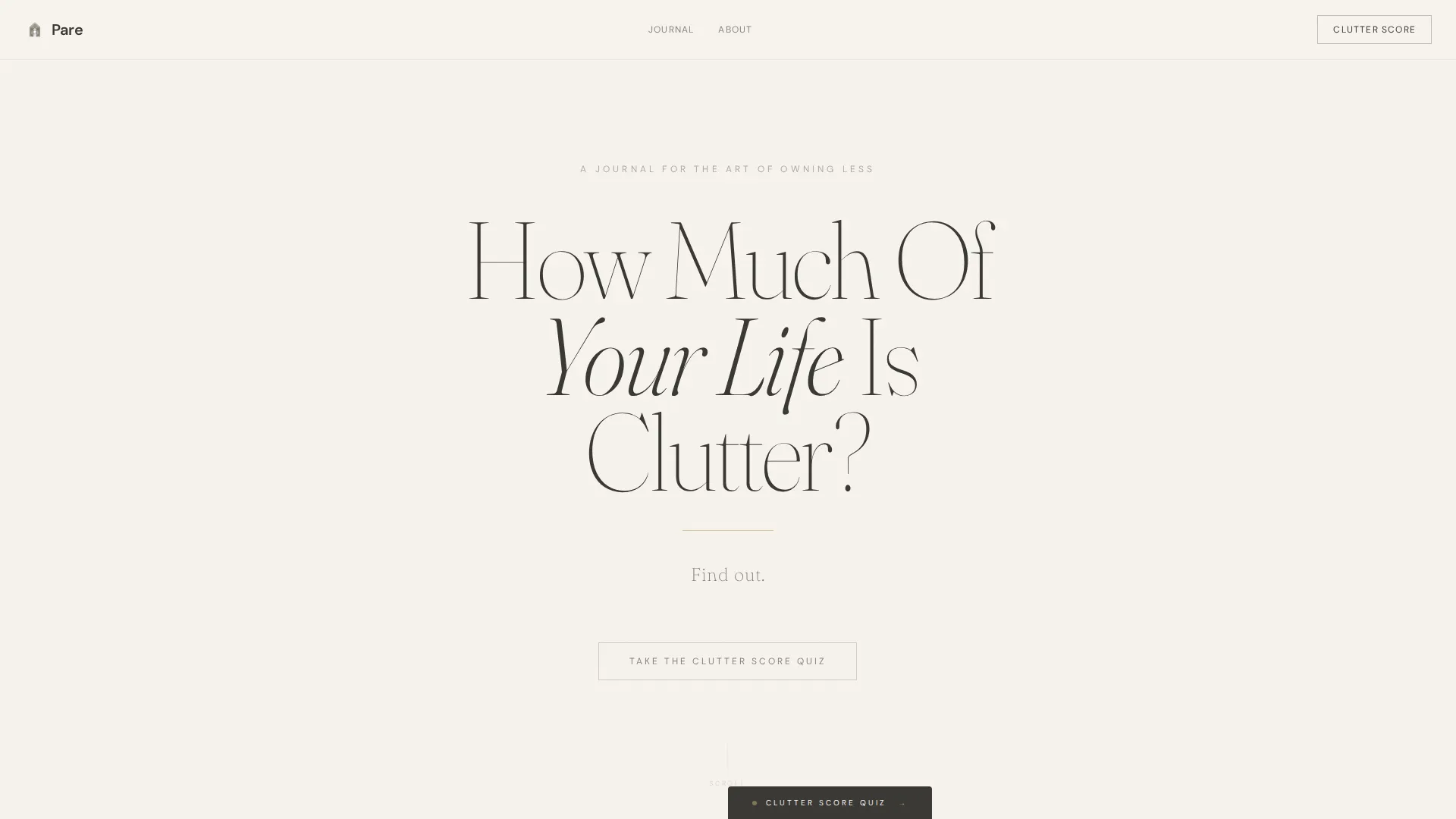
- A hero section with an ultra-thin serif headline, pulsing gold line animation, and a single "Find out." call to action
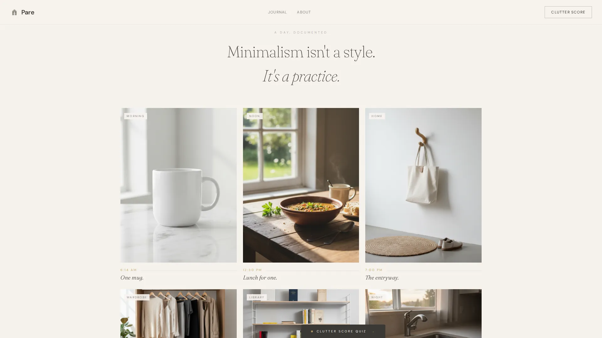
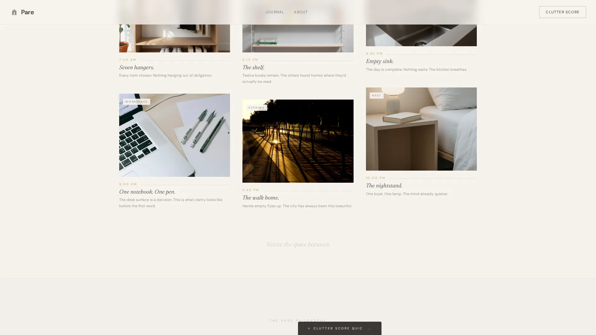
- A masonry vignette grid with timestamped day-in-the-life cards and scroll-driven whitespace expansion
- A full-screen seven-question Clutter Score Quiz with illustrated answers, a radial gauge result, and an email capture screen
Feature list
This template is built around a small set of highly considered components. Each one does a specific job without duplicating what another section already handles.
Giant Headline Hero Section
The hero opens with a single architectural question set in an ultra-thin Fraunces serif at a scale that commands the full viewport. A thin muted gold line pulses once beneath the headline, then the words "Find out." appear below it. No image, no background illustration, just the question and the space around it.
Masonry Vignette Grid
The layout uses a masonry grid to present timestamped day-in-the-life moments rather than product recommendations or how-to tips. Cards show scenes like a single mug at 6:14 AM or a desk with one notebook at 9:00 AM. As the visitor scrolls deeper, the grid loosens and whitespace expands so the page itself teaches the lesson.
Inline Clutter Score Quiz
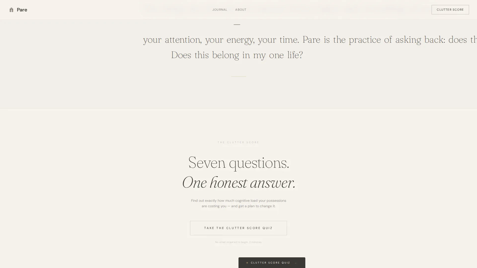
Seven questions appear one at a time against a full-screen white background. Each question uses illustrated answer options rather than plain text. A muted gold progress indicator tracks position. The results screen displays a personalized Clutter Score on a radial gauge, and the email capture appears only at that moment, after curiosity is already invested.
Philosophy Scroll-Reveal Section
A word-by-word scroll-reveal section surfaces the editorial voice of the journal in a deliberate, cinematic way. The text appears as the visitor moves down the page, reinforcing the idea that clarity reveals itself gradually rather than all at once.
Persistent Quiz Entry Tab
A minimal tab anchored to the bottom edge of the viewport keeps the quiz call to action visible throughout the scroll without competing with the editorial content above it. It disappears into the interface until the visitor is ready.
Page sections overview
| Section | Purpose |
|---|---|
| Hero Headline | Hooks visitors with an architectural question and a single pulsing gold call to action |
| Masonry Vignette Grid | Delivers timestamped day-in-the-life cards with scroll-driven whitespace expansion |
| Philosophy Scroll-Reveal | Reveals editorial voice word by word as the visitor scrolls |
| Clutter Score Quiz | Runs a seven-question inline assessment with illustrated answers and a radial gauge result |
| Email Capture Screen | Presents personalized plan offer after quiz completion, before asking for email |
| Minimal Footer | Closes the page with a clean, distraction-free Pattern 4 Superhuman-style footer |
Design & branding system
The visual identity follows a Luxe Minimal theme built on the Cloud Canvas color system. Every tone in the palette earns its place through restraint, and nothing competes for attention.
- Colors: warm parchment white (#F7F3EE) as the primary background, soft graphite (#3B3936) for body text, whisper gray (#D6D2CC) for dividers and inactive states, and muted gold (#C4A96A) reserved for interactive moments and quiz progress indicators
- Typography: Fraunces ultra-thin serif for headlines and the hero question, DM Sans for body text and quiz copy, creating a clear hierarchy between editorial voice and functional text
- Visual style: unbleached linen textures suggested through color rather than imagery, white oak morning light as a tonal reference, and generous negative space used as a structural design element throughout
Mobile & speed optimization
The template is built desktop-first with full mobile responsiveness across all sections. The masonry grid, quiz flow, and scroll-reveal animations are each designed to translate cleanly to smaller viewports.
- The masonry grid reflows for mobile without losing the timestamped vignette structure or the scroll-driven whitespace effect
- The quiz runs inline on mobile with the same illustrated options and radial gauge result, keeping the full experience intact on any screen size
How this template helps you convert
The conversion strategy here is built on curiosity and editorial trust rather than pressure or urgency. Every element is sequenced to reduce friction before the email ask appears.
- The hero headline creates immediate personal relevance by asking a direct question about the visitor's own life, setting up the quiz as the natural next step rather than a promotional interruption
- The masonry vignette grid builds emotional investment before the quiz begins, helping visitors feel the editorial point of view and trust the source before they are asked to share their email
Other information about this template
This template is part of a broader minimalist living blog design family that prioritizes editorial credibility and audience trust. A few additional notes for buyers considering this layout.
- The email capture is placed intentionally after the quiz result screen, once the visitor has completed seven questions and is already curious about their personalized plan
- The footer follows a clean, minimal pattern with no heavy navigation or promotional widgets, keeping the closing experience consistent with the overall restraint of the design
- This template is well suited for content-first publications where the writing and the lived experience behind it are the product, not a course, a shop, or a service
- The pulsing gold line animation in the hero and the quiz progress indicator use the same muted gold accent color, creating a subtle visual thread that ties the two most interactive moments together
Theme
Luxe Minimal
Creative direction
Day-in-the-Life
Color system
Cloud Canvas
Style
Masonry/Pinterest
Direction
Quiz/Assessment
Page Sections
Architectural Hero with Pulsing Gold Line
Masonry Day-in-the-life Grid
Seven-question Clutter Score Quiz
Word-by-word Philosophy Reveal
Persistent Minimal Quiz Tab
Related questions
Does the Clutter Score Quiz require an email to get started?
What type of content works best with the masonry vignette grid?
Is this template suitable for a minimalist living blog focused on topics beyond decluttering?
How does the quiz progress indicator work?
Who is this landing page template best suited for?



