Beauty & Salon Blog & Media Reviews Website Template
Parlour is a beauty and salon newsletter landing page template built on an asymmetric 60/40 grid. It pairs oversized editorial typography with warm Heritage and Story visuals to convert first-time visitors into subscribers. Three curated content sections preview the newsletter's voice, and a dual call-to-action system makes the signup feel earned, not pushed.
by Rocket studio
Quick summary
Parlour is a single-page newsletter template for the beauty and salon industry. It uses an asymmetric 60/40 grid, a Quote/Manifesto header, and three editorial content sections to demonstrate writing quality before asking for a subscription. The layout is desktop-first, warm in tone, and built to convert through showing rather than selling.
Who this template is for
This template serves beauty industry creators who lead with knowledge and craft. If your newsletter earns trust through the quality of its writing, Parlour gives that writing the visual stage it deserves.
- Freelance stylists building clientele through educational content and regular editorial letters
- Independent salon owners looking for a professional subscription page that reflects their brand voice
- Beauty-focused writers and editors whose audience expects depth, not trend roundups
What problem this template solves
Most newsletter landing pages ask for an email before proving they are worth one. Parlour flips that. It lets the writing speak first, building trust before the call to action appears.
- Generic signup pages hide the actual content, leaving visitors with no reason to commit
- Beauty and salon newsletters struggle to stand apart from crowded inboxes without a distinct visual identity
- Creators without a dedicated landing page lose potential subscribers who need to sample the voice before trusting it
What you get with this template
You get a fully structured, single-page editorial landing page designed specifically for a beauty and salon newsletter. Every section is purposeful, every layout choice is intentional, and the conversion path is built in from the start.
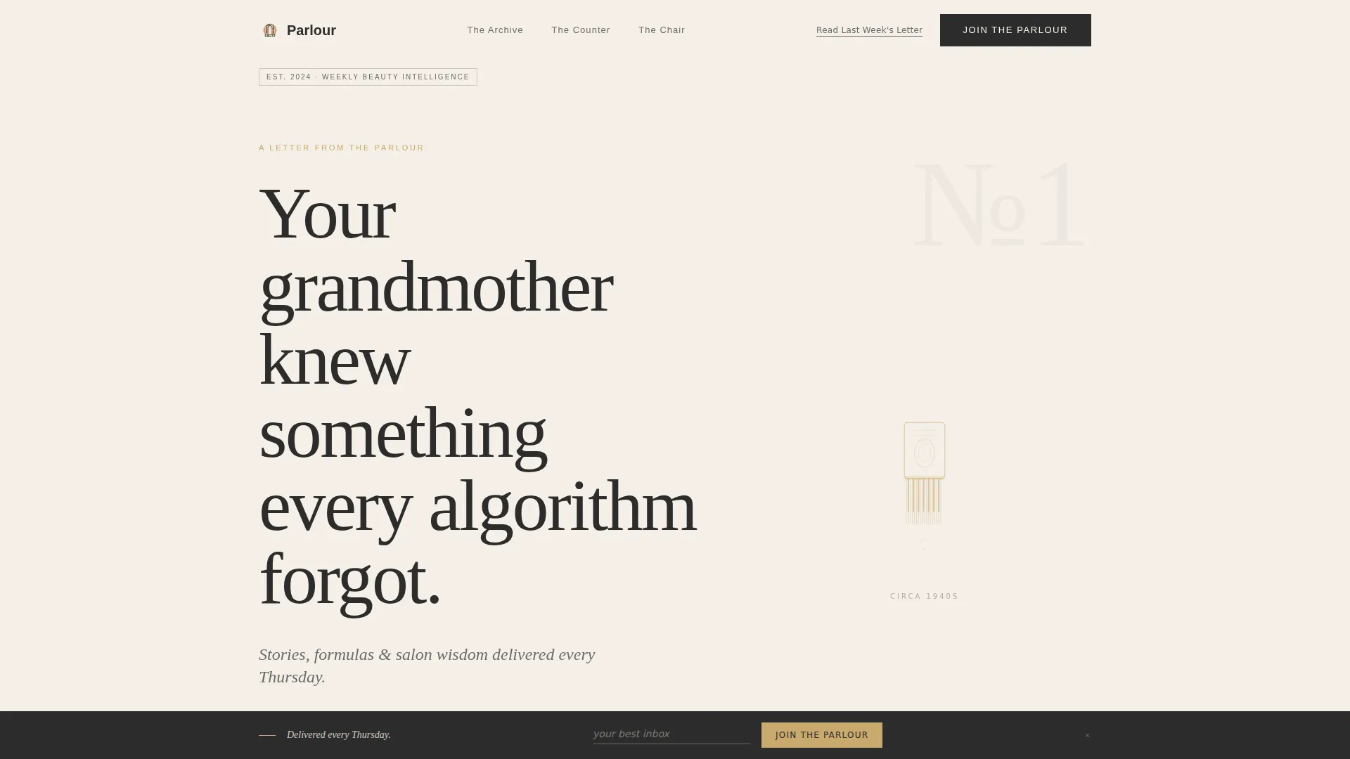
- A Quote/Manifesto hero header with an asymmetric 60/40 layout, oversized serif typography, and an inline email signup field
- Three distinct editorial content sections (The Archive, The Counter, The Chair) each designed to preview a different facet of your newsletter
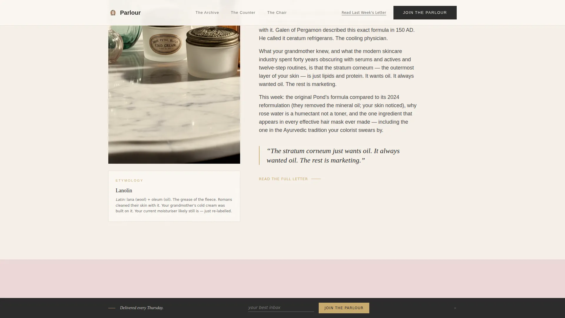
- A fixed bottom call-to-action bar that reappears after the second content section, plus a secondary plain-text link for cautious readers
Feature list
This template delivers a focused set of editorial and conversion-ready features, all grounded in the brief.
Asymmetric 60/40 Editorial Grid
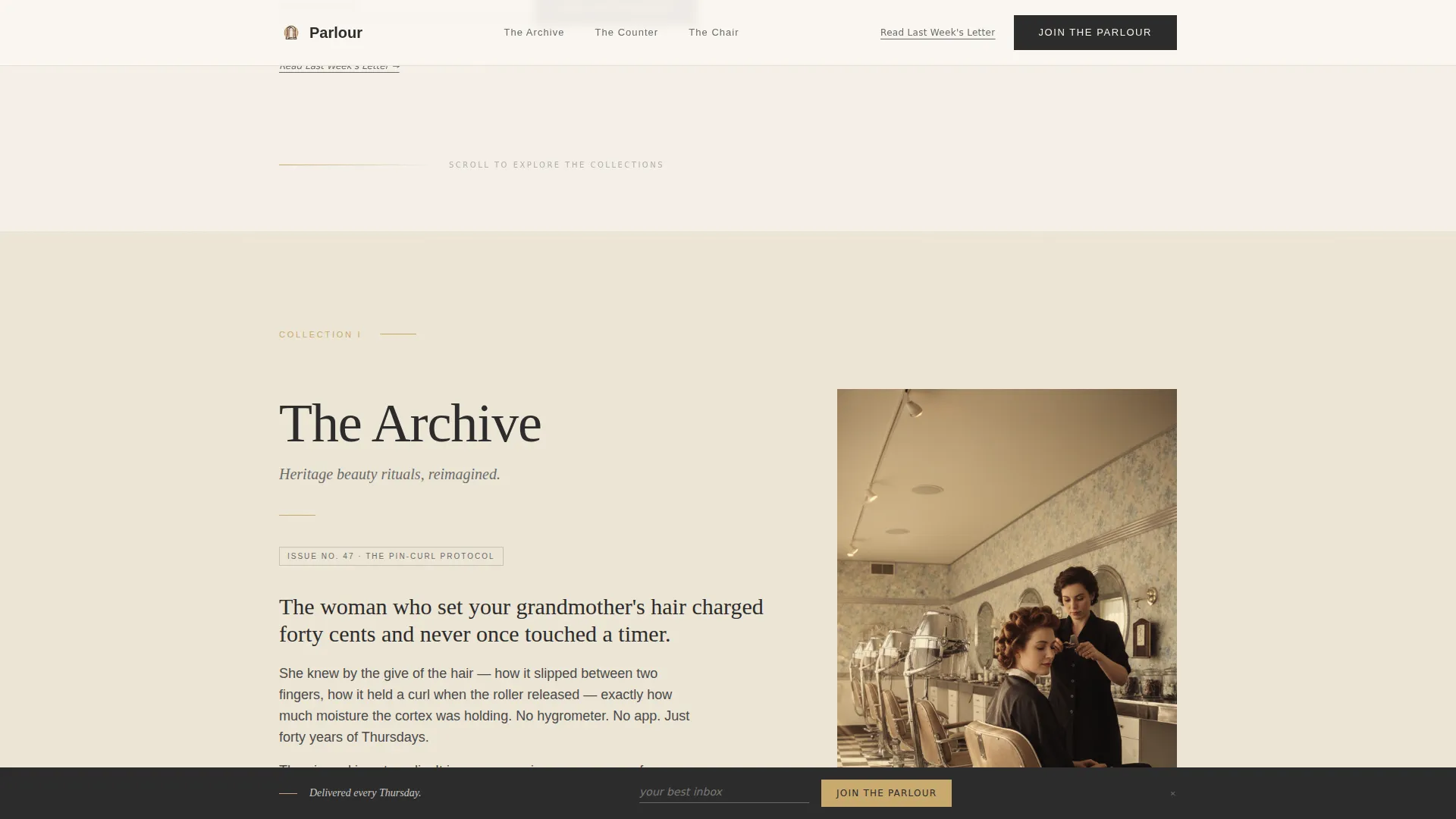
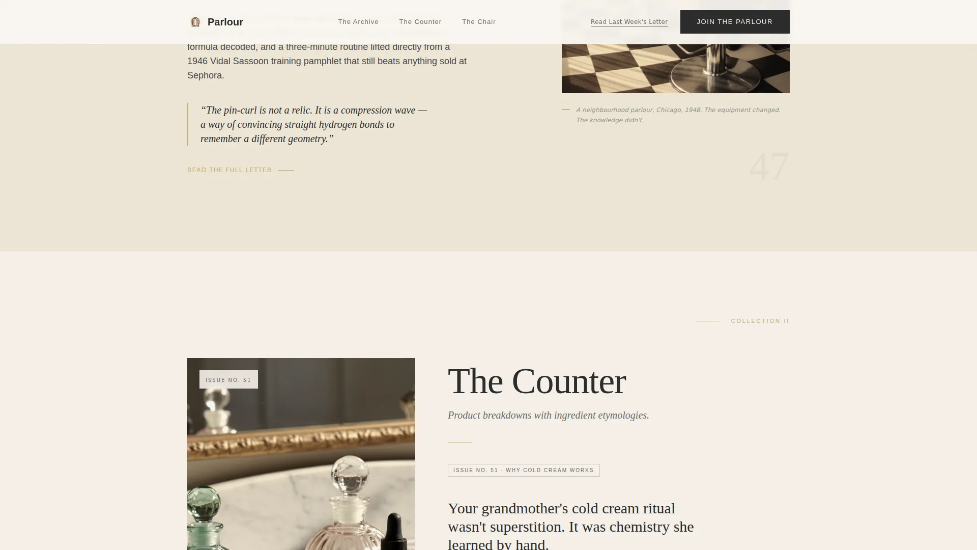
The layout divides each section into a dominant 60-column text area and a supporting 40-column visual column. The ratio alternates between sections, creating a hand-laid magazine rhythm that feels curated rather than templated.
Quote/Manifesto Hero Header
The hero opens with a single oversized serif headline and an italic subline on a parchment background. A small ink-style SVG comb illustration fills the 40-column, letting negative space carry the emotional weight. There is no animation, making the stillness itself a design statement.
Three Curated Content Sections
The Archive, The Counter, and The Chair each preview a different editorial angle. Every section includes a real article excerpt long enough to prove the writing quality, paired with sepia imagery or pull-quotes depending on the section's grid dominance.
Dual Call-to-Action System
The primary call to action sits directly beneath the hero header with a single email field. A fixed bottom bar reactivates after the second content scroll. A secondary plain-text link invites skeptics to read last week's letter before committing.
Social Proof Testimonial Block
Asymmetric quote cards display subscriber testimonials with names and roles such as salon owner, stylist, and beauty editor. The block builds credibility through peer voices rather than platform statistics.
Bento Mosaic Interview Grid
The Chair section uses a bento mosaic grid with hover image reveals to present first-person salon owner interviews. The interactivity is deliberate and low-motion, keeping the editorial feel intact.
Page sections overview
| Section | Purpose |
|---|---|
| Hero Manifesto | Opens with editorial typography, inline email signup, and SVG comb illustration |
| The Archive | Presents heritage beauty rituals with a text-dominant left column and sepia image right |
| The Counter | Showcases ingredient science with a large image left and a pull-quote with excerpt right |
| The Chair | Features salon owner interviews in a bento mosaic grid with hover reveals |
| Social Proof | Displays asymmetric subscriber testimonial quote cards |
| Footer | Provides minimal horizontal footer with essential links |
Design & branding system
The visual identity follows a Heritage and Story theme rendered through the Cloud Canvas color system. Every color choice references a specific emotional register: warm, papery, and intimate without feeling precious.
- Parchment (#F5F0E8) for backgrounds, rose-water pink (#D4A5A5) for accents, deep editorial charcoal (#2C2C2C) for body text, and aged gold (#C9A96E) reserved for pull-quotes, dividers, and hover states
- Typography pairs Fraunces, an editorial serif, for headlines with DM Sans for body text and interface elements
- Visual style references a 1940s beauty column aesthetic: sepia imagery, ink-style illustration, and a layout rhythm that feels hand-composed
Mobile & speed optimization
The template is desktop-first by design, reflecting the editorial magazine layout at its core. The responsive build adapts the 60/40 grid gracefully for smaller screens without losing the template's character.
- The asymmetric grid collapses into a single readable column on mobile, keeping article excerpts and calls to action fully accessible
- Server Components power all sections for a fast static render, reducing load time without sacrificing the richness of the editorial layout
How this template helps you convert
Parlour earns the email signup by demonstrating value before requesting it. The conversion architecture is woven into the content flow, not bolted on top.
- The manifesto header immediately signals editorial voice and places the primary email field in context, so visitors understand what they are signing up for before scrolling
- Three sequential content sections each deliver a polished article excerpt, progressively deepening the reader's trust and desire to receive more
- The fixed bottom call-to-action bar reappears at the right moment in the scroll journey, offering a frictionless second chance to subscribe without interrupting the reading experience
Other information about this template
Parlour is built for the Beauty and Salon Newsletter niche within the Blog and Editorial category. It is well-suited to creators who publish on a weekly cadence and want their landing page to reflect the same editorial care as the letter itself.
- The template style is Asymmetric Grid (60/40), the theme is Heritage and Story, and the creative direction is Curated Collection
- The header concept is Quote/Manifesto and the landing page direction is Lead Generation, making the layout purpose-built for subscriber acquisition
- Color system is Cloud Canvas, combining parchment, rose, charcoal, and gold into a palette that feels historically informed and immediately distinctive
- Animation is intentionally minimal with subtle scroll reveals and hover states on bento grid cards, preserving the stillness that defines the editorial tone
- The footer follows a minimal horizontal pattern, keeping the page's close as considered as its opening
Theme
Heritage & Story
Creative direction
Curated Collection
Color system
Cloud Canvas
Style
Asymmetric Grid (60/40)
Direction
Lead Generation
Page Sections
Asymmetric 60/40 Editorial Grid
Quote/manifesto Hero Header
Three Curated Content Sections
Dual Call-to-action System
Social Proof Testimonial Block
Bento Mosaic Interview Grid
Related questions
Who is this landing page template designed for?
Can I replace the article excerpts with my own writing?
Does the template include the fixed bottom call-to-action bar?
Is the layout responsive for mobile visitors?
Can I use this template if I am not yet publishing weekly?



