Science & Research Blog Specialist Blog Website Template
Permafrost is a coming-soon landing page template built for a narrative climate science blog. It uses an asymmetric 60/40 grid, a warm artisan visual identity, and emotionally driven copywriting to turn curious visitors into founding-list subscribers. The design pairs literary typography with field-journal aesthetics to make climate science feel urgent, human, and worth reading.
by Rocket studio
Quick summary
Permafrost is a single-page waitlist template for a climate science blog that earns reader trust through storytelling before it ever asks for an email. The layout moves from a stark typographic hero through a founder origin story to a focused email capture, all wrapped in a hand-bound journal visual identity that feels warm, unhurried, and entirely intentional.
Who this template is for
This template suits anyone launching a science-led editorial project that needs emotional depth before it needs a subscriber count. It is especially well-suited to writers and researchers who want their landing page to do the persuading for them.
- Climate scientists, glaciologists, or science communicators preparing a public-facing blog or newsletter
- Science educators and policy professionals who want a polished waitlist presence before launch
- Editorial founders building a narrative-first publication for graduate-level or policy-adjacent readers
What problem this template solves
Most science publication landing pages feel like abstract abstracts. They list topics but create no sense of stakes, voice, or reason to return. Permafrost solves the gap between "we have data" and "you need to read this."
- Readers arrive and leave without understanding who is behind the work or why it matters
- Coming-soon pages often convert poorly because they offer nothing except a form field and a promise
- The emotional entry point that turns a curious visitor into a committed subscriber is almost always missing
What you get with this template
You get a fully structured, section-led landing page that builds emotional investment from the first headline to the final call to action. Every section has a clear job to do and a defined visual treatment to do it with.
- A giant centered serif hero with moss brushstroke divider, an asymmetric 60/40 origin story section with artifact columns, a three-column editorial vision bento, a reader portrait section, and a final anchored email capture
- A warm artisan color system using washi cream, shou sugi ban charcoal, moss, and terracotta, all applied with strict hierarchy
- Scroll-reveal animations with spring easing, a brushstroke SVG draw animation, parallax on artifact images, and a FAQ-style accordion for editorial pillars
Feature list
This template is designed around five capabilities that work together to move a reader from first impression to waitlist signup.
Giant Centered Serif Hero
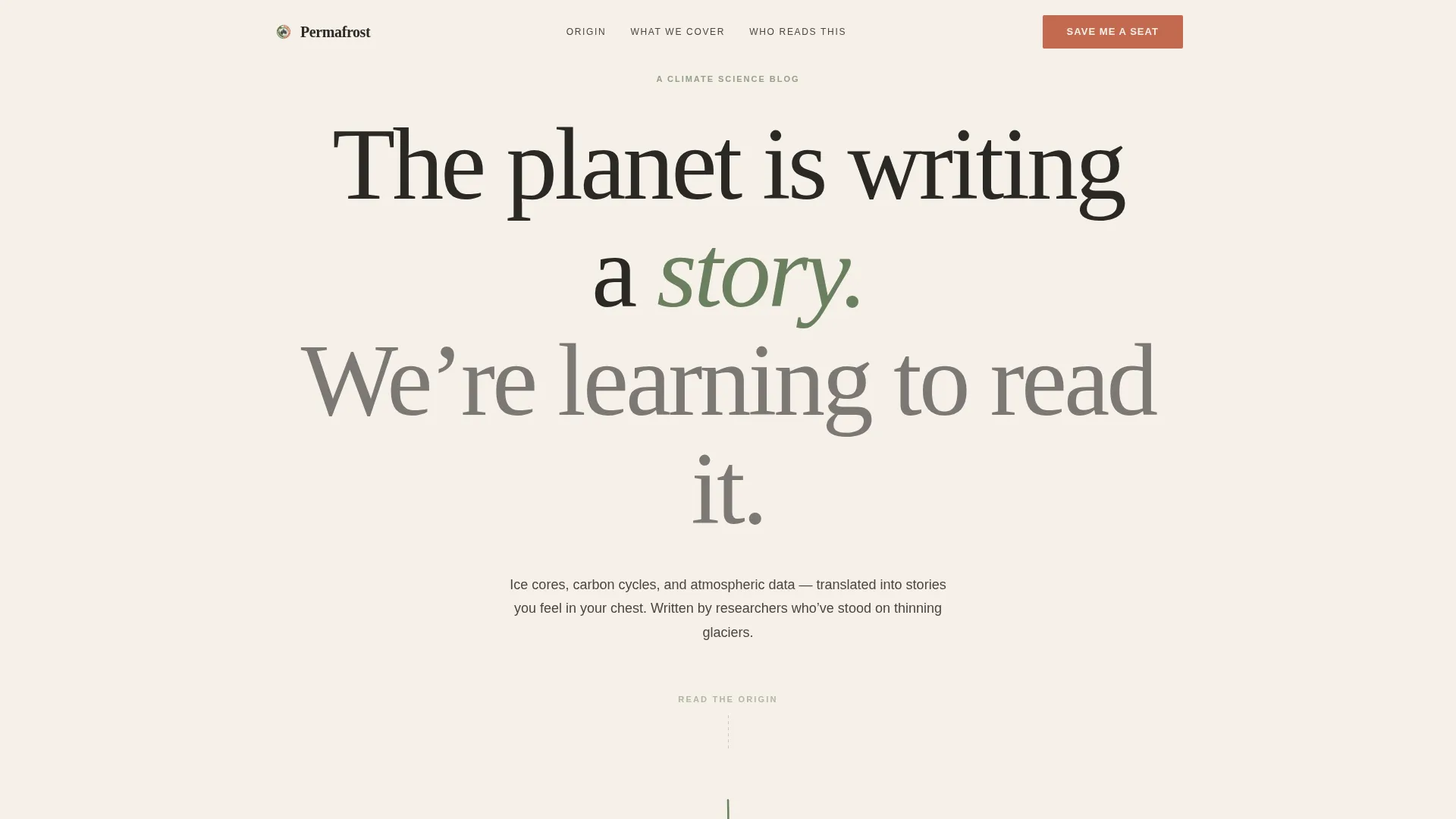
The header is pure typography on bare cream. A hand-kerned serif headline reads at poster scale, with no images or animation competing for attention. A single vertical moss brushstroke below the fold line signals the transition into the story below.
Asymmetric 60/40 Origin Story Grid
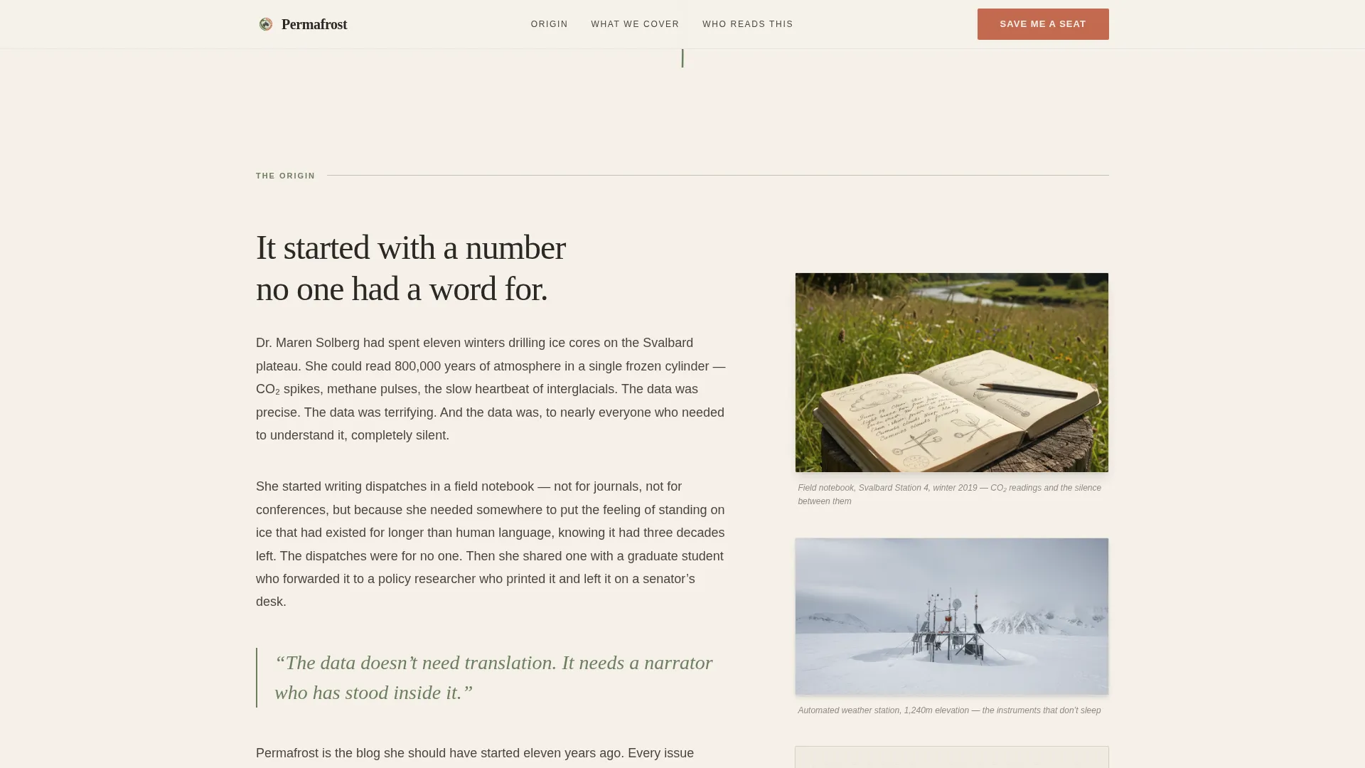
The 60-column carries the founder's written narrative, unfolding downward like a letter being written in real time. The 40-column holds scanned field artifacts: a notebook page, a weather station photograph, and a hand-drawn carbon cycle diagram. The two columns create rhythm and depth without a single word of padding.
Dual-Placement Email Capture
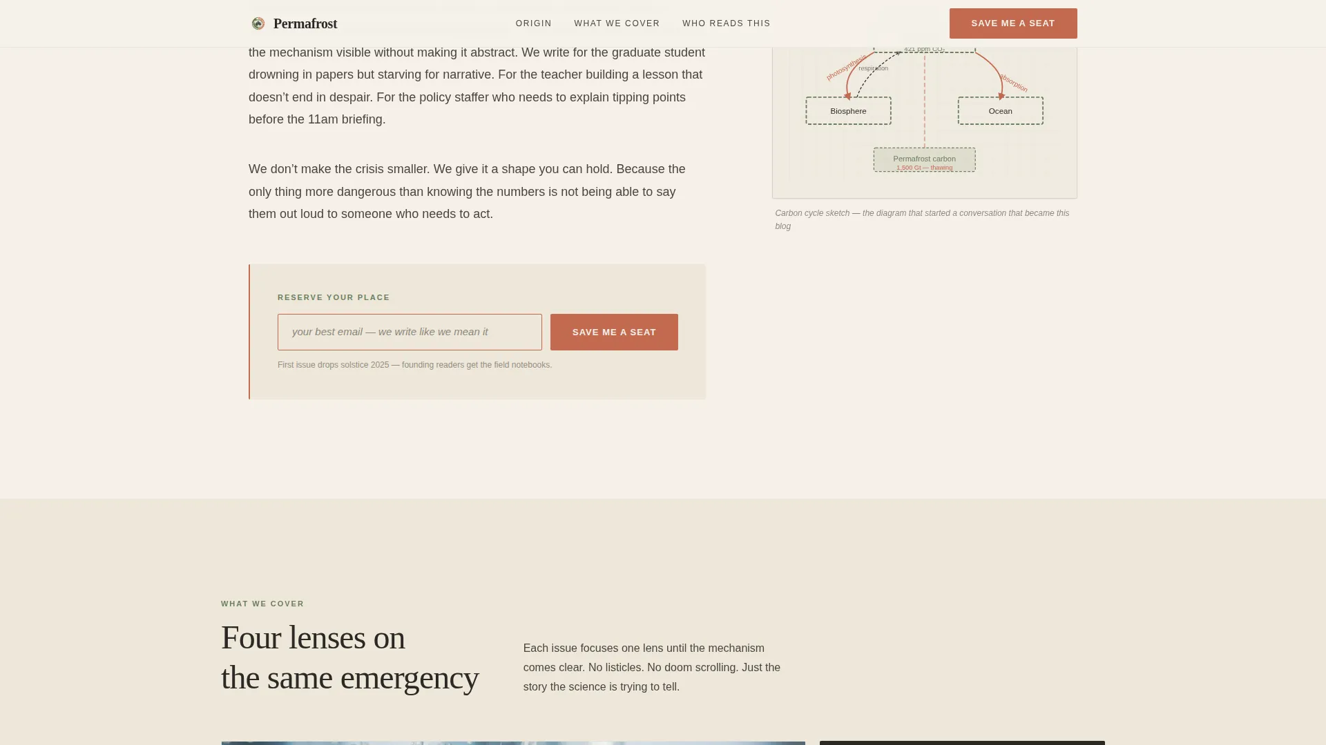
The primary call-to-action form appears twice: once at the emotional peak of the origin story and once anchored at the bottom of the page. The terracotta-bordered field carries placeholder text that matches the editorial voice, and a secondary line below the input reinforces the founding-reader offer.
Editorial Vision Bento Section
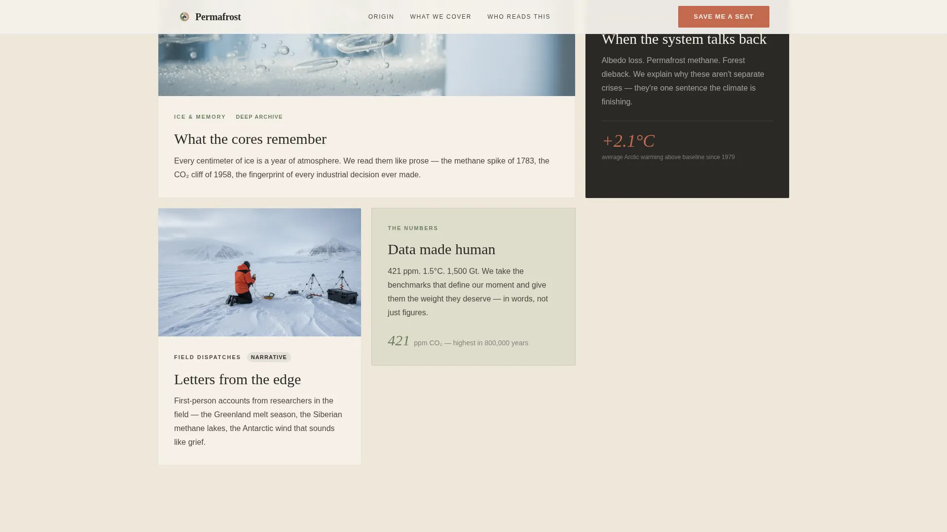
Three varied-size cards arranged in a bento grid communicate what the blog covers and how it covers it. Card sizing creates visual hierarchy without requiring extra copy to explain which topics are primary.
FAQ Accordion for Editorial Pillars
An interactive accordion lets visitors explore the editorial categories in depth without leaving the page. Each panel opens to reveal context about what a given pillar covers and why it exists, reducing uncertainty before the signup commitment.
Page sections overview
| Section | Purpose |
|---|---|
| Hero headline | Sets literary tone and stakes |
| Moss brushstroke divider | Marks transition into narrative |
| Origin story (60/40) | Founder voice and field artifacts |
| Mid-scroll email capture | Converts at emotional peak |
| Editorial vision bento | Shows coverage scope and depth |
| Reader portrait section | Reflects audience back to themselves |
| Final email capture | Anchors the founding-reader offer |
| Minimal footer | Closes without distraction |
Design & branding system
The visual identity follows a Warm Artisan approach through a Japanese Zen color framework. Every color has a defined role, and nothing competes with the reading experience.
- Washi paper cream (#F5F0E8) dominates the reading surface; shou sugi ban charcoal (#2B2926) anchors all body text with generous leading; moss after rain (#6B7F5E) marks section transitions and pull quotes
- Terracotta (#C2694F) appears only on interactive elements and accent strokes, meaning every splash of warmth signals an action the visitor can take
- Typography pairs Fraunces serif for headlines with DM Sans for body and interface text, creating a contrast between editorial weight and clean readability
Mobile & speed optimization
This template is designed desktop-first to serve long-form readers at full width, but the layout adapts gracefully for smaller screens without losing the essential experience.
- The asymmetric 60/40 grid stacks into a single readable column on mobile, keeping the founder narrative and field artifacts in sequence
- Server Components handle all static content sections, keeping the JavaScript footprint minimal across devices
- Scroll-reveal animations use spring easing rather than heavy libraries, keeping motion smooth and load-friendly
How this template helps you convert
The template treats the story itself as the primary persuasion engine. The form is simply the door at the end of a path the visitor already wants to walk.
- The hero headline establishes voice and stakes before a single product claim is made, so the reader arrives curious rather than skeptical
- The origin story section builds emotional investment across scroll depth, placing the first email capture exactly when that investment peaks
- The founding-reader offer beneath the final form adds a tangible reason to sign up now rather than later, without using countdown timers or artificial pressure
Other information about this template
This template is a strong fit for science communication projects that prioritize narrative quality over feature volume. A few additional details worth knowing before you build with it.
- The template is coded with Fraunces and DM Sans as the default type pair; both are open-source and load via standard font delivery
- Interaction details include a brushstroke SVG draw animation on the hero divider and parallax depth on the artifact image column
- The reader portrait section uses archetype-based presentation rather than testimonials with metrics, which keeps social proof honest for a pre-launch project
- The footer follows a horizontal flow pattern, keeping navigation minimal and exit paths uncluttered
Theme
Warm Artisan
Creative direction
Origin Story
Color system
Japanese Zen
Style
Asymmetric Grid (60/40)
Direction
Waitlist/Coming Soon
Page Sections
Giant Centered Serif Hero
Asymmetric 60/40 Origin Story
Dual-placement Email Capture
Editorial Vision Bento Grid
FAQ Accordion for Editorial Pillars
Related questions
Can I use this template before my blog has published any content?
How does the dual email capture placement work?
What kind of publication suits this template best?
Does the template include a way to explain what the blog covers?
Is the asymmetric grid adjustable if I have fewer field artifacts?



