Podcast Editorial Landing Page Template
A precision-crafted editorial landing page for a pharmaceutical podcast brand. Built on a newspaper masthead structure, it guides industry professionals through featured episodes, thematic series, and contributor credentials before asking for anything. The waitlist form earns its place by delivering editorial depth first. Designed for medical affairs directors, biotech founders, and hospital pharmacists who trust rigorous sourcing over promotional noise.
by Rocket studio
Quick summary
This template is an editorial landing page for a pharmaceutical podcast and media brand. It leads with broadsheet-style typography, moves through curated episode content and contributor credentials, and closes with a focused early-access waitlist form. The design aesthetic follows a Japanese Zen color philosophy: restrained, deliberate, and built to communicate authority before it asks for trust.
Who this template is for
This template is built for pharmaceutical media brands and podcast publishers who need to launch with credibility intact. It suits teams that want a coming-soon presence capable of converting a skeptical, highly informed audience.
- Medical affairs directors, biotech founders, and hospital pharmacists who expect editorial rigor
- Podcast brands in the pharmaceutical or life sciences space preparing an early-access waitlist launch
- Independent media publishers covering drug pipelines, regulatory affairs, or formulary strategy
What problem this template solves
Most podcast landing pages lean on bold visuals and generic calls to action. That approach fails with pharmaceutical professionals who are trained to question unsupported claims. This template solves the credibility gap by leading with content depth, typographic authority, and structured editorial hierarchy.
- Generic templates look promotional, not authoritative, and lose trust with expert audiences
- Waitlist pages often ask for sign-ups before demonstrating value, leading to low conversion with informed readers
- Pharmaceutical and life sciences audiences need credential-forward layouts that reflect the seriousness of the subject matter
What you get with this template
You get a fully structured single-page editorial layout that moves from masthead to waitlist in a deliberate, trust-building sequence. Every section has a defined role and a clear visual language.
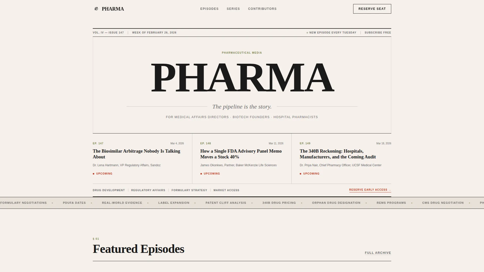
- A newspaper-style hero masthead with broadsheet serif headlines, an editorial tagline, and a three-column episode preview grid
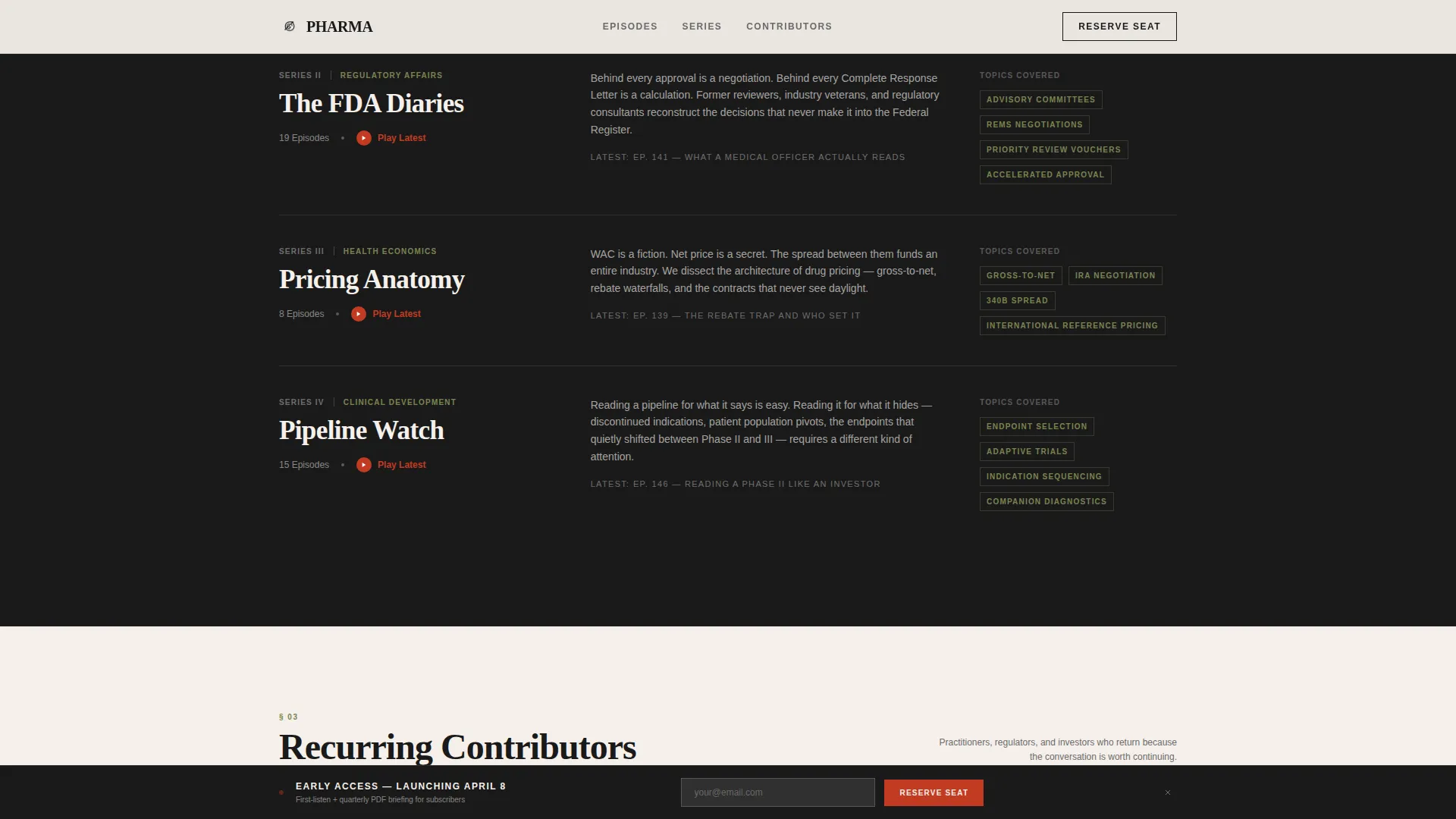
- Thematic series sections presented as magazine investigation headers with editorial introductions
- A dual-placement waitlist form with a listener-type toggle and a fixed bottom bar trigger that activates after the featured episodes
Feature list
This template is built on a small set of well-defined capabilities. Each one serves the core editorial mission directly.
Newspaper Masthead Hero
The hero section presents the show name in a high-contrast serif typeface at broadsheet scale. A single-line editorial tagline sits beneath it. A vertical rule separates the dateline from an issue number. Below the fold, a three-column grid previews upcoming episode titles as headline stubs. No imagery is used. Typography carries the entire authority signal.
Featured Episodes Card Row
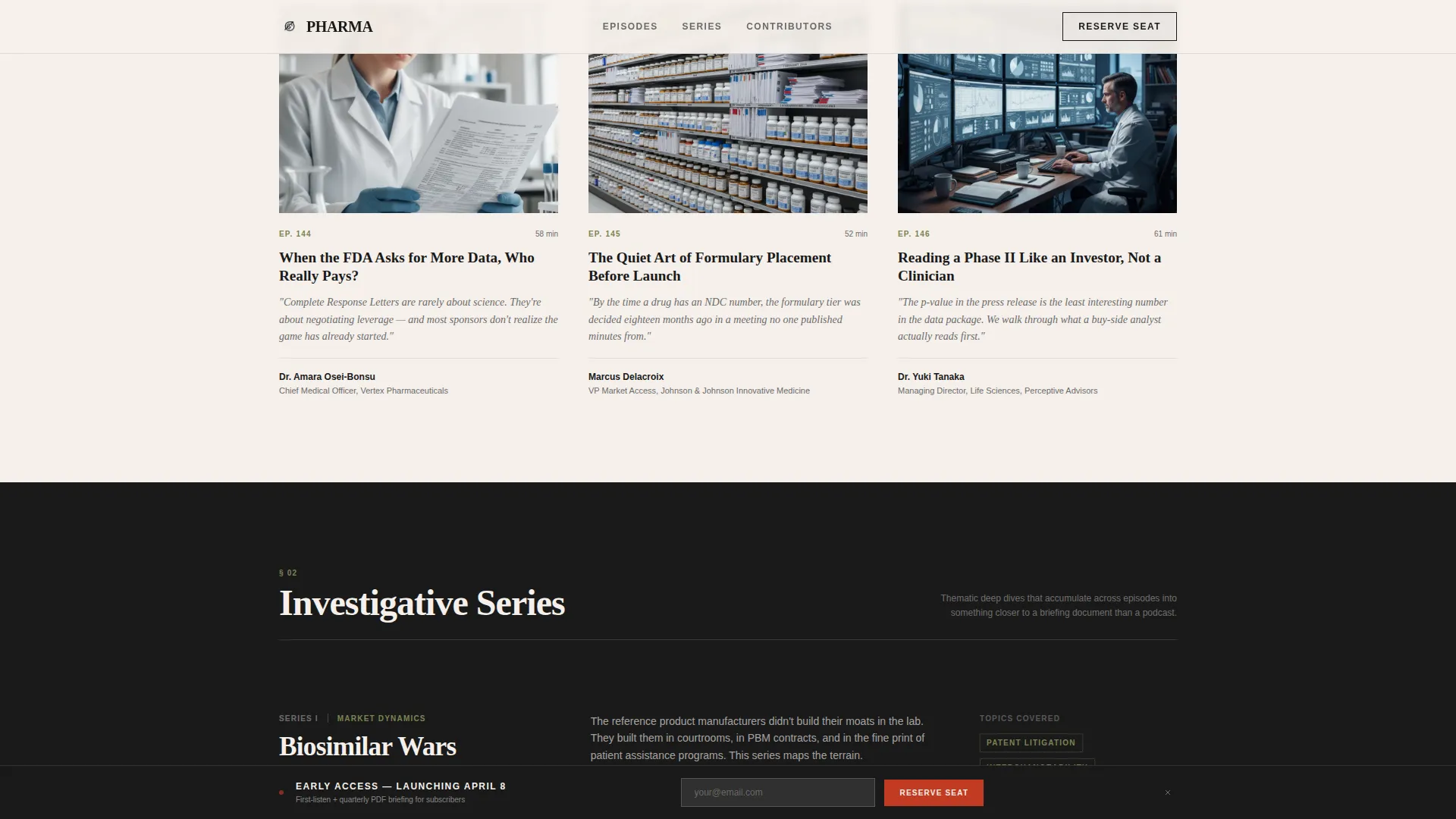
Three episode cards display guest credentials, a one-sentence thesis statement, and episode artwork. Each card reveals a vermillion play icon on hover. The hover state is the only moment of color movement in the section, making the interactive trigger feel earned rather than decorative.
Thematic Series Sections
Episodes are grouped into named investigative series such as "Biosimilar Wars," "The FDA Diaries," and "Pricing Anatomy." Each series is introduced with a brief editorial paragraph. The structure mirrors a long-form journal, allowing visitors to self-select into the topics most relevant to their professional role.
Contributors Strip
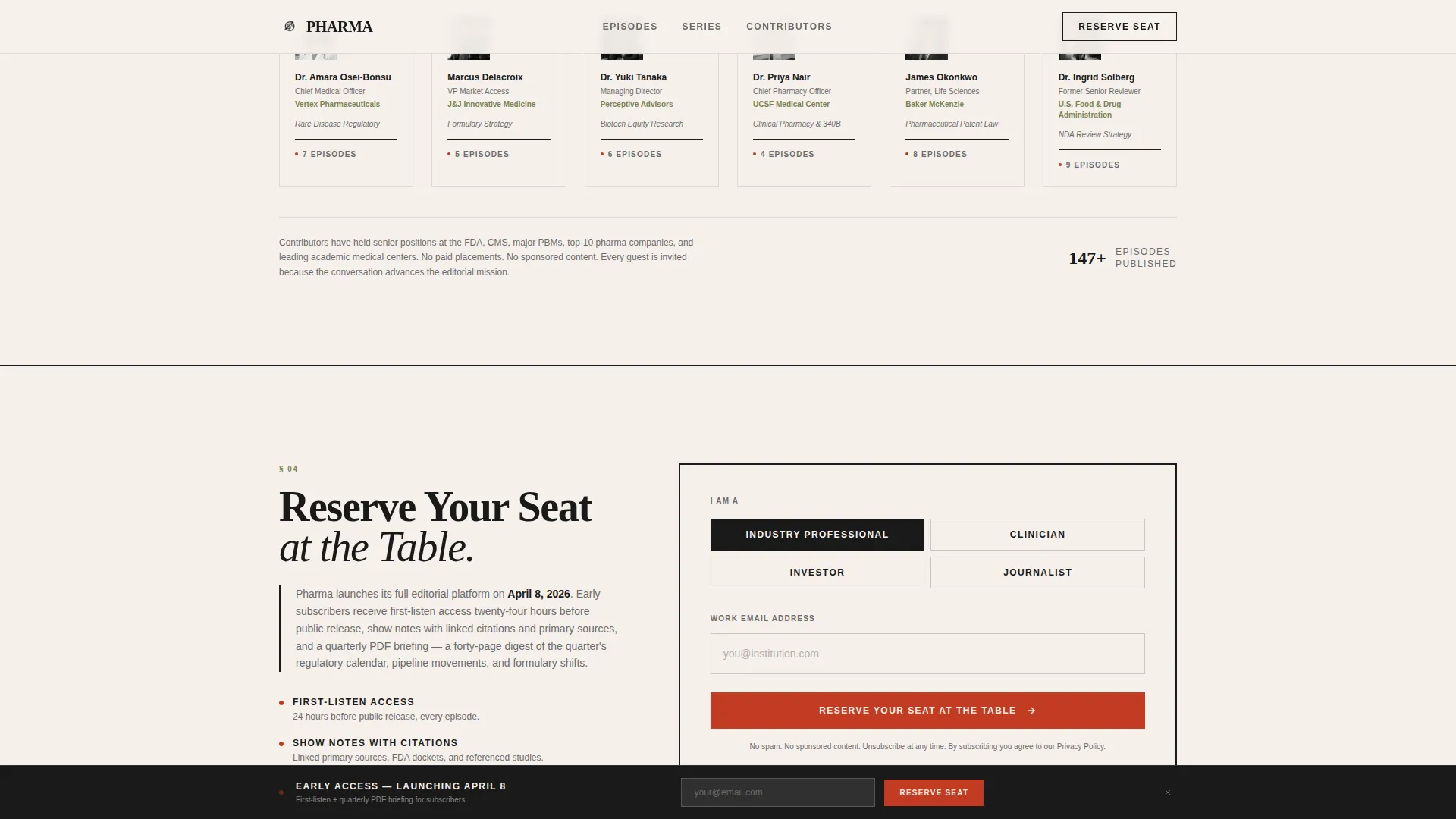
A horizontal strip displays recurring guests with their institutional affiliations and episode counts. This section functions as social proof without promotional language. Credentials speak for themselves, which is exactly the register this audience expects.
Dual-Placement Waitlist Form
The waitlist call to action appears twice. First as a fixed bottom bar that slides in after the visitor scrolls past the featured episodes. Then as a full-width section near the footer with an editorial note explaining the launch timeline and what early subscribers receive: first-listen access, show notes with linked citations, and a quarterly PDF briefing.
Listener Type Toggle
The waitlist form includes a toggle that lets visitors identify as an industry professional, clinician, investor, or journalist. This adds a layer of audience segmentation directly within the sign-up flow, without requiring a separate form or extra fields.
Page sections overview
| Section | Purpose |
|---|---|
| Newspaper Masthead Hero | Establishes editorial authority through typographic-first broadsheet layout |
| Episode Preview Grid | Previews upcoming episode titles below the hero fold in three columns |
| Featured Episodes Row | Showcases three episodes with guest credentials, thesis, and hover play |
| Thematic Series Headers | Groups episodes into named investigations with editorial introductions |
| Contributors Strip | Displays recurring guests with affiliations and episode counts |
| Fixed Bottom Bar | Slides in after scroll past featured episodes to prompt waitlist sign-up |
| Waitlist call to action Section | Full-width sign-up with listener toggle, launch note, and subscriber benefits |
| Footer | Single-row linear footer with publication-style minimal layout |
Design & branding system
The visual language is rooted in an Editorial Magazine style shaped by Japanese Zen restraint. Every color decision is deliberate, and the palette is kept to four values with strict usage rules.
- Stone white (#F5F0EB) dominates the background with generous negative space between content blocks; sumi black (#1A1A1A) carries all body text and section dividers
- Dry moss (#7A8450) appears in category tags and metadata labels; torii vermillion (#C23B22) is reserved exclusively for play buttons and interactive triggers
- Typography uses a high-contrast serif for headlines and a clean sans-serif for body text and interface elements, reinforcing the broadsheet-to-digital translation
Mobile & speed optimization
The template is designed desktop-first, reflecting the professional commute context of its primary audience. Mobile responsiveness is built in so the editorial layout translates cleanly to smaller screens without losing hierarchy.
- Static server components handle content-heavy sections to keep JavaScript usage minimal across the page
- Scroll reveals, hover states, and the fixed bottom bar trigger are implemented with low-to-medium animation weight to preserve a focused reading experience
- The marquee and interactive elements are scoped to avoid layout shift on mobile viewports
How this template helps you convert
The conversion strategy is editorial by design. Trust is built through content before any ask is made.
- The masthead and episode preview grid demonstrate the show's editorial voice immediately, giving skeptical professionals a reason to keep reading before any form appears.
- The featured episodes, series sections, and contributors strip accumulate credibility in layers, so by the time the waitlist form appears, the visitor has already decided whether this publication is worth their inbox.
- The dual-placement form and listener-type toggle reduce friction at the moment of commitment, making the sign-up feel like joining a professional community rather than subscribing to a mailing list.
Other information about this template
This template is part of the Blog and Editorial category, specifically designed for the pharmaceutical podcast and media niche. It is built as a coming-soon and waitlist landing page for a media brand launching in the pharmaceutical industry space.
- The template style is classified as Editorial Magazine, making it suitable for any pharmaceutical media brand, life sciences publication, or B2B podcast brand that needs a credible public-facing presence before launch
- The creative direction follows a Curated Collection approach, meaning content is presented as a carefully edited body of work rather than a product catalog or promotional sequence
- The header concept is Newspaper and Publication, which is distinct from standard hero banner formats and signals a publishing-first identity to the visitor immediately on arrival
- Early subscriber benefits described in the editorial launch note include first-listen access, show notes with linked citations, and a quarterly PDF briefing, each of which reinforces the depth and utility of the publication
Theme
Editorial Magazine
Creative direction
Curated Collection
Color system
Japanese Zen
Style
Editorial/Magazine
Direction
Waitlist/Coming Soon
Page Sections
Newspaper Masthead Hero Section
Featured Episodes with Hover Play
Thematic Series Sections
Contributors Strip with Credentials
Dual-placement Waitlist Form
Listener Type Toggle
Related questions
Who is this landing page template designed for?
What does the waitlist form include?
Can I customize the series names and episode content?
Why does the hero use typography instead of imagery?
What interactive and animation behavior does this template include?



