Premium Community Landing Page Template
Formulary is a hub-and-spoke landing page template built for pharmaceutical community forums. It combines an editorial magazine aesthetic with a warm scrapbook collage header, creator-led spotlight sections, and a seven-question peer-group assessment. The result is a conversion-focused page that turns clinical curiosity into community belonging before asking for an email address.
by Rocket studio
Quick summary
Formulary is a single-page community forum template for pharmacy professionals. It pairs a lived-in editorial magazine look with a structured anchor navigation, three creator spotlight sections, and a guided quiz that matches visitors to a specific forum cohort. The page converts clinical curiosity into community membership through faces, voices, and peer-level insight.
Who this template is for
This template is built for organizations and individuals launching a professional forum or knowledge community in the pharmaceutical space. It suits groups who want credibility driven by real practitioners rather than institutional branding.
- Hospital pharmacists, clinical pharmacists, and PharmD students seeking preceptor-level peer insight
- Community pharmacists, compounding specialists, and regulatory analysts building or joining a practice community
- Forum founders and pharmaceutical media publishers who need a polished, conversion-ready landing page
What problem this template solves
Pharmaceutical professionals often face a gap between official guidance and real-world practice. They need a trusted space where peer insight arrives before formal publications catch up. Generic community landing pages look corporate and cold, which undermines trust with a skeptical clinical audience.
- No clear way to show visitors who the community is actually for before asking them to sign up
- Contributor credibility is buried or absent, making it hard to earn trust from experienced clinicians
- Visitors leave without understanding which forum cohort matches their practice setting or specialty
What you get with this template
This template delivers a fully structured, single-page layout with every section pre-designed and ready to customize. The design system, typography, and interactive components are all specified and built in.
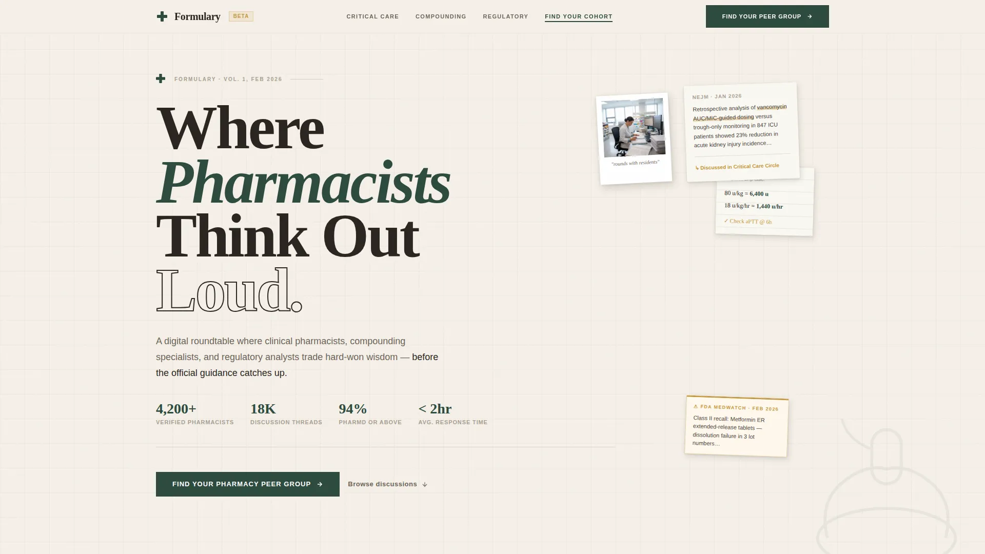
- A collage-style hero header with an anchor navigation bar and the editorial headline "Where Pharmacists Think Out Loud"
- Three creator spotlight sections, each featuring a named contributor portrait, credentials, pull quote, and featured thread preview
- A seven-question illustrated quiz assessment that maps visitors to one of three named forum cohorts, with a cohort results reveal and email capture step
Feature list
This template includes a focused set of design and interaction features drawn directly from the source brief.
Collage Scrapbook Hero Header
The header layers overlapping fragments on a limestone cream background: a cropped clinical trial abstract, a handwritten dosage calculation, a polaroid-style contributor portrait, a torn-out alert notice, and a vintage mortar-and-pestle illustration. Elements are slightly rotated and cast soft shadows, giving the composition an authentic, lived-in reference-desk feel.
Hub and Spoke Anchor Navigation
A sticky anchor navigation bar links directly to each major section of the page. Active states are highlighted in deep pharmacopoeia green, so visitors always know where they are and can jump to the spotlight or quiz section they care about most.
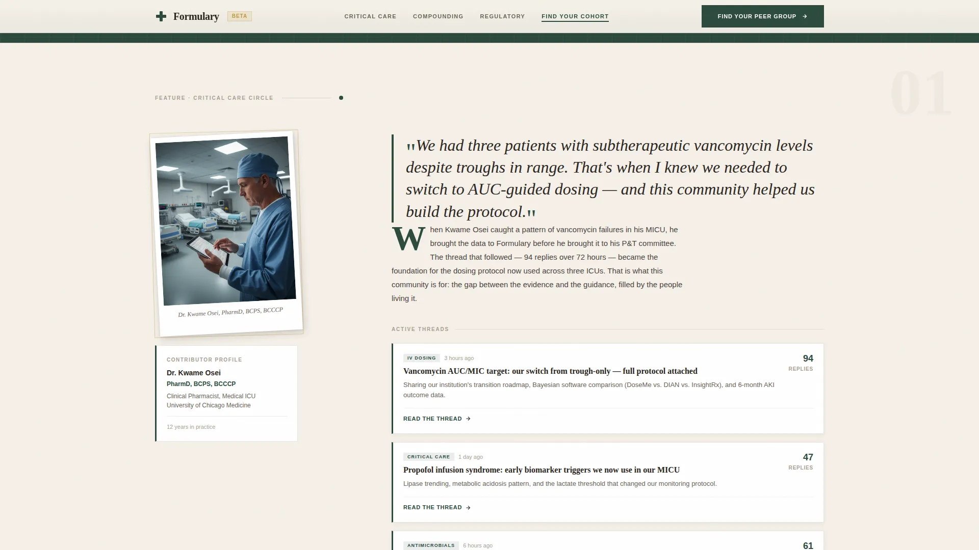
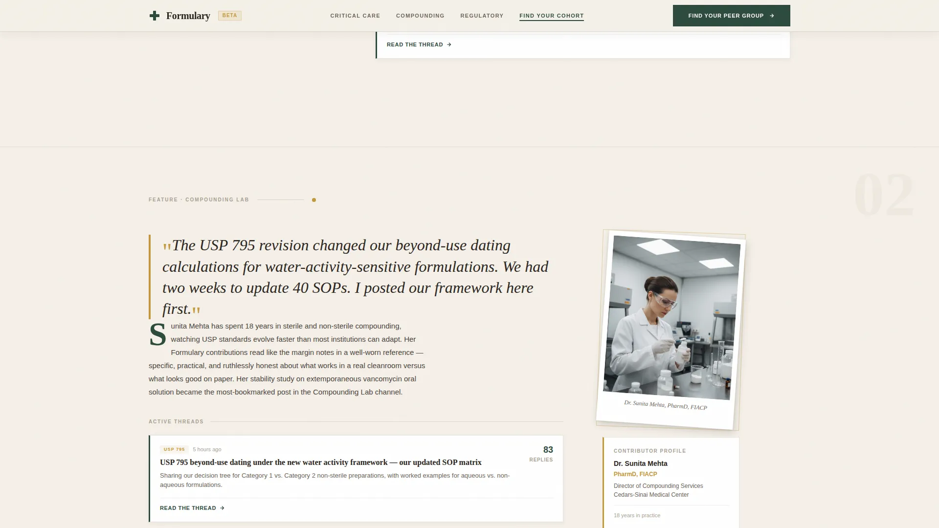
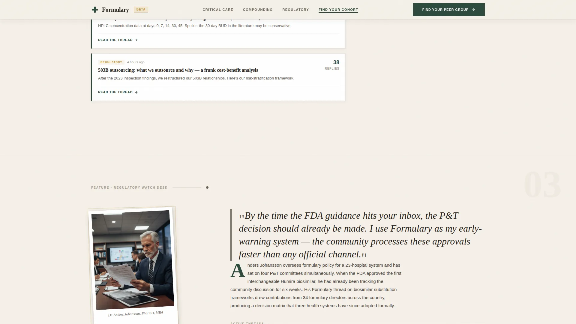
Creator Spotlight Sections
Three dedicated sections each open with a named contributor's portrait, professional credentials, and a pull quote in apothecary amber. The featured discussion thread preview follows immediately, building credibility through real practitioner voices rather than abstract community claims.
Seven-Question Peer Group Quiz
The primary call to action launches a guided assessment covering practice setting, specialty interest, years of experience, top clinical challenge, preferred learning format, contribution comfort level, and time availability. Questions appear one at a time with illustrated answer cards instead of standard radio buttons.
Cohort Results and Email Capture
Quiz results map each visitor to a named forum cohort: Critical Care Circle, Community Practice Table, or Regulatory Watch Desk. Each result includes a preview of active threads and top contributors in that cohort, converting a match into a reason to claim a seat before the email prompt appears.
GSAP Scroll Reveal Animations
The template uses GSAP-powered scroll reveals, staggered card entrances, and smooth quiz transition animations. An IntersectionObserver keeps the anchor navigation state in sync as visitors scroll through each hub section.
Page sections overview
| Section | Purpose |
|---|---|
| Hero Collage Header | Establishes editorial identity, displays headline, and launches anchor nav |
| Anchor Navigation Bar | Provides sticky section links with active green highlight states |
| Critical Care Spotlight | Features IV compatibility contributor portrait, credentials, and thread preview |
| Compounding Lab Spotlight | Highlights stability study specialist with pull quote and discussion thread |
| Regulatory Watch Spotlight | Showcases biosimilar analyst contributor and regulatory forum thread |
| Quiz Call to Action | Launches seven-question illustrated assessment with cohort matching |
| Cohort Results Reveal | Displays matched cohort name, active threads, and top contributors |
| Email Capture Step | Collects visitor email to claim their matched cohort seat |
| Footer | Single-row linear footer with community and navigation links |
Design & branding system
The visual identity follows an Editorial Magazine theme built on the Warm Stone color system. Typography pairs Fraunces, an editorial serif display face, with DM Sans for body text and user interface elements, creating a confident yet approachable reading experience.
- Limestone cream (#F5F0E8) dominates the reading surface; mortar gray (#A89F91) structures typographic hierarchy; apothecary amber (#C4973B) highlights contributor bylines and pull quotes
- Deep pharmacopoeia green (#2C4A3E) anchors the navigation bar and all call-to-action elements, functioning like the green cross above a dispensary door
- The overall aesthetic feels like a vintage pharmacy cabinet: warm wood drawers with brass label pulls, each section holding something precise and worth reading
Mobile & speed optimization
The template is designed desktop-first to serve hospital pharmacists at workstations, with solid mobile support built in for community pharmacists and students on the go.
- Server Components handle static hero, spotlight, and footer sections to keep initial load lean
- Client Components power the quiz flow, anchor navigation highlighting, and cohort results reveal where interactivity is required
- Scroll reveal animations and staggered card entrances are implemented with GSAP, keeping motion purposeful rather than decorative
How this template helps you convert
Every design and copy decision in this template moves visitors from curiosity to commitment through a clear, low-friction path.
- The creator spotlight sections build trust by putting named practitioners and their real clinical contributions front and center, so visitors feel they are joining a community of peers rather than a generic forum platform.
- The illustrated quiz assessment replaces a cold sign-up form with a seven-question experience that gives visitors something valuable, a specific cohort match and thread previews, before asking for their email address.
Other information about this template
This template is part of the Blog and Editorial category under the Pharmaceutical Blog and Media subcategory. It is purpose-built for the pharmaceutical community forum niche, with USA-centric defaults including FDA references, United States pharmacy practice context, English language copy, and MM/DD/YYYY date formatting.
- The intersection match score for this template's category, subcategory, and niche combination is 13, reflecting a strong alignment between editorial community design and pharmaceutical professional audiences
- Social proof elements include named contributor credentials, thread reply counts, active member timestamps, and cohort previews, all of which are pre-structured in the layout
- The template is suitable for forums targeting practitioners across settings including critical care, community dispensing, compounding laboratories, and regulatory analysis
Theme
Editorial Magazine
Creative direction
Creator Spotlight
Color system
Warm Stone
Style
Hub & Spoke (Anchor Nav)
Direction
Quiz/Assessment
Page Sections
Collage Scrapbook Hero Header
Hub and Spoke Anchor Navigation
Three Creator Spotlight Sections
Seven-question Peer Group Quiz
Cohort Matching and Email Capture
GSAP Scroll Animations and Active Nav
Related questions
Who is the primary audience for this template?
Can I customize the contributor portraits and thread previews?
How does the quiz assessment work on this landing page?
What forum cohorts does the quiz result section include?
Is this template suitable for mobile users?


