Telecom Services & Platforms Professional Website Template
Ping is a split-screen landing page template built for Rich Communication Service (RCS) messaging platforms. It pairs a live phone simulation with a Problem-to-Solution scroll arc, converting skeptical enterprise buyers into qualified leads. The dark mission-control aesthetic, teal-lit metrics, and a three-field lead generation form make the value of interactive messaging immediately visible and actionable.
by Rocket studio
Quick summary
Ping is a single-page lead generation template designed for RCS messaging platforms. It opens with a headline stat and an animated phone mockup, then walks visitors through a Problem-to-Solution arc that literally brightens as it scrolls. Every section is split 50/50, keeping data and demonstration side by side at all times.
Who this template is for
This template is built for B2B teams in the messaging infrastructure and marketing technology space. It speaks directly to buyers who already know what SMS is and are ready to see what comes next.
- Product managers at e-commerce platforms frustrated by low email and SMS engagement rates
- Head-of-growth operators at fintech startups who need transactional messages that actually drive taps
- Enterprise marketing directors replacing SMS shortcodes with branded, interactive messaging channels
What problem this template solves
Most messaging platform pages describe their product with bullet points and screenshots. That is precisely the wrong approach when the product itself is visual, interactive, and tactile. Ping solves the demonstration gap.
- Visitors cannot feel the difference between flat SMS and rich RCS by reading about it; they need to experience it
- Standard landing pages bury the proof in testimonials; Ping leads with live simulation and real delivery metrics
- Long lead generation forms create friction; the sequential three-field form here removes it step by step
What you get with this template
Ping delivers a fully structured, section-led single-page layout with high interactivity and a dark dashboard visual identity. Every section is purposefully ordered to move a skeptical enterprise buyer from awareness to form submission.
- A hero section with an animated RCS phone mockup and tappable product carousel built into the layout
- A Problem-to-Solution scroll arc across three split sections, with scroll-linked brightening transitions
- A sticky bottom call-to-action bar, a three-field sequential lead generation form, and a sandbox link path for product-led conversion
Feature list
This template includes purpose-built components that match the complexity of selling messaging infrastructure to enterprise buyers.
Animated RCS Phone Simulation
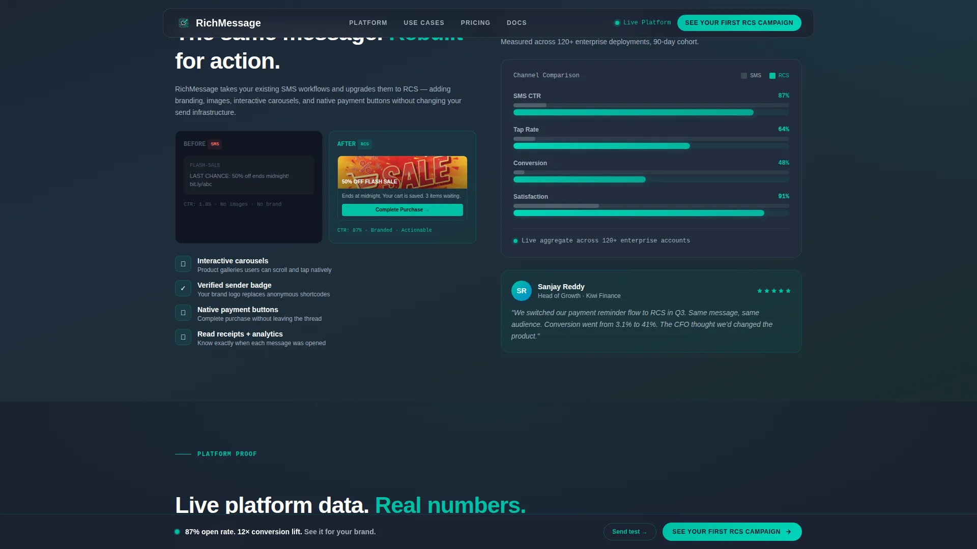
The hero's right panel displays a functioning phone mockup that receives an RCS message in real time. A branded sender logo appears first, then a product carousel fans out, and a "Buy Now" button pulses in teal. Visitors can tap the carousel cards and watch the conversation thread respond, making the value proposition tactile before any paragraph is read.
Problem-to-Solution Scroll Arc
Three split-screen sections guide the reader from pain to proof. Section one shows a grayed-out SMS graveyard with plummeting open-rate graphs. Section two rewrites those same messages as rich cards with climbing teal-lit metrics. Section three delivers dense, anonymized delivery and conversion dashboards beside client logos tagged by vertical.
Sequential Three-Field Lead Form
The lead generation form presents three fields in order: monthly message volume via dropdown (10K, 100K, or 1M+), primary use case (transactional, promotional, or conversational), and work email. No phone number field is included. The sequencing reduces abandonment by revealing one commitment at a time.
Sandbox Conversion Path
A secondary call-to-action invites visitors to send themselves a live test RCS message. This path captures a phone number naturally through product experience rather than a form field, converting skeptics who need to feel the message arrive on their own device before engaging with sales.
Sticky Bottom Call-to-Action Bar
A persistent bottom bar activates after the visitor's second scroll. It carries the primary call to action "See Your First RCS Campaign" and stays visible throughout the remainder of the page, keeping the conversion entry point accessible at any reading depth.
Proof Section with Live Dashboard Layout
The fourth section pairs a dense, data-rich delivery and conversion dashboard on the left with client logos and vertical tags on the right. Retail, banking, and logistics tags add credibility context without requiring named client references.
Page sections overview
| Section | Purpose |
|---|---|
| Hero Split Screen | Headline stat paired with live RCS phone simulation |
| Problem Arc Split | SMS graveyard and plummeting open-rate graphs |
| Solution Arc Split | Rich card preview beside teal-lit climbing metrics |
| Proof Dashboard Split | Delivery data dashboard alongside client vertical tags |
| Lead Gen Form | Sequential three-field form with sandbox secondary path |
| Sticky call to action Bar | Persistent conversion entry activated after second scroll |
| Footer | Linear single-row footer layout |
Design & branding system
The visual identity follows a Dashboard Pro theme using the Teal Catalyst color system. Every color choice has a functional role; nothing decorates without purpose.
- Deep command-center charcoal (#1B2332) anchors all backgrounds, keeping the focus on live data and interactive elements
- Active teal (#00BFA6) appears only on metrics, progress bars, buttons, and interactive elements where something is measurable or clickable
- Soft signal gray (#A4B0BE) handles secondary text and dividers, while clean white (#F5F7FA) surfaces card panels and data displays
- Typography pairs Plus Jakarta Sans for headings with JetBrains Mono for metrics and data values, reinforcing the mission-control aesthetic
Mobile & speed optimization
Ping is designed desktop-first, matching the browsing environment of enterprise B2B buyers at workstations. Full mobile responsiveness is built into the layout so the experience holds across all screen sizes.
- Static sections use server-rendered components to keep initial load lean while preserving visual fidelity
- The phone simulation and sticky call-to-action bar are isolated as client-side components, ensuring interactivity loads without blocking the rest of the page
- Scroll-linked brightening transitions and floating ping indicators are implemented in a way that does not interfere with mobile readability
How this template helps you convert
Ping is structured around a deliberate conversion architecture that removes hesitation at each stage of the buyer journey.
- The animated phone simulation in the hero creates a tactile "aha" moment before any copy is read, reducing the effort needed to explain the product value in text
- The Problem-to-Solution arc builds conviction through visual contrast, so by the time a visitor reaches the lead form they have already seen the before-and-after evidence
- The dual conversion paths, the three-field form and the sandbox link, serve two buyer types: the evaluator ready to talk to sales and the skeptic who needs to experience the product first
Other information about this template
Ping is localized for English (US) audiences with USD currency formatting and MM/DD/YYYY date display conventions. The layout and interaction density are intentionally calibrated for the RCS messaging category within the broader Telecom Services and Platforms market.
- Animation intensity is set to high, including phone bubble animation, bar chart hover effects, scroll-linked section brightening, floating widgets, and ping indicators
- The template sits in the Telecom and Connectivity category, specifically the Rich Communication Service niche, and is built to address the gap between SMS shortcode campaigns and fully interactive branded messaging
- The footer follows a linear single-row pattern, keeping the page exit clean and uncluttered after the primary conversion sections


Theme
Dashboard Pro
Creative direction
Problem→Solution Arc
Color system
Teal Catalyst
Style
Split Screen (50/50)
Direction
Lead Generation
Page Sections
Animated RCS Phone Simulation
Problem-to-solution Scroll Arc
Sequential Three-field Lead Form
Sandbox Conversion Path
Sticky Bottom Call to Action Bar
Proof Dashboard with Vertical Tags
Related questions
Who is this landing page template built for?
Can I customize the headline stat and phone mockup content?
What are the two conversion paths included in this template?
Does the sticky call-to-action bar appear as soon as the page loads?
Is this template suitable for fintech or e-commerce positioning?


