DevOps Newsletter Waitlist Landing Page Template
Pipeline is a single-column waitlist landing page built for a daily DevOps and platform engineering newsletter. It combines a cinematic dark visual identity with editorial card layouts and a focused email capture flow. The design speaks directly to senior site reliability engineers, platform team leads, and staff engineers who need clean signal before standup.
by Rocket studio
Quick summary
Pipeline is a Luxe Minimal, single-column landing page template built for a daily DevOps digest newsletter. It uses a Cinematic Dark color system, editorial scroll-reveal cards, and a tight waitlist capture flow. Every section earns its place, no clutter, no distraction, just a confident pitch to senior engineers who have no patience for noise.
Who this template is for
This template is built for technical founders, developer-relations teams, and independent engineers launching a DevOps or platform engineering newsletter. It assumes your audience is senior, busy, and skeptical of hype.
- Senior site reliability engineers (SREs) managing multi-cloud Kubernetes fleets who want a morning digest
- Platform team leads and internal developer portal builders tracking Terraform provider updates and platform engineering debates
- Staff engineers who need to know about breaking changes in tools like Helm before those changes ruin a release
What problem this template solves
Most newsletter landing pages are built for consumer audiences. They rely on carousels, gradient blobs, and generic social proof. This template solves the credibility gap that appears when a technically rigorous newsletter meets a generic marketing page.
- Engineers distrust pages that feel like marketing. This template looks like a matte-black notebook opened at 6 AM, not a startup splash screen.
- Waitlist pages often lack proof. This template embeds editorial sample cards and a named subscriber pull-quote to demonstrate value before asking for anything.
- Single-purpose capture pages frequently lose visitors who needed one more reason. Two strategically placed call-to-action blocks catch both decisive visitors and those who scrolled for context.
What you get with this template
You get a complete, single-column landing page ready to represent a high-signal DevOps newsletter. Every section is purposeful and distraction-free.
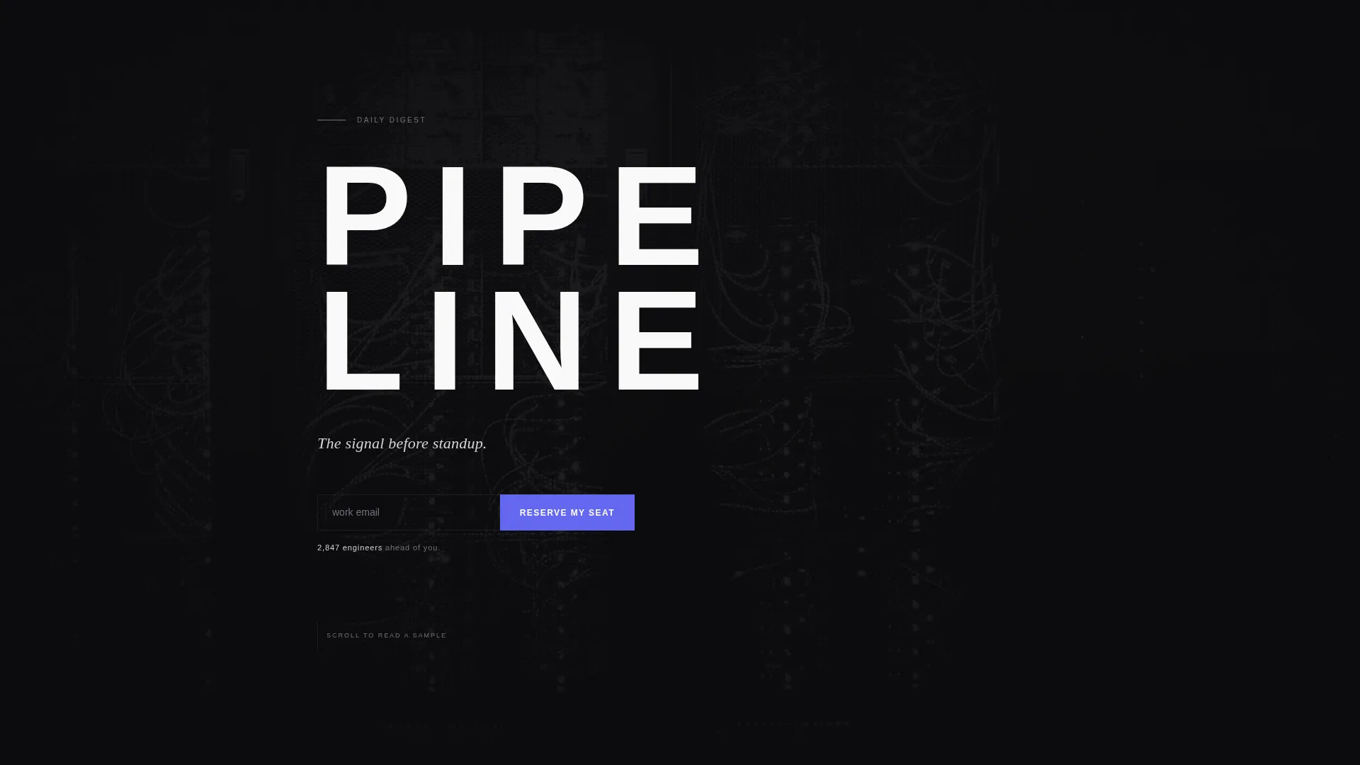
- A Type Over Image hero with enormous tracked-out "PIPELINE" letterforms layered over a desaturated server rack photograph at roughly 8% opacity
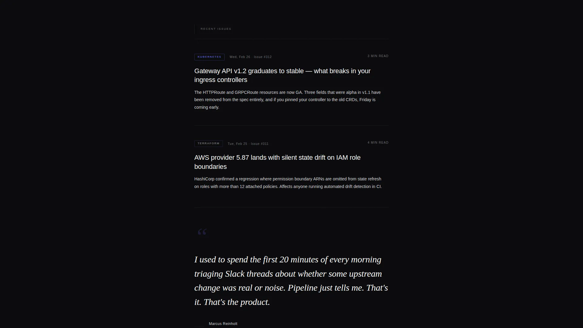
- Three scroll-reveal editorial digest cards displaying a date, headline, two-line summary, and a category pill (Kubernetes, Terraform, Platform)
- A named subscriber pull-quote block for social proof, plus a live waitlist counter showing real queue depth below each email capture field
Feature list
This template includes a focused set of purpose-built components. Each one serves the single goal of converting senior engineers into waitlist signups.
Type Over Image Hero Block
A full-width hero section layers enormous, tracked-out sans-serif letterforms over a barely-visible server rack photograph at approximately 8% opacity. The image provides depth and texture without competing with the typography. A single silver italic sentence, "The signal before standup.", anchors the composition.
Dual Call-to-Action Placement
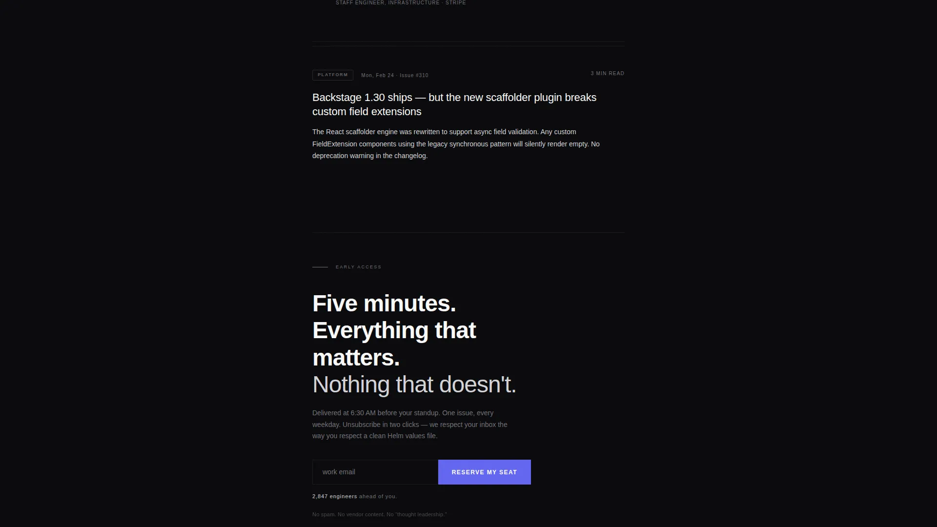
The primary call-to-action button labeled "Reserve My Seat" appears twice on the page. The first instance sits directly beneath the hero sentence for engineers who decide immediately. The second follows the editorial cards for visitors who needed proof before committing.
Scroll-Reveal Editorial Cards
Three digest sample cards enter the viewport one at a time with a subtle vertical translation animation. Each card shows a date, a tightly written headline, a two-line summary, and a color-coded category pill. The staggered reveal mimics the rhythm of flipping through a carefully edited magazine.
Named Subscriber Pull-Quote
A single pull-quote from a named staff engineer at a recognizable company interrupts the card flow. It breaks the visual pattern intentionally, creating a moment of human credibility in an otherwise typographic layout.
Live Waitlist Counter
A dynamic counter displaying a queue number sits directly below each email input field. It manufactures genuine scarcity by showing how many engineers have already reserved a seat, without fabricating urgency.
Ghost-Text Email Input with Indigo call to action
A single email input field with ghost text reading "work email" pairs with an electric indigo call-to-action button. The indigo accent appears nowhere else on the page, making the interactive state impossible to miss against the void black background.
Page sections overview
| Section | Purpose |
|---|---|
| Hero Type Block | Establishes authority with massive tracked typography and first email capture |
| Sample Digest Cards | Demonstrates editorial quality through three scroll-reveal content examples |
| Subscriber Pull-Quote | Builds social proof with a named, role-identified testimonial |
| Second call to action Block | Recaptures visitors who scrolled past the hero before committing |
| Minimal Footer | Closes the page cleanly with no distracting navigation or social links |
Design & branding system
The visual identity follows a Luxe Minimal theme built on a Cinematic Dark color palette. Every color decision is deliberate and tightly constrained.
- Four-color palette: void black (#09090B) as the base, brushed gunmetal (#1C1C1E) for card surfaces, cool silver (#D4D4D8) for body text, and electric indigo (#6366F1) reserved exclusively for the call-to-action button and interactive hover states
- Typography uses DM Sans for body copy and user interface elements, with Fraunces in serif italic for the pull-quote, creating a purposeful contrast between utilitarian clarity and editorial warmth
- Generous negative space and no decorative elements keep the layout feeling like a curated print object rather than a webpage
Mobile & speed optimization
The template is designed desktop-first to match how senior engineers consume long-form content at the start of their day. It scales cleanly to smaller viewports without sacrificing the editorial tone.
- Single-column layout adapts naturally across screen sizes, preserving the vertical reading rhythm on both desktop and mobile
- Scroll-reveal animations use staggered fadeInUp timing to maintain a deliberate, unhurried feel even on devices with smaller displays
How this template helps you convert
The conversion strategy is built around credibility before capture. Nothing asks for an email address before proving the newsletter deserves one.
- The hero establishes authority immediately through typographic scale and a precise editorial subheadline, reducing the time it takes a skeptical senior engineer to understand the value proposition.
- The three editorial sample cards act as a live preview of the newsletter itself, letting the content quality speak before the call-to-action appears a second time.
- The live waitlist counter paired with a single-field email input removes decision friction entirely. There is one action on the page, and the queue number makes it feel worth taking now.
Other information about this template
This template is purpose-built for the DevOps and platform engineering newsletter niche. A few additional details are worth noting for teams evaluating it.
- The footer follows a Superhuman-style extreme minimal pattern: no navigation clusters, no social icon rows, no secondary links
- Film grain overlay and GSAP-powered scroll animations contribute to the cinematic atmosphere described in the design brief
- The page uses server components for static content sections and client components for animated elements, following the build split described in the project details
- The template is English-language and US-centric in its naming conventions and social proof framing
- No secondary conversion path exists by design. The single-column flow keeps all attention on one field and one button.
Theme
Luxe Minimal
Creative direction
Curated Collection
Color system
Cinematic Dark
Style
Single Column Flow
Direction
Waitlist/Coming Soon
Page Sections
Type Over Image Hero Block
Dual Call-to-action Placement
Scroll-reveal Editorial Cards
Named Subscriber Pull-quote
Live Waitlist Counter with Email Input
Related questions
Can I change the sample digest card content to match my newsletter topics?
Does the live waitlist counter connect to a real signup count?
Is this template suitable as a coming soon page before a newsletter launches?
Can I replace the pull-quote with a real subscriber testimonial?
Does the template include the scroll-reveal animation behavior described in the design brief?



