Demo Day Platform Landing Page Template
Pitch is a card grid landing page built for demo day platforms. It pairs a full-viewport dashboard screenshot header with stat-driven feature cards that build a compelling case for your product. The design uses a high-contrast dark palette, live-status indicators, and a dual-path app download call to action that earns its click.
by Rocket studio
Quick summary
Pitch is a single-page, modular card grid landing page designed for demo day platforms. It opens with a live dashboard screenshot that sets the scene instantly, then walks visitors through a series of hard-stat and feature-reveal cards. The page closes with a clear app download call to action backed by everything the visitor just read.
Who this template is for
This template is built for the people who run, judge, and survive demo days. It speaks directly to the operational pressure of managing high-stakes pitch events at scale.
- Accelerator program managers who need to schedule and promote cohort showcases without losing investor interest between events
- Venture capital associates triaging dozens of pitches in a single afternoon and needing a clean, fast way to capture deal signals
- First-time founders who want a professional platform to present their ask and track follow-on interest after the event
What problem this template solves
Demo day logistics are famously broken. Program managers burn hundreds of hours on coordination. Investors walk away with business cards and fading memories. Founders have no reliable way to know who was genuinely interested. This template gives a demo day platform the landing page it needs to make that pain feel immediate and solvable.
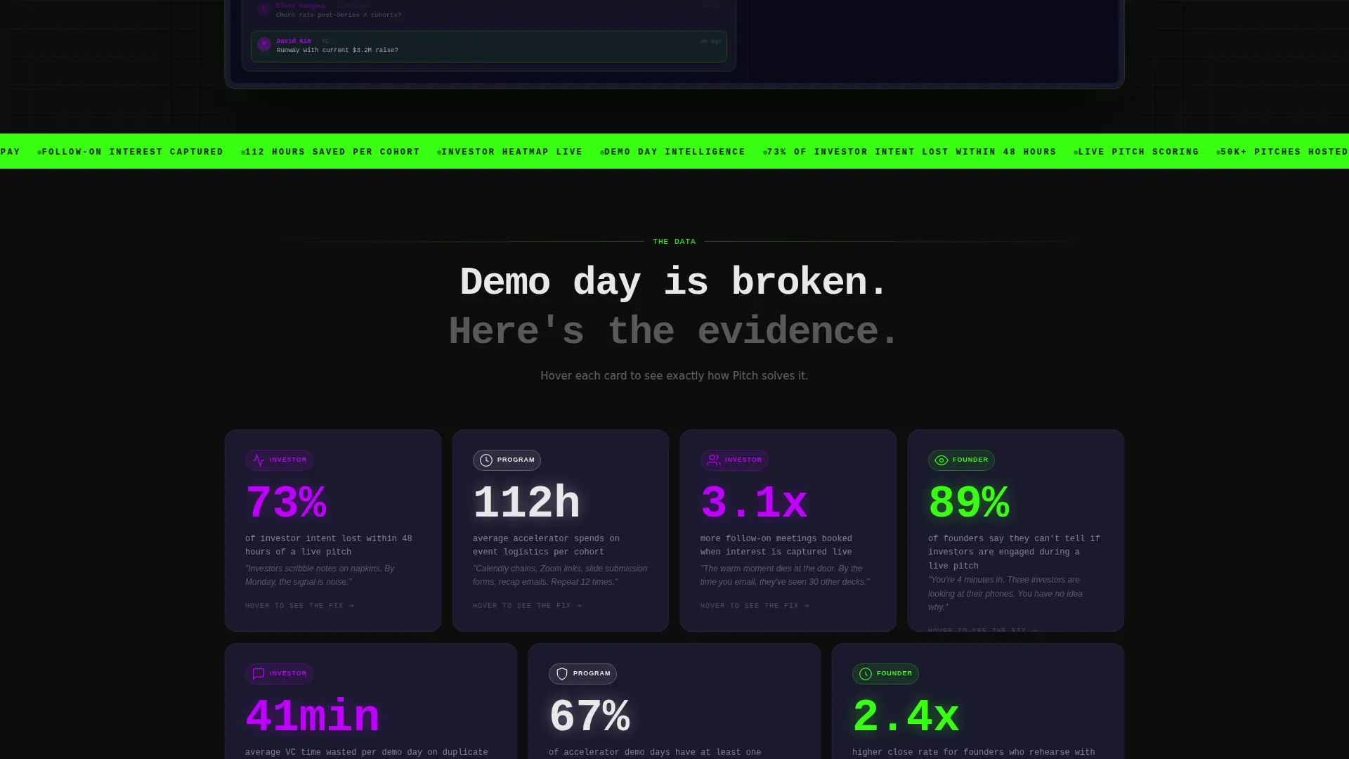
- The stat-card and feature-reveal structure shows visitors exactly how much value is being lost under their current process
- The app download call to action gives a clear, low-friction next step once the case has been made
- The live counter and secondary video link let skeptical visitors verify the platform's traction before committing
What you get with this template
You get a fully structured, modular card grid landing page ready to represent a demo day platform. Every section is purposefully sequenced to build credibility and drive toward a download.
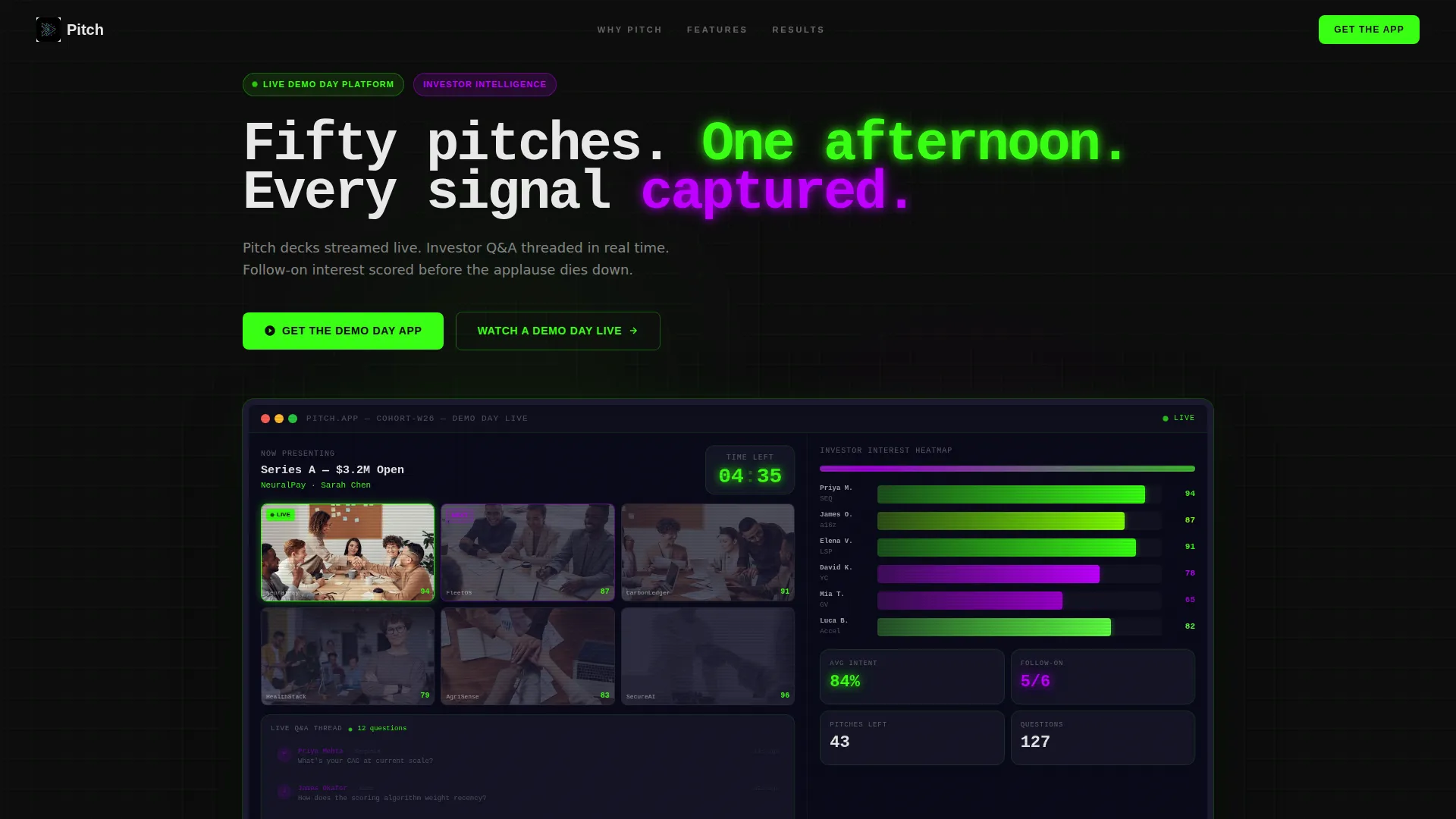
- A full-viewport product screenshot header with headline, countdown clock, and live event dashboard detail
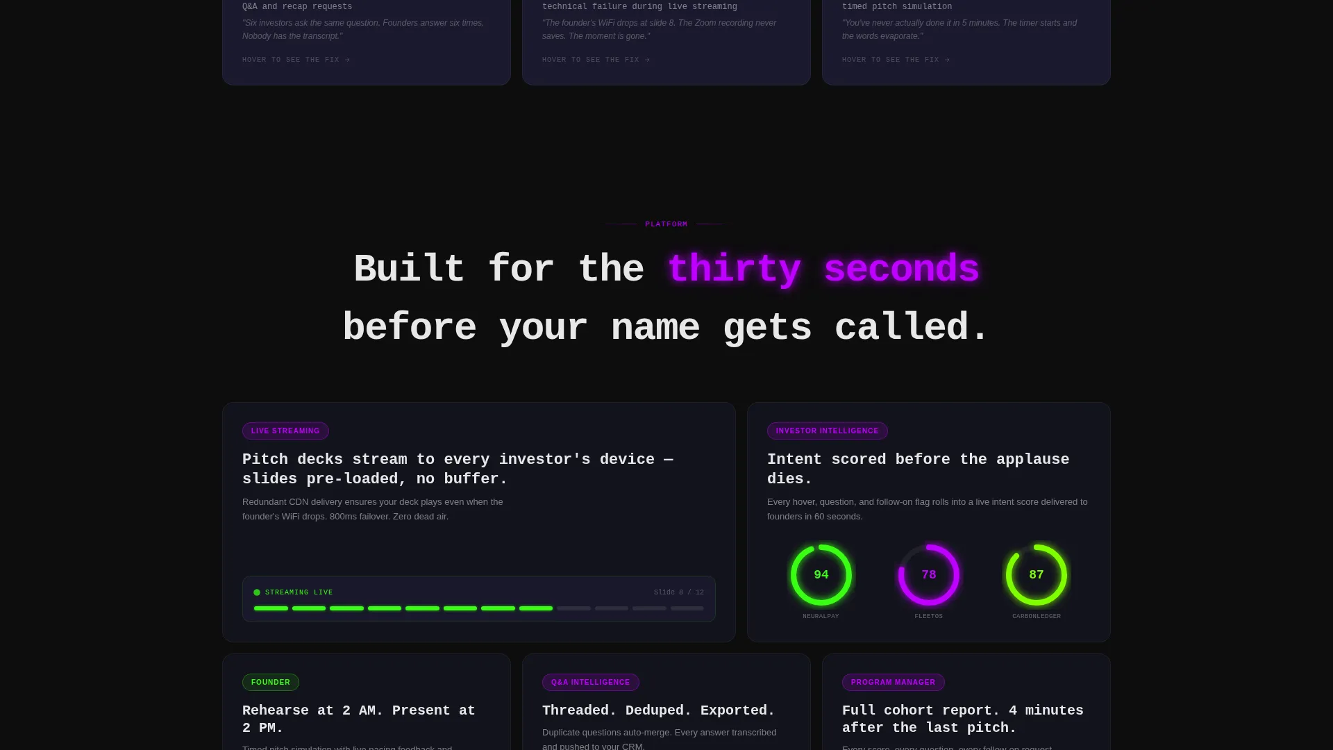
- Seven stat cards paired with seven feature-reveal cards that build the case section by section
- A dual-path conversion footer with app store badges, a single-field email input, a live pitch counter, and a secondary video link
Feature list
This template includes a focused set of design and layout features drawn directly from the brief. Each one serves the demo day platform narrative.
Full-Viewport Dashboard Header
The header stretches the platform's live event screenshot across the entire viewport width. It shows a grid of founder video thumbnails, an investor interest heatmap, a countdown clock reading 04:47, and a scrolling real-time question-and-answer thread. A single headline in data-white sits above the image.
Stat Card and Feature Reveal Grid
The page body is a modular card grid where each stat card leads with a hard number about demo day inefficiency. On interaction, the card flips to reveal the specific platform feature that addresses that stat. The sequence mimics the rhythm of a venture research memo.
Live Platform Counter Card
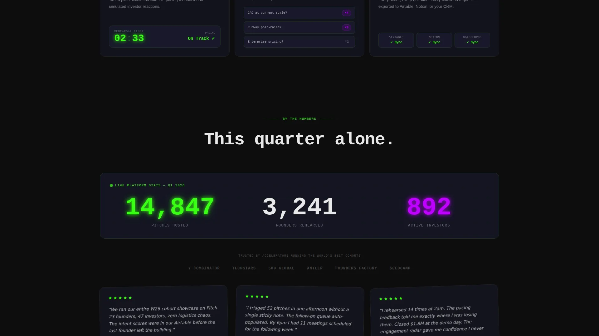
A dedicated card at the bottom of the grid displays a live counter showing pitches hosted on the platform during the current quarter. This gives first-time visitors a real-time proof point before they reach the call to action.
Dual-Path App Download Section
The primary call to action reads "Get the Demo Day App" and is paired with App Store and Google Play badges. A single-field email input labeled "Or send yourself the link" provides a lower-commitment alternative for visitors not ready to install immediately.
Secondary Video Conversion Link
Below the primary call to action, a "Watch a Demo Day Live" link opens a recorded showcase. This secondary path lets skeptical visitors see the product working in a real event context before deciding to download.
Acid Digital Color System
The template uses a precise four-color palette applied with clear intent. Void black dominates all backgrounds. Terminal phosphor green fires on live indicators, progress rings, and primary buttons. Ultraviolet purple marks investor-side features and premium badges. Interface cool gray layers card surfaces so each module reads as a distinct floating element.
Page sections overview
| Section | Purpose |
|---|---|
| Viewport Header Screenshot | Establishes platform context and live event energy instantly |
| Headline Above Screenshot | Delivers the core value statement in a single line |
| Stat Card Row 1 | Opens the industry-pain narrative with a hard data point |
| Feature Reveal Card 1 | Shows the platform solution paired to the first stat |
| Stat Card Row 2 | Escalates the problem with a second quantified pain point |
| Feature Reveal Card 2 | Closes the second pain loop with a product screenshot |
| Stat and Feature Cards 3-7 | Builds the full case across five more pain and fix pairings |
| Live Pitch Counter | Provides social proof through a real-time platform metric |
| App Download Section | Primary conversion with dual store badges and email input |
| Secondary Video Link | Offers a watch-first alternative for hesitant visitors |
Design & branding system
The visual identity follows a Dashboard Pro theme running an Acid Digital color system. Every design decision reinforces the sense of a live, data-driven event environment.
- The four-color palette uses void black (#0D0D0D) for all backgrounds, terminal phosphor green (#39FF14) for live indicators and primary buttons, ultraviolet purple (#BF00FF) for investor features and premium badges, and interface cool gray (#1A1A2E) for card surfaces
- Data-white (#E8E8E8) is used exclusively for typography, keeping every headline and body line legible against the dark backgrounds
- Card surfaces are layered in cool gray so each module floats with its own sense of depth, while green and purple accents create a clear visual hierarchy between standard features and investor-tier capabilities
Mobile & speed optimization
The modular card grid layout is structured to reflow cleanly across screen sizes. The high-contrast color system keeps every element readable on small displays without requiring color adjustments.
- Each card module is self-contained, so the grid stacks vertically on mobile without losing the stat-to-feature reveal logic
- The product screenshot header is framed with a subtle device bezel that scales proportionally, keeping the live dashboard detail legible at smaller widths
- Typography uses data-white at sizes calibrated for readability across viewport widths, avoiding the contrast issues common in dark-theme templates
How this template helps you convert
The page is engineered so that by the time a visitor reaches the call to action, the case for the product has already been made seven times over.
- The stat cards create specific, quantified urgency. Visitors recognize their own operational pain in each number, which makes the feature reveal feel like a direct answer rather than a sales pitch.
- The live pitch counter and secondary video link remove the two most common objections before the download ask. Visitors can verify platform traction and watch the product in action without leaving the page.
- The dual-path call to action lowers the commitment threshold. Visitors who are not ready to install can enter their email instead, giving the platform a follow-up touchpoint without losing the lead.
Other information about this template
This template is part of the Startup and Launch category, specifically designed for the demo day platform niche within startup events and competitions. It is built using the Card Grid modular template style with a Dashboard Pro theme.
- The Acid Digital color system is an intentional design identity, not a generic dark mode. The specific hex values are part of the template and should be preserved to maintain the visual narrative
- The Industry Report creative direction means the scroll experience is designed to feel like reading a data-backed memo, not a typical marketing page. This makes it well suited for technically literate audiences like venture capital associates and program managers
- The App Download landing page direction means all layout decisions serve a single conversion goal. The page does not branch into multiple destinations or sub-pages
Theme
Dashboard Pro
Creative direction
Industry Report
Color system
Acid Digital
Style
Card Grid (Modular)
Direction
App Download
Page Sections
Full-viewport Dashboard Header
Stat Card and Feature Reveal Grid
Live Platform Pitch Counter
Dual-path App Download Section
Secondary Video Conversion Link
Acid Digital Color System Application
Related questions
Who is this landing page template built for?
Can I change the color palette or adapt the visual style?
What is the primary call to action on this page?
Does this template include the live counter and video link?
Is this a single-page template or a multi-page build?