Sports Blog & Media Professional Website Template
Playbook is a hub and spoke landing page template built for a weekly sports newsletter that earns the email signup before asking for it. The layout moves through five anchored sections, from a manifesto header to a live sample issue, using a Cinematic Dark palette, gold accent details, and high-motion scroll triggers that give every word the weight of a prestige documentary title card.
by Rocket studio
Quick summary
Playbook is a single-page, anchor-navigated template designed for a weekly sports newsletter. It opens with a full-black manifesto header, guides readers through the story behind the letter, surfaces a real archived edition as proof, then closes with social proof before asking for an email. The writing does the selling. The design stays out of the way.
Who this template is for
This template was built for newsletter writers and independent sports media creators who have a strong editorial voice and want a landing page that matches it. It suits founders launching a paid or free weekly letter, lapsed journalists going independent, and anyone building a content-first subscription product in the sports space.
- Sports newsletter writers launching or relaunching their publication
- Independent sports media creators who want a page that reflects editorial quality
- Fantasy sports commissioners or analysts building a subscriber base
What problem this template solves
Most sports newsletter landing pages look like every other email capture page. They shout. They promise. They ask before they give. This template reverses that dynamic. The writing leads, the design creates atmosphere, and the email ask comes only after the reader has already seen the quality of the work.
- Generic newsletter pages fail readers who are skeptical of another highlight-reel take
- No existing template captures the quiet authority of a niche, opinionated sports letter
- Asking for an email before proving value kills conversion for editorial products
What you get with this template
You get a fully structured, single-page landing page with five distinct anchored sections, each with its own creative direction and purpose. Every layout decision traces back to one goal: let the writing prove itself before the page asks for anything.
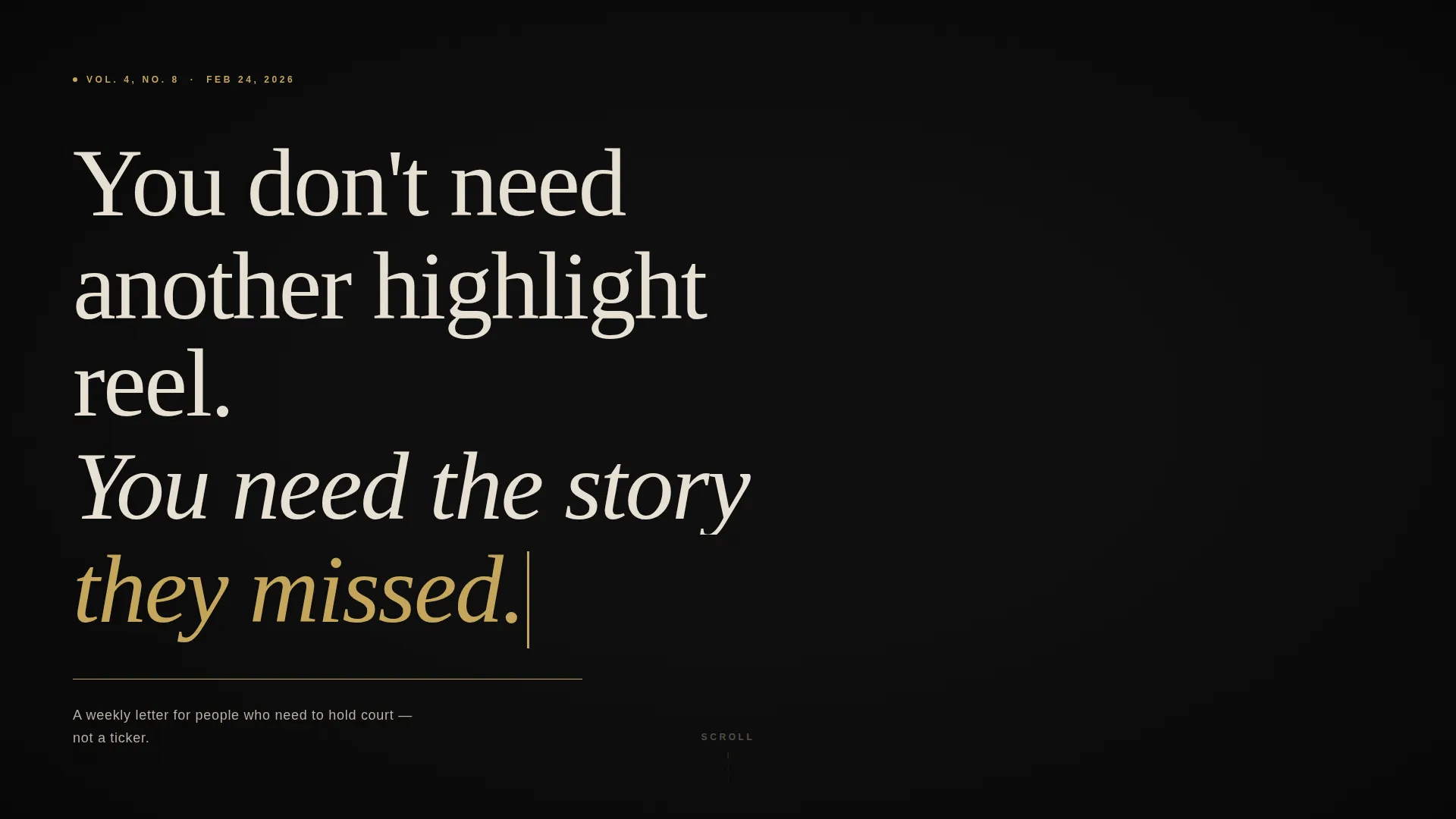
- A full-viewport manifesto header with a typewriter text reveal and animated gold rule
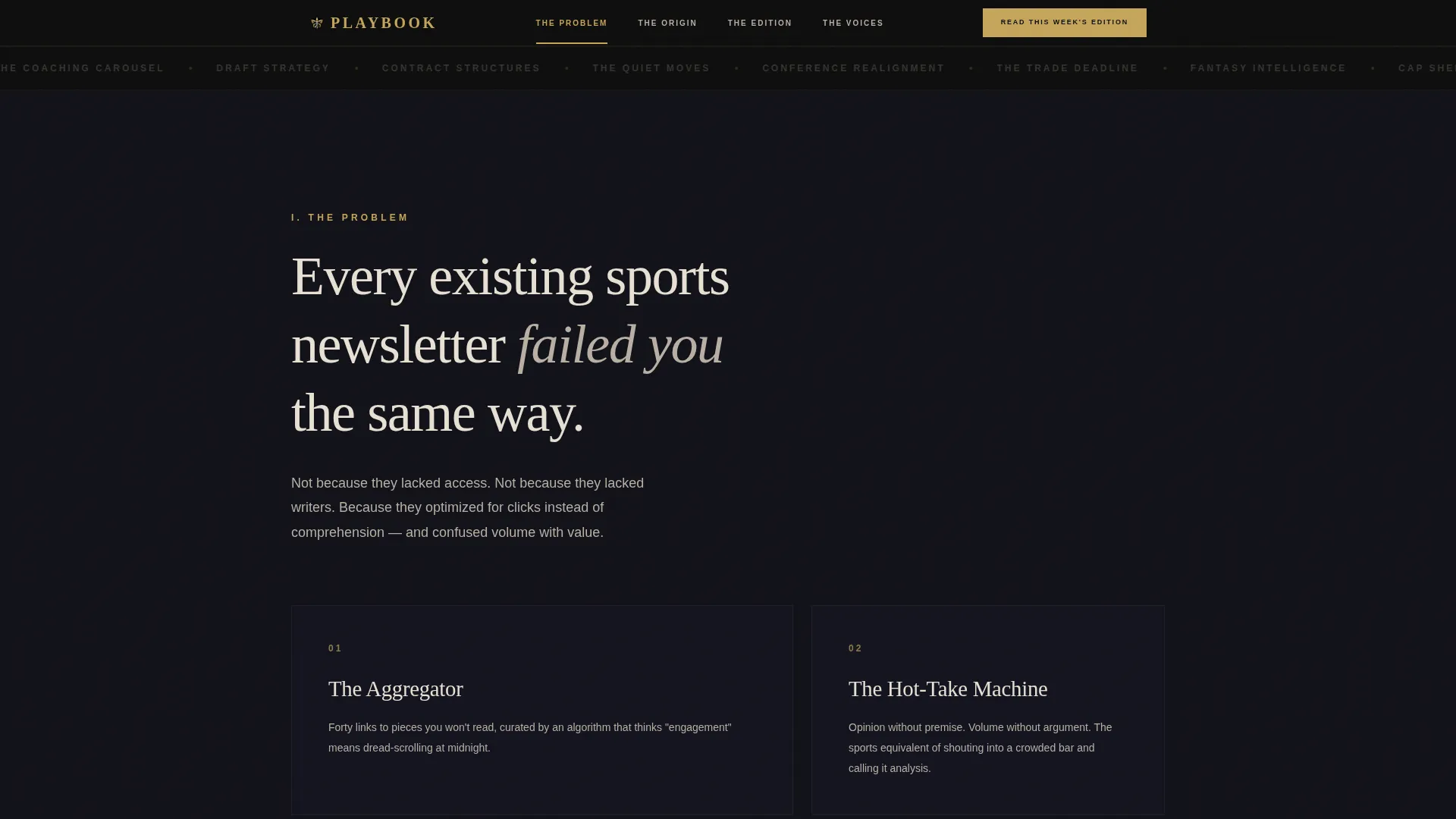
- An anchor navigation bar that highlights the active spoke as the visitor scrolls
- An email gate modal tied to the primary call to action, capturing a single field
Feature list
This template is built around a set of purposeful, editorially driven features. Each one reflects a specific decision about how a premium sports newsletter earns trust and converts skeptical readers.
Typewriter Manifesto Header
The opening viewport is pure midnight black. A serif manifesto appears line by line, as if typed onto a teleprompter, ending with a thin gold rule that draws itself beneath the final line. No imagery competes with the words.
Anchor Navigation with Gold Highlights
A persistent anchor navigation bar links directly to each spoke section. The active section highlight uses the aged gold accent color, giving readers a clear sense of where they are and where the page leads.
Archived Edition Display
One full sample issue is displayed as a readable on-page artifact, with real headlines and real analysis. This is the trust anchor of the page. An email gate call to action appears directly below it.
Email Gate Modal
The primary call to action opens a focused modal with a single email field and no additional friction. The form design stays consistent with the page palette, so the transition feels natural rather than transactional.
Margin Note Testimonials
Reader testimonials are styled as handwritten margin notes on a newsprint texture. The social proof section feels like a physical artifact rather than a polished review block, which matches the editorial tone of the publication.
GSAP Scroll Animations
Each section transition uses staggered fades and scroll-triggered animations built with GSAP (GreenSock Animation Platform). The charcoal background deepens by a shade with each section, pulling the reader further into the experience.
Page sections overview
| Section | Purpose |
|---|---|
| Manifesto Header | Opens the page on pure black with typewriter text reveal and animated gold rule |
| Anchor Navigation Bar | Persistent nav that highlights active spoke with aged gold accent |
| The Problem Spoke | Explains why existing sports newsletters failed the reader |
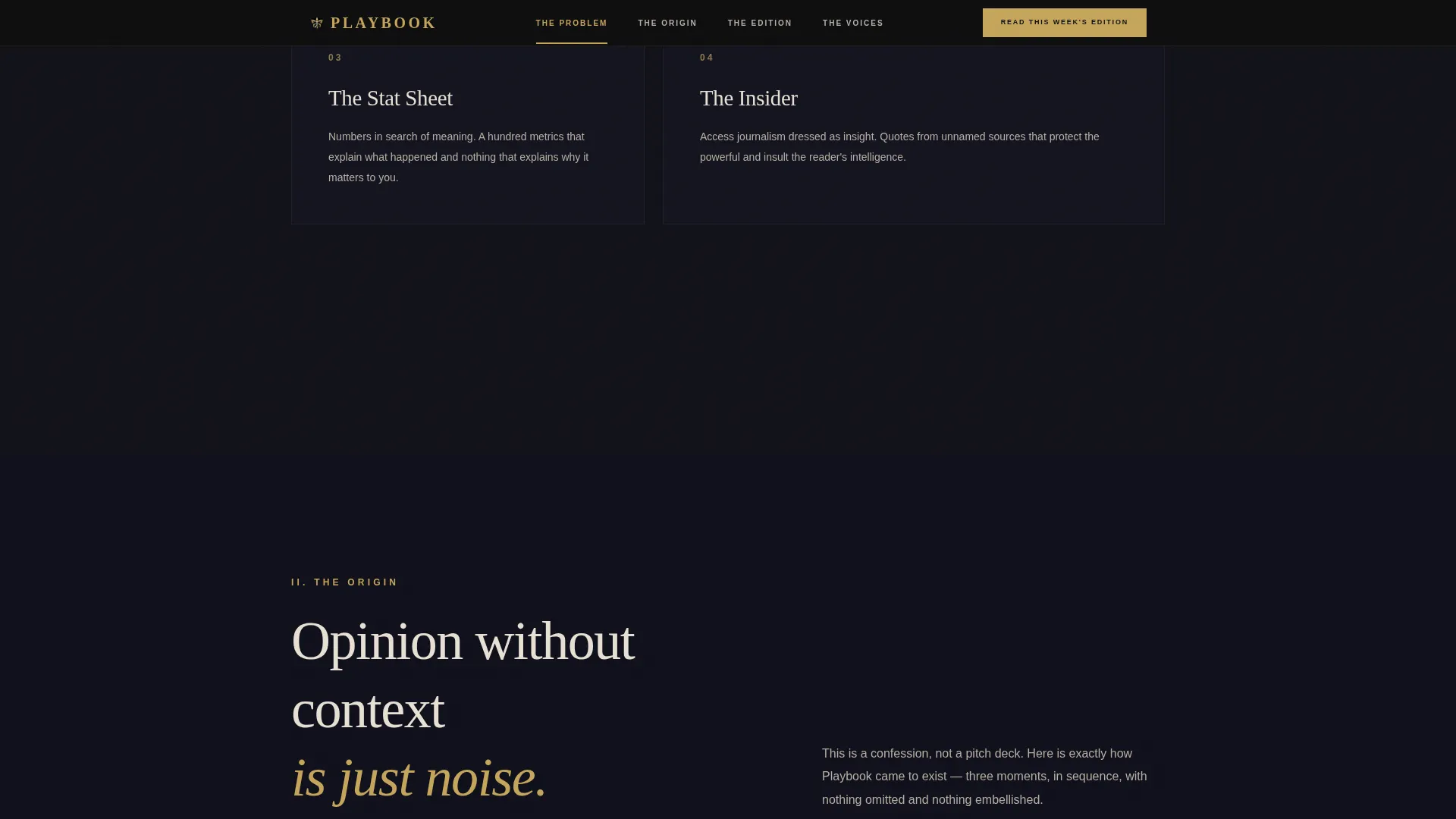
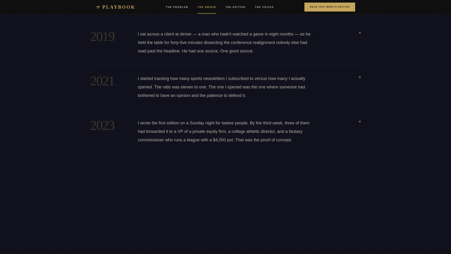
| The Origin Spoke | Shares the moment opinion without context became noise |
| The Edition Spoke | Displays a real archived issue as proof, with email gate call to action |
| The Voices Spoke | Handwritten margin note testimonials styled on newsprint texture |
| Single-Row Footer | Clean linear footer closing the page |
Design & branding system
The visual identity uses a Luxe Minimal approach built on a Cinematic Dark color palette. Every color decision reinforces editorial authority. The typography pairing separates display from utility without ever breaking the atmosphere.
- Color palette: midnight black (#0D0D0D), projection-room charcoal (#1A1A2E), warm parchment (#E8E0D4) for body text, aged gold (#C5A55A) reserved for calls to action, anchor nav highlights, and the logo mark
- Typography: Fraunces serif for display headings and pull quotes, DM Sans for body text and interface elements
- Background depth increases section by section, shifting the charcoal shade darker as the reader scrolls deeper
Mobile & speed optimization
The template is built desktop-first, reflecting the primary reader persona of a finance professional opening the page on a laptop Monday morning. Responsive breakpoints ensure the layout holds on smaller screens without losing the editorial atmosphere.
- Desktop layout is prioritized; all section proportions and type scales are designed for widescreen reading
- Responsive structure adapts the anchor navigation and modal for tablet and mobile viewports
- Static sections use server components for fast initial load; animation layers are handled client-side
How this template helps you convert
This template converts by earning trust before making an ask. The page structure is a deliberate sequence, not a collection of sections.
- The manifesto header qualifies the reader immediately. If the voice resonates, they stay. If not, they were never going to subscribe.
- The archived edition section removes all doubt by showing a full sample issue before asking for an email, turning skeptics into subscribers.
- The secondary archive path offers three headline-only teasers that loop back to the email capture, giving curious readers a second on-ramp without leaving the page.
Other information about this template
This template is part of the Blog and Editorial category, under the Sports Blog and Media subcategory. It is purpose-built for the sports newsletter niche and uses an Origin Story creative direction to build trust through narrative structure rather than feature lists or promises.
- Template style: Hub and Spoke with anchor navigation
- Header concept: Quote and Manifesto with typewriter reveal
- Landing page direction: Content and Resource destination
- Color system: Cinematic Dark
- Theme: Luxe Minimal
- Localization: English, United States sports context, USD pricing reference where applicable
- Footer: Linear single-row pattern
Theme
Luxe Minimal
Creative direction
Origin Story
Color system
Cinematic Dark
Style
Hub & Spoke (Anchor Nav)
Direction
Content/Resource
Page Sections
Typewriter Manifesto Header
Anchor Navigation with Active Highlights
Archived Edition Display
Single-field Email Gate Modal
Handwritten Margin Note Testimonials
GSAP Scroll Trigger Animations
Related questions
Can I replace the sample issue with my own archived edition?
Does the email gate connect to a mailing list platform?
Can I adjust the color palette to match a different brand?
Is this template suitable for a paid newsletter or only free subscriptions?
What makes this different from a standard newsletter landing page template?



