Modern Curated Landing Page Template
Airwave is a Luxe Minimal editorial landing page built for a weekly podcasting curated links newsletter. The single-page layout guides visitors through a cinematic reel header, a first-person origin story, magazine-style testimonial pull quotes, and an inline issue preview. One email field and a sticky subscribe bar keep the conversion path clean and distraction-free.
by Rocket studio
Quick summary
Airwave is a single-page editorial landing page designed for a weekly podcasting newsletter. It opens with a looping short-form reel, builds trust through a founder origin story, and proves value with a real issue preview. The entire page leads toward one goal: a single-click email subscription.
Who this template is for
This template fits audio creators who publish content regularly and want a dedicated, credible home for their newsletter. It works equally well for a solo producer launching a first list or an experienced editor expanding a freelance brand.
- Independent podcasters managing solo production schedules who need a home for their weekly dispatch
- Audio editors building client rosters who want a polished, editorial presence for their newsletter
- Network producers scouting formats who need a quick, trustworthy page to capture industry reader subscriptions
What problem this template solves
Podcast creators spend hours every week hunting for the same links, tools, and industry news their peers are also hunting for. A plain sign-up page does not communicate the value of that curation work. This template solves the credibility gap between "just another newsletter" and a must-read weekly resource.
- No clear way to show prospective subscribers what the newsletter actually contains before they commit
- No narrative structure to turn casual visitors into invested readers who feel part of a story
- No frictionless conversion path that removes every unnecessary field and decision from the sign-up flow
What you get with this template
The template delivers a full single-page layout structured around editorial storytelling and email conversion. Every section is purposeful, every design detail reinforces the analog-print aesthetic, and the subscription mechanics are reduced to their simplest possible form.
- A looping cinematic reel header with a serif fade-in tagline, followed by a scrolling first-person origin story arc
- Magazine-style pull quote testimonials woven into the narrative and a muted gold subscriber count badge
- An inline accordion issue preview showing five real curated links with one-line annotations, plus a dual-placement subscribe form and a sticky subscribe bar
Feature list
This template is built around six core capabilities drawn directly from the Airwave brief.
Looping Short-Form Reel Header
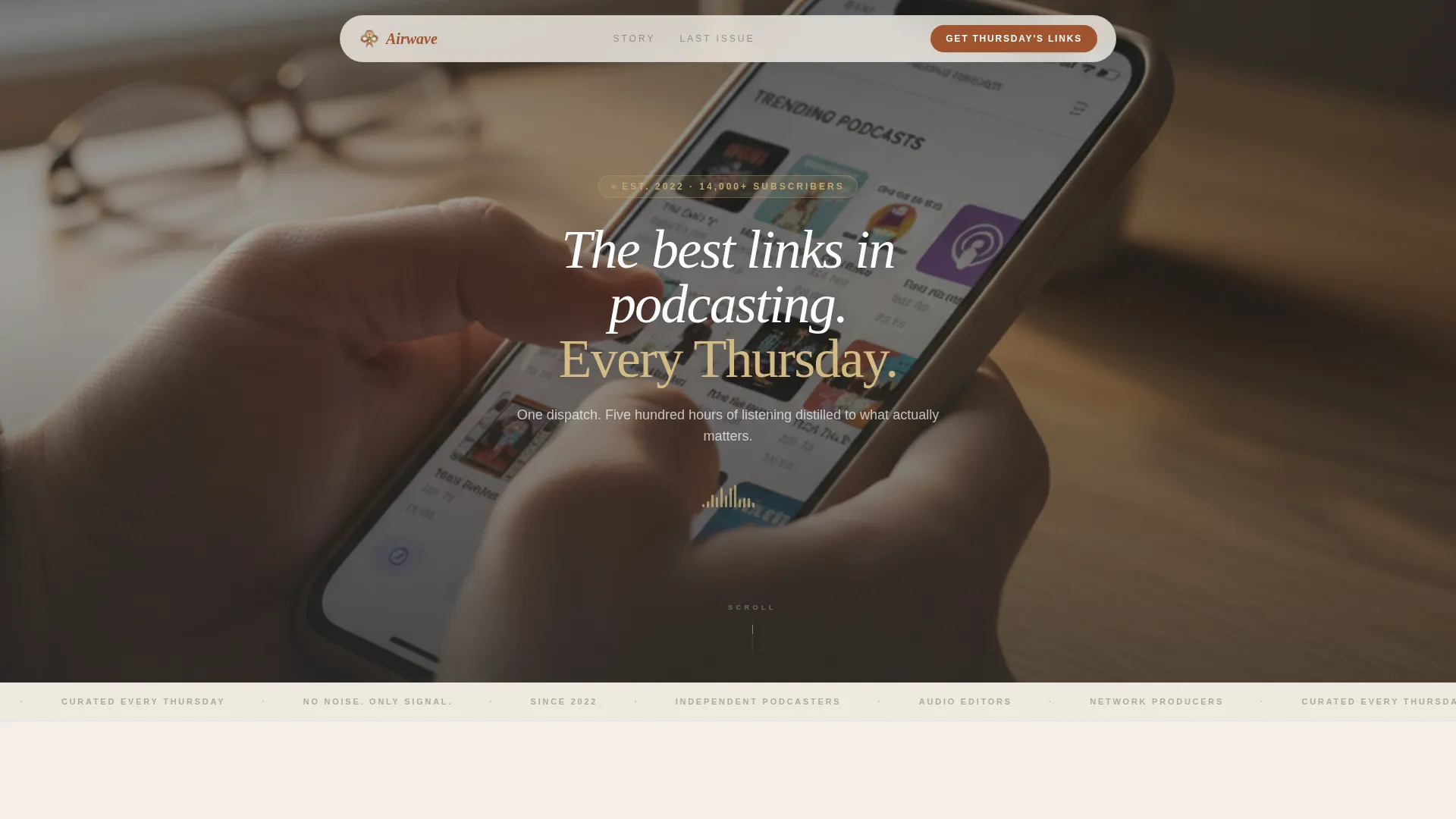
The header plays a fifteen-second looping montage of hands scrolling curated link cards, a waveform pulsing in an editing timeline, and a finger tapping share on a podcast episode. Footage is slightly slowed and grain-treated for a filmic feel. A serif tagline fades in over the reel: "The best links in podcasting. Every Thursday."
Scrolling Origin Story Arc
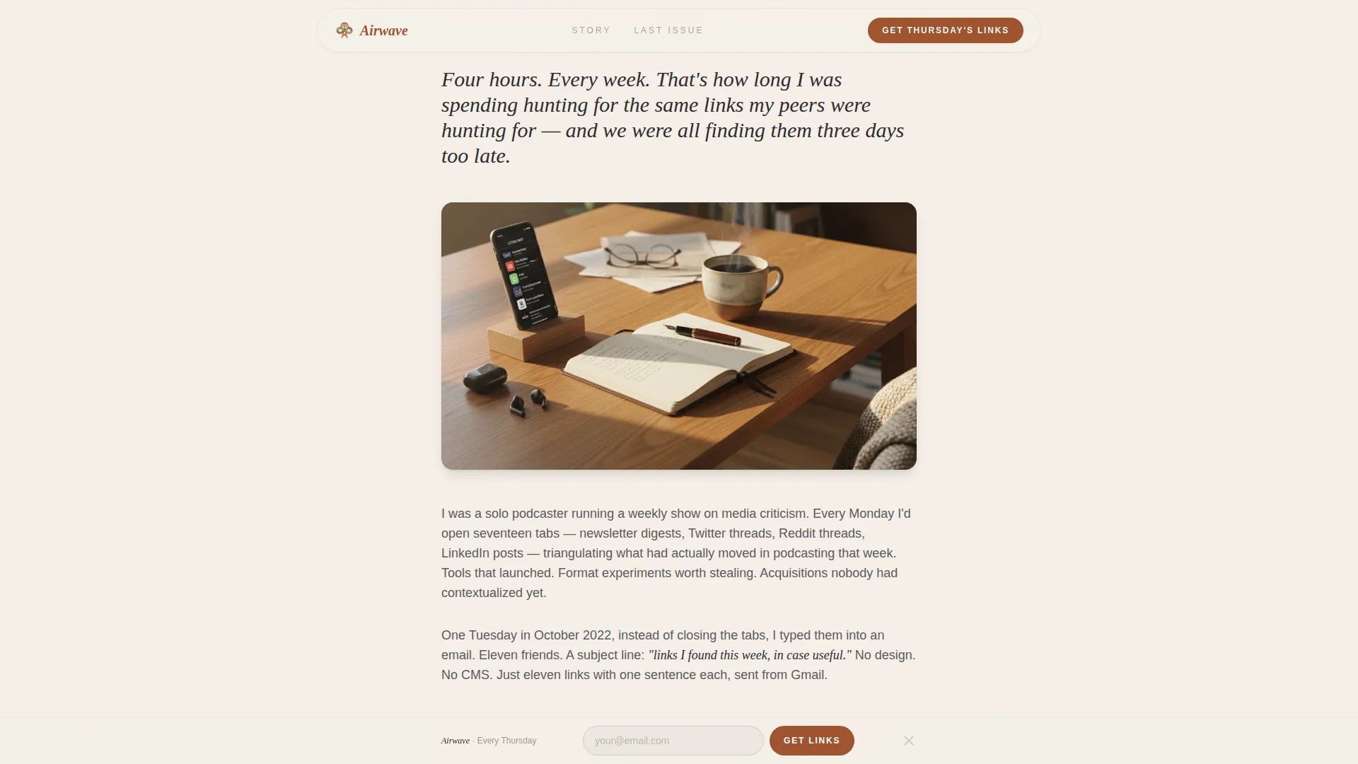
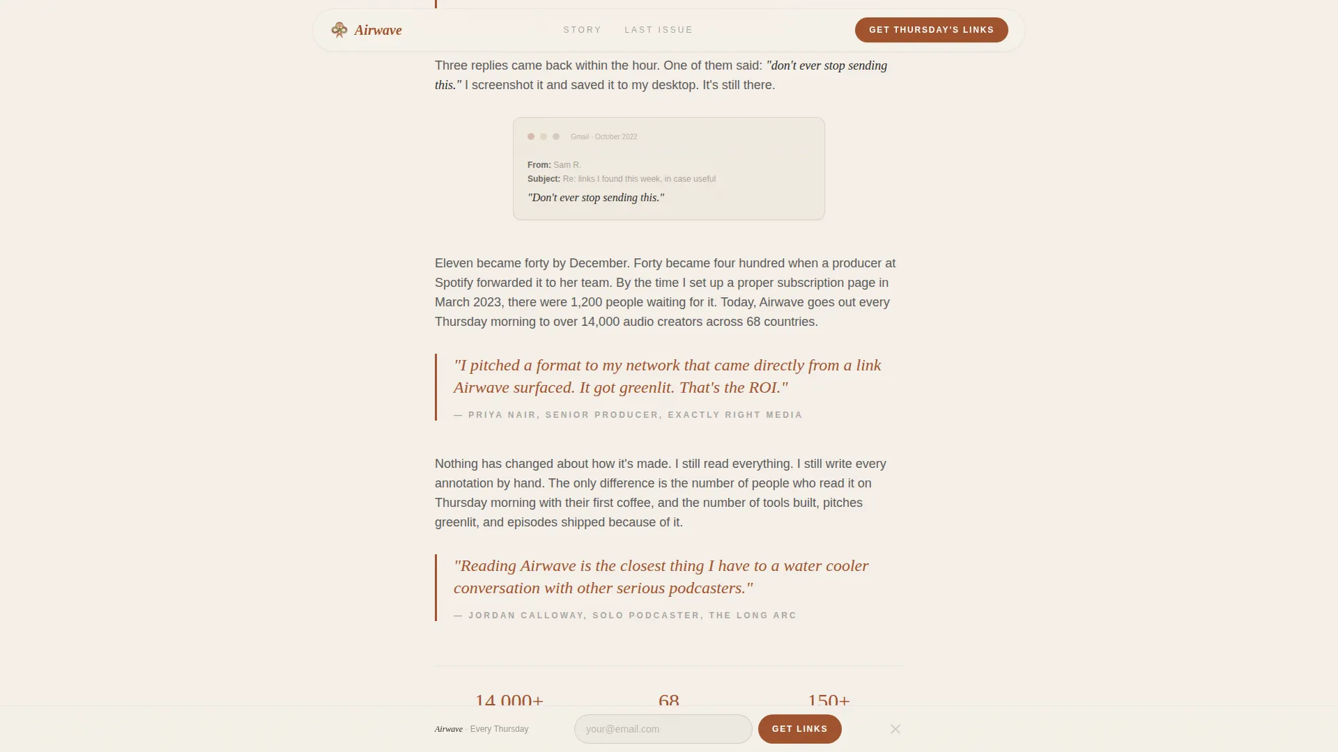
Below the header, a first-person founder narrative unfolds across scroll sections. Each section peels back a new layer of the story, from the initial frustration of spending four hours a week hunting links, to the first hand-typed email to eleven friends, to the screenshot of the first reply, to thousands of readers. The stakes build so the reader arrives at the subscribe form already invested.
Magazine-Style Testimonial Pull Quotes
Testimonials are placed inside the narrative flow as pull quotes, styled the way a magazine feature would use them. They are not stacked in a grid. Each quote appears at the moment in the story where it carries the most emotional weight, reinforcing trust without interrupting the reading rhythm.
Inline Accordion Issue Preview
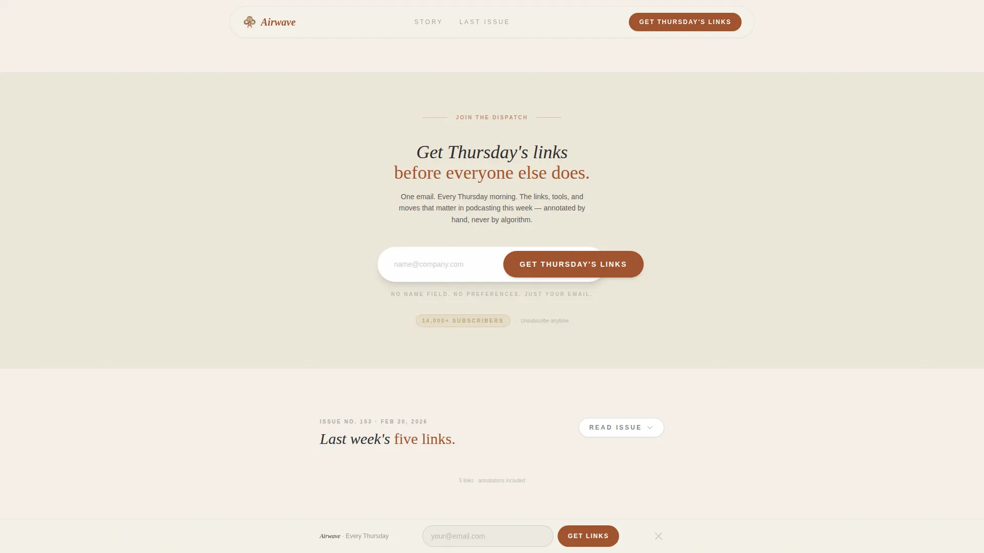
A "Read Last Week's Issue" link opens an inline accordion revealing five real curated links with one-line annotations. This proves the quality of the curation before asking for an email address. It removes the primary objection, "I don't know if this is worth it," directly on the page.
Dual-Placement Subscribe Form
The primary call to action, "Get Thursday's Links," uses a single email input field and a rust-colored submit button. The form appears twice: once embedded at the emotional peak of the origin story and once as a minimal sticky bar fixed at the bottom of the viewport. No name field, no preference checkboxes, one field and one click.
Luxe Minimal Editorial Design System
The full visual identity is built into the template. Parchment cream backgrounds, deep rust headlines and accent links, charcoal body text, and muted gold hover states and badge details work together to create a deliberate, tactile analog feel in a digital space. Fraunces serif handles display type and DM Sans handles body copy.
Page sections overview
| Section | Purpose |
|---|---|
| Cinematic Reel Header | Establishes editorial tone and introduces the newsletter tagline |
| Origin Story Scroll | Builds emotional investment through a first-person founder narrative |
| Testimonial Pull Quotes | Weaves social proof into the narrative at key emotional moments |
| Last Week's Issue | Proves newsletter value with a real inline accordion issue preview |
| Embedded Subscribe Form | Captures email at the emotional peak of the origin story scroll |
| Sticky Subscribe Bar | Keeps the conversion path accessible throughout the full page scroll |
| Minimal Footer | Closes the page cleanly without distracting from the subscribe goal |
Design & branding system
The visual identity follows a Luxe Minimal theme that evokes a limited-edition print zine. Every color and typeface choice reinforces the feeling of something handpicked and deliberately crafted, not algorithmically assembled.
- Color palette: warm parchment cream (#F5F0E8) for backgrounds, deep rust (#A0522D) for headlines and accent links, charcoal (#2B2B2B) for body text, and muted gold (#C2A96E) for hover states and subscriber count badges
- Typography: Fraunces serif for all display headings and the hero tagline, DM Sans for body copy, creating a premium editorial contrast between expressive display and clean readable body text
- Texture and motion: a CSS grain overlay adds analog warmth, GSAP scroll reveals animate section entries, and a looping reel crossfade in the header reinforces the filmic, tactile identity
Mobile & speed optimization
The template is designed mobile-first, which reflects where the target audience actually reads. Podcasters and audio editors are primarily on their phones, so the layout, typography scale, and interactive components are all sized and sequenced for a small screen before being refined for desktop.
- Mobile-first layout with touch-friendly accordion interaction for the inline issue preview and a sticky subscribe bar sized for thumb-reach at the bottom of the screen
- Static-first rendering approach using server components for all non-interactive sections, keeping the page lightweight while reserving client-side interactivity for the accordion, sticky bar show/hide, and magnetic call-to-action behavior
How this template helps you convert
The entire page is structured as a single conversion funnel with no dead ends and no unnecessary decisions. Every section either builds trust or removes friction before asking for an email address.
- The origin story arc builds genuine emotional investment before any ask is made, so visitors arrive at the subscribe form already feeling that this newsletter is worth their inbox.
- The inline accordion issue preview eliminates the main objection by showing real curated content with annotations before asking for an email address, replacing skepticism with proof.
- The dual-placement form strategy keeps the "Get Thursday's Links" call to action available at the right emotional moment in the scroll and persistently accessible via the sticky bar throughout the full page.
Other information about this template
This template is part of the Blog & Editorial category, specifically built for the Podcasting Newsletter subcategory. It is designed for the Podcasting Curated Links Newsletter niche and carries an Intersection Match Score of 13, indicating a strong alignment between the editorial style, the lead generation direction, and the target audience needs.
- The template style is Editorial/Magazine, meaning the layout prioritizes long-form narrative scroll design over short-form product feature grids
- The creative direction is Origin Story, which is an intentional structural choice, not decorative, because founding narratives convert well for content subscription products by making the reader feel like a participant rather than a prospect
- The header concept is Short-Form Reel, implemented as a CSS looping montage rather than a hosted video embed, keeping the filmic quality without introducing external video dependencies
- The landing page direction is Lead Generation with a single conversion goal: email subscription via the "Get Thursday's Links" call to action
Theme
Luxe Minimal
Creative direction
Origin Story
Color system
Parchment & Rust
Style
Editorial/Magazine
Direction
Lead Generation
Page Sections
Looping Cinematic Reel Header
Scrolling First-person Origin Story
Magazine-style Pull Quote Testimonials
Inline Accordion Issue Preview
Dual-placement Subscribe Form
Luxe Minimal Editorial Design System
Related questions
Can I change the newsletter name and founder story text?
Does the accordion issue preview include real links from the start?
Can I update the color palette to match my own brand?
Is the sticky subscribe bar always visible while scrolling?
Do I need a third-party tool to connect the subscribe form?



