Vintage Collector Newsletter Landing Page Template
Pop is a horizontal scroll landing page built for a weekly Funko Pop collecting newsletter. Styled as a vintage broadsheet, it guides visitors through curated editorial panels before landing them at a frictionless email signup. The design rewards curiosity, every swipe feels like turning a page on intel the rest of the collector community hasn't seen yet.
by Rocket studio
Quick summary
Pop is a single-page, horizontal scroll landing page designed to drive newsletter signups for a weekly Funko Pop collecting dispatch. It mimics the feel of an aged broadsheet, using ink-and-paper aesthetics to build anticipation panel by panel. Visitors arrive at a newspaper front page and swipe through curated editorial sections before reaching a back-page signup.
Who this template is for
This template is built for newsletter creators operating in the collector community space. It suits anyone running a weekly intelligence dispatch aimed at engaged, deal-aware readers.
- Funko Pop collectors who want to build a subscriber base around vault alerts and price data
- Resellers and grail-hunters looking to establish a trusted weekly source for drop lists
- Newsletter operators who want a landing page that feels as curated and credible as the content itself
What problem this template solves
Most newsletter landing pages look the same, a headline, a field, a button. For a collector audience that values curation and exclusivity, that approach falls flat. This template solves the trust gap before the signup moment.
- Visitors need to feel the value before they commit, and redacted preview headlines show the dispatch is already written and waiting
- A generic page gives no sense of editorial identity, while this template's broadsheet format signals that the newsletter is serious, specific, and worth reading
- The horizontal scroll pacing builds urgency organically, so by the time readers reach the call to action they are already invested
What you get with this template
You get a fully designed, section-led horizontal scroll landing page with a distinct Heritage and Story visual identity. Every component is built around the editorial broadsheet concept from the source brief.
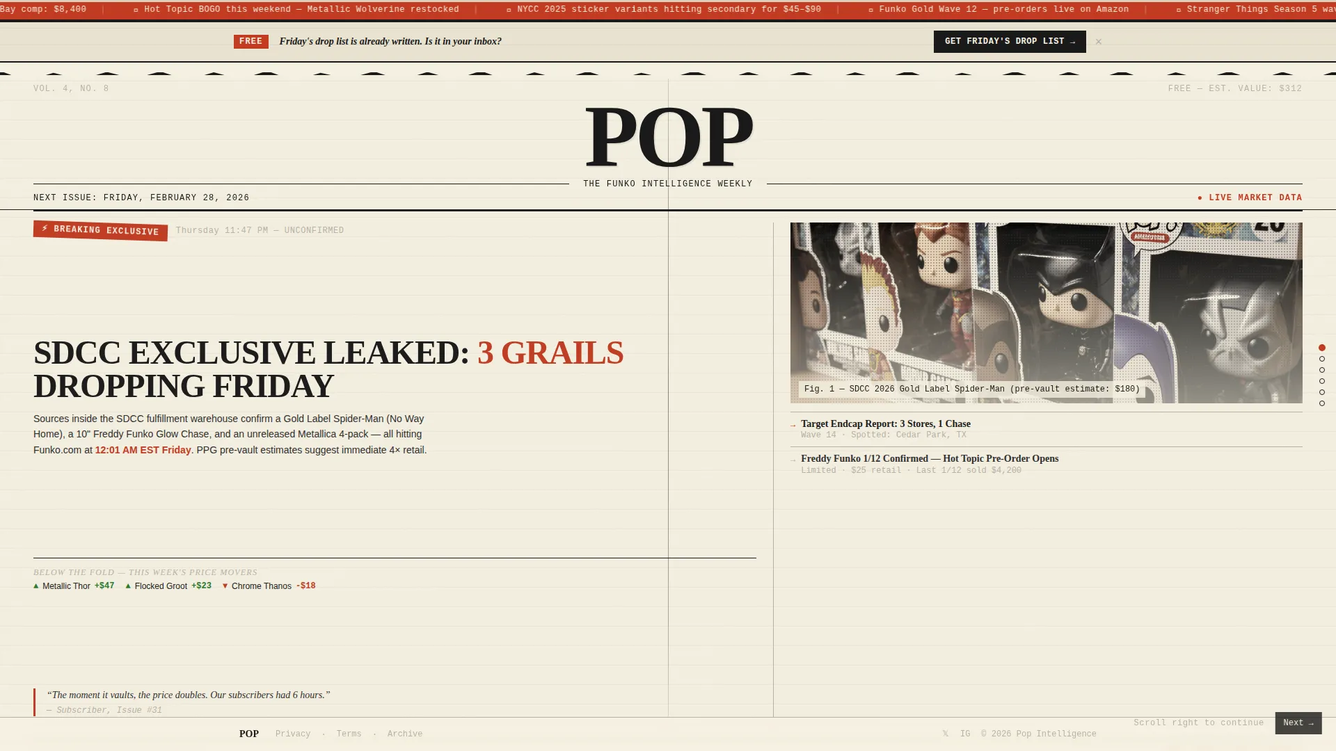
- A full-viewport newspaper front page header with masthead, halftone hero image treatment, lead story headline, and a fold-line subhead teasing price movers
- Four editorial scroll panels covering Market Watch, The Vault, Grail of the Week, and Reader Shelves, each designed as a curated newspaper section
- Three strategically placed call-to-action moments including a torn-paper banner, an inline classified ad between panels, and a full back-page signup panel with redacted preview headlines
Feature list
This section covers the core built-in components and design capabilities included in the template.
Horizontal Scroll Panel Layout
The page flows horizontally across five distinct panels. Each panel functions as a self-contained newspaper section. Swiping left mimics turning a broadsheet page, building a sense of forward momentum and escalating exclusivity.
Newspaper Front Page Header
The header fills the full viewport as a broadsheet front page. It includes a heavy condensed serif masthead, a banner date for the next issue send date, a halftone-treated hero image of a boxed figure, a lead story headline, and a below-the-fold subhead.
Redacted Preview Headlines
Three upcoming issue headlines appear on the back-page signup panel in a redacted state. This component acts as proof of value, showing visitors that Friday's content is already ready and giving them a specific reason to subscribe before the information goes public.
Three-Point Call to Action Placement
The signup prompt appears in three distinct forms across the page. First as a torn-paper banner above the masthead, then as an inline classified ad between scroll panels, and finally as a dedicated back-page panel with a single email field. No name field is required.
Halftone and Scan Line Visual Effects
The template uses halftone dot treatments on hero imagery and scan line animation effects throughout. These effects reinforce the printed-paper aesthetic and give the page its tactile, collector-zine personality.
Editorial Data Panels
The Market Watch and Vault panels display price movement data and newly vaulted figures in a structured editorial layout. Price and data typography uses a monospaced style to distinguish data from editorial copy, keeping information clear and scannable.
Page sections overview
| Section | Purpose |
|---|---|
| Torn-Paper call to action Banner | First signup prompt, pinned above masthead |
| Newspaper Front Page | Hero header with masthead, halftone image, lead headline |
| Below the Fold Subhead | Teases week's price movers before scroll begins |
| Market Watch Panel | Displays top price risers and fallers with directional arrows |
| The Vault Panel | Lists newly vaulted figures with last retail sighting context |
| Grail of the Week | Single deep-dive with provenance and price history |
| Reader Shelves Panel | Subscriber collection photos rendered in halftone style |
| Inline Classified Ad call to action | Mid-scroll signup prompt styled as a classified advertisement |
| Back Page Signup | Full-panel email field, redacted headlines, and final call to action line |
| Minimal Footer | Centered superhuman-style footer with minimal links |
Design & branding system
The visual identity follows a Heritage and Story theme built on an Ink and Paper color system. Every design decision reinforces the feeling of a collector's edition zine pulled from a longbox.
- Color palette: aged newsprint cream (#F5F0E1) as the dominant background, printer's ink (#1A1A1A) for all typography, red pencil editor's mark (#C23B22) for prices and exclusive callouts, and faded column-rule gray (#B8B2A6) for ruled lines between content blocks
- Typography: Fraunces in heavy condensed weights handles serif headlines, JetBrains Mono handles all price and data display, and DM Sans handles body copy for clean readability
- Texture and structure: column rules, pull quotes, a visible center crease, and paper-grain details sustain the broadsheet illusion across every horizontal panel
Mobile & speed optimization
The template is designed desktop-first, prioritizing the horizontal scroll experience on larger screens. A mobile fallback layout is included so the content remains accessible on smaller devices.
- Desktop horizontal scroll uses GPU-accelerated transforms to target smooth panel transitions
- Page-turn transition animations, stagger reveal effects, and halftone treatments are built to run at a consistent frame rate on modern hardware
- Mobile fallback converts the horizontal panel flow into a vertical reading experience without losing the editorial identity
How this template helps you convert
The conversion strategy is built into the page architecture. Visitors are not asked to subscribe immediately; they are shown value first and given multiple low-friction moments to act.
- The redacted preview headlines on the back page give visitors tangible proof that the next issue is already prepared, turning the signup into an access decision rather than a trust leap
- The three-point call-to-action placement means a visitor who is ready to subscribe can act at any point in the scroll journey without being forced to reach the end
- The single-field signup removes friction entirely: no name, no preferences, just an email address and a button labeled "Get Friday's Drop List"
Other information about this template
This template is categorized under Blog and Editorial and is specifically designed for the Funko Pop collecting newsletter niche. It is a strong fit for operators publishing on platforms such as Substack or Beehiiv, as the call-to-action flow is built to direct visitors to an external signup URL or embedded form on either platform.
- The template style is Horizontal Scroll, a layout well suited to editorial storytelling and sequential content reveals
- The creative direction is Curated Collection, meaning every section is designed to feel hand-picked and purposeful rather than templated
- Animation interactivity is set to high, including scan line effects, halftone rendering, page-turn transitions, and hover-triggered redacted headline reveals
- The header concept is Newspaper and Publication, making this template a natural fit for any editorial newsletter with a strong curatorial identity beyond the Funko Pop niche



Theme
Heritage & Story
Creative direction
Curated Collection
Color system
Ink & Paper
Style
Horizontal Scroll
Direction
Click-Through
Page Sections
Horizontal Scroll Panel Architecture
Newspaper Front Page Header
Redacted Preview Headlines
Three-point Call to Action Placement
Editorial Data Display Panels
Halftone and Scan Line Effects
Related questions
Do I need design experience to customize this template?
Can I connect this landing page to my newsletter platform?
Is the horizontal scroll experience available on mobile devices?
How many call-to-action placements does this template include?
Can I adapt this template for a newsletter outside the collector niche?



