Hobby & Passion Content Blog & Content Website Template
Popshrine is an editorial masonry landing page built for the Funko Pop collecting community. It pairs a Japanese Zen color system with an opinionated magazine voice to create a curated browsing experience. Themed collection clusters, full-width pull quotes, and an inline five-question personality quiz work together to classify visitors as collector archetypes and capture email leads.
by Rocket studio
Quick summary
Popshrine is a single-page editorial landing page for a Funko Pop collecting blog and community. The design channels Japanese Zen minimalism through a masonry grid layout, alternating ink-black and shōji-cream backgrounds, and torii vermillion reserved exclusively for interactive moments. A manifesto hero, themed collection clusters, and an inline collector DNA quiz make this template specific, opinionated, and built to earn subscriber trust.
Who this template is for
This template speaks directly to the collector who thinks in grails, chases, and vault dates. It also works for the casual fan who started with one figure and quietly filled three detolf shelves. If you run a collecting blog, a community hub, or a passion-led editorial site, this page was designed with your audience in mind.
- Active collectors who track chase variants, convention exclusives, and vaulted figures
- Casual fans being drawn deeper into the hobby and looking for community
- Blog and editorial creators who want a design that matches the obsession they write about
What problem this template solves
Most collecting blogs look like a generic WordPress theme wearing a Pop vinyl sticker. The design does not match the care that goes into the collection being written about. Readers arrive, feel nothing, and leave before finding the content that would have hooked them.
- Generic blog layouts fail to communicate editorial authority or collector credibility
- There is no built-in engagement mechanism to convert a first-time visitor into a subscriber
- Collection-focused content gets lost without a visual hierarchy that treats each cluster as its own editorial moment
What you get with this template
You get a fully structured single-page layout that guides visitors from first impression through quiz completion and email opt-in. Every section is intentional, every transition is designed, and every call to action earns its place.
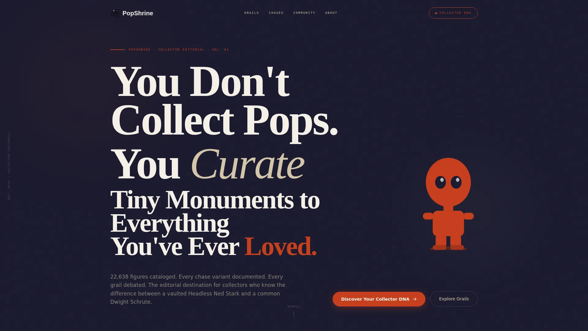
- A full-viewport manifesto hero with oversized intersecting editorial typography and a vermillion Pop silhouette SVG
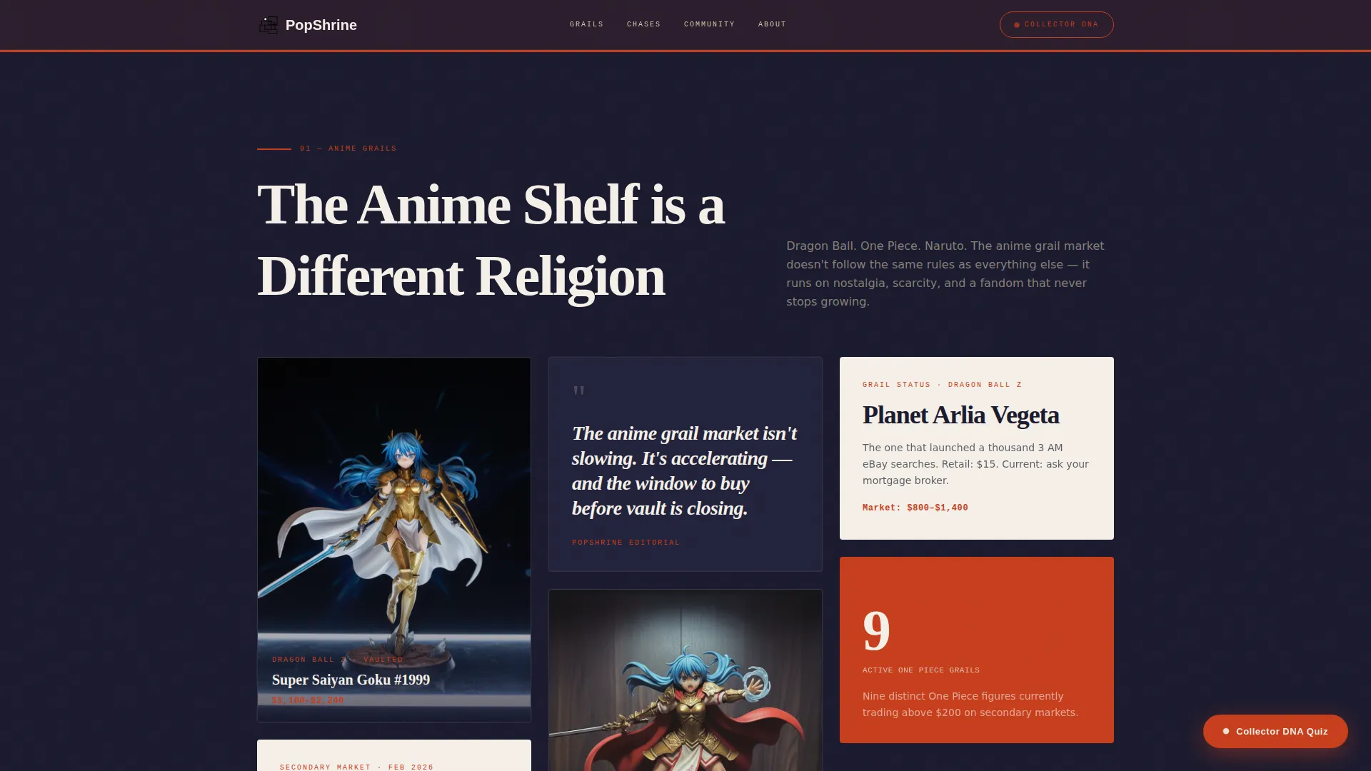
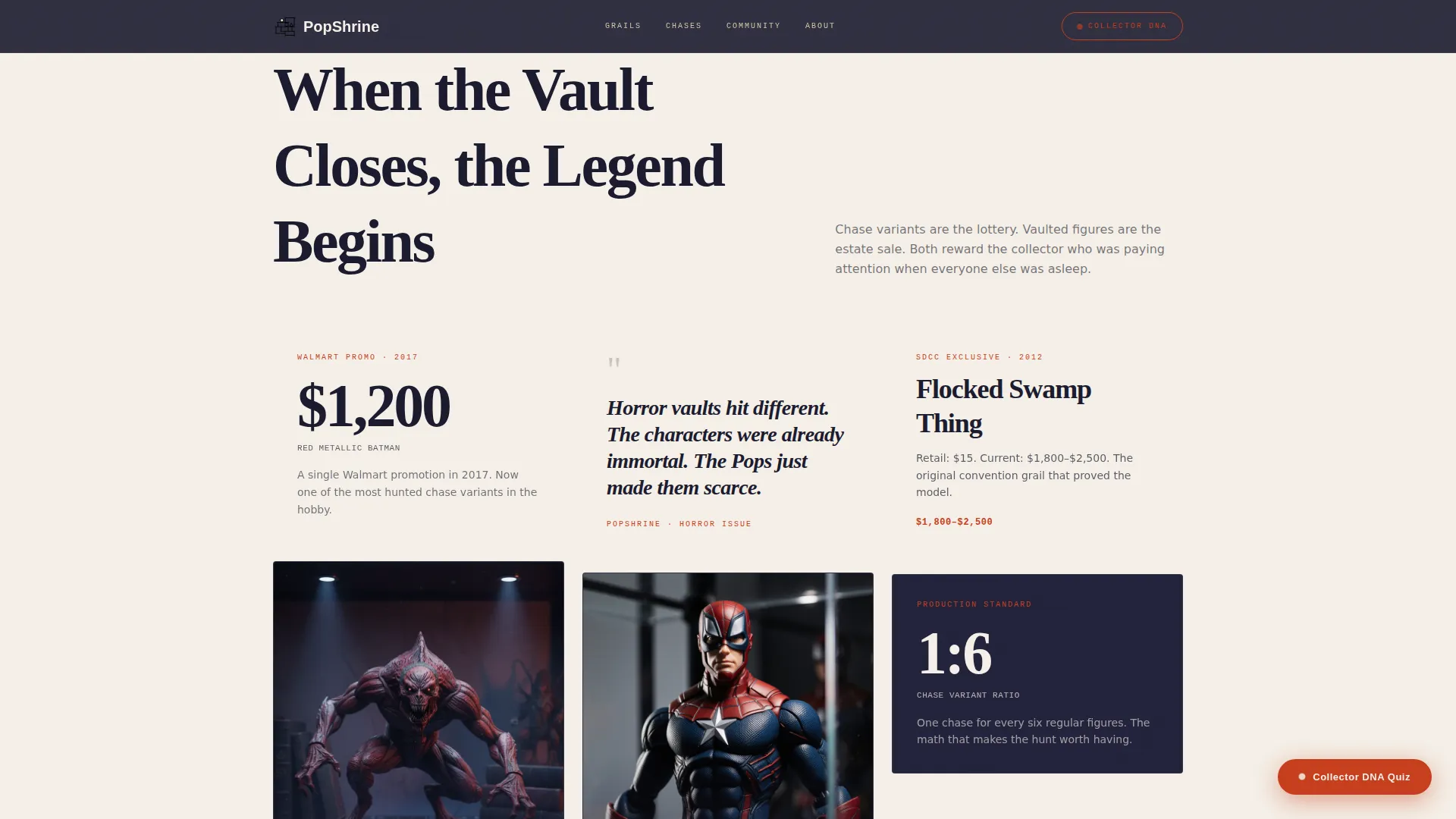
- Themed masonry clusters for Anime Grails, Marvel Chases, Horror Vaulted, and Convention Exclusives, each with magazine-voice editorial cards
- An inline five-question collector DNA quiz with four archetype results, a tailored blog reading list, and an email opt-in
Feature list
This template packs a focused set of capabilities drawn directly from the design and content brief. Each feature serves a specific purpose in the collector journey from arrival to subscription.
Manifesto Hero Section
The hero fills the full viewport with oversized editorial serif text arranged in intersecting vertical and horizontal columns. A single Funko silhouette in torii vermillion anchors the lower right corner. There is no photography, no banner clutter, only words that make a collector feel seen before they scroll.
Themed Masonry Grid Clusters
The masonry layout reveals collection clusters in sequence as the visitor scrolls: Anime Grails, Marvel Chases, Horror Vaulted, and Convention Exclusives. Each cluster uses staggered GSAP scroll reveals so tiles appear with weight and intention rather than all at once.
Editorial Pull Quote Breaks
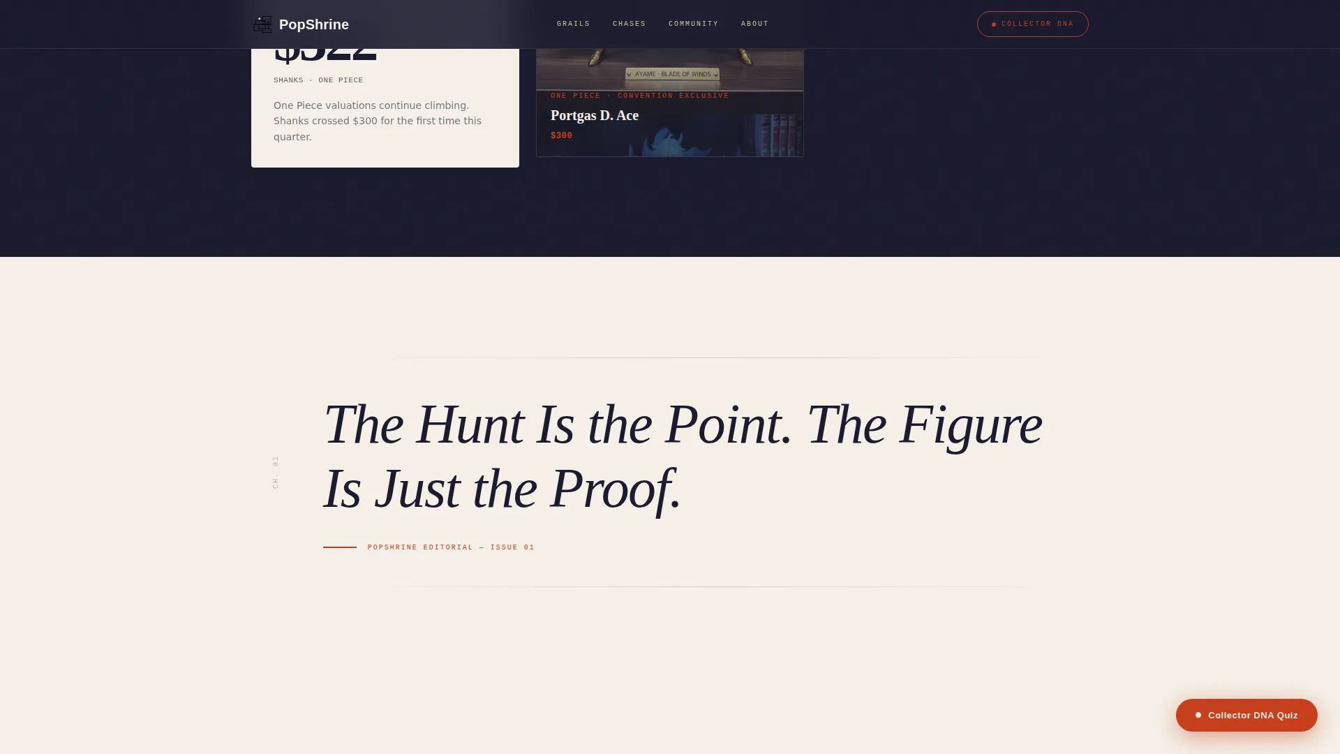
Full-width pull quote sections interrupt the masonry grid between clusters, functioning like chapter titles in a print magazine. They reset attention, build editorial rhythm, and give the page a sense of deliberate pacing rather than an endless content feed.
Inline Collector DNA Quiz
A five-question illustrated quiz opens directly on the page without redirecting the visitor. Questions cover favorite franchise universe, display style preference, budget comfort per figure, rarest piece owned, and most-wanted grail. Results deliver one of four collector archetypes with a personalized reading list.
Floating Vermillion Call-to-Action Pill
A vermillion pill button labeled "Discover Your Collector DNA" appears as a floating element after the second masonry cluster. It follows the visitor through the scroll experience before the quiz section appears in full width near the bottom of the page.
Archetype Results with Email Opt-In
Quiz results assign visitors to one of four collector archetypes: The Archivist, The Hunter, The Curator, or The Flipper. Each result includes a tailored blog reading list and an email opt-in prompt to receive a custom watchlist, turning quiz completion into a lead generation moment.
Page sections overview
| Section | Purpose |
|---|---|
| Manifesto Hero | Opens with full-viewport editorial quote and vermillion Pop silhouette |
| Anime Grails Cluster | First themed masonry block with magazine-voice editorial cards |
| Pull Quote Break | Full-width chapter title resets scroll rhythm between clusters |
| Marvel and Horror Cluster | Second themed masonry block covering chases and vaulted figures |
| Floating Quiz Pill | Persistent vermillion button surfaces after the second cluster |
| Collector DNA Quiz | Inline five-question quiz with archetype results and email opt-in |
| Page Footer | Horizontal flow footer closing the editorial experience |
Design & branding system
The visual identity blends editorial magazine confidence with Japanese Zen restraint. Negative space is treated as a design element, not an empty gap. Every color decision is intentional, and the typography hierarchy reinforces the magazine-voice tone across every section.
- Color palette: washed ink black (#1A1A2E), shōji screen cream (#F5F0E8), tatami warm beige (#D4C5A9), and torii vermillion (#C73E1D) used exclusively for calls to action and interactive highlights
- Typography system: Fraunces for editorial serif headlines, Manrope for body text, and IBM Plex Mono for labels and metadata
- Alternating ink-black and shōji-cream backgrounds create visual breathing room between masonry tiles
Mobile & speed optimization
The template is built desktop-first to match the primary behavior of collectors who browse and photograph their shelves on larger screens. Mobile responsiveness is included so the experience holds together at every breakpoint.
- GSAP scroll reveals and masonry stagger animations use CSS transforms only, keeping visual performance clean
- Intersection Observer drives staggered tile reveals so content loads into view with intentional pacing rather than all at once
- The inline quiz uses a state machine approach so transitions between questions feel smooth without full-page reloads
How this template helps you convert
Every layout decision pushes a first-time visitor toward a meaningful action without feeling pushy. The quiz is the engine, and the editorial design is the context that makes taking it feel worthwhile.
- The manifesto hero creates immediate identity resonance, making collectors feel the page was built for them before a single scroll
- The floating pill button keeps the quiz call to action visible through the browsing experience, reducing the distance between interest and click
- Archetype results pair a personalized reading list with an email opt-in, so the conversion moment feels like a reward rather than a transaction
Other information about this template
This template is well suited for collectors and editorial creators who want a starting point that already reflects their level of taste and specificity. A few additional details worth noting before you build:
- Community social proof is built into the layout, with placeholder stats referencing figures cataloged, community size, and grail valuations
- The footer follows a horizontal flow pattern that keeps the page feeling editorially consistent from hero to close
- Localization defaults are set to English, USD pricing context, and US date format
- The template supports high animation settings including parallax effects and masonry hover states for an immersive desktop experience
- Page interactivity is high by design: the inline quiz includes illustrated questions and a state machine to manage transitions cleanly
Theme
Editorial Magazine
Creative direction
Curated Collection
Color system
Japanese Zen
Style
Masonry/Pinterest
Direction
Quiz/Assessment
Page Sections
Manifesto Hero with Editorial Typography
Themed Masonry Collection Clusters
Full-width Editorial Pull Quotes
Inline Five-question Collector DNA Quiz
Floating Call-to-action Pill Button
Archetype Results and Email Opt-in
Related questions
What collector archetypes does the quiz produce?
How many questions are in the Collector DNA Quiz?
Is this template designed for desktop or mobile users?
Can I change the themed collection clusters to match my own categories?
What makes this layout different from a standard blog template?



