Hobby & Passion Content Blog & Content Website Template
Porcelain is a single-page landing page template built for antique doll collecting blogs and communities. It uses an asymmetric 60/40 grid, a Warm Artisan visual identity, and a manifesto-driven scroll to guide estate sale hunters, retired collectors, and newcomers toward an identification archive and a free weekly newsletter.
by Rocket studio
Quick summary
Porcelain is a landing page template designed for serious doll collecting communities. It combines an asymmetric 60/40 editorial grid with a Parchment and Rust color system to create a warm, scholarly atmosphere. Visitors move from a manifesto hero through belief rows and article previews to a newsletter sign-up form. The result reads less like a website and more like a well-curated collector's library.
Who this template is for
This template suits anyone running a content-driven doll collecting blog or community who wants to earn reader trust before making an ask. It is built for voices that value depth, patience, and preservation over quick transactions.
- Estate sale hunters and active collectors looking for a credible online home for their knowledge
- Retired collectors cataloguing years of acquisitions who want to share expertise through long-form writing
- Newcomers who inherited an unmarked collection and need a warm, knowledgeable community to guide them
What problem this template solves
Most blog templates treat every niche the same way. A doll collecting community is not a product page, a news feed, or a social profile. It needs to communicate scholarly depth and genuine warmth at the same time, without looking clinical or cluttered.
- Generic blog layouts fail to signal the cultural seriousness that serious collectors expect
- Standard call-to-action patterns push the ask too early, before trust is established
- One-column editorial designs flatten the visual rhythm that makes a manifesto-style scroll feel alive
What you get with this template
You get a fully structured single-page layout with every section pre-designed and ready to customize. The template combines editorial typography, a curated color system, and layered animation to deliver a reading experience that feels considered rather than assembled.
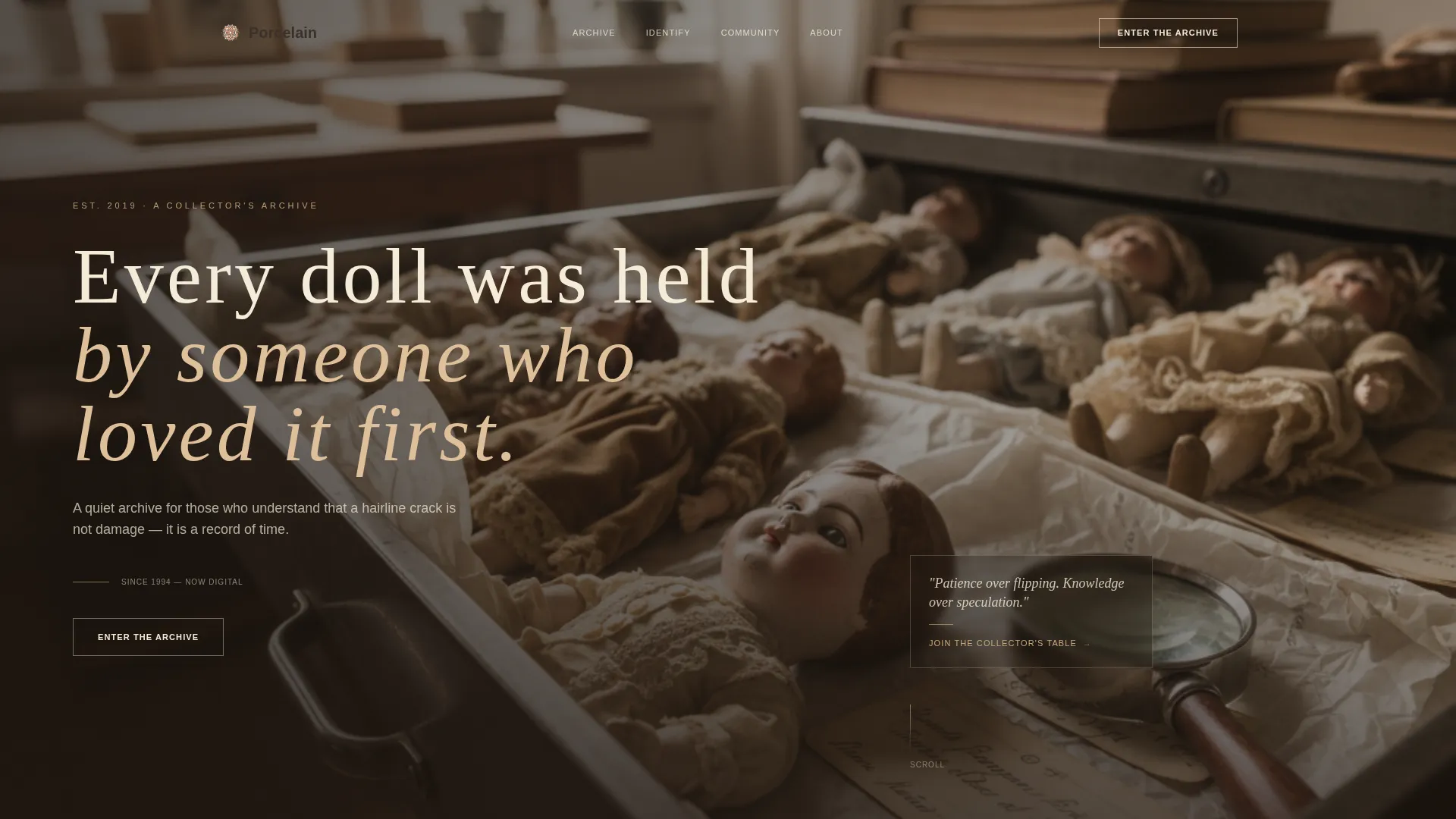
- A full-width hero with a 60/40 Type Over Image layout and a scroll-linked manifesto headline fade-in
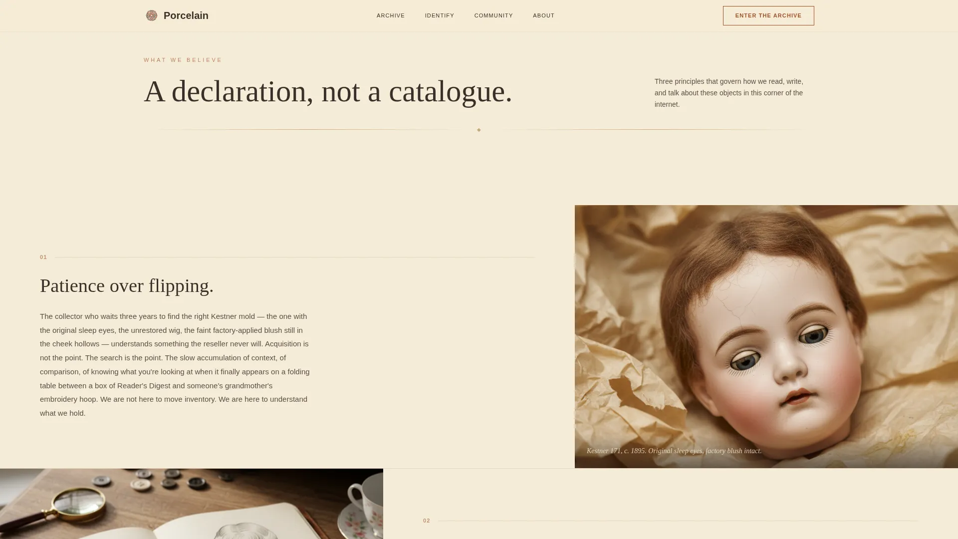
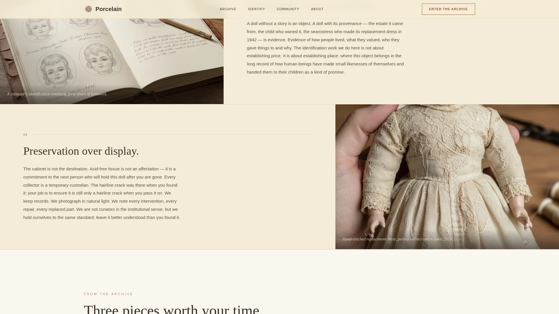
- Three alternating belief rows with prose on one side and a curated photograph on the other
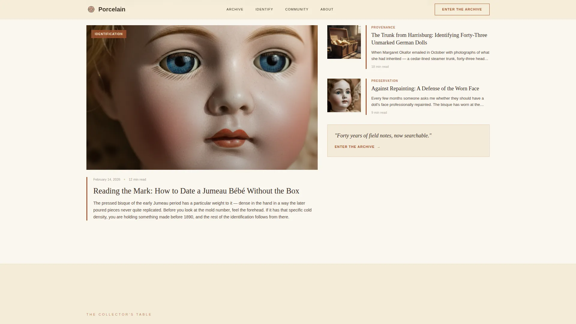
- Three article preview cards with thumbnail photographs and opening lines, sitting directly above a newsletter sign-up form
Feature list
A paragraph introduces this section: the features below reflect every distinct capability built into this template, each grounded directly in the source brief.
Asymmetric 60/40 Editorial Grid
The layout uses a consistent 60/40 column split throughout the page. The wider column carries prose and primary content while the narrower column holds photographs or a floating call to action. This creates a deliberate visual rhythm without symmetry.
Manifesto Belief Rows
Three belief rows follow the hero section. Each row places a short prose paragraph on one side and a single curated photograph on the other. The image side alternates left and right with each row, producing a gentle visual sway as the reader scrolls.
Scroll-Linked Word Reveal Animation
The headline in the hero section fades in with a scroll-linked word reveal. Body sections use blur-fade entrance animations triggered by an Intersection Observer. Image thumbnails respond to hover with a subtle zoom effect.
Article Preview Cards
Three pre-designed article preview cards sit above the newsletter form. Each card includes a thumbnail photograph slot and an opening-line text area. These cards demonstrate archive depth and build reader confidence before the sign-up ask.
Newsletter Sign-Up Form
The sign-up section is styled as a parchment-toned reply card with a rust-colored border. It asks only for a first name and an email address. This low-friction approach reflects the template's principle of earning value before requesting anything.
Arc Browser Split Footer
The footer follows a split layout with the logo and tagline on the left and navigation links on the right. This clean, editorial footer keeps the page grounded without adding visual noise at the bottom of a long scroll.
Page sections overview
| Section | Purpose |
|---|---|
| Hero Header | Introduces the manifesto with a full-width Type Over Image layout and a fade-in headline |
| Manifesto Belief Rows | Communicates community values through three alternating prose and photograph rows |
| Article Preview Cards | Proves archive value with three thumbnail-led previews and opening lines |
| Newsletter Sign-Up Form | Converts interested readers with a low-friction name-and-email reply card |
| Split Footer | Closes the page with logo, tagline, and navigation links in a balanced two-column layout |
Design & branding system
The visual identity follows a Warm Artisan theme built around an aged, hand-crafted aesthetic. Every color choice and typeface selection reinforces the feeling of a hand-bound journal open on a wooden desk.
- Color system: aged parchment cream (#F5ECD7) for backgrounds, deep rust (#A0522D) for headlines and accent borders, muted charcoal brown (#3B302A) for body text, and soft rose gold (#C9A87C) for hover states and interactive highlights
- Typography: Cormorant Garamond at display weight for headlines with generous letter-spacing, and Manrope for body text to keep long-form reading comfortable
- Visual details: rust-toned borders on the newsletter card, cream headline text over the hero photograph, and image zoom hover states reinforcing tactile warmth throughout
Mobile & speed optimization
The template is built desktop-first to suit the browsing habits of serious collectors, and it scales down cleanly to mobile viewports. All animation is handled through pure CSS and Intersection Observer triggers, with no heavy JavaScript libraries required.
- Scroll-linked animations use CSS only, keeping the interaction layer lightweight on all devices
- The asymmetric grid reflows gracefully for narrower screens without losing the editorial feel
- Image hover states and blur-fade entrance effects remain smooth across modern browsers and mobile hardware
How this template helps you convert
The page is structured as a Content and Resource destination, meaning every design decision is built to earn trust before presenting an offer. Conversion pressure builds gradually from the first manifesto headline to the newsletter form.
- The hero and belief rows establish the community's values, so the visitor understands the archive before they are asked to enter it. The primary call to action, "Enter the Archive," feels like an invitation rather than a prompt.
- The three article preview cards directly above the newsletter form do the persuasion work. Opening lines and thumbnail photographs show the reader exactly what the archive contains, making the newsletter sign-up feel like a natural next step.
- The reply-card newsletter form asks only for a first name and email address. Minimal friction and a warm visual design lower the barrier for new visitors and long-time collectors alike.
Other information about this template
This section covers additional context that rounds out the full picture of what Porcelain offers and how it fits within a broader collector ecosystem.
- The template is built for English-language audiences in the United States, with US date formatting and USD currency conventions assumed throughout
- Creative direction follows a Manifesto approach, meaning the scroll reads as a declaration of belief rather than a navigational index
- The header concept is Type Over Image, with the manifesto headline positioned on the 60-column side and a single call to action floating in the negative space of the 40-column side
- The landing page direction is Content and Resource, designed to funnel visitors toward an identification archive containing guides, maker databases, and valuation references
- Animation intensity is set to medium, balancing visual interest with readability for desktop-first collector audiences
Theme
Warm Artisan
Creative direction
Manifesto
Color system
Parchment & Rust
Style
Asymmetric Grid (60/40)
Direction
Content/Resource
Page Sections
Asymmetric 60/40 Editorial Grid
Manifesto Belief Rows with Alternating Layout
Scroll-linked Animation System
Article Preview Cards
Parchment Reply-card Newsletter Form
Arc Browser Split Footer
Related questions
Who is the ideal reader for a landing page built on this template?
What sections come pre-built in this template?
Can I use this template if my collection focus is not antique dolls?
Does the newsletter form connect to an email service?
Is this template suitable for a desktop-first audience?



