Resin Art Newsletter Landing Page Template
Pour is a masonry-layout landing page template built for resin art and craft newsletters. It combines a cinematic macro hero image, a staggered gallery-walk grid, and inline email capture forms to turn visual content into subscriber conversions. The editorial magazine aesthetic, wabi-sabi color palette, and single-field subscribe prompt make it ideal for craft newsletter creators ready to grow an audience.
by Rocket studio
Quick summary
Pour is a single-page, masonry-layout newsletter landing page designed for resin art and craft content creators. The template pairs a cinematic type-over-image hero with a gallery-walk grid of issue previews, technique close-ups, and reader-submitted pours. Every scroll moment builds curiosity, and strategically placed email capture forms convert that curiosity into subscribers.
Who this template is for
Pour is built for creative newsletter publishers who want their landing page to feel as considered as the content they send. It suits makers at every stage, from kitchen-counter hobbyists to studio artists.
- Hobbyist resin makers and Etsy sellers who need a polished subscription page without a complex build
- Craft newsletter creators who want visual content to do the persuading
- Studio artists and serious makers who treat resin as fine art and want a landing page that reflects that intent
What problem this template solves
Most newsletter landing pages ask visitors to subscribe before showing them anything worth subscribing to. Pour flips that dynamic entirely. The masonry grid IS the argument. Visitors scroll through proof before they ever see a form.
- Generic newsletter templates lack the visual depth needed for image-heavy craft content
- Standard single-column layouts bury the quality of the work behind plain text and weak calls to action
- Makers lose potential subscribers because their landing page does not match the visual standard of their actual content
What you get with this template
Pour delivers a complete, section-led landing page that blends editorial design with lead generation structure. Every section has a clear job, and every design choice supports the goal of converting visitors into newsletter subscribers.
- A full masonry landing page with a hero, two grid sequences, a full-width editorial break, and a final subscribe section
- Inline email capture forms appearing after every third row of the masonry grid, each asking for one field only
- A persistent floating call-to-action button in the bottom-right corner so the subscribe prompt is always visible
Feature list
This section details the core built-in capabilities that make Pour work as both a visual showcase and a subscriber conversion tool.
Cinematic Type-Over Hero
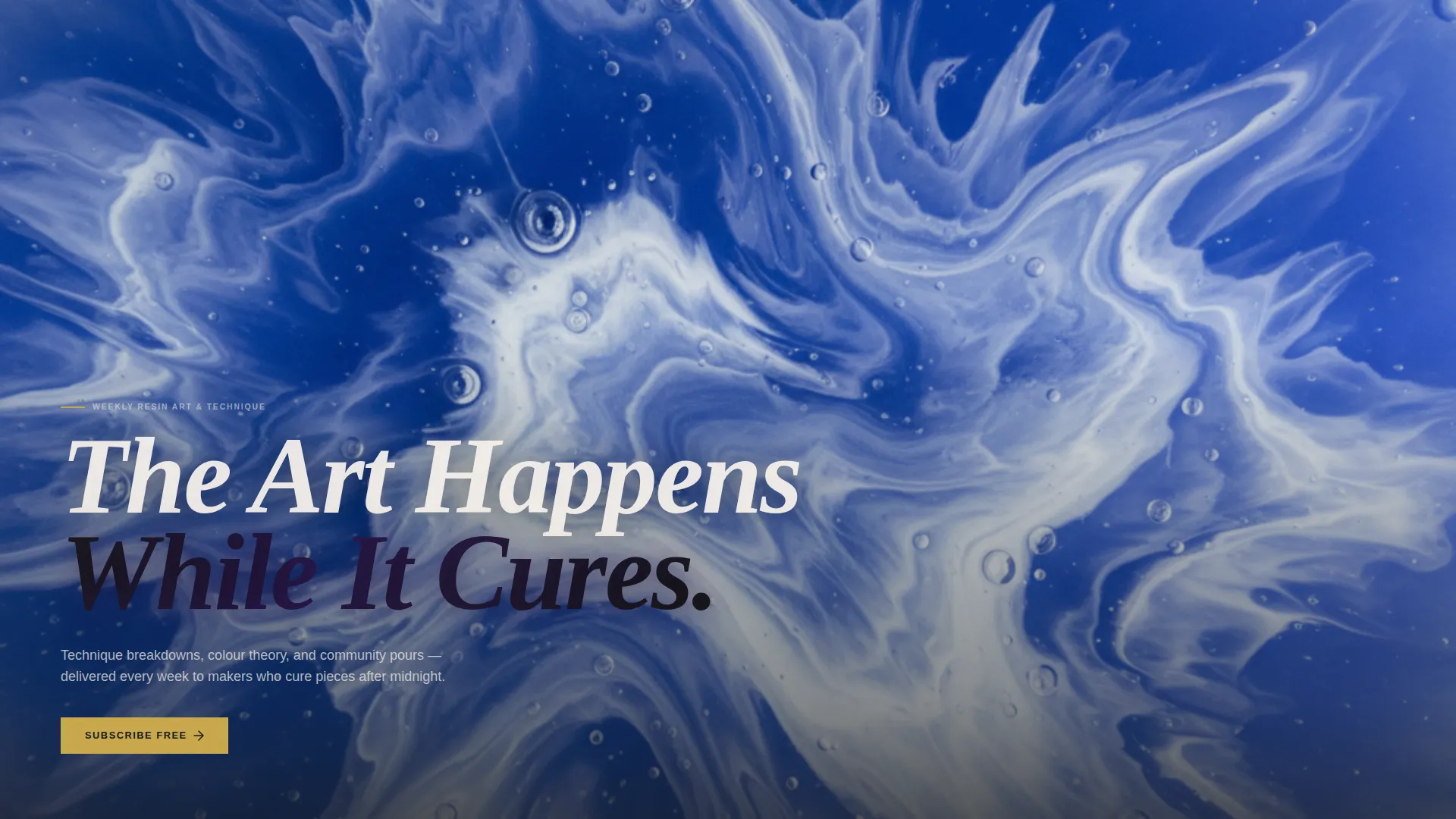
The hero section uses a macro photograph of a resin pour mid-cure, shot from directly above. A tall condensed serif headline overlays the image with a subtle knockout effect where resin color bleeds through the letterforms. A single gold subscribe button floats at the bottom of the viewport.
Staggered Masonry Grid
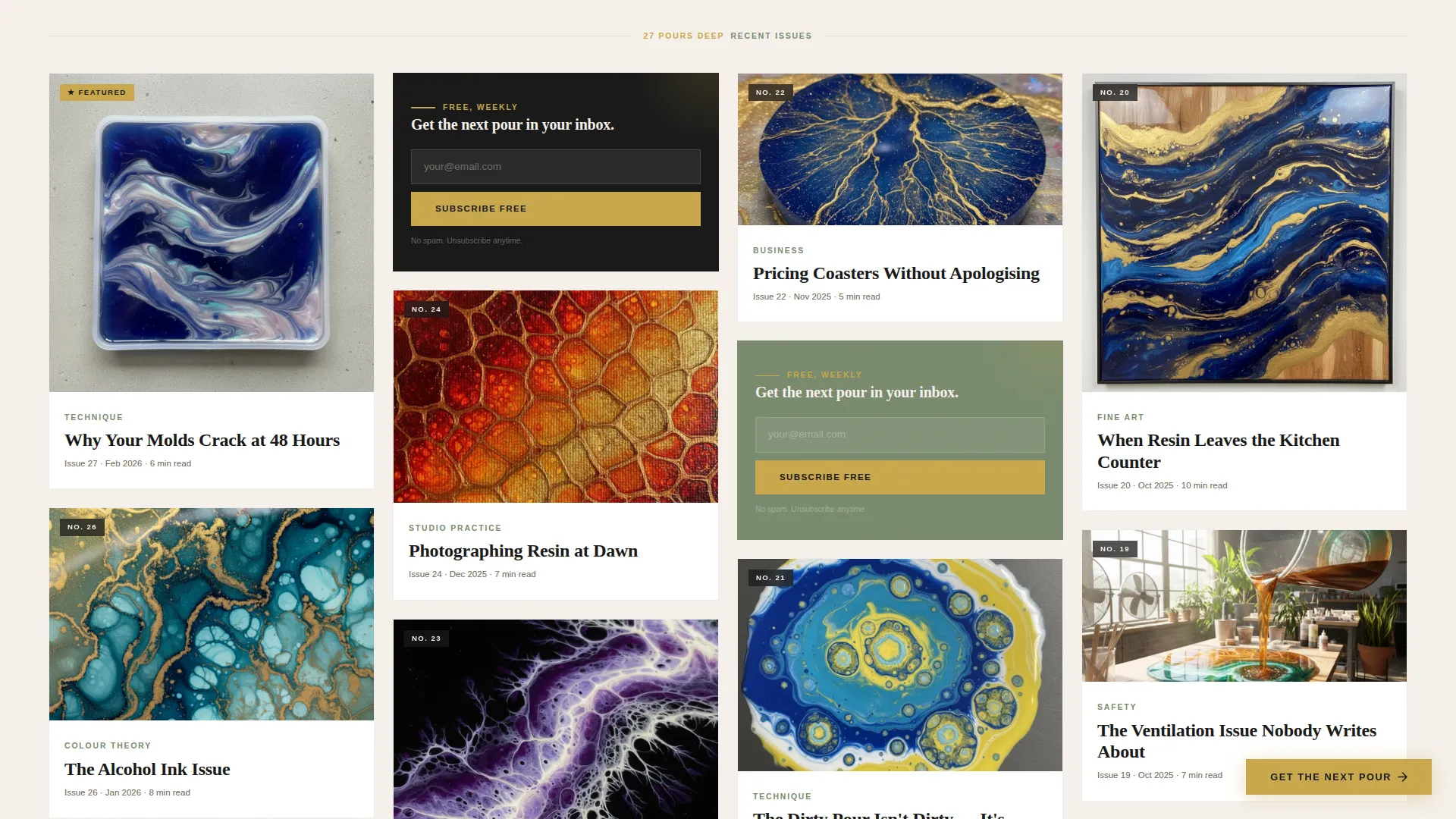
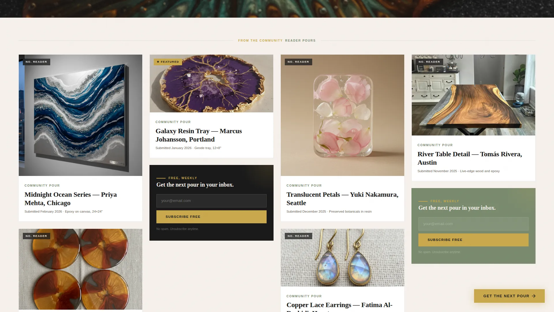
The masonry layout staggers newsletter issue previews, technique close-ups, and reader-submitted pours at varied scales. Some cards are tall and cinematic, others small and jewel-like. Each card carries a single editorial headline that sparks curiosity without giving everything away.
Full-Width Editorial Break
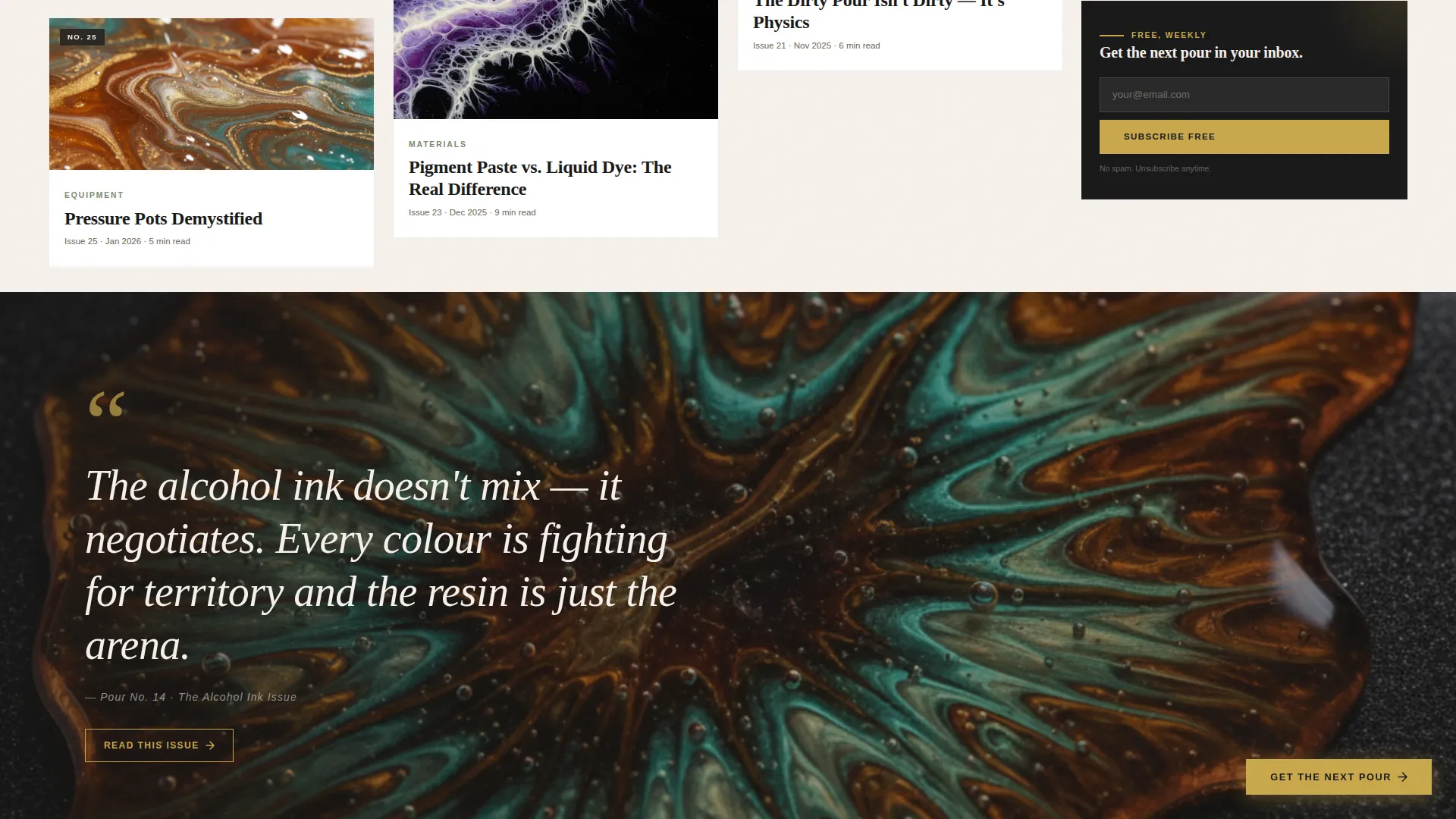
After the first masonry grid sequence, the layout opens to a full-bleed pour photograph filling the entire screen width. A pull quote from that issue sits over the image, giving visitors a direct taste of the newsletter's editorial voice and depth.
Inline Email Capture Forms
A frictionless email capture form appears inline after every third row of the masonry grid. The form asks for one field only, an email address, keeping the path to subscription as short as possible. The same subscribe prompt repeats at the final section alongside a link to browse past issues.
Persistent Floating Call to Action
A gold-colored subscribe button lives in the bottom-right corner of the page at all times. It stays visible as visitors scroll through the masonry grid, ensuring the conversion path is never more than one tap away.
Archive Teaser Section
The final page section pairs the email capture with a link to a sample archive of past issues. The archive itself ends with the same subscribe prompt, creating a looped conversion path for visitors who want to read before committing.
Page sections overview
| Section | Purpose |
|---|---|
| Hero image header | Sets visual tone and presents the primary subscribe call to action |
| Masonry grid rows 1-3 | Showcases issue previews and technique cards to build content curiosity |
| Inline email capture | Converts engaged scrollers with a single-field form after row three |
| Full-width editorial break | Deepens trust with a full-bleed pour image and pull quote from a featured issue |
| Masonry grid rows 4-6 | Continues content proof with reader pours and technique close-ups |
| Second inline capture | Repeats the frictionless subscribe form after the second grid sequence |
| Final subscribe section | Combines email capture with a Browse Past Issues archive link |
| Minimal footer | Closes the page with a clean horizontal footer pattern |
Design & branding system
Pour uses an editorial magazine aesthetic grounded in a wabi-sabi sensibility. The muted earth tones hold space so resin photography can provide all the color and drama. Typography is handled by two complementary typefaces working in clear roles across the page.
- Color palette: stone white (#F5F0EB) for backgrounds, sumi ink (#1A1A1A) for body text and headlines, dry moss (#7A8B6F) for accents, and liquid gold (#C9A84C) reserved exclusively for subscribe buttons and hover states
- Typography: Fraunces condensed serif for display headlines and editorial moments, DM Sans for body copy and interface elements
- Visual rhythm alternates between a dense masonry gallery and full-width breathing moments, keeping the scroll experience engaging without feeling relentless
Mobile & speed optimization
Pour is built with a mobile-first priority because its core audience browses on phones, often while photographing work or checking references at a kitchen counter. The layout and interactions are designed to work beautifully at small screen sizes before scaling up.
- Lazy loading is prioritized across the image-heavy masonry grid to keep the experience smooth on mobile connections
- Animations include parallax hero effects, staggered masonry reveal transitions, and scroll-linked interactions built to perform well without blocking the layout
- The inline email capture forms and persistent floating button are sized and positioned for easy one-thumb interaction on mobile screens
How this template helps you convert
Pour treats the masonry grid itself as the primary persuasion tool. Visitors are never asked to subscribe blindly. They are shown proof first, then offered a frictionless path to join.
- The hero immediately sets a high visual standard that signals the newsletter is worth opening, priming visitors to engage before they scroll
- The staggered grid of issue cards, technique previews, and reader pours builds cumulative evidence that the content delivers real depth, making the subscribe decision feel earned rather than forced
- Inline forms appearing after every third row catch visitors at peak engagement, and the persistent floating button ensures no conversion moment is ever lost to scrolling past a form
Other information about this template
Pour is a purpose-built landing page template within the Blog and Editorial category, specifically matched to the Resin Art and Craft Newsletter niche. A few additional details worth knowing before you build with it.
- The template style is Masonry and Pinterest-inspired, designed to handle varied-height image cards gracefully across the grid
- The header concept is Type Over Image, meaning the headline and call to action are composed directly over the hero photograph with no navigation bar interrupting the visual field
- The creative direction follows a Gallery Walk approach, where scrolling feels like moving through a curated exhibition rather than reading a conventional web page
- The lead generation direction is the structural spine of the page, with every design decision oriented toward a single conversion goal: email subscription
Theme
Editorial Magazine
Creative direction
Gallery Walk
Color system
Japanese Zen
Style
Masonry/Pinterest
Direction
Lead Generation
Page Sections
Cinematic Type-over Hero Section
Staggered Masonry Grid Layout
Full-width Editorial Break
Frictionless Inline Email Capture
Persistent Floating Subscribe Button
Archive Teaser and Browse Path
Related questions
What kind of newsletter is this template designed for?
Does the email capture form connect to any specific platform?
Can I use this template if I am just starting my newsletter?
What makes this layout different from a standard newsletter landing page?
Is the template suitable for mobile visitors?



