D2C Landing Page Template, Data Command
A data-driven prelaunch landing page for direct-to-consumer brands that want to build real anticipation. Built on a modular card grid, it leads with hard evidence, not hype. A tab-switching hero, animated data visuals, and a prosecutorial scroll sequence guide early adopters straight to an app download or email capture.
by Rocket studio
Quick summary
This prelaunch landing page template is built for direct-to-consumer brands that want to earn trust before launch day. It uses a modular card grid to present market data, beta tester quotes, and competitor comparisons in a sequence that builds conviction. Two conversion paths capture both app-ready visitors and email-first subscribers.
Who this template is for
This template is made for founders and brand teams who are launching a direct-to-consumer product and want to attract early adopters before it goes live. It works best when you have real data to back your claim that the category is broken.
- Direct-to-consumer startup founders building a prelaunch waitlist
- Product teams targeting early adopters on platforms like Product Hunt or Kickstarter
- Brand marketers who want to capture both app downloads and email leads from a single page
What problem this template solves
Most coming soon pages waste early traffic. They show a vague tagline, a countdown timer, and an email field. Visitors bounce because there is nothing to believe in yet. This template solves that by leading with evidence instead of promises.
- Generic teaser pages fail to convert early adopters who want proof before they commit
- Brands lose high-intent visitors because there is no structured case for why the product matters
- A single conversion path misses visitors who are not yet ready to download an app
What you get with this template
You get a fully structured prelaunch landing page built on a modular card grid layout. Every section is designed to carry a specific job in the persuasion sequence, from the opening data shock to the final download call to action.
- A three-tab hero switcher that cycles through the problem, the data, and the product reveal
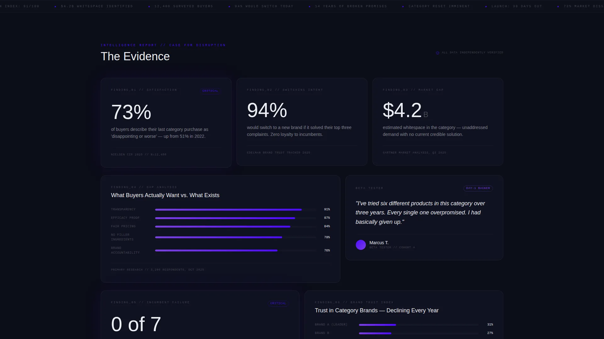
- A scrollable card grid presenting stat callouts, mini-charts, pull quotes, and competitor snapshots
- Dual conversion paths covering app download badges and an email capture for the full report
Feature list
This template ships with a set of purpose-built components that work together as an integrated persuasion system.
Three-Tab Feature Switcher Hero
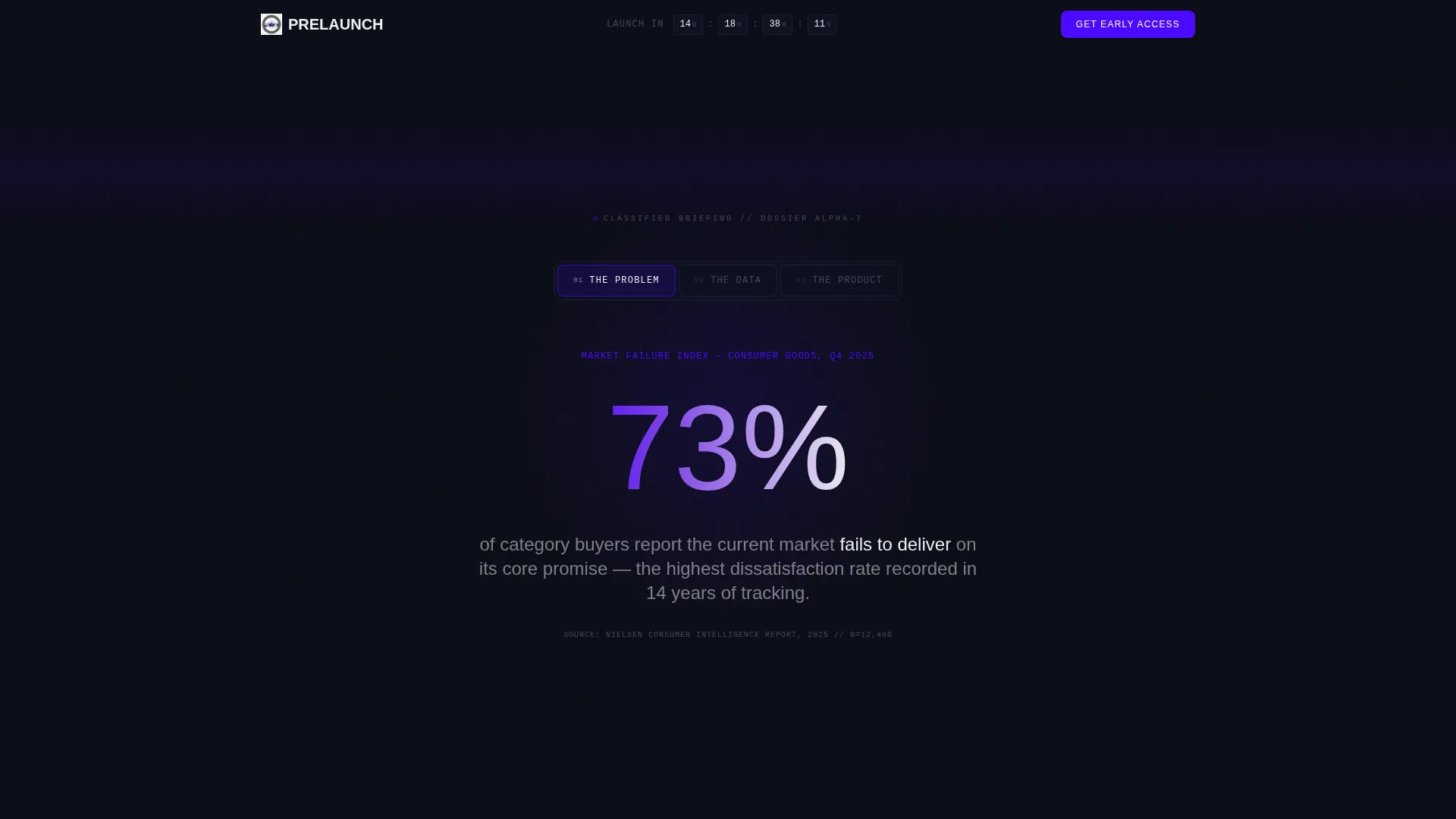
The header uses three clickable tabs labeled "The Problem," "The Data," and "The Product." Each tab swaps the hero content without a page reload. "The Problem" shows a bold stat in large readout-white type. "The Data" reveals a minimal animated chart with indigo gradient bars. "The Product" teases a blurred product silhouette with a pulsing unlock icon.
Modular Card Grid Layout
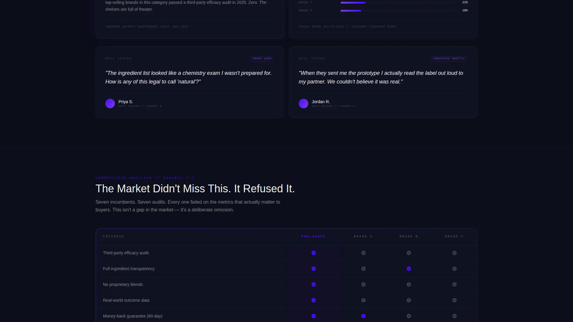
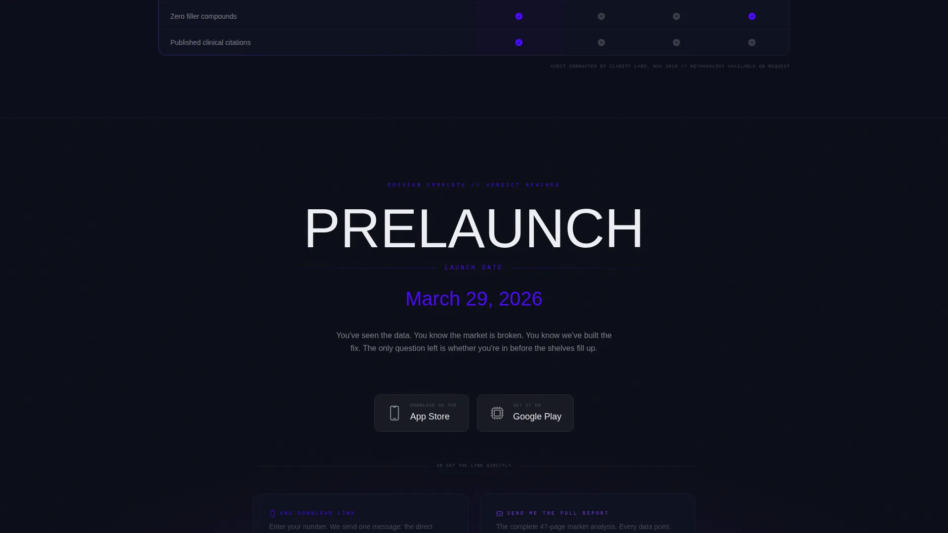
The scroll section is built as an industry report in card form. Cards alternate between stat callouts, mini-charts, pull quotes from beta testers, and competitor comparison snapshots. The rhythm escalates row by row, ending with a reveal card that locks in the product name and launch date.
Dual Conversion Path Design
The primary call to action reads "Get Early Access" and links to both an App Store badge and a Google Play badge side by side. A tertiary option lets visitors enter a phone number to receive a direct download link via SMS. A secondary email capture reads "Send Me the Full Report" for visitors who are not yet ready to install.
Data Command Visual Theme
The page uses the Electric Indigo color system throughout. Deep void black (#0B0D17) forms the base. Charged indigo (#4B0AFF) and signal violet (#7B3FE4) power the glows and gradients. Readout white (#EDEEF2) is used for all typography and data labels. The result feels like a mission control screen built for urgency.
Prosecutorial Scroll Sequence
Each card row in the grid presents a single sourced data point. The sequence is structured as evidence building toward an inevitable conclusion. By the time the visitor reaches the product reveal card, skipping the call to action feels like walking away from a briefing mid-sentence.
SMS Download Link Path
Beyond the standard app badges, visitors can enter their phone number to receive a direct download link by text message. This lowers friction for mobile visitors who want the app but are not browsing from the device they use most.
Page sections overview
| Section | Purpose |
|---|---|
| Tab Switcher Hero | Opens the page with three dossier-style content states |
| Problem Stat Card | Leads the scroll with a single high-impact market data point |
| Animated Data Chart | Visualizes the market gap using indigo gradient bar animation |
| Beta Tester Quotes | Adds human credibility through pull quotes from early users |
| Competitor Comparison Cards | Shows side-by-side snapshots proving category gaps |
| Product Reveal Card | Locks in the product name and launch date at peak conviction |
| App Download call to action | Drives installs via App Store and Google Play badges |
| SMS Capture Field | Offers a direct download link via text for mobile visitors |
| Email Capture Block | Collects emails with a "Send Me the Full Report" secondary path |
Design & branding system
The visual identity follows a Data Command theme that treats every design choice as functional. The palette is intentionally dark and charged, built to make numbers feel urgent and information feel classified.
- Electric Indigo color system: void black (#0B0D17), charged indigo (#4B0AFF), signal violet (#7B3FE4), and readout white (#EDEEF2)
- Typography uses large-scale readout-white numerals for stat callouts, reinforcing the mission control aesthetic
- Glows, gradients, and the pulsing unlock icon are used sparingly so each animated element carries weight
Mobile & speed optimization
The modular card grid is built to restack cleanly on smaller screens. Each card is a self-contained unit, so the layout adapts without losing the escalating data narrative.
- Cards reflow into a single-column stack on mobile without disrupting the prosecutorial sequence
- The tab switcher hero remains fully functional on touch devices, with each tab swap staying smooth
- Heavy visual elements like the animated chart and blurred silhouette are contained within their card boundaries to keep layout stable across screen sizes
How this template helps you convert
The template earns the conversion by making the visitor feel informed rather than sold to. Every design and structural decision is pointed toward one outcome: a visitor who reaches the call to action and feels it would be irrational to leave.
- The tab-switching hero immediately signals that this page has substance, not just a countdown. Visitors self-select into the angle that hooks them most, whether that is the problem, the data, or the product tease.
- The prosecutorial card grid does the persuasion work before the call to action appears. By the reveal card, the visitor has absorbed enough evidence to act with confidence rather than hesitation.
Other information about this template
This template is part of the Startup and Launch category, specifically designed for the direct-to-consumer brand coming soon niche. It is well-suited for teams who want a high-conviction prelaunch presence without writing a single line of vague teaser copy.
- Template style: Card Grid (Modular), making it straightforward to add, remove, or reorder evidence cards as your data set grows
- Creative direction: Industry Report, meaning the page reads like a sourced briefing rather than a marketing brochure
- Header concept: Feature Tab Switcher, a single-component hero that handles three distinct content states in one compact section
- Landing page direction: App Download, with SMS and email as secondary paths to accommodate visitors at different stages of readiness
- Color system: Electric Indigo, a palette built to communicate data urgency and brand seriousness simultaneously
Theme
Data Command
Creative direction
Industry Report
Color system
Electric Indigo
Style
Card Grid (Modular)
Direction
App Download
Page Sections
Three-tab Hero Switcher
Modular Evidence Card Grid
Dual App Download Call to Action
Secondary Email Capture Path
Data Command Color System
Animated Indigo Chart Component
Related questions
Can I use this template without a finished product?
Do both app store links need to be live before I publish this page?
How many evidence cards should I include in the scroll section?
Can I adapt this template for a physical product instead of an app?
Can I swap or reorder the card types in the grid?