Meal Prep Blog Landing Page Template | Editorial Grid
Prep is a meal prep blog landing page built on an asymmetric 60/40 editorial grid. It pairs long-form manifesto prose with stark overhead food photography to turn time-strapped readers into email subscribers. The primary call to action is a free downloadable Sunday Prep Blueprint PDF, captured through a single inline form asking only for a first name and email.
by Rocket studio
Quick summary
Prep is a single-page editorial landing page for a meal prep blog. It uses a 60/40 asymmetric grid, a manifesto-style narrative, and a Parchment and Rust color system to move readers from emotional recognition to a free PDF signup. The page is desktop-first and collapses to a single column on mobile.
Who this template is for
This template is built for food bloggers and content creators who want to grow an email list around meal prep. It works best when the audience already feels the weekly dinner chaos and just needs someone to name it.
- Meal prep bloggers launching or refreshing a content destination
- Food writers who want a lead-generation page with editorial personality
- Independent creators targeting busy readers: nurses, new parents, remote workers, and anyone spending too much on takeout
What problem this template solves
Most food blog landing pages look like recipe indexes. They list content but never make a case for why any of it matters. Readers skim, feel nothing, and leave without signing up. This template solves that by leading with conviction before it asks for anything.
- Readers arrive to a bold manifesto headline, not a cluttered homepage
- The editorial layout earns trust before the email form ever appears
- The sticky bottom call-to-action keeps impatient visitors on a path without interrupting the narrative flow
What you get with this template
You get a fully designed, single-page landing page structured around five purposeful sections. Every element is built to carry readers from the opening declaration through to the email capture without losing momentum.
- Giant centered serif hero headline with a rust rule and pulsing scroll arrow
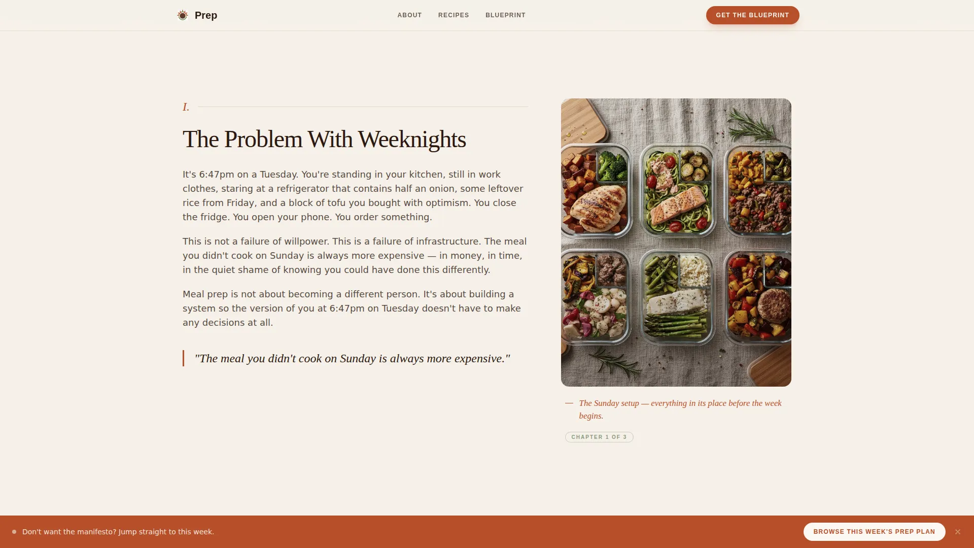
- Asymmetric 60/40 editorial grid with prose on the left and photography plus pull quotes on the right
- Inline email capture form, a proof photo grid with handwritten-style annotations, a testimonials section, and a sticky bottom call-to-action button
Feature list
Manifesto-Style Hero Section
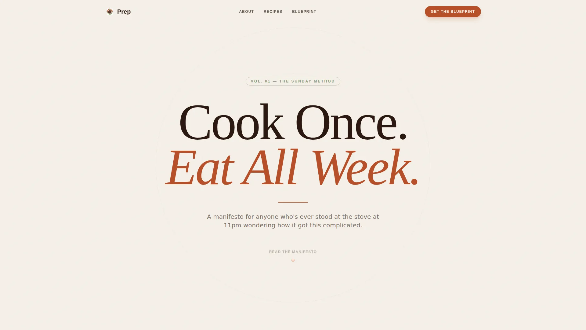
The hero opens with a single enormous serif headline reading "Cook Once. Eat All Week." set in espresso type on a parchment background. No images compete for attention. A thin rust rule sits underneath and a pulsing downward arrow invites the reader to keep scrolling.
Asymmetric 60/40 Editorial Grid
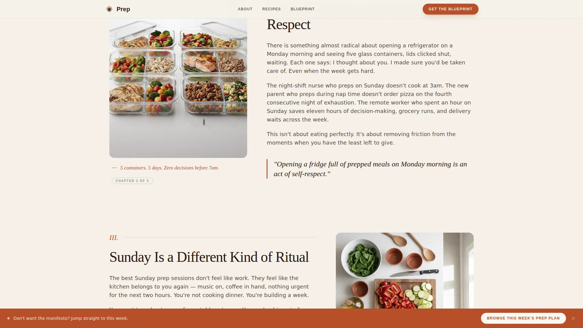
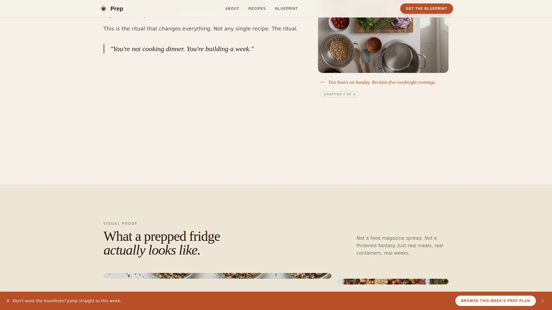
The core layout divides each manifesto section into a 60-column prose block and a 40-column visual block. Long-form editorial copy sits left. Overhead food photography, pull quotes styled as marginalia, and handwritten-style annotations sit right. The rhythm alternates between argument and visual proof.
Inline Email Capture Form
The email form appears after the third manifesto section, timed to when emotional engagement peaks. It asks only for a first name and an email address. The offer is a free downloadable Sunday Prep Blueprint PDF. The placement makes the signup feel like joining a conversation rather than filling out a form.
Proof Photo Grid
An asymmetric photo grid shows five perfectly portioned meal prep bowls with handwritten-style annotations overlaid. This section functions as visual evidence for the manifesto claims made in the prose sections above it.
Sticky Bottom Call-to-Action
A "Browse This Week's Prep Plan" button stays anchored at the bottom of the viewport in rust. It gives impatient visitors direct access to recipe content without requiring them to read through the full manifesto first.
Reader Testimonials Section
Three specific testimonials represent the core reader personas: a night-shift nurse, a new parent, and a remote worker. Each quote references concrete time or money savings, reinforcing the manifesto's core argument with real-reader voices.
Page sections overview
| Section | Purpose |
|---|---|
| Hero Headline | Opens with the manifesto declaration |
| Manifesto Editorial Grid | Builds the core argument across 60/40 prose and photography |
| Proof Photo Grid | Provides visual evidence with annotated meal photos |
| Reader Testimonials | Reinforces trust through specific, role-attributed quotes |
| Inline Email Capture | Converts engaged readers into subscribers |
| Footer Linear Row | Closes the page with a clean single-row footer |
Design & branding system
The visual identity follows an Editorial Magazine theme. The palette draws on aged materials and kitchen warmth, creating a tone that feels personal and earned rather than polished and corporate.
- Colors: Parchment cream (#F5F0E8) for backgrounds, deep espresso (#2C1810) for body text, warm rust (#B7502A) for headlines and interactive elements, and muted sage (#8A9A7B) for tags, dividers, and hover states
- Typography: Fraunces serif for headlines and pull quotes, DM Sans for all body copy, creating a clear editorial hierarchy
- Animations: Scroll-reveal prose, subtle parallax on food photography, a pulsing arrow in the hero, and a marquee element add medium-level motion without overwhelming the reading experience
Mobile & speed optimization
The template is built desktop-first. On smaller screens, the 60/40 grid collapses into a single-column layout so both prose and photography stack naturally and remain fully readable.
- The asymmetric grid collapses to a single column on mobile, keeping content order logical
- CSS animations only, with no heavy JavaScript dependencies for motion effects
- Server Components handle static content sections, keeping the page lightweight on initial load
How this template helps you convert
The page is designed as a content and resource destination. Every structural decision moves readers closer to the email signup without pressuring them.
- The manifesto narrative builds emotional buy-in across three sections before the email form appears, so readers hand over their contact details willingly
- The sticky bottom call-to-action captures visitors who are ready to act immediately, without forcing them to scroll through the full editorial journey first
Other information about this template
This template is part of the Prep collection, designed specifically for the meal prep blog niche within the broader food and recipe editorial category. It fits creators who want a content destination that doubles as a lead-generation page.
- The footer uses a Pattern 1 Linear Single-Row layout, keeping the close of the page clean and uncluttered
- Localization is set for English (US) with imperial measurements and USD references
- The template is built for direct-to-reader publishing with no external platform dependencies assumed
- The page is suited for any meal prep content creator looking to build a Sunday ritual community around a free resource offer
Theme
Editorial Magazine
Creative direction
Manifesto
Color system
Parchment & Rust
Style
Asymmetric Grid (60/40)
Direction
Content/Resource
Page Sections
Manifesto Hero with Serif Headline
Asymmetric 60/40 Editorial Grid
Inline Email Capture Form
Annotated Proof Photo Grid
Sticky Bottom Call-to-action
Role-attributed Testimonials Section
Related questions
What is the primary call to action on this landing page?
What sections are included in this landing page template?
Who is this meal prep landing page template designed for?
How does the sticky call-to-action button work alongside the email form?
Can I customize the colors and typography in this template?



