Creative Project Coming Soon & Pre-Reveal Website Template
Standby is a coming soon landing page template built for creative projects that need to capture attention before they're ready to reveal everything. It uses a comparison table with locked, scroll-revealed cells to ration information strategically, turning curiosity into sign ups. A kanban-style dashboard header, sequential lead capture form, and floating early access call to action make this coming soon page design unlike any standard placeholder page.
by Rocket studio
Quick summary
Standby is a coming soon landing page template designed for indie creators, solo founders, and design studios who need to generate buzz before their work is ready to show. Its core mechanic is a scroll-driven comparison table that reveals locked details one row at a time, making every coming soon page visit feel like a classified briefing. The result is a coming soon landing that converts curiosity into early access sign ups.
Who this template is for
This coming soon landing page is not a generic soon landing page for any business with a drop date to announce. It is purpose-built for a specific kind of creator who is building in public but revealing selectively. The target audience understands that anticipation is a marketing asset, and they want a coming soon page that reflects that belief.
- Indie game developers soft-announcing a title before its release date is confirmed
- Solo founders who want to validate demand and collect email addresses before writing code
- Design studios teasing a rebrand or upcoming product line before an official launch
What problem this template solves
Most coming soon pages are just a placeholder. They show a logo, a launch date, and a basic email signup form, then ask website visitors to trust that something interesting is coming. That approach misses the opportunity to build anticipation and generate excitement during the most powerful window before an official launch.
The problem is not the coming soon concept itself. The problem is that most landing pages treat the pre-launch period as a waiting room rather than a persuasion stage. Standby flips that entirely.
- Creators have no good way to reveal just enough to generate interest without giving away the full picture
- Standard sign up forms do not create urgency or reward early adopters with a sense of exclusive access
- Typical coming soon page designs fail to engage visitors long enough to capture leads meaningfully
What you get with this template
This soon landing page template delivers a full, section-led coming soon landing page flow. Every component is designed to build anticipation progressively, encourage sign ups, and give prospective customers a reason to stay. The template is not just a placeholder with a countdown clock. It is a fully structured pre-launch experience.
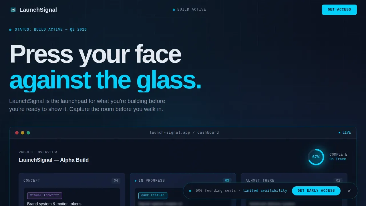
- A dashboard kanban header frozen mid-build at 67% progress, with blurred task cards and a pulsing cyan progress ring
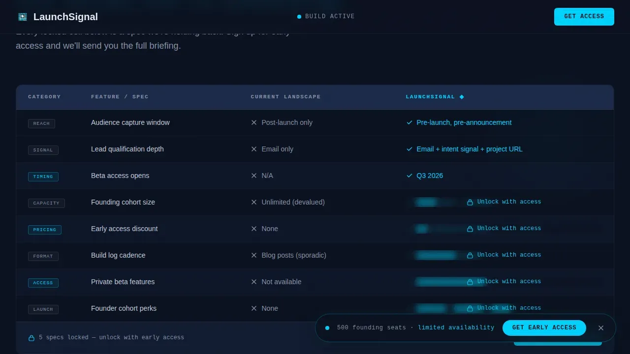
- A scroll-driven comparison table with locked and blurred cells that unlock row by row as the visitor scrolls deeper
- A three-field sequential lead capture form: email first, then an interest dropdown, then an optional project URL field
- A floating primary call to action bar pinned after the first scroll, reading "Get Early Access" in electric cyan
- A secondary coming soon path labeled "Follow the Build Log" for visitors who want email-only capture without full commitment
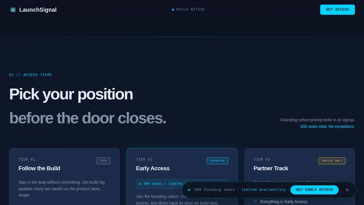
- Three-tier early access breakdown with unlock incentives for early adopters at each level
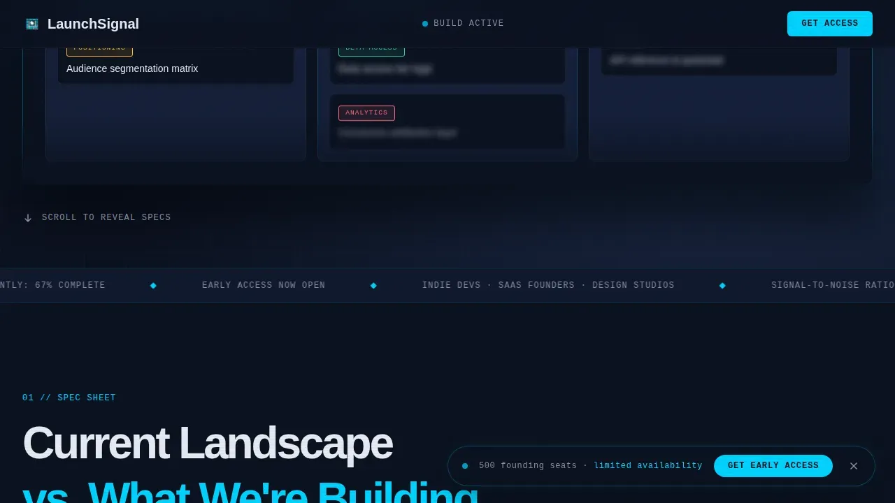
- A marquee credibility strip carrying build velocity metrics, beta capacity counter, and spots-remaining scarcity signals
Feature list
This coming soon landing page template is built around one unusual idea: withholding information is the persuasion mechanism. Every feature serves that core intent, from the first impression created by the dashboard header to the final form field that captures valuable leads.
Scroll-Triggered Comparison Table
The comparison table is the heart of this coming soon page. It contrasts the current landscape with what is being built, row by row. Some cells are visible; others are blurred with a lock icon. Each scroll deeper reveals one more spec, one more key element, one more reason to sign up. This mechanic encourages visitors to keep scrolling and rewards engagement with information, making the email capture form feel like a fair trade.
Dashboard Kanban Hero Header
The header is not a hero photograph or background images carousel. It is a stylized project-management interface frozen mid-build. Visitors see a kanban board with columns labeled "Concept," "In Progress," and "Almost There." Task cards are blurred just enough to read category labels such as VISUAL IDENTITY, CORE FEATURE, and BETA ACCESS, but not the details underneath. A circular progress ring pulses at 67% in electric cyan. The dashboard IS the story, communicating that this project is real, tracked, and moving forward toward an upcoming launch.
Sequential Lead Capture Form
The email capture form is three fields revealed in sequence. Email appears first. Then a single dropdown asks what the visitor is most interested in: Early Pricing, Beta Testing, or Partnership. Finally, an optional field asks for their project URL. This sequential structure reduces friction, avoids overwhelming visitors with too many fields at once, and collects richer signal data than a standard email signup form.
Floating Early Access call to action Bar
After the first scroll, a floating bar pins to the viewport and stays visible throughout the rest of the coming soon landing page. The primary call to action reads "Get Early Access" in electric cyan against terminal navy. This placement ensures the coming soon page converts website visitors at any scroll depth without disrupting the reading flow.
Scroll-Locked Cell Reveal System
The locked cell mechanism across the comparison table is the template's unique value proposition. Rows containing redacted information use a soft blur overlay and a lock icon. As the visitor scrolls, GSAP ScrollTrigger animations remove the blur and unlock each row in sequence. This approach makes every new reveal feel earned, sustaining visitor engagement from top to footer.
Access Tier Breakdown
Below the comparison table, three access tiers are presented with distinct unlock incentives. This section encourages sign ups by framing early access as a tiered reward. Each tier is designed to appeal to a different type of prospective customer, whether they are primarily interested in pricing, beta testing, or a partnership conversation.
Page sections overview
| Section | Purpose |
|---|---|
| Dashboard kanban header | Communicates project momentum with a frozen mid-build interface and 67% progress ring |
| Marquee credibility strip | Delivers scrolling build stats, beta capacity counter, and spots-remaining scarcity signals |
| Comparison table | Contrasts current landscape with what is coming using scroll-unlocked, locked, and blurred cells |
| Access tier breakdown | Presents three early access tiers with distinct unlock incentives for different visitor types |
| Lead capture form | Collects email, interest category, and optional project URL through a three-field sequential form |
| Minimal footer | Centered social media icons, social media accounts links, and copyright in Superhuman-style minimal layout |
Design & branding system
The visual identity follows a terminal-editorial hybrid direction. The palette is a Midnight Blue color system built to feel like the glow of three monitors in a dark room at 2 a.m. Navy dominates every background surface. Slate separates content blocks like card surfaces. Gray carries body text. Cyan appears sparingly, only on interactive elements, progress indicators, and the call to action, so it hits with full attention value every time.
- Colors: terminal navy (#0B1120) as the dominant background, muted interface slate (#1B2A4A) for card and section surfaces, cool status-bar gray (#8892A6) for body text and secondary labels, and electric signal cyan (#00D4FF) reserved exclusively for interactive elements and the coming soon call to action
- Typography: JetBrains Mono for labels, category tags, and code-style elements; DM Sans for editorial headlines, giving the coming soon page a monospace-precision-meets-large-scale-type feel that reinforces the brand personality of a serious, focused build in progress
- High quality images are replaced by the live dashboard user interface as the primary visual, avoiding generic background images and keeping the first impression sharp and intentional
Mobile & speed optimization
The template is desktop-first by design. The dashboard kanban header needs horizontal space to communicate its full story. However, a mobile-responsive fallback is built in to ensure website visitors on smaller screens still experience a coherent coming soon page. Optimizing a coming soon landing page for mobile is important because a significant portion of traffic will arrive from mobile devices, even for a product aimed at a desktop-primary audience.
- The floating early access bar adapts to mobile viewports with large, tap-friendly button sizing that avoids overwhelming visitors with crowded controls
- Client-side components handle animations and form logic separately from static server-rendered structure, keeping the coming soon page lightweight and responsive across devices
- High quality images and media assets are structured to compress efficiently, supporting fast initial load times and reducing the risk of losing interested visitors before they reach the comparison table
How this template helps you convert
A well-designed coming soon landing page can serve as the foundation for a successful launch. Standby is engineered around the idea that the pre-launch window is not dead time. It is the highest-leverage moment to capture leads, build anticipation, and warm up potential customers before a single feature ships. Every design decision in this coming soon landing feeds that goal.
- The locked comparison table cells create a direct motivation loop: the more a visitor wants to know, the more reason they have to submit the email capture form and unlock what the coming soon page withheld. This makes the form feel like a reward rather than a request, driving sign ups without pressure.
- The floating "Get Early Access" bar ensures the primary call to action is always visible, so website visitors who are ready to commit can act at any scroll point without having to hunt for a sign up form. This removes the friction that causes valuable leads to leave before converting.
- Social proof signals embedded in the marquee strip, including build velocity metrics and a live beta capacity counter, create urgency and validate visitor interest. Incorporating social proof through these scarcity signals encourages visitors to sign up before the coming soon page closes early access.
Other information about this template
This section covers additional context that helps you understand the full scope and practical use of the Standby coming soon landing page template.
The coming soon page design philosophy here treats every locked cell as a micro-engagement moment. Rather than overwhelming visitors with everything at once, Standby rations information like classified briefing documents. Each scroll deeper reveals a launch quarter, a beta capacity number, or a single screenshot corner, making every new row feel earned.
The template is particularly useful for anyone who wants to generate interest before a service launch, upcoming event, or product launch, without committing to a full new website. It lets creators establish a meaningful first impression, create awareness, and grow an email list before any public-facing product is ready.
The coming soon page is not just a placeholder and is not just four words over a background. It is a complete pre-launch lead generation system. The abundance plan for early beta spots, the contact details pathway through the interest dropdown, and the optional project URL field all work together to collect richer data from prospective customers than a standard email-only form would produce.
Using a countdown timer is a well-established way to build urgency on a coming soon page. While the Standby template uses a 67% progress ring rather than a traditional countdown timer or countdown clock, the effect is similar: it tells website visitors that time is moving, the project is real, and the drop date is approaching. Creators who want to add a launch date countdown can adapt the progress ring section to display a countdown timer or countdown clock format.
The template supports the kind of coming soon landing page that search engines can begin indexing before the official launch, giving creators an early SEO foothold. Placing relevant keywords in the page copy and meta fields helps search engines understand the upcoming launch context, which supports discoverability before the full site goes live.
- This coming soon landing page is suited for indie game devs, solo founders, and design studios building toward an upcoming launch or service launch
- The comparison table can serve as a tool to solicit feedback and gather customer feedback by revealing features and asking visitors to signal their most-wanted capability through the interest dropdown
- The "Follow the Build Log" secondary path is ideal for generating sign ups from prospective customers who are not ready for a full commitment but want to stay informed
- Contact details and project context are collected through the optional URL field, making sign up forms here richer than simple email-only capture
- Early adopters who sign up early may receive an early access code depending on how the creator configures the tier system
- Adding social media channels and social media accounts links in the footer allows the coming soon page to extend its reach through social media channels without overwhelming the main lead capture flow
- Landing page builders that offer over 400 conversion-focused templates can complement this template for creators who want additional coming soon page examples for reference before customizing Standby
- The standby high anticipation creative project coming soon landing page template and soon landing page template are designed specifically for creative projects where anticipation itself is the product
Theme
Dashboard Pro
Creative direction
Spec Sheet
Color system
Midnight Blue
Style
Comparison Table
Direction
Lead Generation
Page Sections
Scroll-triggered Comparison Table with Locked Cells
Dashboard Kanban Hero Header
Sequential Three-field Lead Capture Form
Floating Early Access Call to Action Bar
Three-tier Early Access Breakdown
Marquee Credibility and Scarcity Strip
Related questions
Can I use this coming soon page without a countdown timer?
Who is the target audience for this coming soon landing page?
How does the comparison table help capture leads?
Can I collect more than just email addresses with this template?
Does this template work for a service launch or upcoming event outside creative industries?



