HealthTech Accelerator Research Dashboard Website Template
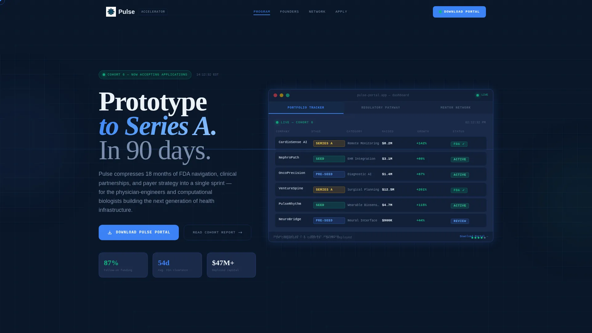
Pulse is a hub-and-spoke anchor-nav landing page template built for healthtech accelerators. It combines a simulated dashboard header, data-dense research-report scroll sections, and a dual-path app download flow. Designed in a Midnight Blue Data Command palette, it helps early-stage healthtech programs attract physician-engineers, ex-pharma founders, and biotech spinouts ready to sprint from prototype to Series A.
by Rocket studio
Quick summary
Pulse is a single-page healthtech accelerator landing page template built around a Hub and Spoke (Anchor Nav) structure. It opens with a Feature Tab Switcher dashboard simulation and guides visitors through data-dense program proof sections styled as an industry research report. The primary call to action drives app downloads, while a secondary email-capture path collects leads from founders who need more time.
Who this template is for
This template is built for healthtech accelerator programs that need to recruit ambitious early-stage founders. It speaks directly to people who are technically brilliant but navigating unfamiliar commercial territory.
- Physician-engineers building remote patient monitoring platforms who need regulatory and payer guidance
- Ex-pharma product leads and computational biologists spinning out of university labs with diagnostic algorithms
- Accelerator program operators who want a high-credibility digital presence that feels as serious as the work inside the program
What problem this template solves
Most accelerator landing pages look like generic startup brochures. Healthtech founders require more. They need evidence before they commit, and they respond to density, specificity, and proof over polish.
- Founders stall because program pages fail to communicate clinical credibility or regulatory depth
- Early-stage healthtech teams face a gap between validated science and Series A readiness that a vague one-pager cannot bridge
- Programs lose qualified applicants because the page does not feel authoritative enough to earn trust from a physician or a regulatory expert
What you get with this template
You get a fully structured, single-page layout that feels like a proprietary research brief and a live data platform at the same time. Every section is purpose-built to move a skeptical technical founder from curiosity to action.
- A Feature Tab Switcher header with three animated data panels: Portfolio Tracker, Regulatory Pathway, and Mentor Network
- An anchor navigation bar that keeps visitors oriented across data-rich scroll sections, each anchored to a distinct program pillar
- A dual-path conversion system with a primary app download flow and a secondary email-capture path for the Cohort Report PDF
Feature list
This template ships with tightly designed components that work together as a cohesive system.
Feature Tab Switcher Dashboard Header
Three clickable tabs sit across the top of a simulated dashboard interface. Each tab reveals a different animated data panel: a cohort company grid with stage badges and funding milestones, an FDA submission timeline with completed and pending nodes, and a constellation of mentor headshots connected by specialty lines. The interface feels functional enough that visitors instinctively try to click deeper.
Sticky Anchor Navigation Bar
A persistent navigation bar keeps the page's hub-and-spoke structure visible at all times. Visitors can jump between program sections without losing context. Clinical pulse blue highlights the active section indicator so the eye always knows where it is.
Data-Dense Industry Report Sections
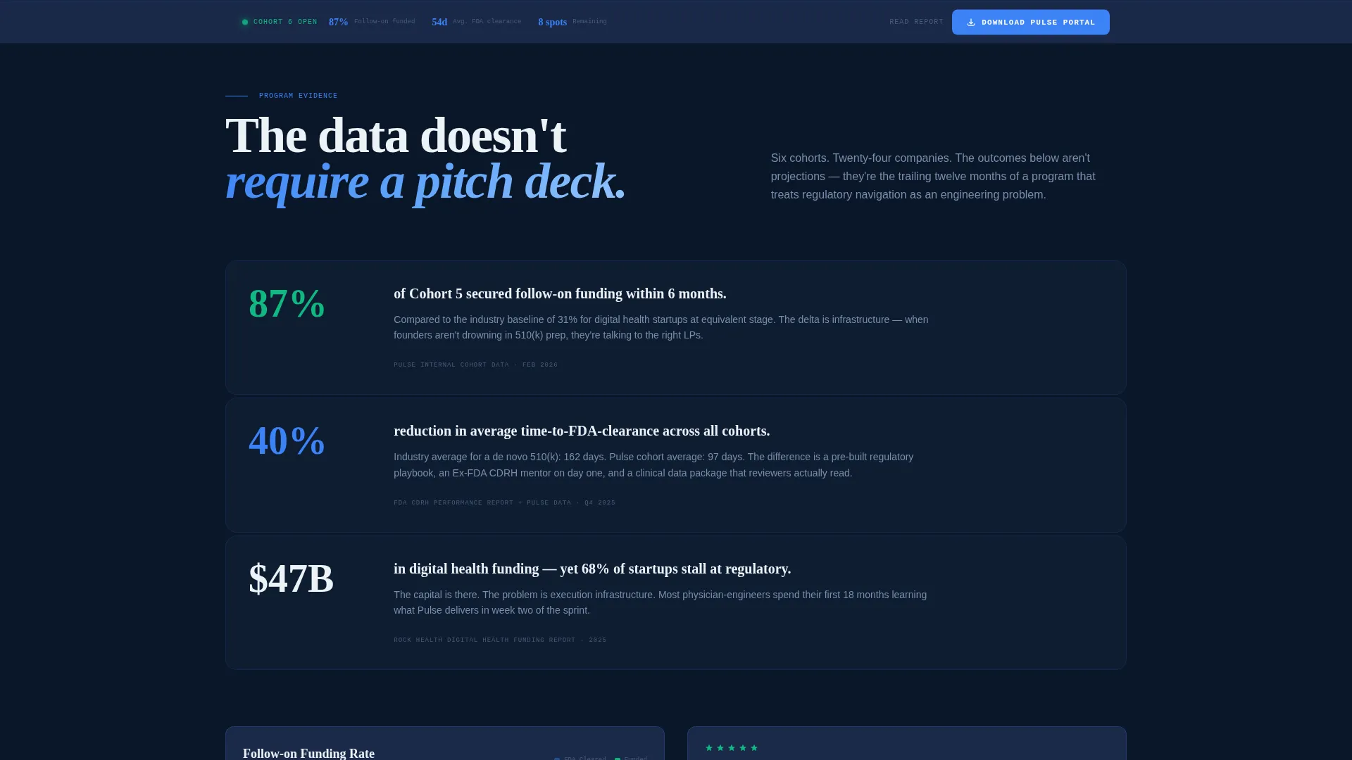
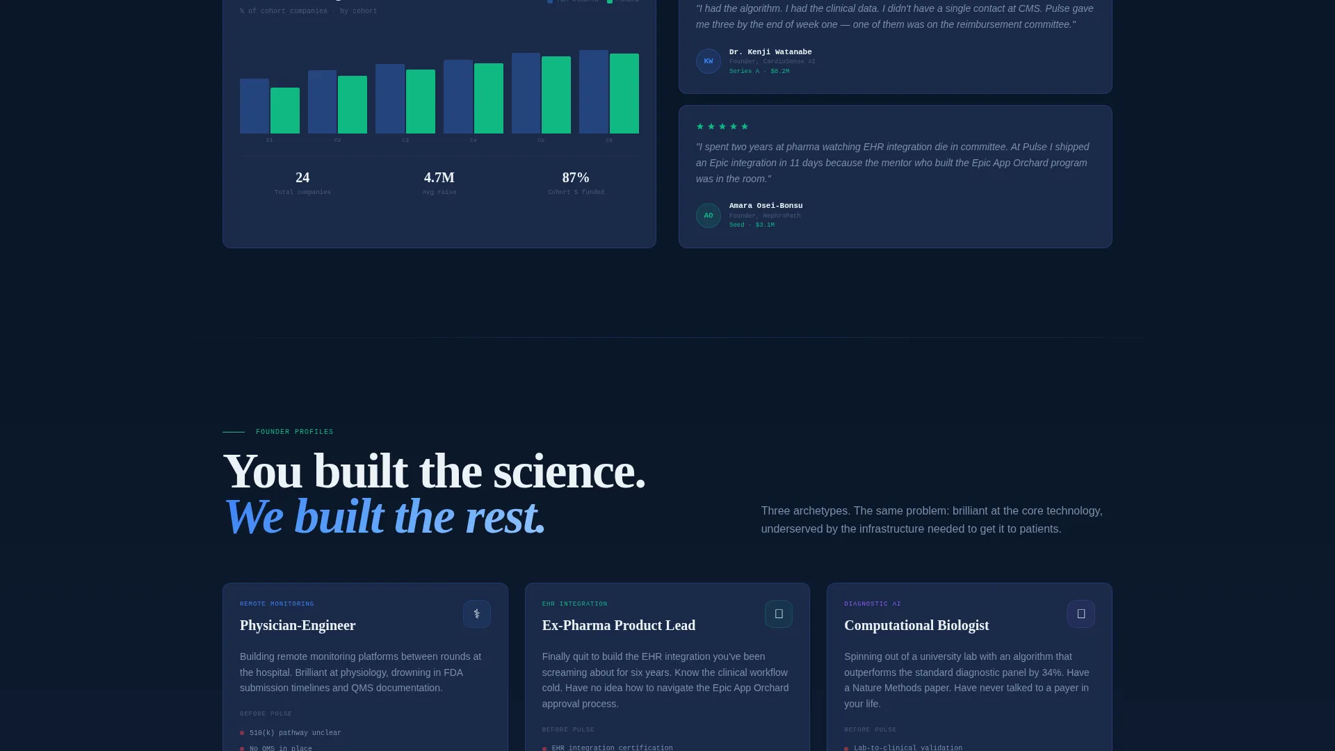
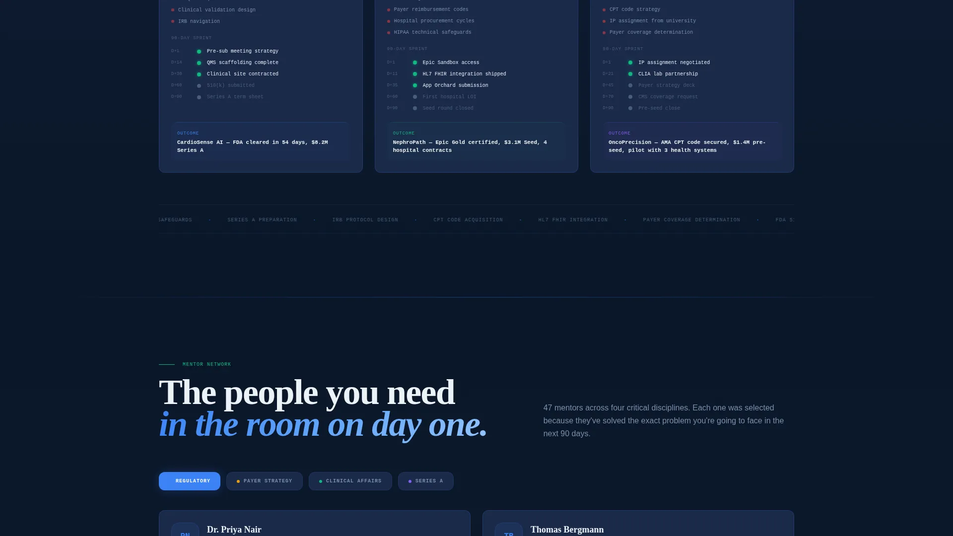
Each scroll section is styled as a page from a proprietary research report. Sections surface specific program statistics, interactive charts, anonymized case timelines, and pull-quote testimonials. The tone escalates deliberately from market context to program proof to individual founder outcomes.
App Download Interstitial Flow
The primary call to action, "Download the Pulse Portal," appears first inside the header dashboard and then resurfaces as a persistent bottom bar after the second scroll section. Tapping it opens a lightweight interstitial where founders select their platform, enter their startup name and stage, and receive a deep link via SMS.
Secondary Email Capture Path
A "Read the Full Cohort Report" secondary call to action captures email addresses from founders who are not yet ready to download. This delivers a PDF version of the page's data narrative and keeps qualified leads inside the funnel.
Pull-Quote and Metrics Display Blocks
Vitals green accent color appears exclusively on live metrics and success indicators. Pull-quote testimonials from founders and clinical partners are embedded alongside data blocks, reinforcing program credibility at each scroll depth.
Page sections overview
| Section | Purpose |
|---|---|
| Tab Switcher Header | Simulates a live program dashboard with three clickable data panels |
| Sticky Anchor Nav | Keeps hub-and-spoke structure visible and navigable across all sections |
| Market Context Block | Opens with digital health market data to frame the program's urgency |
| Cohort Outcomes Section | Presents specific program statistics and follow-on funding proof points |
| Regulatory Pathway Module | Visualizes FDA timeline reduction data with completed and pending nodes |
| Clinical Partnerships Block | Highlights clinical partner relationships and collaboration case timelines |
| Payer Strategy Section | Covers reimbursement navigation context within the ninety-day sprint framework |
| Mentor Network Panel | Maps mentor specialties and connects them visually to founder needs |
| Founder Testimonials Area | Surfaces pull-quote proof from cohort founders and clinical partners |
| App Download Bar | Persistent bottom bar with primary call to action and SMS deep-link interstitial |
| Cohort Report Capture | Secondary email-capture path delivering the PDF cohort narrative |
Design & branding system
The visual identity follows a Data Command theme built entirely in a Midnight Blue color system. The palette is inspired by the glow of a patient monitor in a dim intensive care unit. Every color choice serves a clear functional role.
- Deep terminal navy (#0A1628) covers approximately eighty percent of the canvas as the primary background; desaturated steel (#1B2A4A) handles card surfaces and section dividers; clinical pulse blue (#3B82F6) marks interactive highlights and anchor-nav indicators; defibrillator white (#EDF2F7) carries all body typography and data labels
- Vitals green (#10B981) appears only on live metrics and success indicators, preserving its signal value and preventing visual noise
- The overall system reads like a heads-up display: authoritative, always-on, and zero room for ambiguity
Mobile & speed optimization
The template is structured to translate cleanly from desktop command-center scale down to mobile without losing the data-dense feeling that makes the design credible.
- The sticky anchor nav collapses gracefully for smaller screens so founders can still jump between sections without scrolling blind
- The persistent app download bottom bar remains accessible at all viewport sizes, keeping the primary conversion path one tap away at all times
How this template helps you convert
The page is engineered as a progressive trust-building sequence. Each section adds a layer of evidence before the call to action appears in its most persistent form.
- The Feature Tab Switcher immerses visitors in the program's data environment within seconds of arrival, creating the feeling of using the platform before they have signed up
- The industry report scroll sequence escalates from market proof to cohort outcomes to individual founder stories, so by the time the persistent bottom bar appears the visitor has already been mentally inside the program for sixty seconds
- The dual-path conversion system captures both the high-intent founder ready to download and the research-stage founder who needs the PDF first, reducing the number of qualified visitors who leave without converting
Other information about this template
Pulse is part of the Startup and Launch category under the Accelerator and Incubator subcategory. It is purpose-built for the HealthTech Accelerator niche and reflects a specific intersection of template style, theme, and conversion direction.
- The Hub and Spoke (Anchor Nav) template style makes Pulse a strong fit for programs with multiple distinct pillars such as regulatory, clinical, and payer strategy that each need their own section weight
- The Industry Report creative direction is intentional: it positions the accelerator as a knowledge authority, not just a program vendor, which is critical for recruiting founders with scientific or clinical backgrounds
- The App Download landing page direction is paired with an SMS deep-link delivery mechanic, making the conversion path feel like a product onboarding moment rather than a standard form submission
Theme
Data Command
Creative direction
Industry Report
Color system
Midnight Blue
Style
Hub & Spoke (Anchor Nav)
Direction
App Download
Page Sections
Feature Tab Switcher Dashboard Header
Sticky Anchor Navigation Bar
Industry Report Scroll Sections
Dual-path Conversion System
Vitals Metrics and Pull-quote Blocks
Persistent App Download Bottom Bar
Related questions
What type of program is this template designed for?
Can I update the statistics and cohort data shown in the template?
How does the app download flow work in this template?
Is there a lead capture option for founders not ready to download?
Does the header dashboard display real live data?



