Authoritative eCommerce Landing Page Template
Pulse is a single-page, asymmetric grid landing page built for e-commerce thought leadership publications. It combines a luxe minimal editorial aesthetic with a structured lead-generation flow, guiding DTC brand founders, e-commerce directors, and agency strategists from a compelling report preview toward a qualified download form.
by Rocket studio
Quick summary
Pulse is an editorial landing page template designed for e-commerce intelligence publishers. It uses an asymmetric 60/40 grid to present flagship report findings alongside a sticky conversion column. The warm stone color system and serif-led typography give the page the weight of a printed journal, while the scroll structure builds progressive urgency toward a lead-generation form.
Who this template is for
This template is built for operators and strategists who publish or present high-value e-commerce intelligence. It suits anyone who needs a polished, credibility-first landing page that converts informed readers into qualified leads.
- DTC brand founders who publish quarterly reports or trend breakdowns for their sector
- E-commerce directors and media teams at mid-market retailers presenting data to stakeholders
- Agency strategists who need a data-backed pitch or report landing page that earns the download
What problem this template solves
Most editorial landing pages look like either a generic blog or a blunt sales page. Neither builds the trust that a sophisticated operator audience demands before sharing their business details. Pulse closes that gap.
- Generic templates lack the typographic and spatial restraint that signals editorial authority
- Standard lead-gen pages ask for information before proving value, creating friction and drop-off
- Report landing pages rarely guide the reader through a logical narrative that makes the full download feel necessary
What you get with this template
You get a fully structured, single-page editorial layout that previews roughly forty percent of a flagship report while systematically building demand for the rest. Every section has a defined role in the conversion journey.
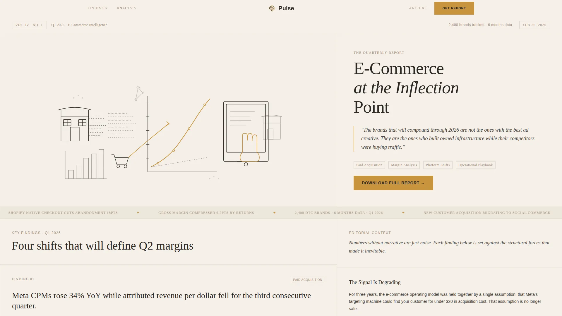
- An illustrated hero section with a serif masthead, dateline, and volume number establishing journal-level credibility
- A 60/40 grid report descent with typographically rich data cards, an editorial narrative column, and a sticky call-to-action element
- A full-width closing lead-generation module with a work email field, company name field, and a Gross Merchandise Value dropdown for lead qualification
Feature list
This template is organized around a focused set of capabilities, each designed to serve the editorial-intelligence use case.
Asymmetric 60/40 Editorial Grid
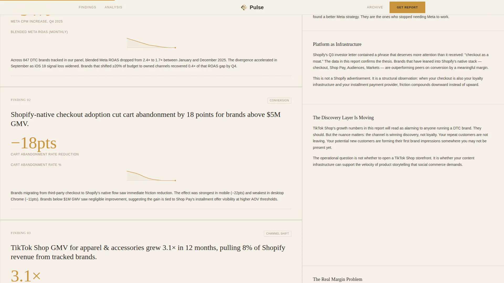
The page body splits into a dominant 60-percent findings column and a 40-percent narrative column. Key findings appear as data cards on the left while contextual editorial copy runs continuously on the right, giving readers two reading speeds in one view.
Sticky Conversion Column
After the third data card, a "Download the Full Report" call-to-action element locks into position within the 40-percent column and follows the reader down the page. This placement captures intent at peak engagement without interrupting the reading flow.
Hand-Drawn Editorial Illustration Header
The hero features a custom single-line-weight editorial illustration rendered in charcoal ink on a travertine cream ground. Abstract marketplace imagery, including storefronts dissolving into data streams and hands reaching through screens, is accented at exactly three focal points in muted saffron.
Typographic Data Cards with Minimal Charts
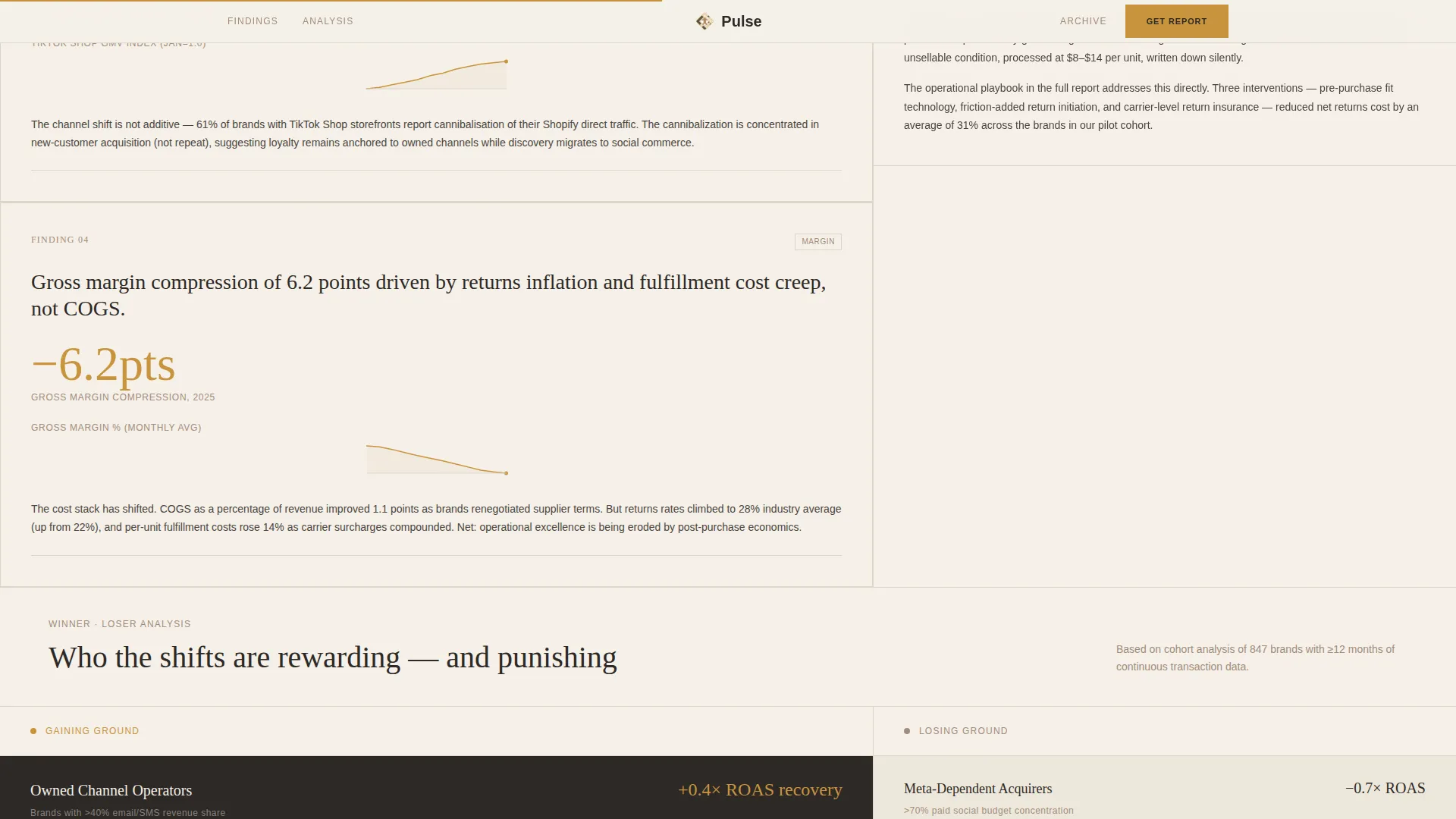
Findings are presented as typographically rich cards with thin saffron line charts on cream backgrounds. The chart style strips away all decorative elements, letting the data communicate directly without visual noise.
Dual-Path Lead-Generation Form
The closing module offers a primary path with a work email, company name, and a Gross Merchandise Value range dropdown for qualified leads. A secondary path captures email only under a "Get the Weekly Brief" offer, reducing friction for visitors not yet ready to share company details.
Scroll-Driven Narrative Architecture
The page is structured as a four-stage descent: market shift, winner-loser analysis, operational playbook, and prediction. Each stage raises the stakes, making the unrevealed sixty percent of the report feel like a gap the reader cannot leave unfilled.
Page sections overview
| Section | Purpose |
|---|---|
| Hero Masthead | Establishes journal credibility with illustration, serif headline, dateline, and volume number |
| Marquee Ticker | Delivers live-feel editorial context and signals active publication cadence |
| Report Descent Grid | Presents key findings as data cards alongside a continuous editorial narrative in a 60/40 layout |
| Sticky call to action Column | Locks the download prompt in view after the third data card to capture peak-engagement clicks |
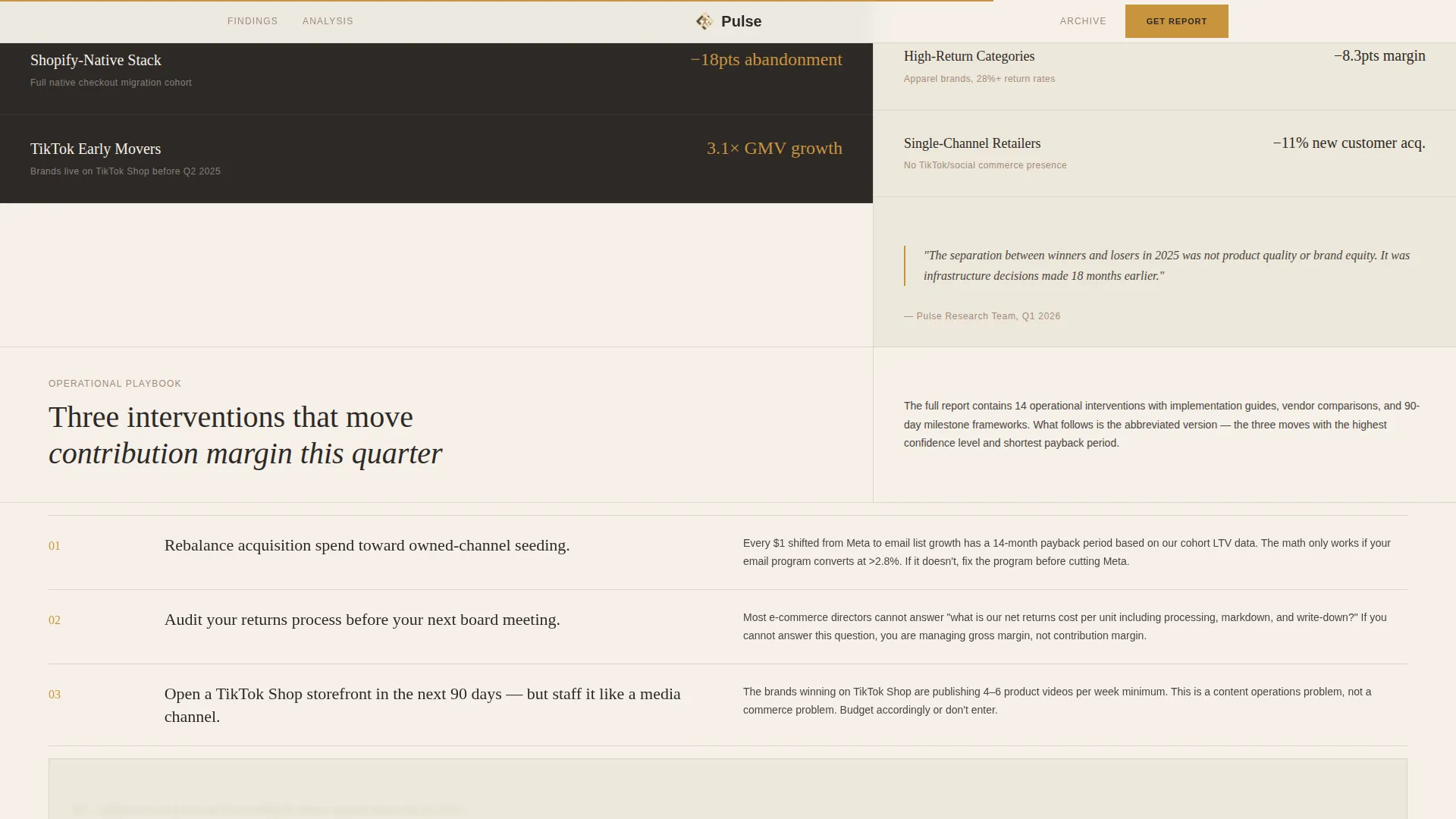
| Winner/Loser Analysis | Asymmetric bento layout showing brand performance data with thin saffron chart lines |
| Operational Playbook | Three findings with pull-quote rules and saffron accents, building actionable takeaway momentum |
| Closing Lead-Gen Module | Full-width form capturing work email, company name, and GMV range with a secondary Weekly Brief opt-in |
| Minimal Footer | Horizontal flow footer keeping navigation clean and the editorial tone uninterrupted |
Design & branding system
The design language sits between a New Yorker cover and a financial intelligence brief. Every element earns its place through restraint, and negative space carries as much visual weight as the color palette.
- Warm stone color system: travertine cream (#F5F0E8) as the page ground, wet clay (#A38B7A) for supporting elements, charcoal ink (#2D2926) for body text and linework, and muted saffron (#C9943E) reserved strictly for links, pull-quote rules, and hover states
- Typography pairs Fraunces as the serif display face for headlines and pull quotes with DM Sans as the clean body and interface typeface, reinforcing the journal-meets-intelligence-brief aesthetic
- Saffron accents appear at exactly three focal points in the hero illustration, keeping the palette disciplined and every color moment deliberate
Mobile & speed optimization
The template is built desktop-first, reflecting the primary use context of board meeting preparation and late-night dashboard review. A mobile fallback ensures the experience remains usable across devices.
- Server Components handle static editorial content to reduce client-side load, while Client Components manage the interactive form and scroll animations
- Animations are set to medium intensity, including masked text reveals, parallax effects, staggered scroll reveals, and a sticky sidebar, all tuned to complement reading rather than distract from it
How this template helps you convert
The conversion strategy is built into the scroll architecture itself. The reader is never asked to commit before the page has earned their trust.
- The four-stage report descent reveals approximately forty percent of the report's insights freely, making the remaining sixty percent feel like an unbearable gap rather than a paywall, and the sticky call-to-action element captures the moment that tension peaks.
- The dual-path closing form qualifies high-intent leads through the Gross Merchandise Value dropdown while offering a frictionless Weekly Brief opt-in for visitors who need more time, ensuring no engaged reader leaves without a conversion touchpoint.
Other information about this template
This template is a strong fit for e-commerce media brands, intelligence newsletters, and agency content teams that publish recurring research. A few additional details worth knowing before you build:
- The accordion FAQ component is included in the interactive layer, giving you a space to answer common reader objections directly on the page
- Reader company logos and specific data points are built into the social proof layer, using volume and issue credibility signals rather than generic testimonial formats
- The footer follows a horizontal flow pattern, keeping navigation minimal and in keeping with the overall editorial restraint of the design
- The layout is scoped to the English language, USD pricing context, and a United States market focus, making it immediately ready for North American e-commerce publications
Theme
Luxe Minimal
Creative direction
Industry Report
Color system
Warm Stone
Style
Asymmetric Grid (60/40)
Direction
Lead Generation
Page Sections
Asymmetric 60/40 Editorial Grid
Sticky Conversion Column
Hand-drawn Editorial Illustration Header
Minimal Saffron Line Charts
Dual-path Lead-generation Form
Scroll-driven Four-stage Narrative
Related questions
Who is this landing page template designed for?
Can I use this template for a recurring publication rather than a one-time report?
How does the lead-generation form qualify visitors?
What option exists for visitors not ready to complete the full form?
Is this template suited to a desktop-heavy audience?



