Fitness Industry Editorial Report Landing Page Template
Pulse is an editorial landing page template built for fitness industry intelligence publications. It pairs a hardbound-journal visual identity with a waitlist-gating flow, letting you tease chapter previews, capture reader roles, and build a qualified audience before launch. The design is typographic, deliberate, and suited to operators who trust substance over spectacle.
by Rocket studio
Quick summary
Pulse is a single-page editorial template for fitness industry trend reports. It opens like a title page, unfolds through roman-numeral chapter cards, and closes with a minimal waitlist form. The entire experience is built to earn signups through intellectual curiosity rather than pressure tactics.
Who this template is for
This template is designed for publishers and operators who produce serious, research-backed content for the fitness industry. It works best when the audience values analysis over aesthetics and makes decisions at scale.
- Boutique studio owners looking for a credible destination to distribute trend intelligence
- Fitness technology founders validating editorial positioning before a full product launch
- Corporate wellness directors and industry strategists who need a professional report landing page
What problem this template solves
Most editorial templates are built for lifestyle blogs, not for B2B fitness intelligence. They either feel too casual for a professional audience or too cold for a craft-forward publication. Pulse bridges that gap with a structure designed to build anticipation and capture leads without sacrificing editorial tone.
- Generic blog templates dilute authority by prioritizing visual clutter over typographic conviction
- Standard waitlist pages offer no content preview, giving visitors no reason to sign up early
- Fitness industry publishers lack a ready-made format that signals expertise and earns trust before full content is revealed
What you get with this template
You get a complete, single-page editorial layout built specifically for a fitness industry report publication on a waitlist model. Every section has a defined purpose, and nothing is decorative without intent.
- A full five-section page flow: hero title composition, chapter card scroll, data visualization interrupt, social proof counter, and waitlist form
- A typographic design system using editorial serif and clean sans-serif type, a four-color Japanese Zen palette, and deliberate whitespace
- Scroll-triggered animations, a fixed call-to-action button that materializes mid-scroll, and a minimal email-plus-role waitlist form
Feature list
This template includes the following built-in capabilities drawn directly from the source brief.
Chapter-Book Hero Section
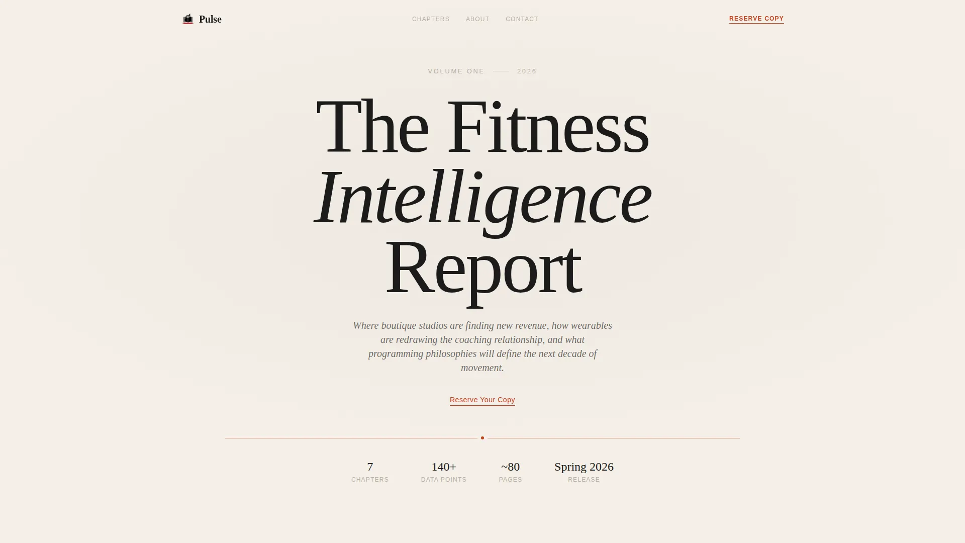
The header opens as a centered vertical title-page composition. "Volume One" appears in small-caps secondary type, followed by a large editorial serif headline and a single italic thesis statement. A thin vermillion rule separates the header from the body, and a subtle linen texture fills the background. No imagery is needed.
Roman Numeral Chapter Cards
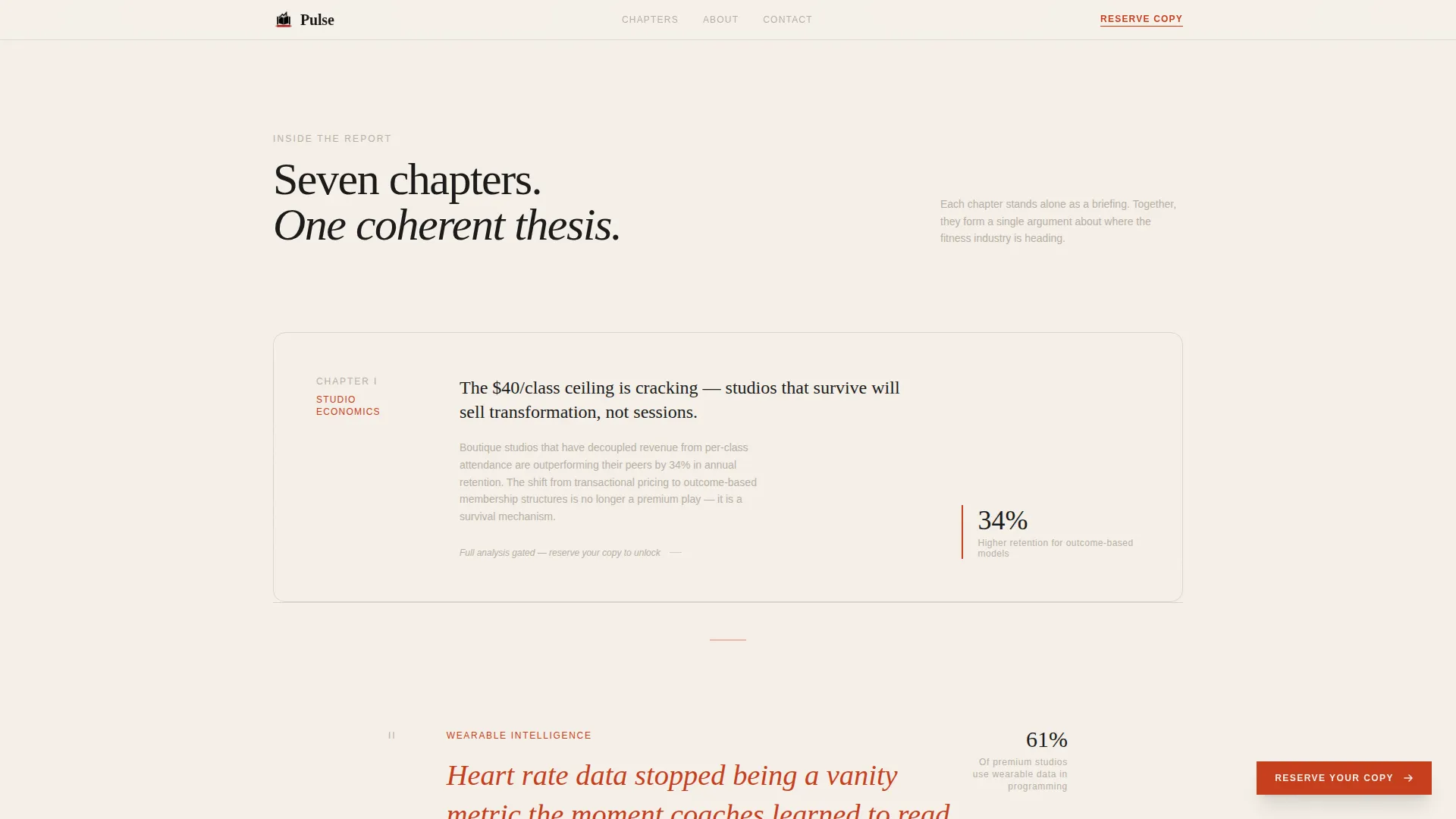
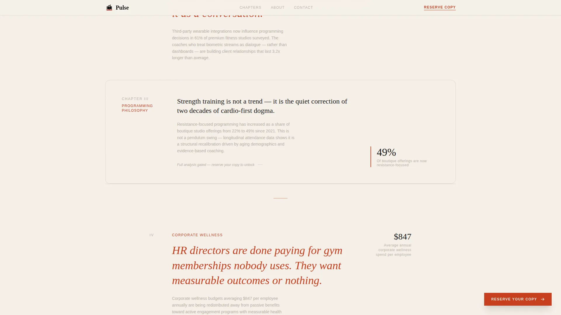
Each scroll section presents one report topic as a chapter card. Cards include a roman numeral, a one-line finding, and a two-sentence abstract. The scroll rhythm alternates between tight typographic cards and generous whitespace, creating an exhibition-catalog cadence that rewards continued reading.
Ink-Brush Data Visualization
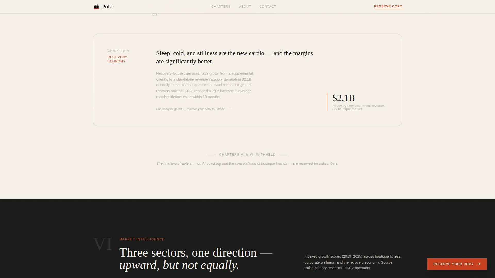
Full-bleed data visualization sections interrupt the chapter card rhythm. Charts are rendered in an ink-brush aesthetic and convey real industry numbers. These sections function as visual proof points that reinforce the publication's analytical credibility.
Scroll-Linked Fixed Call to Action
A vermillion reserve button materializes after the visitor scrolls past the third chapter card. It remains fixed on screen as a persistent prompt without obstructing the reading experience. This scroll-linked behavior keeps the conversion path present without interrupting early content discovery.
Minimal Waitlist Form
The reserve form collects only an email address and a single radio selection: Studio Owner, Founder, or Strategist. A live waitlist counter displays the current number of signups in warm gray beneath the submit button. The low-friction format is designed to reduce drop-off while still capturing role context.
Scroll-Triggered Reveal Animations
Chapter cards and key sections animate in with staggered scroll-triggered reveals. The pacing reinforces the editorial tone by introducing content at a measured, deliberate rhythm. Animation intensity is set to medium, keeping the experience dynamic without feeling promotional.
Page sections overview
| Section | Purpose |
|---|---|
| Hero Title Page | Sets editorial authority with a typographic title-page composition and vermillion rule |
| Chapter Card Scroll | Previews each report topic through roman numeral cards with findings and abstracts |
| Data Visualization Interrupt | Breaks the card rhythm with a full-bleed ink-brush chart conveying industry data |
| Waitlist Social Proof | Displays a live counter and reader-type breakdown to build quiet confidence |
| Reserve Waitlist Form | Captures email and reader role with minimal friction via a two-field form |
| Footer | Closes the page with a horizontal flow layout pattern |
Design & branding system
The visual identity follows a Warm Artisan direction expressed through a Japanese Zen color system. Every color choice has a defined role, and nothing competes for attention without purpose.
- Washi cream (#F5F0E8) dominates the canvas as breathing space; sumi ink black (#1A1A1A) carries all body text with generous leading; tatami warm gray (#B8AFA6) defines section dividers and secondary type
- Vermillion (#C73E1D) appears exclusively on interactive elements and pull quotes, used sparingly so each instance carries visual weight
- Typography pairs Fraunces editorial serif for headlines with DM Sans for body and interface text, balancing craft legibility with clean readability
Mobile & speed optimization
The template is built desktop-first for editorial readers but responds cleanly to tablet and mobile viewports. Technical implementation favors static rendering where possible to keep the client-side footprint light.
- Desktop-first layout with responsive behavior across tablet and mobile screen sizes
- Server components handle static content sections, keeping JavaScript to a minimum for faster initial load
- Scroll-triggered animations and the fixed call-to-action button are designed to function correctly across device sizes without degrading the reading experience
How this template helps you convert
The page earns its signups by revealing enough of each chapter's thesis to create genuine intellectual curiosity, then gating the full analysis behind the waitlist form.
- The chapter card previews expose the report's value incrementally, giving visitors a reason to scroll further and a reason to reserve their copy before the form even appears
- The fixed vermillion button materializes only after the visitor has engaged with three chapter cards, timing the conversion prompt to a moment of demonstrated interest
- The two-field waitlist form asks only for an email address and a role selection, keeping friction featherlight while collecting the segment data needed to serve readers well
Other information about this template
Pulse is part of a broader editorial template category suited to B2B content publishing in the fitness space. A few additional details worth knowing before you build:
- The template is localized for English (US) with USD formatting where applicable
- The footer uses a horizontal flow layout pattern consistent with modern editorial publishing conventions
- The live waitlist counter and reader-type breakdown provide social proof without aggressive urgency tactics
- The page is designed for the fitness industry report niche but the chapter-card structure and waitlist flow adapt well to any B2B intelligence publication
- Animation is set to a medium intensity level, using scroll-triggered reveals and staggered card entries rather than attention-grabbing motion
Theme
Warm Artisan
Creative direction
Curated Collection
Color system
Japanese Zen
Style
Editorial/Magazine
Direction
Waitlist/Coming Soon
Page Sections
Chapter-book Hero Composition
Roman Numeral Chapter Cards
Ink-brush Data Visualization
Scroll-linked Fixed Call to Action Button
Minimal Two-field Waitlist Form
Staggered Scroll-triggered Animations
Related questions
Who is this template designed for?
Can I customize the chapter card topics and copy?
How does the waitlist form collect reader information?
Does the page display correctly on mobile devices?
Can this template be adapted for a report outside the fitness industry?



