Healthcare News Blog Horizontal Scroll Landing Page
Pulse is a horizontal-scroll landing page template built for healthcare news publications and editorial media brands. It guides visitors through a cinematic, chapter-by-chapter journey from media noise to editorial clarity. With a collage hero, an origin-story scroll structure, sticky calls to action, and an Ink & Paper visual identity, Pulse earns reader trust before asking for a single click.
by Rocket studio
Quick summary
Pulse is a single-page horizontal-scroll template designed for healthcare news blogs and editorial media. It uses an origin-story structure to build reader trust across five lateral panels, moving from the problem of shallow health headlines to a demonstration of real editorial rigor. A sticky call-to-action and email signup complete the conversion path.
Who this template is for
Pulse is built for publishers, editors, and independent journalists who cover healthcare and medical news with depth and authority. It suits teams that need their landing page to do the convincing before a reader commits to subscribing.
- Healthcare news blogs targeting hospital administrators, health policy professionals, and pharma strategists
- Editorial media brands that publish original reporting on FDA rulings, lab research, and health legislation
- Independent healthcare journalists or newsletter operators launching a professional publication
What problem this template solves
Most health news sites look identical. Generic layouts, recycled stock photography, and headlines stripped of context give serious readers no reason to stop scrolling. Pulse addresses that trust deficit head-on by letting the design itself communicate editorial conviction.
- Readers cannot distinguish credible healthcare journalism from content-farm output at a glance
- A standard vertical homepage gives no space to demonstrate how reporting is actually done
- Call-to-action buttons appear before readers have any reason to believe the publication is worth their time
What you get with this template
You get a fully structured horizontal-scroll landing page with five distinct narrative panels, a sticky primary call to action, and a secondary email signup with a delivery-frequency toggle. Every section is built to move visitors from skepticism to subscription.
- Five thematic scroll panels covering the hero, the problem, the founder's desk, the editorial process, and the clarity payoff
- A sticky "Read Today's Briefing" button pinned throughout the scroll and repeated as a full-width banner at the final panel
- A "Get the Morning Round-Up" email field with a daily or weekly delivery toggle
Feature list
Pulse delivers a precise set of designed components drawn directly from its editorial brief. Each feature serves a specific purpose in building authority and guiding visitors toward action.
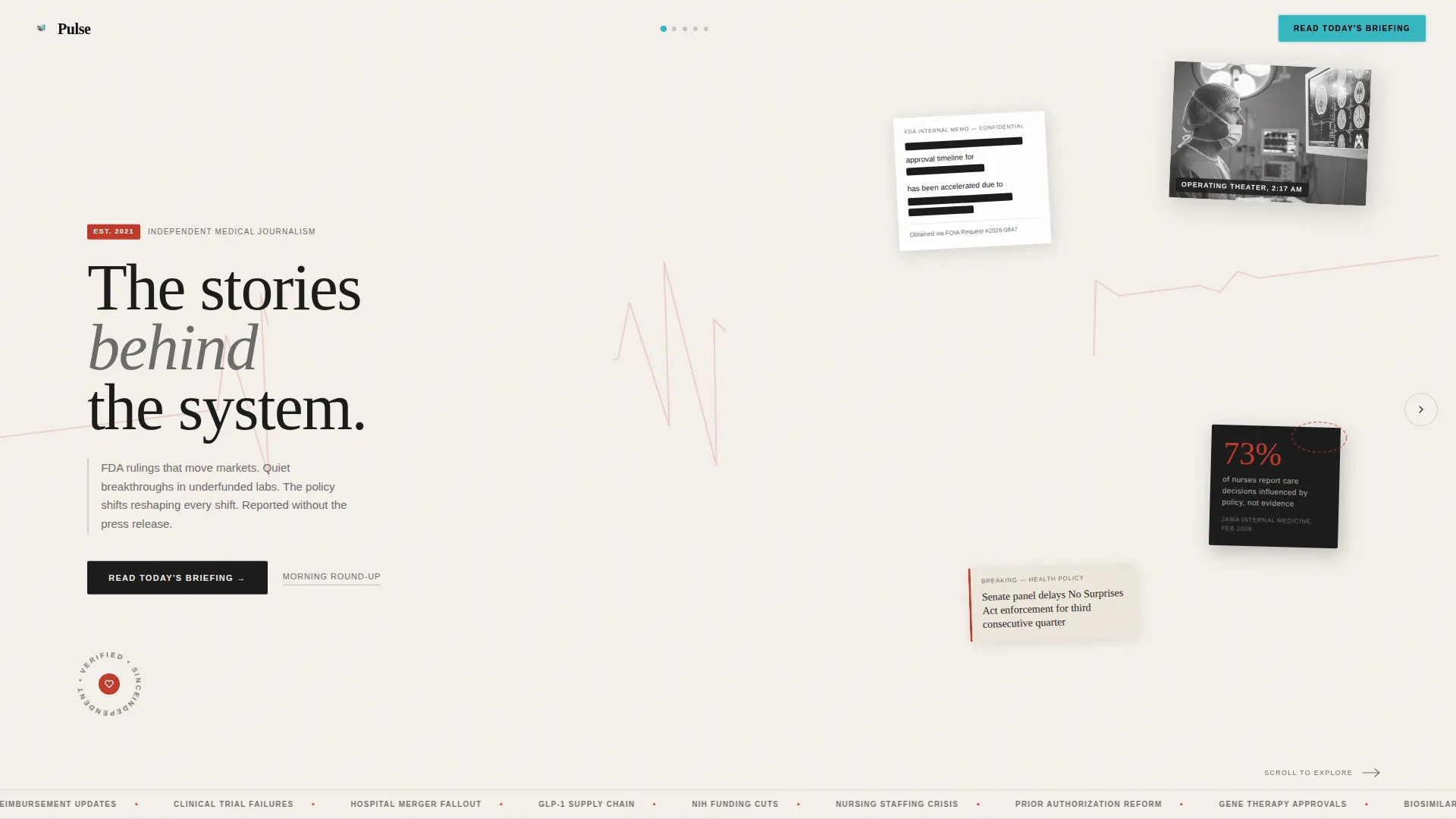
Collage Scrapbook Hero Panel
The hero uses overlapping headline fragments, redacted document textures, cropped clinical photography, and hand-circled statistics layered like a journalist's research wall. A diagonal strip of electrocardiogram paper runs behind the masthead. The headline "The stories behind the system" fades in over the composition, establishing tone before a single word of body copy is read.
Horizontal Scroll Origin Story Structure
Each lateral panel functions as a chapter in the publication's story. The scroll moves from a wall of sterile, identical health headlines, through a cluttered founder's desk of primary sources, into the editorial fact-checking process, and finally arrives at a single clean article on white space. The journey from chaos to clarity is the pitch.
Sticky Primary Call to Action
The "Read Today's Briefing" button remains pinned in the top-right corner throughout the entire horizontal scroll. It reappears as a full-width banner in the final panel. Visitors never have to hunt for the next step.
Email Signup with Frequency Toggle
The secondary conversion path offers a single email input field paired with a toggle that lets visitors choose daily or weekly delivery for the Morning Round-Up newsletter. The interaction is minimal and frictionless by design.
Editorial Process Panel
A dedicated scroll panel visualizes the publication's fact-checking layers, source verification steps, and red-pen editorial treatment. This panel exists specifically to demonstrate rigor rather than claim it, giving skeptical readers concrete visual evidence of how stories are built.
High-Fidelity CSS Animation System
The template uses horizontal scroll snap, marquee effects, a rotating badge, image reveals, and staggered text animations. All animations are driven by CSS and an Intersection Observer pattern, keeping the experience smooth and visually compelling without relying on heavy scripting.
Page sections overview
| Section | Purpose |
|---|---|
| Hero Collage Panel | Sets editorial tone, introduces masthead and headline |
| Problem Statement Panel | Shows the wall of generic health headlines readers distrust |
| Founder's Desk Panel | Establishes editorial conviction through primary-source clutter |
| Editorial Process Panel | Demonstrates fact-checking rigor visually before claiming it |
| Clarity Payoff Panel | Delivers single clean article proof and full-width call to action |
| Minimal Footer | Closes the page with horizontal flow and essential links |
Design & branding system
The visual identity follows a Luxe Minimal theme built on an Ink & Paper color system. Every palette decision is restrained and deliberate, evoking a first-edition medical journal bound in linen rather than a digital product trying to impress.
- Color palette: deep editorial black (#1A1A1A) for primary type, warm cotton stock (#F5F0EB) for backgrounds, soft graphite (#6B6B6B) for secondary text and ruled lines, and arterial red (#C0392B) used exclusively for breaking news tags and interactive hover states
- Typography: Fraunces display serif for headlines and masthead treatment, DM Sans for body text and interface elements
- Compositional style: intentionally imperfect collage layouts with two-to-three degree tilts, torn textures, redacted document overlays, and ruled-line dividers that feel editorial rather than digital
Mobile & speed optimization
Pulse is designed desktop-first to deliver the full horizontal-scroll narrative experience on large screens. A mobile fallback converts the horizontal panel sequence into a vertical layout so the content remains fully accessible on smaller devices.
- Desktop-first horizontal scroll with CSS snap points keeps panel transitions precise and intentional
- Static panel construction and CSS-driven animations reduce reliance on heavy JavaScript bundles
- Intersection Observer triggers control reveal animations, ensuring elements animate only when visible
How this template helps you convert
Pulse earns the click by building trust across the scroll journey rather than asking for it upfront. By the time a visitor reaches the final panel, the publication has already demonstrated its editorial standards visually.
- The sticky "Read Today's Briefing" button remains visible throughout the entire scroll, giving visitors a clear next step at every stage of the journey without interrupting the narrative.
- The origin-story panel structure replaces generic feature lists with a lived demonstration of how Pulse journalism is made, so readers arrive at the email signup already convinced of the publication's value.
- The dual conversion path (article click-through plus email signup with frequency toggle) captures both immediate readers and longer-term subscribers in a single frictionless flow.
Other information about this template
Pulse is categorized under Blog & Editorial and the Healthcare Blog & Media subcategory, with a niche focus on healthcare news publishing. It is built for US-centric healthcare context and uses English-language copy throughout.
- Template style: Horizontal Scroll with snap-point navigation across five thematic panels
- Creative direction: Origin Story, moving the reader from media chaos to editorial clarity across each lateral chapter
- Header concept: Collage/Scrapbook with layered textures, tilted elements, and an electrocardiogram paper diagonal
- Landing-page direction: Click-Through, optimized to drive visitors into live editorial content and newsletter signup
- Intersection match score for this template's category, subcategory, and niche alignment is 13



Theme
Luxe Minimal
Creative direction
Origin Story
Color system
Ink & Paper
Style
Horizontal Scroll
Direction
Click-Through
Page Sections
Collage Scrapbook Hero Panel
Horizontal Scroll Origin Story
Sticky Primary Call to Action
Email Signup with Frequency Toggle
Editorial Process Visualization Panel
CSS Animation and Reveal System
Related questions
Who is the primary audience for this template?
Can I adapt this template for a newsletter-first publication?
Does the horizontal scroll work on mobile devices?
How many scroll panels does the template include?
Can I change the color palette or typography to match my brand?



