HR Newsletter Landing Page Template | Ink & Paper
Pulse is an editorial landing page template built for HR and People Ops newsletter creators. It pairs a full-viewport manifesto header with a masonry card grid, interstitial stat blocks, and a sticky email capture bar. The result is a broadsheet-style page that builds subscriber trust through curated past editions and named contributor credentials before asking for the sign-up.
by Rocket studio
Quick summary
Pulse is a single-page newsletter landing page template designed for HR and People Ops content creators. It leads with a bold editorial manifesto, proves value through a masonry grid of past digest cards, and converts visitors with a persistent email capture element. The Ink and Paper visual theme gives the page a marked-up broadsheet feel that feels authoritative from the first scroll.
Who this template is for
This template is built for newsletter creators and independent editors who publish daily or weekly HR intelligence content. It is a strong fit if your audience is time-pressed and needs to trust your editorial voice before subscribing.
- People Ops leads and HR directors running curated digest newsletters for busy professionals
- Solo talent partners and independent HR consultants publishing a daily briefing
- Content strategists building a subscriber list around hiring law, compliance, or workforce policy
What problem this template solves
Most newsletter landing pages describe the content rather than demonstrate it. Readers arrive, skim a generic pitch, and leave unconvinced. Pulse solves this by replacing the pitch with proof.
- Visitors see real past editions with named contributors and credential lines before any ask
- The sticky email capture bar removes the need to scroll back up to subscribe
- Gating the free sample behind the same email field doubles the capture opportunity without adding friction
What you get with this template
Pulse delivers a complete single-page layout structured around editorial authority and lead generation. Every section is designed to earn the subscribe click rather than demand it.
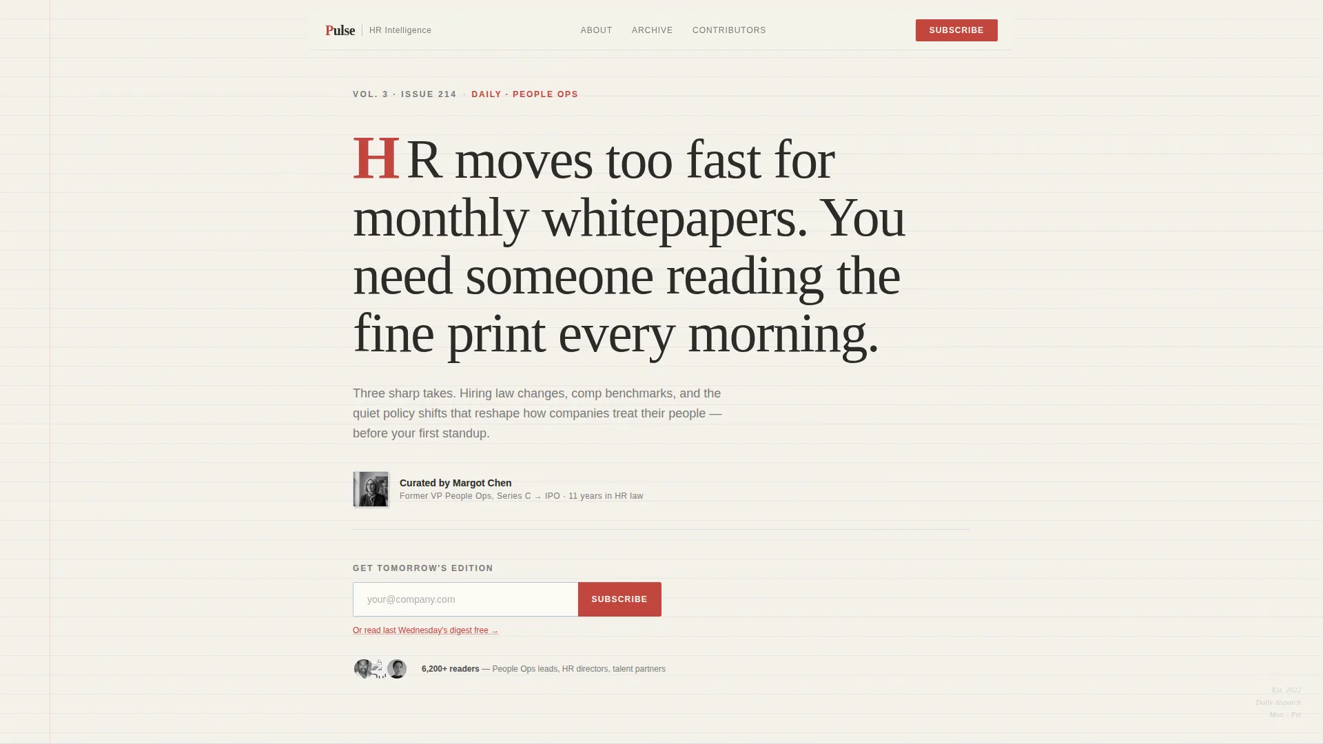
- A full-viewport manifesto header with ruled-line texture, a red drop cap, and a byline portrait zone
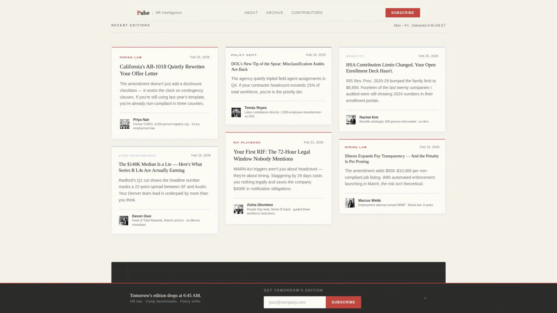
- A dual masonry card grid showing recent editions and archival takes, each with headshot, credential, and excerpt
- Full-width interstitial cards for oversized statistics and reader testimonials
- A primary email capture block beneath the manifesto and a sticky bottom bar that reappears after the third card row
- A secondary free-sample path gated behind the same email field
Feature list
Editorial Manifesto Header
The hero section fills the full viewport with a large editorial serif headline set against a textured off-white background with faint ruled lines. A single red drop cap anchors the opening word, and a small byline area displays the curator's name, title, and a postage-stamp-sized black-and-white portrait.
Masonry Card Grid
Two distinct masonry grid sections organise past editions and archival takes. Each card includes a contributor thumbnail headshot, a credential line such as "Former CHRO, 4,200-person org", and a two-sentence excerpt written to read like a hot take rather than a summary.
Full-Width Interstitial Cards
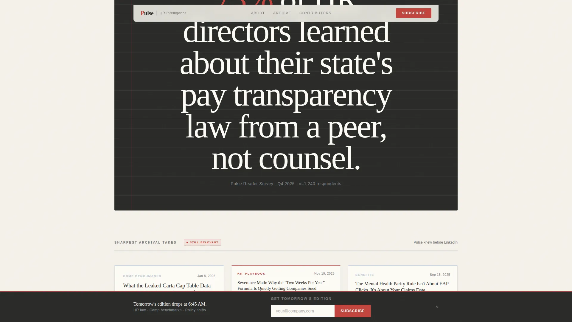
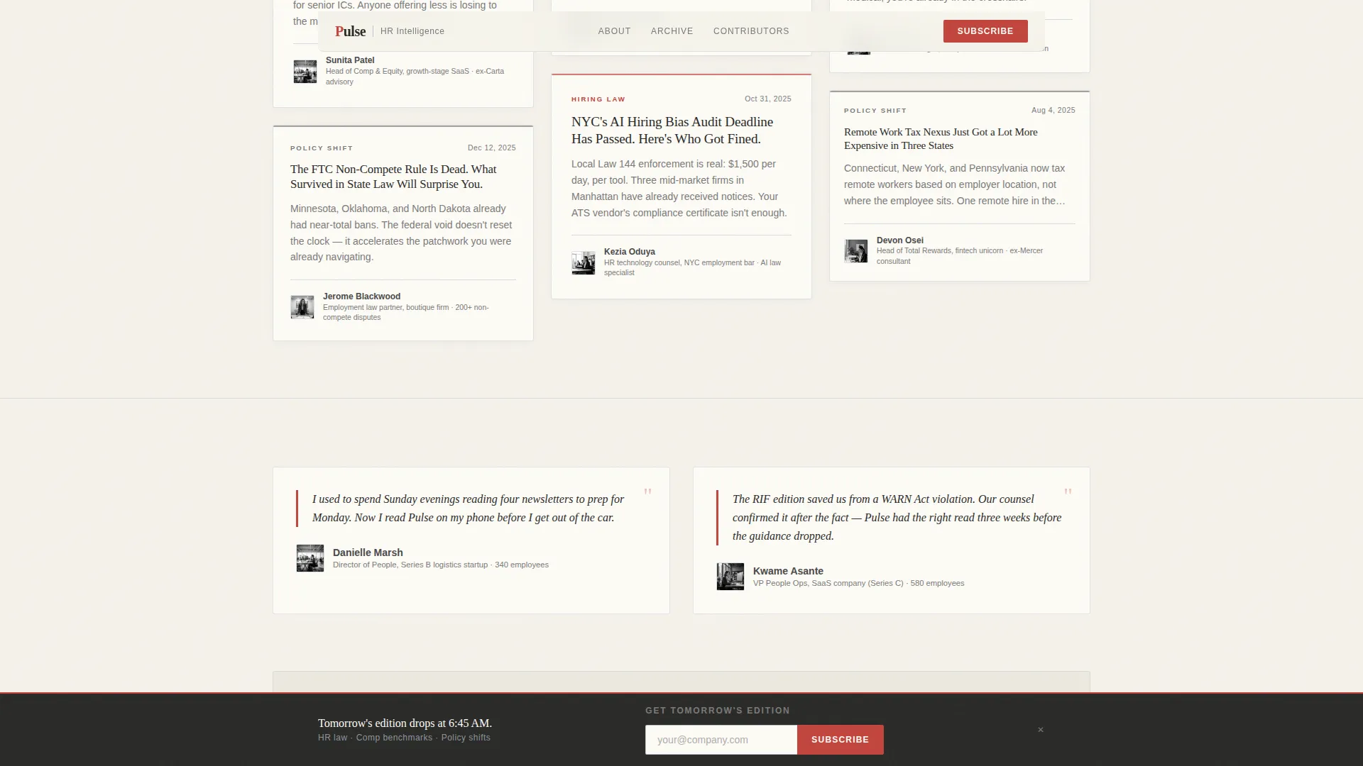
Occasional full-width cards break the masonry rhythm. Each interstitial displays a single statistic or reader testimonial in oversized type, creating natural pause points that reinforce the newsletter's authority between grid rows.
Sticky Bottom Email Bar
After the visitor scrolls past the third row of cards, a sticky bar locks to the bottom of the viewport. It carries the primary call to action with a single email field and a red submit button, keeping the subscription path visible without interrupting the reading flow.
Free Sample Gate
A secondary call to action labelled "Read Last Wednesday's Digest" offers a full past edition as a free preview. It routes through the same email capture, giving visitors a low-commitment entry point while still building the subscriber list.
Scroll Animation System
The template includes scroll-reveal animations with a cubic-bezier spring curve, parallax ruled-line effects on the background, and card hover lifts. The magnetic call-to-action button adds tactile responsiveness to the primary submit element.
Page sections overview
| Section | Purpose |
|---|---|
| Manifesto Hero | Opens with full-viewport editorial headline, drop cap, byline portrait, and first email capture |
| Recent Editions Grid | Masonry cards for recent digest issues with contributor headshots, credentials, and excerpts |
| Interstitial Stat Card | Full-width card breaking the grid with an oversized statistic |
| Archival Takes Grid | Deeper masonry cards building long-form authority through older high-value editions |
| Testimonial Interstitial | Reader quote in oversized type reinforcing editorial trust before the final call to action |
| Sticky Email Bar | Persistent bottom bar reappearing after third card row with email field and red submit button |
| Minimal Footer | Horizontal footer strip in Pattern 3 style, clean and low-distraction |
Design & branding system
The visual identity follows an Ink and Paper editorial theme built on the Soft Mist color system. Every color choice references the tactile feeling of a marked-up manuscript rather than a digital product.
- Warm newsprint white (#F5F2EB) for all backgrounds, pencil-lead gray (#4A4A4A) for body text, and faded margin blue (#B8C6D4) for thin section dividers
- Red editor's mark (#C2453D) reserved strictly for calls to action, the drop cap, pull quotes, and the submit button to preserve urgency
- Fraunces editorial serif for all display headlines and DM Sans for body copy and interface labels, pairing gravitas with readability
Mobile & speed optimization
The template is designed desktop-first to honor the broadsheet reading experience, with a responsive mobile fallback that reflows the masonry grid into a single column.
- Masonry cards restack gracefully on smaller viewports, keeping headshots and credential lines intact
- Static content uses server components while scroll effects and the sticky bar run as client components, separating rendering concerns by interactivity need
- The sticky bottom email bar adapts to mobile screen heights without obscuring card content
How this template helps you convert
Pulse is structured to move a skeptical HR professional from curious to subscribed through progressive proof rather than persuasion copy.
- The manifesto header establishes a credible editorial voice in the first five seconds, giving visitors a reason to keep scrolling before any ask appears.
- The masonry card grid accumulates evidence across multiple past editions, so by the time the sticky bar reappears, the visitor has already seen the value of subscribing.
- The free sample gate gives reluctant visitors a low-friction path that still results in an email capture, removing the last barrier to conversion.
Other information about this template
Pulse fits naturally within the broader landscape of B2B media and newsletter publishing tools. It is well suited for creators who want to launch or relaunch a curated HR intelligence digest with a professionally designed subscriber acquisition page.
- The template supports a US-centric HR law and compliance editorial focus, including hiring law changes, compensation benchmarks, and state-by-state policy tracking
- The Creator Spotlight creative direction means contributor credibility is a core structural element, not decorative, making it ideal for curators who feature guest editors or named analysts
- The Lead Generation page direction means every design decision from the drop cap to the sticky bar is oriented toward a single outcome: capturing the visitor's email address
- The page type is a single-page landing page, not a multi-page site, which keeps the subscriber journey linear and undistracted
Theme
Ink & Paper
Creative direction
Creator Spotlight
Color system
Soft Mist
Style
Masonry/Pinterest
Direction
Lead Generation
Page Sections
Editorial Manifesto Header with Drop Cap
Dual Masonry Card Grid
Full-width Interstitial Blocks
Sticky Bottom Email Capture Bar
Gated Free Sample Path
Scroll Animation and Hover System
Related questions
Can I change the color palette to match my own newsletter brand?
Does the template include actual newsletter content or only the layout?
How does the sticky email bar behave on mobile devices?
Can I use this template for a weekly newsletter instead of a daily one?
Is the free sample a separate page or part of the same landing page?



