Healthtech Interview Newsletter Landing Page Template
Pulse is an editorial landing page template built for a weekly healthtech interview and profile newsletter. It combines a Heritage and Story visual identity with a Gallery Walk scroll experience, drawing in health-tech investors, hospital innovation officers, and founder-operators through curated portrait profiles, a manifesto header, and two clear calls to action that build genuine reader hunger before asking for the click.
by Rocket studio
Quick summary
Pulse is a single-page editorial template designed for a weekly healthtech interview newsletter. It opens with a bold manifesto quote, guides visitors through a gallery of founder and clinician profiles, and closes the loop with two clear paths: read the latest issue or subscribe free. The aesthetic is restrained and deliberate, built to feel like a quality print journal on screen.
Who this template is for
This template is made for newsletter publishers who cover health innovation through long-form interviews and personal profiles. It speaks directly to the people who produce it and the audience who reads it.
- Founder-operators and healthtech journalists publishing weekly interview content
- Newsletter creators targeting health-tech investors, hospital innovation officers, or clinical leaders
- Editorial teams who want a landing page that earns the subscriber before asking for the sign-up
What problem this template solves
Most newsletter landing pages lead with a form. Pulse leads with people. The problem it solves is the trust gap between a first-time visitor and a subscribe button they have no reason to click yet.
- Generic newsletter pages lose visitors before the value lands
- Profile-driven storytelling is hard to present without a layout built for it
- Health-focused audiences are skeptical and need editorial credibility before they convert
What you get with this template
You get a complete, single-page layout that carries a visitor from first impression to committed action through carefully sequenced editorial sections. Every element is built around the interview format and the specific audience this newsletter serves.
- A full-scroll manifesto header with a quote, portrait, and silent opening moment
- A gallery-style profile section with alternating portrait and pull-quote layout
- Two conversion paths: a primary read call to action and a secondary free subscribe option
- A persistent bottom bar that appears after the third profile to capture late-stage intent
- Italic editorial thesis fragments placed between every third profile as a rhythmic divider
Feature list
A paragraph introducing the features: Each feature in this template is grounded in the editorial and conversion logic described in the source brief. Together they create a landing page that feels like curated journalism rather than a marketing funnel.
Manifesto Header with Portrait
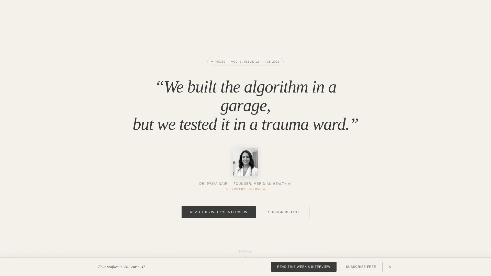
The page opens with a single sentence in large serifed type set against heirloom cream. Below it sits a tightly cropped black-and-white portrait, eyes direct to camera. No navigation appears on first load. The quote occupies a full scroll-length before the page content begins, giving the visitor space to settle in.
Gallery Walk Profile Layout
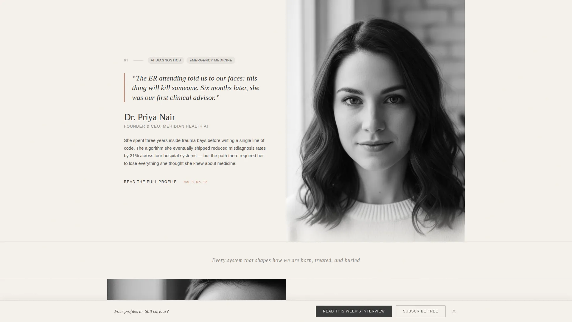
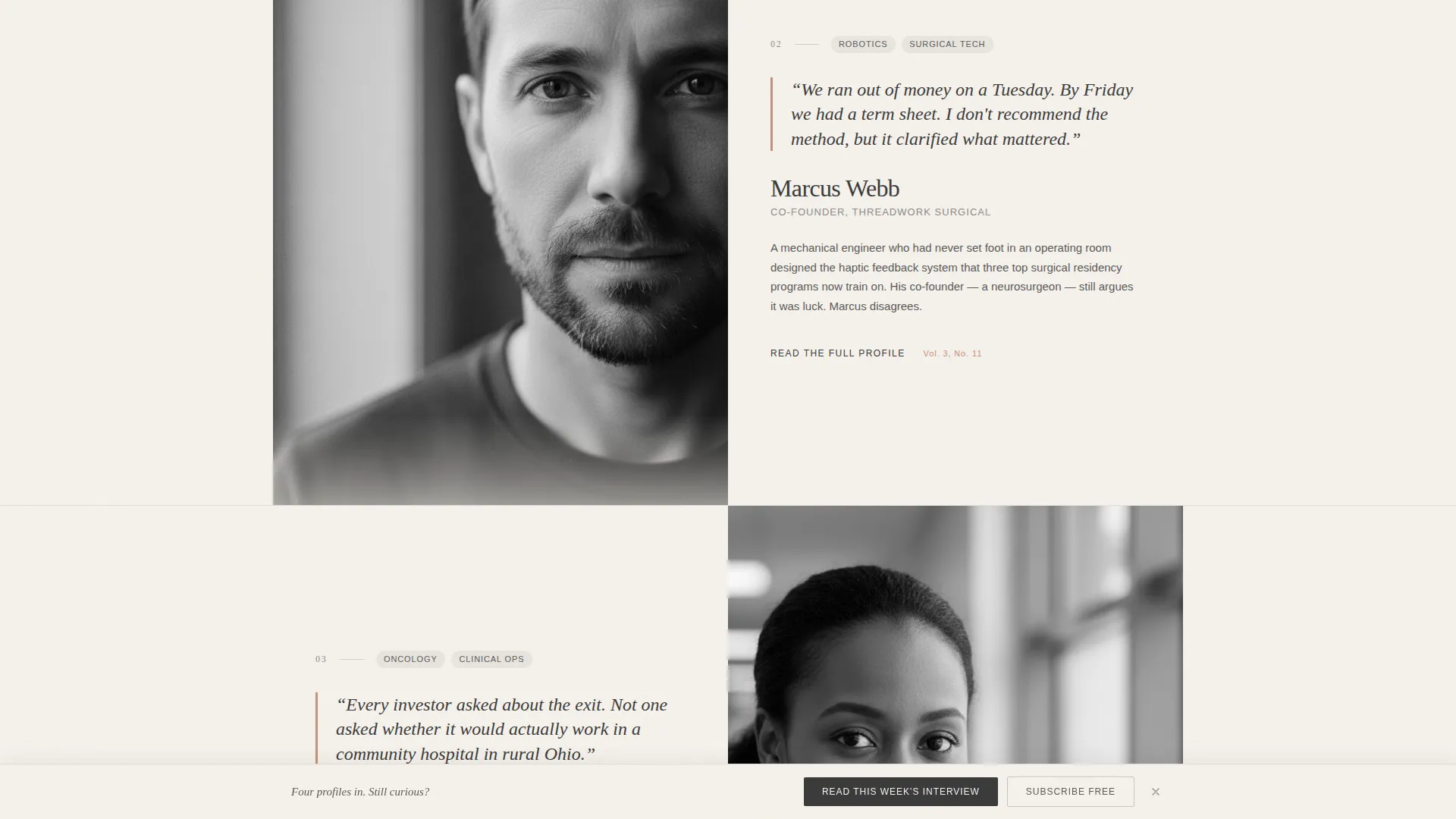
Each profile section pairs a large editorial portrait on one side with a clay rose pull-quote on the other. A two-sentence teaser sits beneath. Portraits alternate left and right across successive profiles, creating a deliberate read-pause-absorb rhythm that mirrors moving through a curated exhibition.
Editorial Thesis Dividers
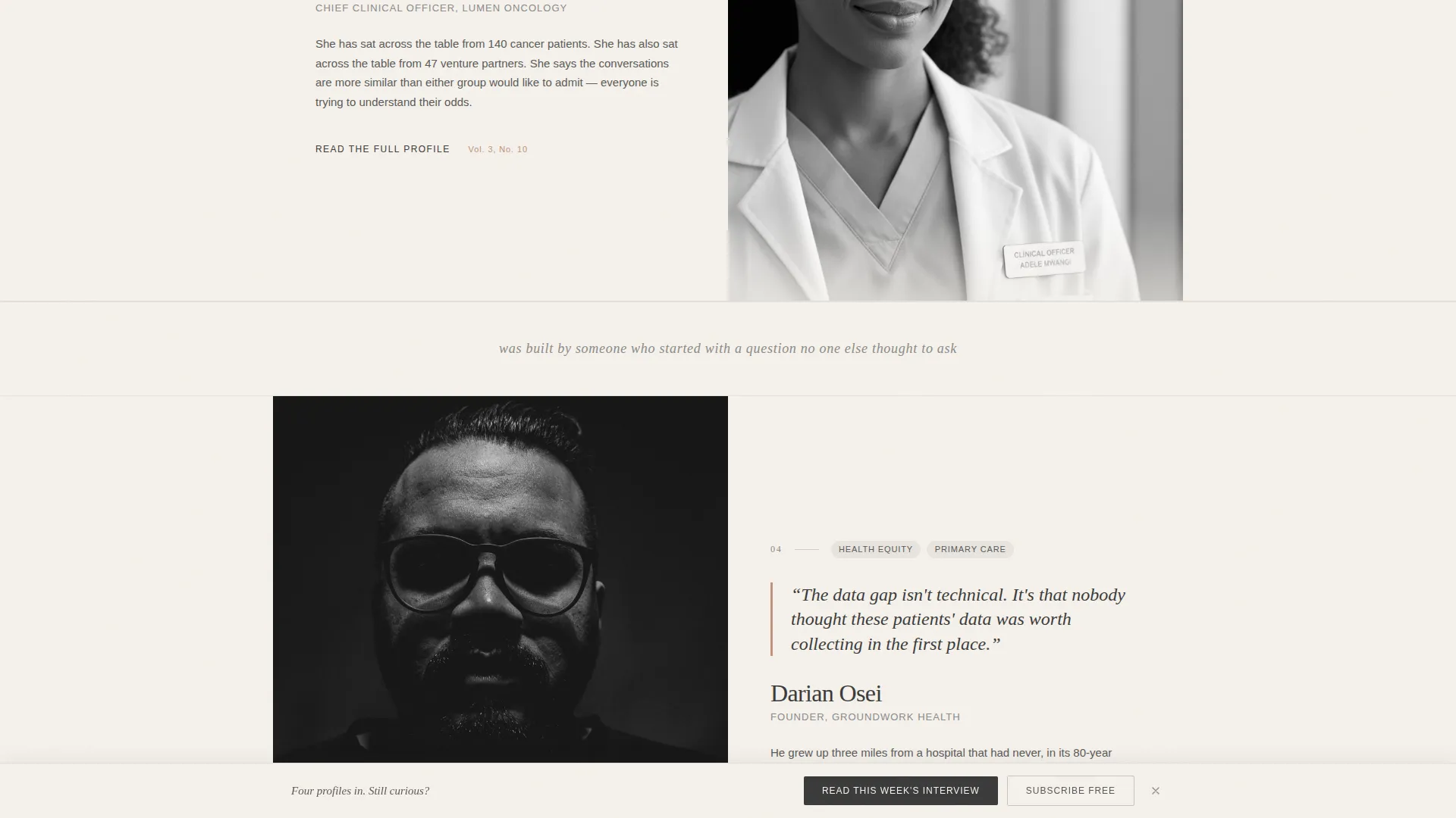
Between every third profile, a thin divider line carries a single italic sentence fragment. These fragments are pieces of the newsletter's editorial thesis. They only complete when the visitor reaches the bottom of the page, rewarding full scrolls and reinforcing the publication's point of view.
Dual Call-to-Action System
The primary call to action reads "Read This Week's Interview" and appears first below the manifesto header. It returns as part of a persistent bottom bar after the third profile. A secondary option, "Subscribe Free," sits beside it in quiet graphite and collects only an email address.
Persistent Bottom Bar
After the visitor passes the third profile, a bottom bar locks into view. It carries both the primary and secondary calls to action together. This placement is intentional: by that point, the profiles have done enough work to make the click feel natural rather than forced.
Heritage Color and Typography System
The Soft Mist palette uses warm fog, heirloom cream, quiet graphite, and muted clay rose as defined accent colors. Clay rose appears only on pull-quote borders, hover states, and subscribe accents, making each use feel deliberate. The serifed type reinforces the linen-bound journal aesthetic throughout.
Page sections overview
| Section | Purpose |
|---|---|
| Manifesto Quote Header | Opens the page with a full-scroll serifed quote and a black-and-white portrait, setting editorial tone before anything else loads |
| Profile One | First alternating portrait and pull-quote pairing with a two-sentence teaser |
| Profile Two | Second alternating profile, maintaining left-right portrait rhythm |
| Profile Three | Third profile, after which the persistent bottom bar activates |
| Thesis Divider One | Italic editorial fragment after the third profile, beginning the thesis thread |
| Profile Four | Fourth profile, where accumulated curiosity drives click intent |
| Primary call to action Block | "Read This Week's Interview" button linked to the latest issue on the chosen publishing platform |
| Subscribe Free Path | Secondary email capture option in quiet graphite beside the primary call to action |
| Persistent Bottom Bar | Sticky action bar carrying both calls to action, visible from the third profile onward |
Design & branding system
The visual identity follows a Heritage and Story theme expressed through the Soft Mist color system. Every color choice is tied to a specific emotional register: warmth without softness, restraint without coldness.
- Warm fog (#E8E4DF) and heirloom cream (#F5F1EB) form the primary page backgrounds, giving the layout its linen-and-paper quality
- Quiet graphite (#3A3A3A) handles body text and secondary interface elements, keeping legibility high without harshness
- Muted clay rose (#C4907A) is reserved exclusively for pull-quote borders, hover states, and subscribe accents, so every appearance carries earned visual weight
Mobile & speed optimization
The template is structured for clean readability at any screen size. The gallery portrait-and-quote rhythm adapts gracefully to narrower viewports without losing its editorial feel.
- Alternating portrait and pull-quote columns reflow into single-column stacks on smaller screens
- The persistent bottom bar remains accessible on mobile, keeping both calls to action within thumb reach
- Large serifed type and high-contrast graphite text maintain legibility across device sizes without requiring size adjustments
How this template helps you convert
This template earns the conversion rather than demanding it. The entire scroll sequence is designed so that by the time a call to action appears in a persistent position, the visitor has already been given a reason to care.
- The manifesto header creates immediate editorial credibility; a strong attributed quote signals that real, named people trust this publication
- Each profile adds another face and another fragment of untold story, building a cumulative hunger that the "Read This Week's Interview" button satisfies at exactly the right moment
- The "Subscribe Free" path offers a low-commitment alternative, capturing visitors who are curious but not yet ready to read the full issue
Other information about this template
This template is purpose-built for the healthtech newsletter format, but the layout logic works for any interview-driven editorial publication with a defined niche audience. The click-through destination can point to an issue hosted on Substack, Beehiiv, or any other publishing platform where the newsletter lives.
- The template style is classified as Editorial and Magazine, suited for profile-heavy and long-form interview content
- The landing page direction is Click-Through, meaning the primary goal is driving traffic to an existing issue rather than capturing leads at volume
- The header concept is Quote and Manifesto, a single attributed sentence that frames the entire publication's identity before the visitor scrolls
- The Gallery Walk creative direction means the scroll experience is intentionally paced, not information-dense
Theme
Heritage & Story
Creative direction
Gallery Walk
Color system
Soft Mist
Style
Editorial/Magazine
Direction
Click-Through
Page Sections
Manifesto Header with Full-scroll Opening
Gallery Walk Profile Sections
Persistent Dual Call-to-action Bar
Editorial Thesis Divider System
Soft Mist Heritage Color System
Click-through Conversion Architecture
Related questions
What kind of newsletter is this template designed for?
Can I update the header quote and portrait for each new issue?
Where does the primary call-to-action button link?
Does this template collect email addresses?
Is the Gallery Walk layout only suited to healthtech content?



