Pulse - Dynamic Healthtech Landing Page Template
Pulse is a split-screen healthtech landing page template built for startups that turn raw biometric and lab data into real-time risk intelligence. It features a tab-switching header, animated Problem-Solution scroll sections, a Before/After toggle engine, and a progressive two-step sign-up form, all wrapped in a dark, high-contrast Acid Digital visual identity.
by Rocket studio
Quick summary
Pulse is a single-page healthtech landing page template designed for platforms that detect chronic disease risk before it becomes a diagnosis. The layout uses a 50/50 split-screen structure, a Feature Tab Switcher header, and a scroll-driven Problem-Solution arc that builds trust section by section before presenting the core call to action.
Who this template is for
This template is built for healthtech founders and product teams launching platforms that sit at the intersection of preventive care and data intelligence. It speaks directly to three distinct audiences without losing focus.
- Primary care physicians who need a cleaner way to interpret fragmented patient data across multiple sources
- Corporate wellness directors managing population health spend and looking to demonstrate measurable outcomes
- Health-conscious individuals who track wearable metrics but want clearer, actionable interpretation of their numbers
What problem this template solves
Healthtech startups often struggle to communicate a complex, data-heavy value proposition to audiences with very different mental models. A generic template cannot hold that tension. Pulse is built specifically for that challenge.
- Fragmented health data feels overwhelming to every audience segment, and the template shows how your platform resolves that chaos visually
- Visitors leave before reaching the call to action when the product story is unclear or the stakes feel abstract
- A single layout cannot speak to physicians, wellness directors, and individual users simultaneously without a structured, segmented flow
What you get with this template
Pulse delivers a fully structured landing page layout with every section, interaction pattern, and visual component defined in the brief. Nothing is left to guess.
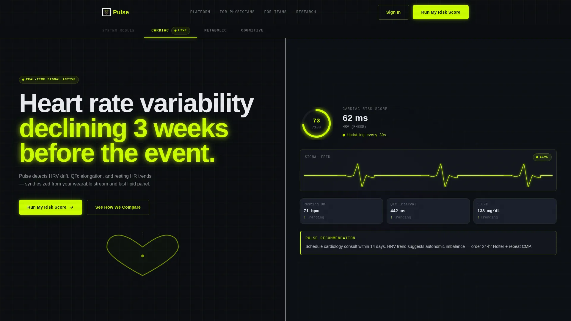
- A split-screen header with three switchable tabs (Cardiac, Metabolic, Cognitive), each revealing a different dashboard simulation on the right panel
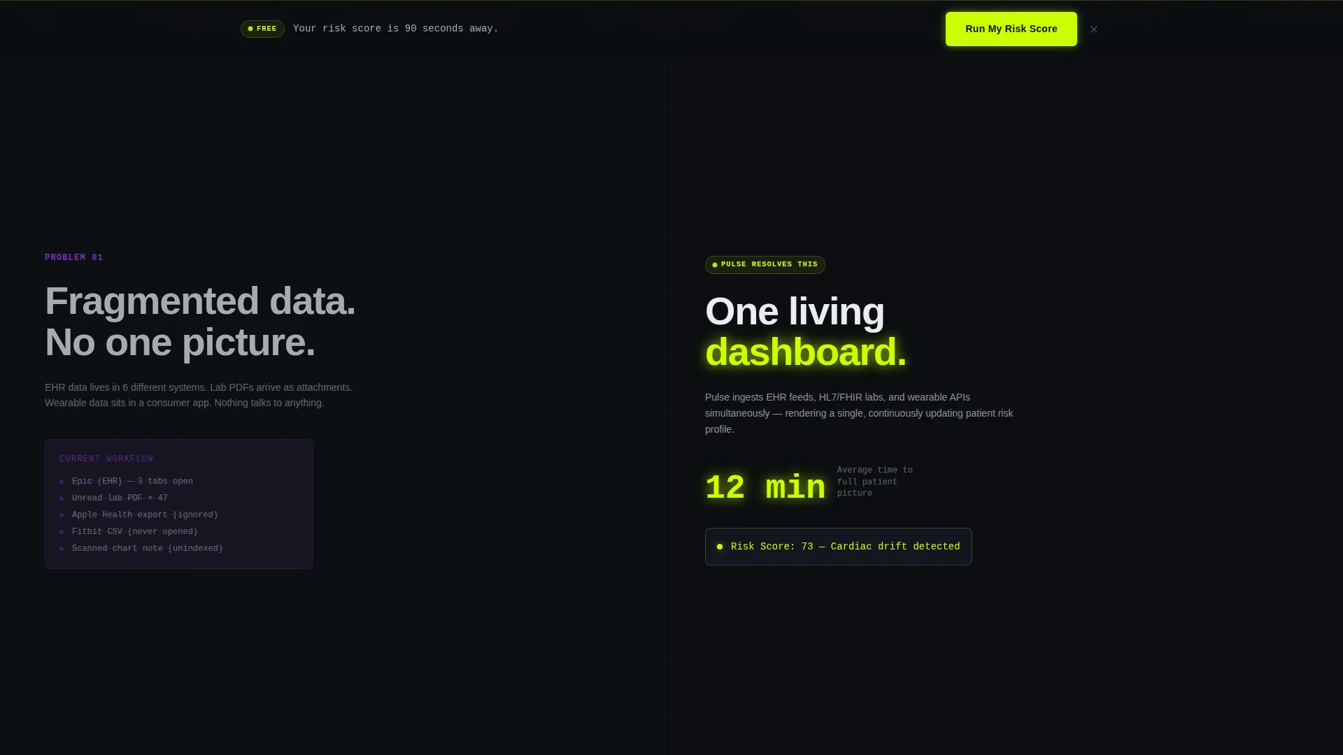
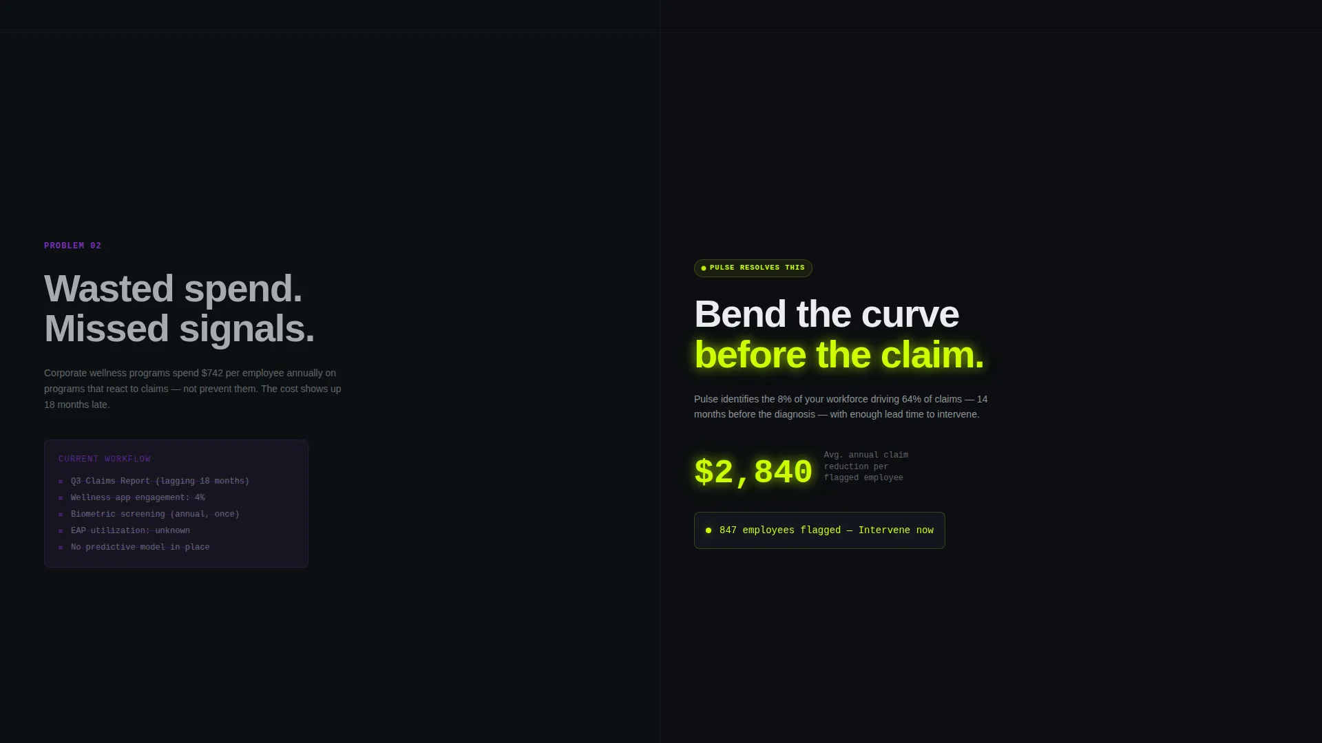
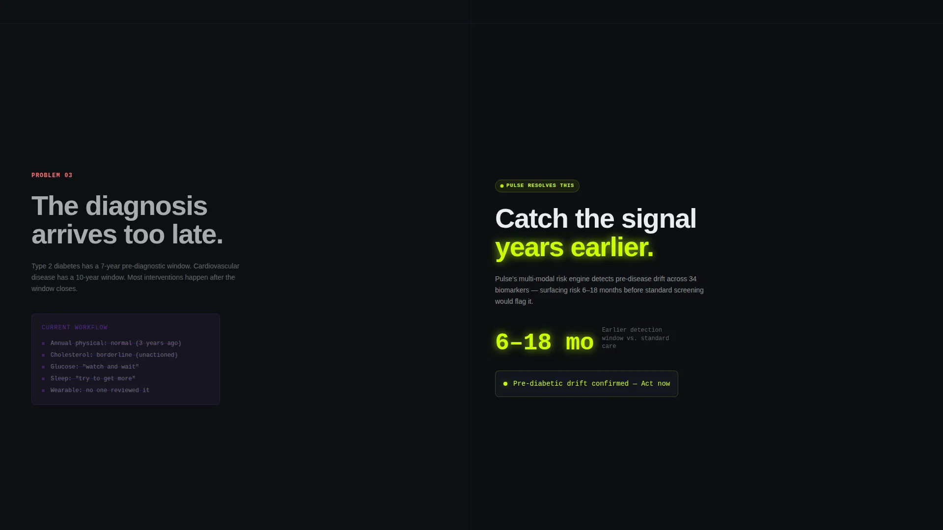
- A scroll-driven Problem-Solution arc with three escalating section pairs, each showing the legacy chaos on the left and the Pulse resolution on the right
- A progressive two-step sign-up form, a persistent sticky call-to-action bar, and an animated seven-criteria comparison table
Feature list
This template packages several high-impact layout and interaction patterns purpose-built for a healthtech product launch.
Feature Tab Switcher Header
Three tabs labeled Cardiac, Metabolic, and Cognitive sit across the top of the viewport. Each tab triggers a split-screen transformation: the left panel shows a stylized human silhouette with the relevant organ system glowing in chartreuse wireframe, while the right panel displays a live-simulated dashboard with ticking numbers and self-drawing graphs. The active tab pulses once on load.
Problem-Solution Scroll Arc
Below the header, each scroll section pairs a left-side problem panel with a right-side resolution panel. The left shows legacy chaos (fragmented records, unread lab PDFs, missed-diagnosis bar charts) rendered in desaturated violet and gray. The right answers with clean, chartreuse-highlighted Pulse insights. The stakes escalate across three pairs, from scattered data to wasted spend to missed early detection.
Before and After Toggle Engine
A persistent "Before Pulse / With Pulse" toggle anchors the middle of the page. Visitors can flip any section between the legacy workflow and the Pulse workflow without scrolling away. This component lets the product story reset itself for skeptical visitors who need to see the contrast more than once.
Progressive Two-Step Form
The sign-up form collects information across two steps. Step one asks for role (Physician, Wellness Director, or Individual) and connected wearable type. Step two requests an email address and offers an optional lab-work file upload. The two-step structure lowers perceived friction and qualifies the lead at the same time.
Animated Comparison Table
A "See How We Compare" secondary path links to an animated side-by-side table. It pits the Pulse platform against legacy electronic health record dashboards, traditional wellness platforms, and consumer health apps across seven criteria. Each row reveals its winner with a chartreuse check animation triggered on scroll.
Sticky Call-to-Action Bar
A bottom bar carrying the primary call to action ("Run My Risk Score") activates once the visitor has scrolled past 60% of the page. It stays visible without interrupting the scroll narrative, appearing only after the visitor has seen enough of the product story to act with confidence.
Page sections overview
| Section | Purpose |
|---|---|
| Tab Switcher Header | Introduce three health domains with interactive split-screen simulations |
| Problem Panel One | Show scattered data chaos as the first pain point |
| Solution Panel One | Resolve fragmented records into a single actionable insight |
| Problem Panel Two | Expose the financial cost of uncoordinated wellness data |
| Solution Panel Two | Demonstrate spend clarity through the Pulse dashboard view |
| Problem Panel Three | Frame missed early detection as the highest-stakes failure |
| Solution Panel Three | Show real-time risk scoring as the decisive resolution |
| Before/After Toggle | Let visitors flip between legacy and Pulse workflows |
| Primary call to action Block | Present the "Run My Risk Score" form after the third resolution |
| Comparison Table | Animate a seven-criteria versus table against competing solutions |
| Sticky call to action Bar | Reinforce the primary call to action across the bottom of the viewport |
Design & branding system
The visual identity follows an Acid Digital color system built to feel like a lab monitor glowing in a dark room. Every color has a deliberate role, and nothing is decorative without purpose.
- Void black (#0B0E11) forms the primary background, creating the high-contrast operating environment where data elements perform
- Electric chartreuse (#CCFF00) drives every interactive surface, live data point, call-to-action button, and animated highlight, while clinical UV violet (#7B2FBE) anchors graph lines, toggle states, and section dividers
- Phosphor white (#EAECF0) carries all body text and card surfaces, keeping readability crisp against the dark background
Mobile & speed optimization
The template layout is designed with responsive behavior in mind, adapting the 50/50 split-screen structure for narrower viewports without losing the visual contrast that defines the design.
- Split-screen sections restack vertically on smaller screens so problem and solution panels remain legible in sequence
- Animated elements such as the self-drawing graphs and chartreuse pulse effects are scoped to their containers, keeping the motion purposeful rather than resource-heavy
How this template helps you convert
The entire page is structured as a progressive trust-building sequence. By the time the call to action appears, the visitor has already seen their own workflow problem reflected and resolved three times.
- The tab-switching header invites immediate interaction before any scrolling, establishing the platform's intelligence early and reducing the time needed to hook the visitor
- The escalating Problem-Solution arc builds emotional stakes across three pairs, moving from inconvenience to cost to consequence, so the "Run My Risk Score" call to action feels like relief rather than a sales ask
- The two-step form and optional comparison table offer two different paths to commitment, catching both high-intent visitors ready to sign up and skeptical visitors who need one more proof point
Other information about this template
This template is part of the Startup and Launch category, specifically designed for the Startup Homepage subcategory within the HealthTech Startup niche. It combines four advanced design and layout decisions that are rare in off-the-shelf templates.
- The Dynamic Motion theme governs all transitions and animated states, ensuring the page feels alive without relying on video backgrounds or heavy external assets
- The Comparison/Versus landing page direction is built into the structural DNA of the layout, not added as an afterthought
- The template is suited for teams building in the preventive health, population health management, and wearable data intelligence spaces
- It can support product launches, investor-facing demos, waitlist pages, and early-access sign-up flows within a single layout
Theme
Dynamic Motion
Creative direction
Problem→Solution Arc
Color system
Acid Digital
Style
Split Screen (50/50)
Direction
Comparison/Versus
Page Sections
Feature Tab Switcher Header
Problem-solution Scroll Arc
Before and After Toggle Engine
Progressive Two-step Form
Animated Seven-criteria Comparison Table
Sticky Call-to-action Bar
Related questions
Who are the three target audiences this template addresses?
Can I use this template for a waitlist or early-access launch?
What makes the Before/After toggle different from a standard comparison section?
Does the template include the animated comparison table layout?
Is this template limited to healthtech startups?



