Retail Blog & Media Specialist Pre-Launch Website Template
Pulse is a coming-soon landing page template built for a retail thought leadership publication. It pairs a full-viewport newspaper masthead with an asymmetric masonry gallery of locked editorial cards and a sticky waitlist bar. The design channels the authority of a printed broadsheet, targeting retail strategists, direct-to-consumer founders, and merchandising directors.
by Rocket studio
Quick summary
Pulse is a single-page waitlist template for a retail industry publication. It opens with a bold serif masthead, flows into a masonry gallery of locked editorial previews, and closes with a sticky subscription bar. The layout feels like a beautifully typeset broadsheet, unhurried, literate, and built to earn trust before a single article publishes.
Who this template is for
This template is made for founders and strategists who are launching a premium editorial brand in the retail space. It suits anyone who wants their coming-soon page to signal depth and authority rather than a generic countdown.
- Retail strategists at mid-market chains building an audience before launch
- Direct-to-consumer founders scaling into physical retail who want a credible media presence
- Merchandising directors and industry insiders creating a thought leadership platform
What problem this template solves
Most coming-soon pages look disposable. They offer a blinking timer and a plain email field, which does nothing to communicate the value of what is coming. For a publication targeting sophisticated retail professionals, that first impression is the pitch.
- Visitors have no reason to sign up for a waitlist when they cannot feel the quality of the content
- Generic landing pages fail to signal editorial credibility to a discerning B2B audience
- A plain form cannot create desire for a specific article or interview the way a locked card can
What you get with this template
You get a complete, single-page coming-soon layout designed to build a waitlist for a premium retail publication. Every section is purposeful, and the structure moves visitors from curiosity to sign-up with editorial confidence.
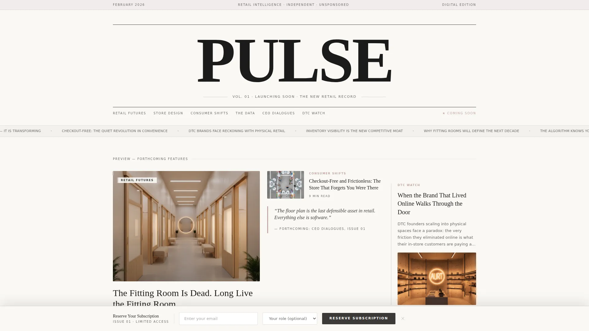
- A full-viewport newspaper masthead section with a serif headline, dateline, and three staggered article preview cards
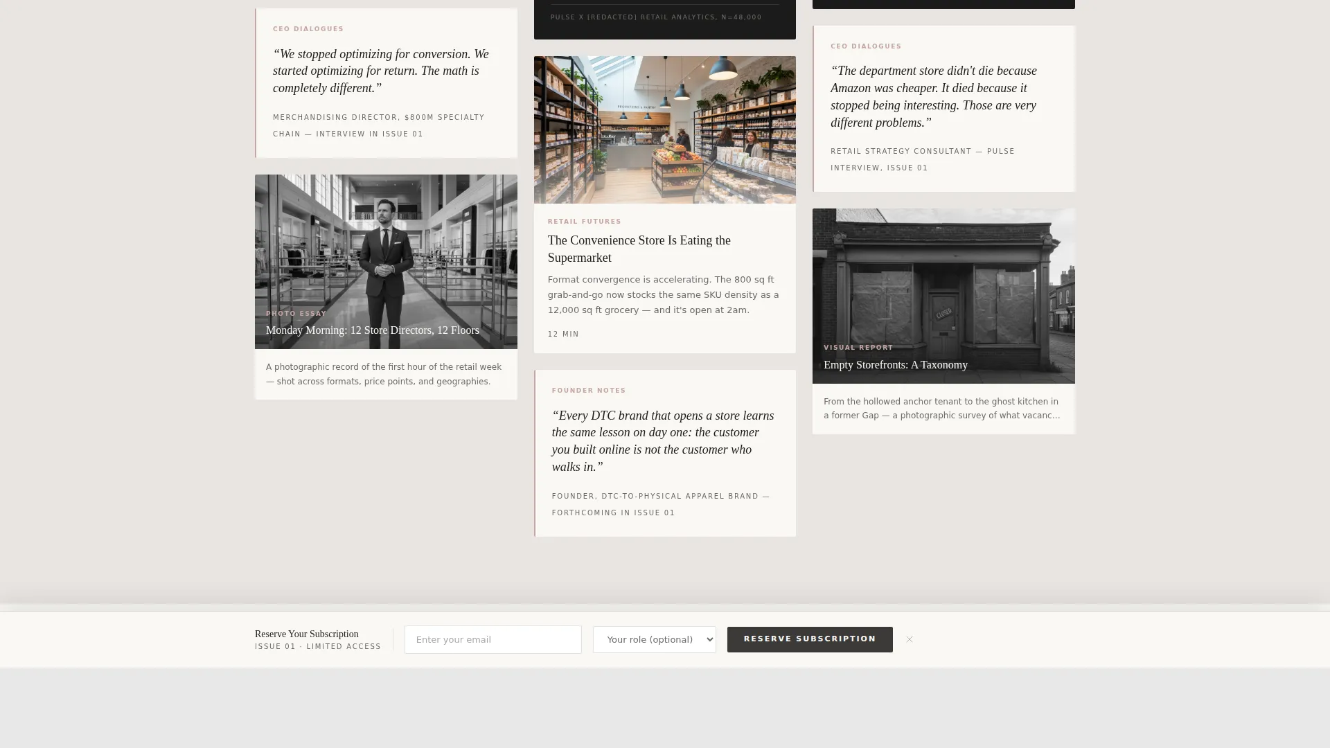
- An asymmetric masonry gallery of locked content tiles in multiple formats: long-read previews, data visualization squares, quote strips, and photo essays
- A sticky waitlist bar with an email field and an optional role dropdown that appears after two scroll depths
Feature list
This template ships with a focused set of components, each designed to make the publication feel real and worth waiting for.
Full-Viewport Newspaper Masthead
The hero section presents "PULSE" in a large-weight serif font across the full viewport width. A thin rule and a dateline reading "Vol. 01 · Launching Soon · The New Retail Record" flank the title, giving the page immediate publication authority. Three staggered editorial preview cards sit below the masthead, each featuring a working headline and shallow depth-of-field photography.
Asymmetric Masonry Gallery
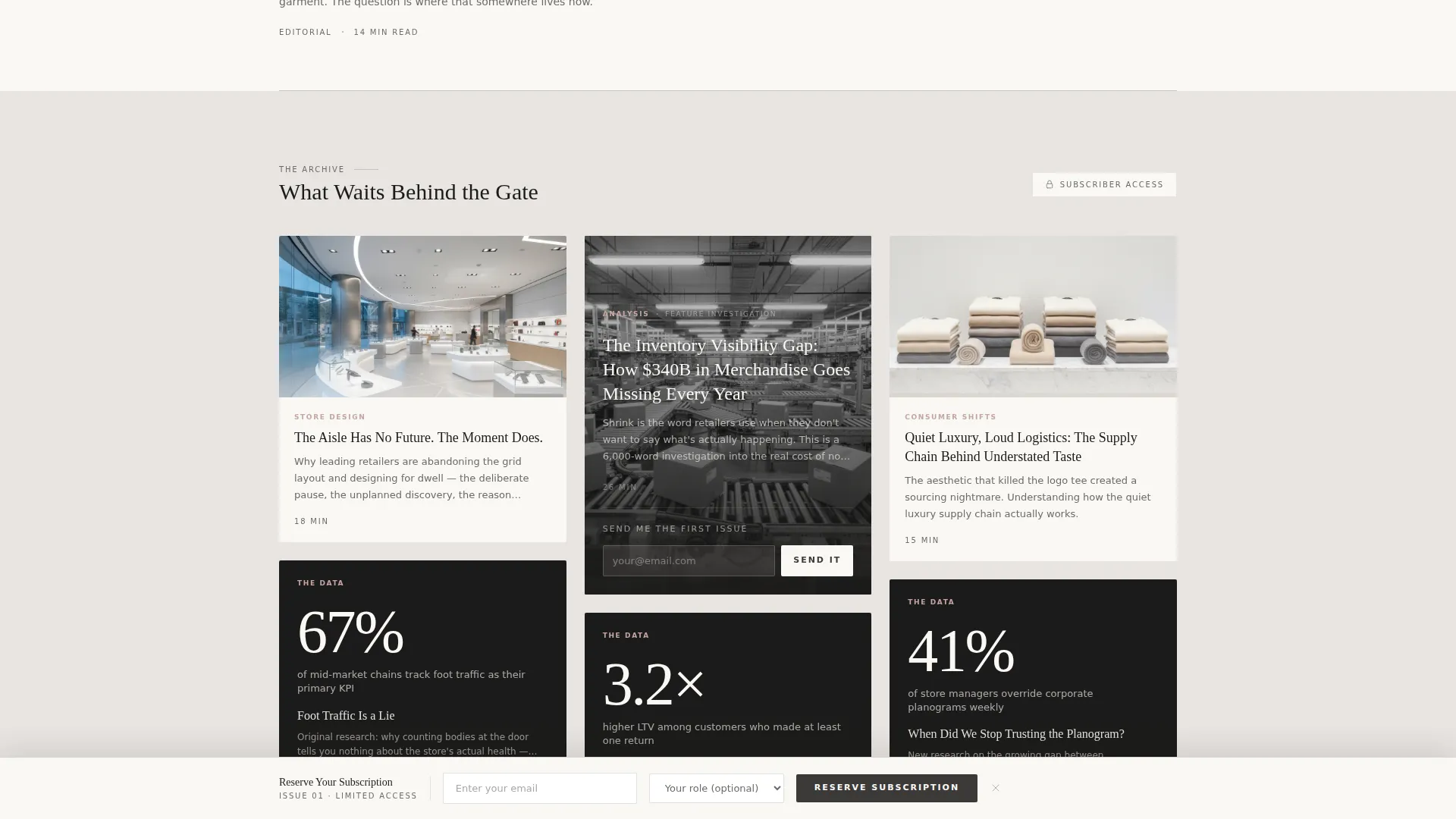
Content tiles cascade in uneven columns as the visitor scrolls, mimicking the rhythm of walking through a gallery exhibition. Each card uses a different proportion and format, so no two cards look alike. The variety holds attention and communicates that the publication covers many content formats.
Frosted Glass Locked Cards
Every card in the masonry gallery is overlaid with a frosted-glass effect and a small lock icon. The overlay signals that substantial content exists just behind the gate. Hover states reveal the muted rose accent, rewarding interaction without unlocking the content.
Embedded Secondary Conversion Path
The most visually compelling locked card contains a "Send Me the First Issue" button. This creates a specific moment of desire tied to a real article rather than a generic promise. It gives visitors a second, more personal reason to leave their email.
Sticky Waitlist Bar
A persistent bottom bar appears after the visitor scrolls through two scroll-depth thresholds. It presents a "Reserve Your Subscription" call to action with an email input and a single optional dropdown for role selection: Strategist, Founder, Merchant, or Curious Outsider.
Scroll-Triggered Card Reveals
Cards enter the viewport through staggered scroll-triggered animations, giving the gallery a sense of arrival rather than static display. The pacing reinforces the editorial, unhurried tone of the publication brand.
Page sections overview
| Section | Purpose |
|---|---|
| Newspaper Masthead Hero | Establishes publication authority and previews editorial content |
| Staggered Preview Cards | Teases forthcoming feature articles below the masthead |
| Masonry Gallery | Displays locked content tiles across multiple editorial formats |
| Quote Strip Tiles | Surfaces CEO interview excerpts to signal source access |
| Data Visualization Squares | Teases original research to reinforce analytical credibility |
| Sticky Waitlist Bar | Captures email and role data after two scroll depths |
Design & branding system
The visual identity follows an editorial magazine theme built on a Soft Mist color palette. Every color decision reinforces the feeling of a linen-bound journal left open on a marble countertop: unhurried and deliberately understated.
- Color palette: newsprint cream (#FAF8F5) and fog gray (#E8E4E1) alternate as section backgrounds; quiet charcoal (#3B3A39) carries all body text; muted rose (#C4A6A0) appears on hover states, pull-quote borders, and card underlines
- Typography: Fraunces serif handles all display headlines, delivering typeset weight and editorial gravity; DM Sans handles body copy and interface labels with clean legibility
- No navigation bar or hamburger menu is included; the masthead functions as the sole authority anchor, keeping the reading experience uninterrupted
Mobile & speed optimization
The template is designed desktop-first, reflecting the behavior of retail strategists who read long-form industry content at a desk. A responsive mobile fallback is built in so the page works cleanly on smaller screens.
- The masonry gallery reflows into a single-column layout on mobile, preserving card readability without breaking the editorial structure
- Server Components handle all static content sections, keeping the JavaScript footprint minimal and page load lean
- Scroll-triggered animations and frosted-glass overlays are scoped to avoid unnecessary rendering overhead on mobile devices
How this template helps you convert
The conversion architecture is layered deliberately. Visitors encounter multiple moments of desire before they reach a form, which means the sign-up feels earned rather than demanded.
- The locked card gallery creates genuine curiosity by showing the shape and depth of content that visitors cannot yet access, making the waitlist feel like an unlock rather than a chore.
- The embedded "Send Me the First Issue" button inside the most compelling locked card ties the sign-up action to a specific article, converting article-level interest into a waitlist submission.
- The sticky waitlist bar arrives only after two scroll depths, so it appears when visitors have already demonstrated engagement and are more likely to convert.
Other information about this template
This template is suited for editorial brands that prioritize a strong first impression over a feature-heavy pre-launch page. A few additional details are worth knowing before you build with it.
- The template includes no navigation links, keeping all visitor attention on the editorial content and the waitlist conversion path
- The role dropdown (Strategist, Founder, Merchant, Curious Outsider) doubles as a lightweight audience segmentation tool at the point of sign-up
- The dateline and volume number system ("Vol. 01") is easy to update and immediately signals that the publication follows a structured editorial calendar
- The template is built with the Masonry/Pinterest layout style and a Gallery Walk creative direction, making it well-suited for any content-rich coming-soon page beyond retail

Theme
Editorial Magazine
Creative direction
Gallery Walk
Color system
Soft Mist
Style
Masonry/Pinterest
Direction
Waitlist/Coming Soon
Page Sections
Full-viewport Newspaper Masthead
Asymmetric Masonry Gallery
Frosted Glass Locked Cards
Embedded Secondary Call to Action
Sticky Waitlist Bar on Scroll
Scroll-triggered Card Reveals
Related questions
Can I change the publication name and dateline text?
Does the template include real article content?
How does the sticky waitlist bar appear?
Is this template usable for a publication outside the retail industry?
Can I add more cards to the masonry gallery?



