FoodTech Startup Professional Website Template
Pulse is a hub-and-spoke landing page template built for FoodTech Series A startups targeting multi-unit restaurant operators. It combines a product screenshot header, anchor navigation, and a five-spoke Industry Report layout to guide visitors from margin-loss awareness straight to a freemium trial signup. The Slate and Sky color system gives it the focused look of an operational command center.
by Rocket studio
Quick summary
Pulse is a single-page, anchor-nav landing page template for FoodTech startups. It targets multi-unit restaurant operators who need to spot margin problems fast. The design uses a Startup Velocity theme with a deep Slate and Sky palette. Conversion flows toward a free trial for up to five locations, with a secondary lead-capture path for a downloadable industry report.
Who this template is for
This template is built for early-stage FoodTech companies going after multi-unit restaurant groups. It suits a founding team that has a working product and is ready to drive trial signups from operators who already live inside dashboards.
- Vice Presidents of Operations managing fifteen to two hundred restaurant locations
- Chief Financial Officers who still reconcile profit-and-loss data in spreadsheets
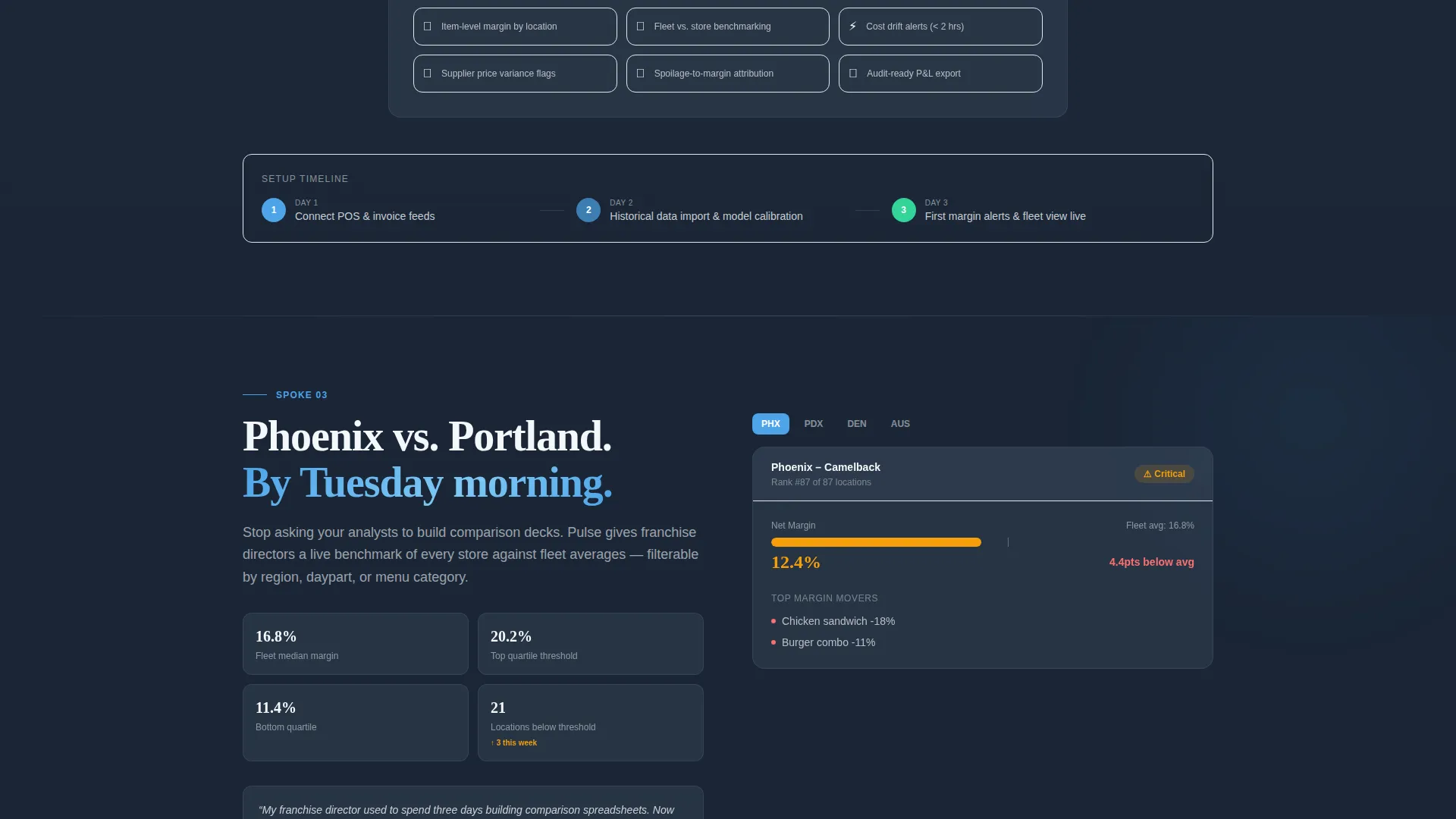
- Franchise directors who need side-by-side store performance comparisons on short notice
What problem this template solves
Multi-unit operators often discover margin leaks weeks after the damage is done. A generic startup template cannot communicate the operational urgency that FoodTech buyers need to feel before they commit to a free trial.
- The template frames the problem with industry-cited stats and real operator language, so visitors recognize their own pain immediately
- It structures five spoke sections to escalate stakes from single-store waste to portfolio-wide blind spots
- The two-step signup form lowers entry friction so operators start a trial without over-committing upfront
What you get with this template
You get a fully structured, single-page landing page that walks a multi-unit operator from problem awareness to a free trial in one scroll. Every section has a defined job, and the anchor navigation keeps the visitor oriented throughout.
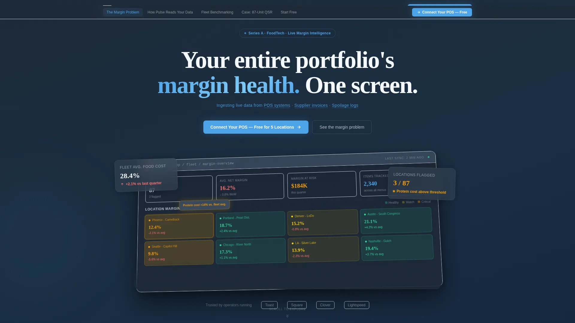
- A product screenshot hero section with a real-looking multi-location margin heatmap and a dimensional dashboard mockup
- Five content spokes covering the margin problem, data ingestion, fleet benchmarking, a case study, and the trial call to action
- A sticky anchor nav with a persistent "Connect Your POS" call-to-action button visible at every stage of the page
Feature list
This section covers the core built-in components that make the Pulse template work for a FoodTech Series A launch.
Product Screenshot Hero
The full-width header shows a pixel-perfect dashboard capture of a multi-location margin heatmap. One underperforming location pulses in amber with a tooltip reading "Protein cost +14% versus. fleet avg." The screenshot sits on a slate-to-sky gradient, angled five degrees with a soft shadow to feel dimensional.
Sticky Anchor Navigation
A five-link anchor nav pins to the top of the page after the user scrolls past the header. It labels each spoke clearly and keeps a persistent primary call-to-action button visible. This keeps long-scrolling operators oriented without losing the conversion trigger.
Five-Spoke Content Structure
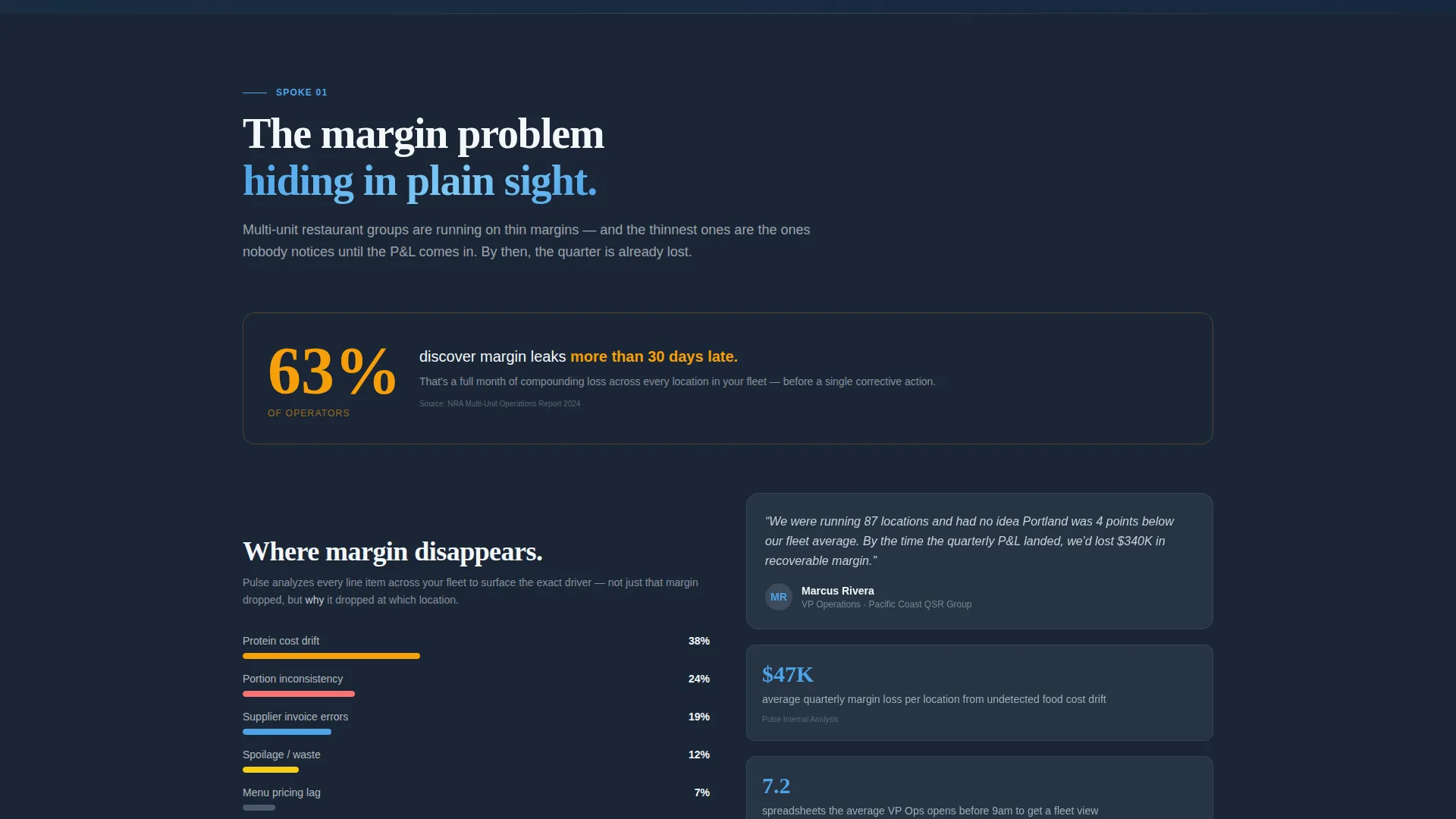
Each spoke opens with a bold industry stat, then moves through product context, annotated user interface close-ups, and a short operator quote. The rhythm follows alarm, explanation, proof, and relief to build urgency with every section.
Two-Step Freemium Signup Form
Step one asks only for a work email and a point-of-sale provider from a dropdown. Location count and company name come after account creation. This two-gate approach removes the biggest barrier to trial starts.
Secondary Lead Capture Path
Visitors who are not ready to connect their point-of-sale system can download the 2024 Multi-Unit Margin Report behind an email gate. This captures research-mode buyers early and gives them a reason to return for the product later.
Slate and Sky Visual System
The color system uses deep operational slate for primary backgrounds, mid-graphite for card surfaces, open-sky blue on every interactive element and data highlight, and altitude white for section spacing. The result feels like a cockpit instrument panel: focused, readable, and authoritative.
Page sections overview
| Section | Purpose |
|---|---|
| Hero Header | Anchor the visitor with a bold dashboard screenshot and headline |
| Anchor Navigation Bar | Pin five spoke labels and the primary call to action above the fold after scroll |
| The Margin Problem | Open the first spoke with a cited industry stat and operator context |
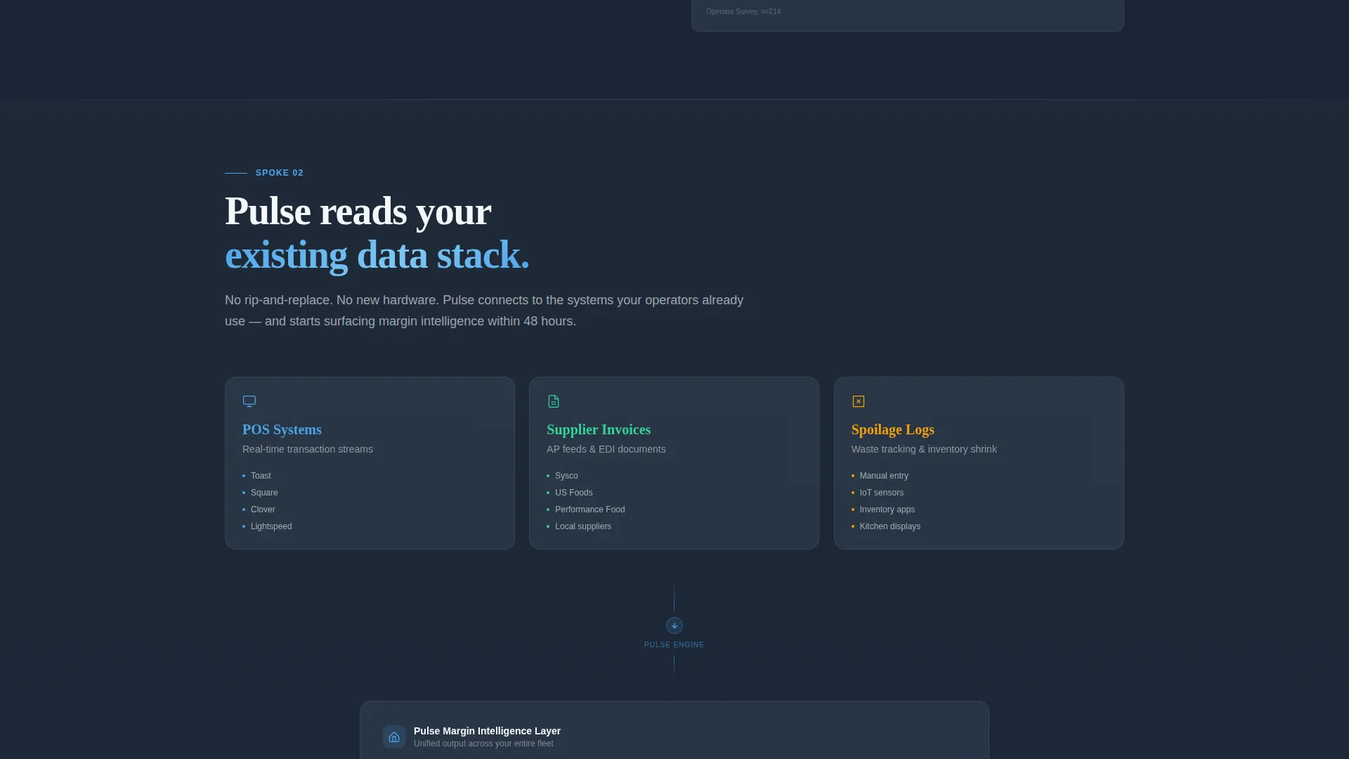
| How Pulse Reads Data | Explain point-of-sale, invoice, and spoilage log ingestion with annotated user interface |
| Fleet Benchmarking | Show cross-location comparison with a close-up of the heatmap interface |
| Case: 87-Unit QSR | Deliver a concrete case study spoke to build proof and credibility |
| Start Free call to action | Close the page with the primary freemium trial form and secondary report gate |
Design & branding system
The visual identity follows the Startup Velocity theme, built to feel like a cockpit at cruising altitude. Slate dominates the heavy data sections, sky blue marks every interactive element, and altitude white creates breathing room between spokes.
- Deep operational slate (#1E2A38) for primary section backgrounds; mid-graphite (#3B4A5C) for card and panel surfaces
- Open-sky blue (#4DA3E8) reserved for all interactive elements, data highlights, and calls to action
- Altitude white (#F4F7FA) used between spokes to prevent visual density from overwhelming the reader
Mobile & speed optimization
The template layout is designed to remain readable and navigable on smaller screens. The anchor nav collapses gracefully, and the dashboard screenshot scales without losing its dimensional effect.
- The five-spoke scroll structure keeps each section self-contained, making it easy to read in short mobile sessions
- The two-step form reduces the number of fields visible at once, which is especially useful on touch devices
How this template helps you convert
Pulse is built around a specific conversion logic: make the problem undeniable, then make the solution effortless to start.
- The header and anchor nav place the primary call-to-action "Connect Your POS, Free for 5 Locations" in three visible positions so operators encounter it at the moment of highest intent
- The secondary email gate for the downloadable margin report captures leads who are not yet ready to integrate, creating a second conversion funnel from the same page
Other information about this template
This template is categorized under Startup and Launch, specifically within the FoodTech Startup subcategory. It is purpose-built for a FoodTech Series A context where the founding team needs a credible, data-forward first impression.
- The Industry Report creative direction gives the page the tone of a proprietary research briefing, not a typical software sales page
- The template style is Hub and Spoke with Anchor Navigation, making it easy to adapt spoke content for different operator segments or regions
- The header concept uses a Product Screenshot approach, which communicates working-product credibility to operator buyers who are skeptical of vaporware
- The freemium and trial conversion direction means the page is optimized for low-friction trial starts rather than demo request forms
Theme
Startup Velocity
Creative direction
Industry Report
Color system
Slate & Sky
Style
Hub & Spoke (Anchor Nav)
Direction
Freemium/Trial
Page Sections
Product Screenshot Hero Section
Sticky Five-spoke Anchor Nav
Industry Report Spoke Layout
Two-step Freemium Signup Form
Secondary Report Lead Gate
Slate and Sky Color System
Related questions
Can I customize the five spoke sections for a different audience?
What point-of-sale providers does the signup form dropdown include?
How does the secondary lead capture path work?
Is this template suited for a company that is still in pre-launch?
Can the anchor navigation labels be changed?



