HealthTech Startup Cost Calculator Website Template
Pulse is a healthtech landing page template built for growth-stage clinical AI platforms targeting VP-level hospital buyers. It opens with a live ROI calculator, unfolds into a frosted comparison table, and closes with a personalized call to action loop. The Tech Glass visual system and real-time number animations make complex data feel immediate and credible.
by Rocket studio
Quick summary
Pulse is a single-page Click-Through landing page template designed for healthtech startups selling clinical AI to hospital operations leaders. It leads with an interactive ROI estimator, follows with a seven-metric comparison table, and closes by looping the visitor's personalized projection back into the final demo booking call to action. Every section is styled in a Tech Glass Glassmorphic visual system built around deep surgical navy and clinical teal.
Who this template is for
This template is built for growth-stage healthtech founders and marketing teams who need to convert skeptical, data-driven hospital executives into qualified demo bookings. It is not a general SaaS template. It is specifically shaped around the buying context of clinical AI platforms.
- VP Operations, Chief Medical Officers, and Chief Nursing Officers at regional hospital systems evaluating patient deterioration tools
- IT Directors assessing Electronic Health Record (EHR) integration feasibility for clinical AI platforms
- Healthtech startup teams preparing a high-stakes outbound or paid campaign targeting hospital decision-makers
What problem this template solves
Hospital executives do not respond to generic feature lists. They respond to numbers that speak to their specific situation: their bed count, their readmission rate, their Centers for Medicare and Medicaid Services (CMS) scorecard. Most healthtech landing pages fail because they lead with product and bury the proof. Pulse flips that structure entirely.
- Visitors arrive and immediately interact with a live ROI calculator rather than reading passive marketing copy
- The comparison table surfaces competitive gaps against legacy alerting systems using familiar clinical metrics instead of abstract feature comparisons
- The evidence layer and personalized call to action loop close the trust gap before the visitor reaches a booking form
What you get with this template
You get a fully structured, section-complete landing page template built around the hospital buyer journey. Every component is mapped to a specific conversion moment, and the visual system is consistent from the header calculator down to the footer.
- A live ROI estimator hero that takes bed count, average readmission rate, and EHR vendor as inputs and animates projected annual savings, flagged deteriorations per month, and CMS penalty reduction in real time
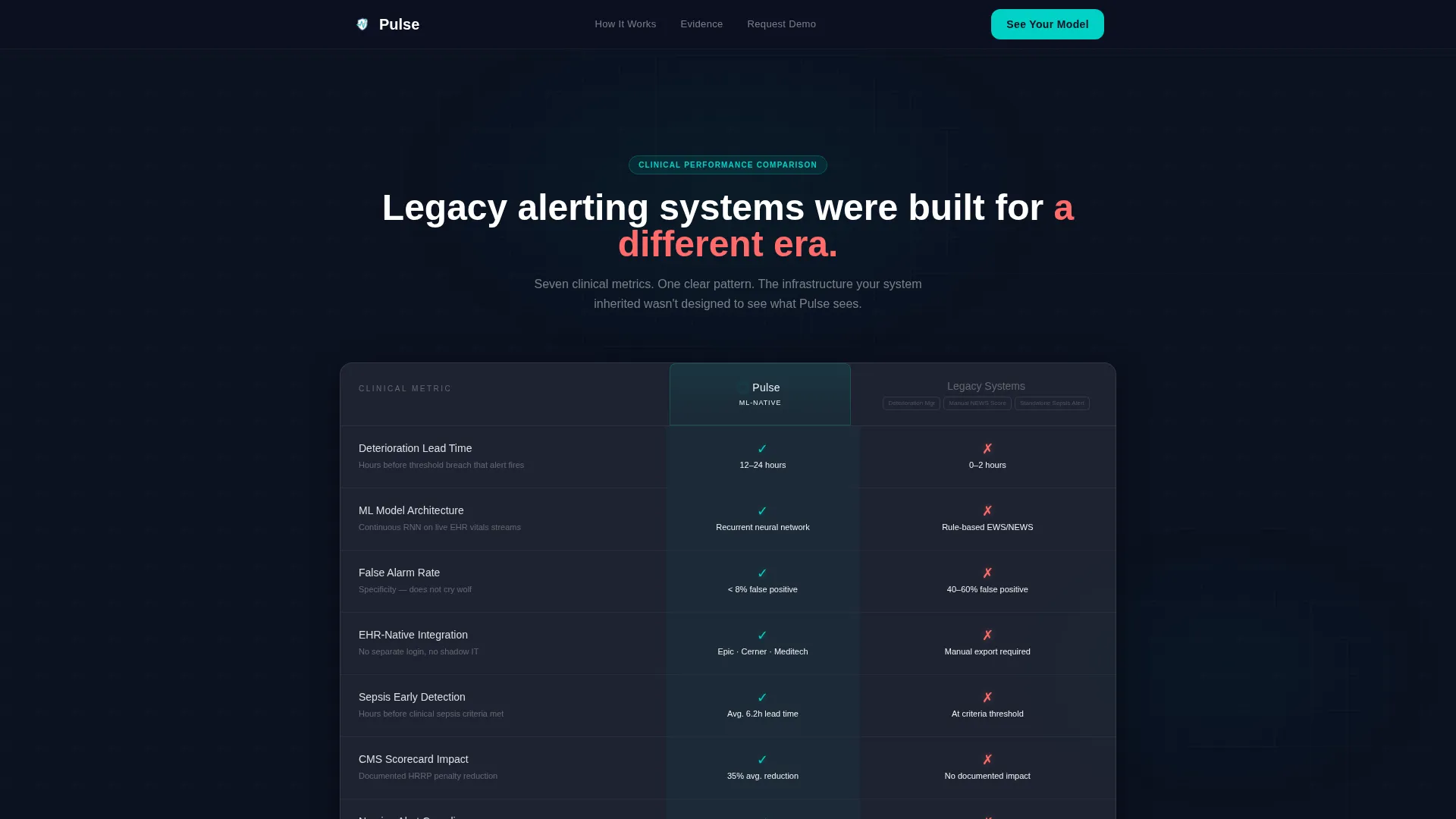
- A frosted-glass comparison table pitting your platform against legacy alerting systems across seven clinical metrics, with clinical teal indicators for your side and warning coral indicators for competitor gaps
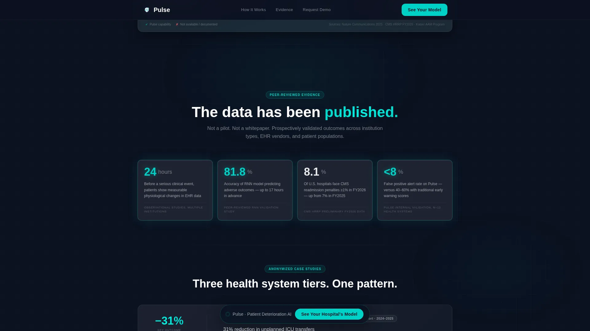
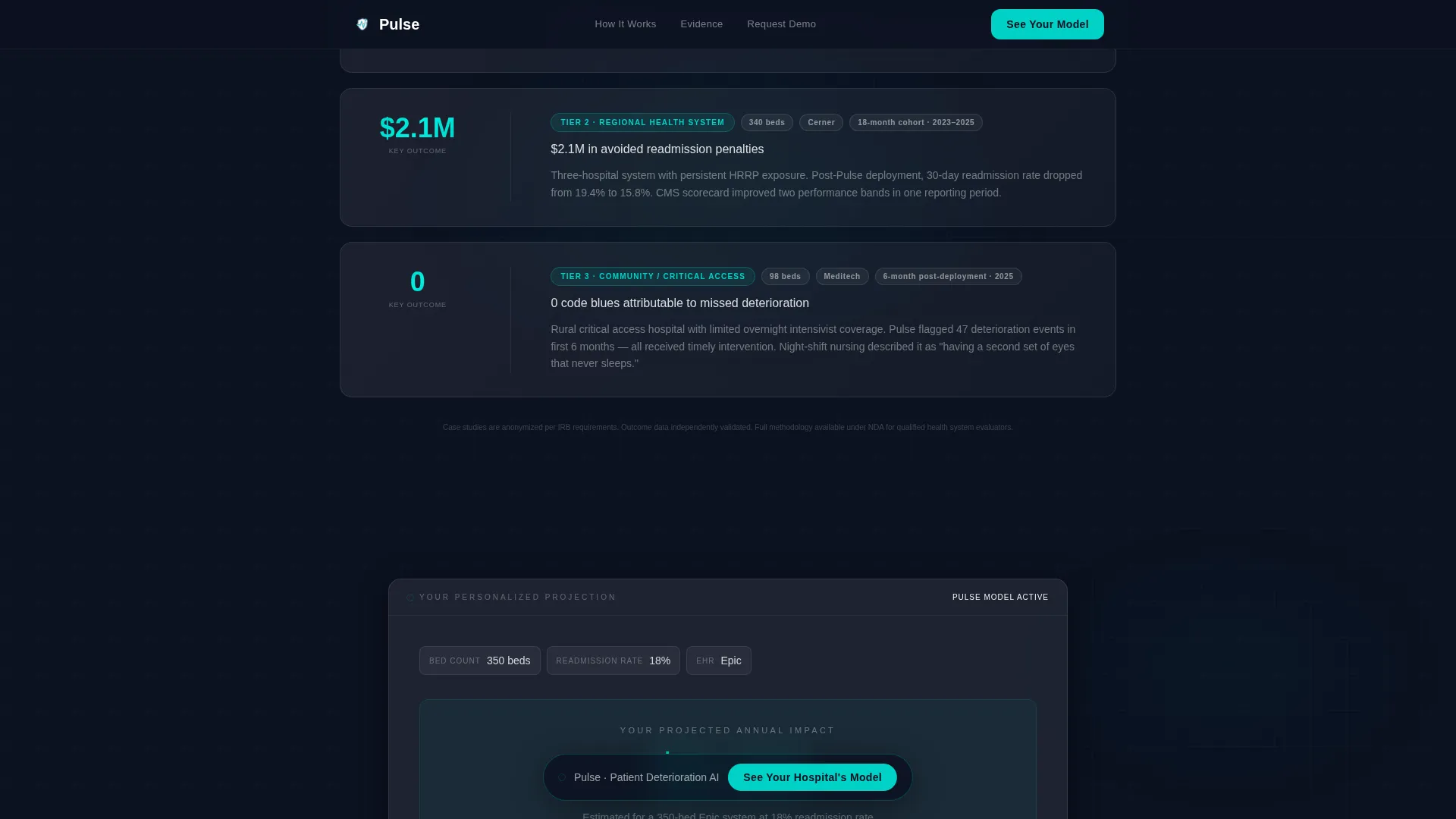
- Three anonymized health system case study cards, a peer-reviewed evidence layer, and a personalized call to action recap section that references the visitor's own calculator output
Feature list
This template is built around high-interactivity components and a clinical data aesthetic. Each feature below is grounded in what the template structure and design system actually deliver.
Live ROI Calculator Header
The hero section is an interactive estimator, not a static headline. Visitors input their hospital's bed count, readmission rate, and EHR vendor from a dropdown. As they type, number ticker animations display projected annual savings, monthly flagged deteriorations, and CMS penalty reduction in real time. The tool itself is the hook.
Frosted Comparison Table
A seven-metric comparison table renders Pulse against legacy alerting systems in a frosted glass card layout. Clinical teal checkmarks float on glass rows for your platform. Warning coral indicators mark competitor deficits. Hover states animate on each row, keeping the data feel interactive rather than static.
Peer-Reviewed Evidence Cards
The evidence layer presents outcome data and anonymized case studies as glowing data cards. Each card sharpens into focus as it enters the viewport using intersection observer reveals. Three health system tiers are represented, giving buyers at different organization sizes a relevant data point.
Personalized Call to Action Loop
The final section recaps the visitor's calculator output before presenting the primary call to action. This means the demo booking prompt references the visitor's own projected numbers, making the click feel like continuing a conversation rather than starting a new one. The primary call to action reads "See Your Hospital's Model."
Sticky Bottom Navigation Pill
After a visitor scrolls past 40 percent of the page, a frosted pill call to action appears in the bottom navigation and persists through the rest of the scroll. This keeps the booking prompt visible without interrupting the content flow.
Qualifying Demo Booking Form
Clicking the primary call to action opens a short qualifying form. It collects name, title, health system name, and a single radio question asking whether the current system is Epic, Cerner, Meditech, or Other. There is no pricing page and no free trial offer. The form is intentionally brief to reduce drop-off.
Page sections overview
| Section | Purpose |
|---|---|
| Hero ROI Calculator | Personalize projected savings by hospital inputs |
| Comparison Table | Compare Pulse against legacy alerting systems |
| Evidence Layer | Validate with peer-reviewed data and case studies |
| Call to Action Loop | Recap visitor output and prompt demo booking |
| Footer (Linear Single-Row) | Close page with minimal, clean navigation row |
Design & branding system
The visual identity follows a Tech Glass theme built on a Glassmorphic color system. Every surface is designed to feel like looking through the glass wall of a sterile cleanroom: sharp, backlit, and floating in controlled atmosphere. The palette is precise and clinically restrained.
- Core colors: deep surgical navy (#0B1120) as the primary background, frosted white at 8 to 12 percent opacity for glass card layers, clinical teal (#00D2C6) for interactive elements and data highlights, and warning coral (#FF6B6B) reserved exclusively for competitor-column metrics and risk indicators
- Typography: DM Sans for headlines and Plus Jakarta Sans for body copy and user interface elements, both keeping the layout crisp and legible at data-dense section widths
- Visual details: frosted blur borders on stacked cards, gradient sheen on every surface, number ticker animations in clinical teal, and intersection observer reveals for evidence cards entering the viewport
Mobile & speed optimization
The template is built desktop-first, reflecting how VP-level buyers typically engage during ops meetings on a laptop. The layout is responsive and adapts for mobile viewing without breaking the calculator or comparison table structure.
- Desktop-first layout prioritizes wide comparison table readability and full-width calculator card presentation
- Responsive mobile adaptation ensures the sticky bottom pill, calculator inputs, and frosted card sections reflow cleanly on smaller screens
- Static sections use server-rendered components while the live calculator runs as a client-side component, keeping the interactive section isolated for performance
How this template helps you convert
Every section in this template is designed to move a qualified hospital executive one step closer to booking a demo. The structure follows a deliberate narrative arc.
- The hero calculator creates an immediate personal stake by showing the visitor their own projected numbers before any product claim is made, anchoring the rest of the page to a specific dollar figure
- The comparison table and evidence layer build credibility by presenting competitive gaps and peer-reviewed outcome data in a clinical, report-style format that mirrors how hospital executives already consume information
- The personalized call to action loop closes the loop by surfacing the visitor's own calculator output one more time at the conversion moment, so the demo booking feels like a logical next step rather than a cold ask
Other information about this template
This template is categorized under Startup and Launch, specifically within the HealthTech Growth Stage Startup niche. It is designed for a United States healthcare regulatory context, with copy and data references aligned to USD, CMS terminology, and domestic hospital system structures.
- The template supports EHR vendor segmentation through the calculator dropdown, which currently includes Epic, Cerner, Meditech, and Other as qualifying options
- Animation intensity is high by design: number ticker animations, frosted glass shimmer effects, and intersection observer card reveals are all built into the template structure
- The creative direction follows an Industry Report cadence, meaning the scroll experience is structured like a paginated white paper moving from problem framing through evidence to a personalized conclusion
- This template does not include a pricing section or free trial offer by design; the calculator output provides enough specificity to motivate the click without requiring a pricing commitment

Theme
Tech Glass
Creative direction
Industry Report
Color system
Glassmorphic
Style
Comparison Table
Direction
Click-Through
Page Sections
Live ROI Calculator with Ticker Animations
Seven-metric Frosted Comparison Table
Intersection-reveal Evidence Cards
Personalized Call to Action Loop
Sticky Bottom Pill Navigation
Short Qualifying Demo Form
Related questions
Who is the primary audience for this template?
Does the ROI calculator work out of the box?
Can I customize the comparison table metrics?
Why does this template not include a pricing section?
What visual style does this template follow?


