HealthTech Startup Specialist Professional Website Template
Pulse is a bento grid landing page template built for healthtech Product Hunt launches. It uses a glassmorphic dark-user interface design system, a problem-to-solution scroll arc, and a live-dashboard header to show clinical data tools at their best. The layout guides clinic CTOs, digital-health founders, and early adopters straight from curiosity to a sandboxed demo click.
by Rocket studio
Quick summary
Pulse is a single-page bento grid template designed for healthtech startups launching on Product Hunt. It opens with a live-dashboard header, walks visitors through a problem-to-solution visual arc, and closes every row with a clear call to action. The design uses a glassmorphic dark palette that feels precise, clinical, and modern.
Who this template is for
This template is built for founders and technical decision-makers who need a launch page that speaks fluently to a clinical and developer audience. It skips generic startup clichés and leads with product credibility instead.
- Clinic CTOs evaluating a new integration on launch day
- Digital-health founders scouting competitive launches and positioning
- Product Hunt early adopters who need instant proof before they upvote
What problem this template solves
Most healthtech landing pages bury the product under marketing copy. Visitors leave before they understand what the tool actually does. Pulse solves that by making the product the hero from the first scroll pixel.
- Scattered screenshots and vague benefit claims fail to earn technical trust
- Friction-heavy demo flows lose high-intent visitors before they convert
- Generic startup layouts do not communicate clinical-grade credibility
What you get with this template
You get a complete, ready-to-customize bento grid landing page built around a clear narrative arc. Every section is purposeful, and every component is tied directly to conversion.
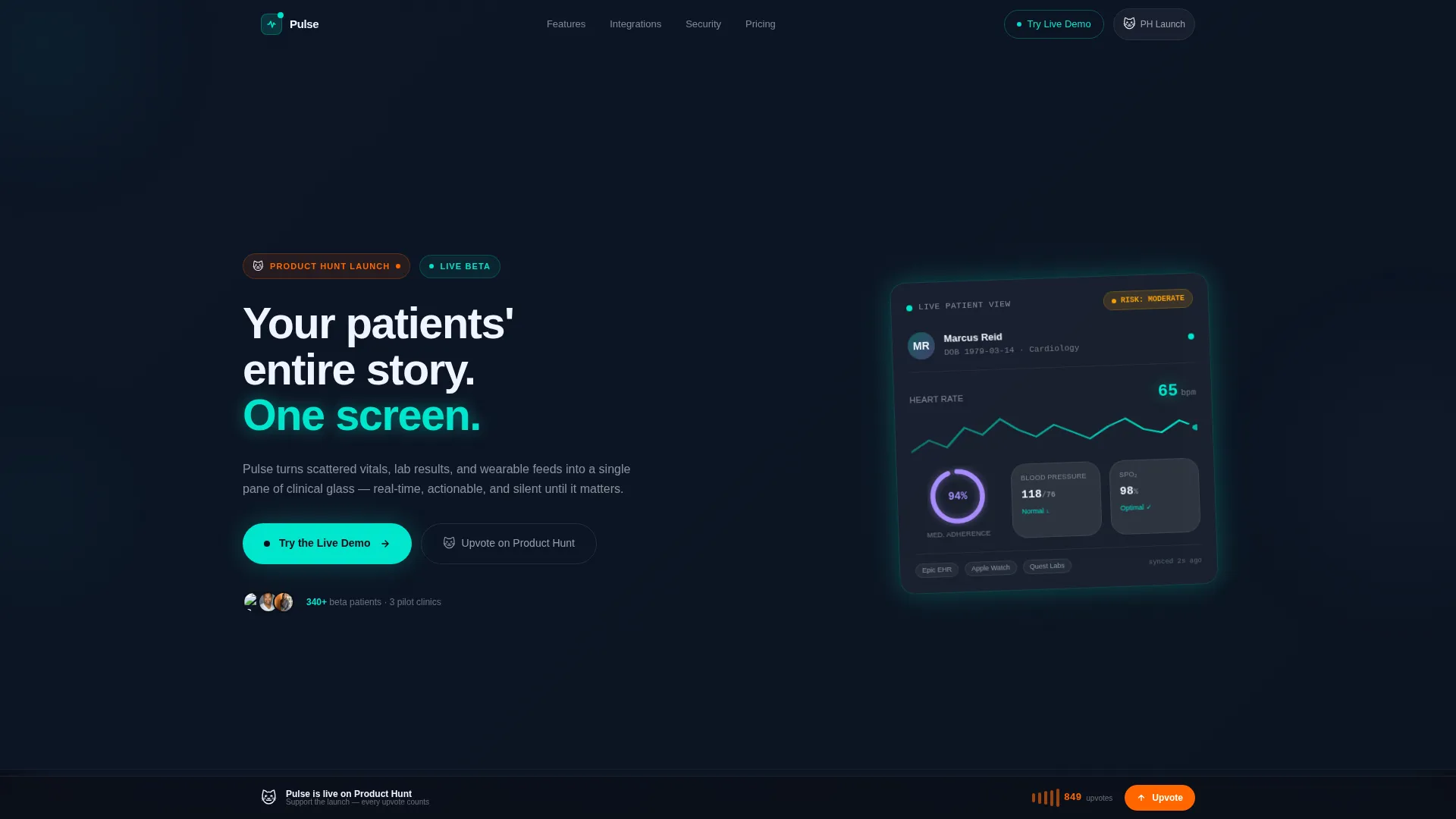
- A living dashboard header with a heart-rate sparkline, medication-adherence ring chart, risk-score badge, and a pulsing notification dot
- A four-row bento scroll structure moving from fragmented status quo to unified solution, proof metrics, and social momentum
- A dual call-to-action system with a ghost button in the header and a filled teal button after the solution row, plus a sticky bottom bar with a Product Hunt upvote path
Feature list
This section covers the core capabilities built into the Pulse template. Each feature is drawn directly from the design brief.
Bento Grid Layout System
The page is structured in four distinct bento rows. Each row tells one chapter of the product story, from broken data to unified clarity. Cards are sized and spaced to guide the eye without crowding the screen.
Glassmorphic Dark user interface
The visual system uses deep surgical black as the base, frosted-glass card surfaces at low opacity, electric teal for live-data accents, and soft clinical lavender for secondary badges and graph gradients. Every color choice is intentional and tied to a functional meaning.
Living Dashboard Header
The header features a pixel-perfect product screenshot on a frosted-glass card, slightly rotated on the Z-axis for depth. Inside the preview: a real-time heart-rate sparkline at 72 beats per minute, a medication-adherence ring chart at 94 percent, an amber risk-score badge, and a pulsing notification dot.
Problem-to-Solution Scroll Arc
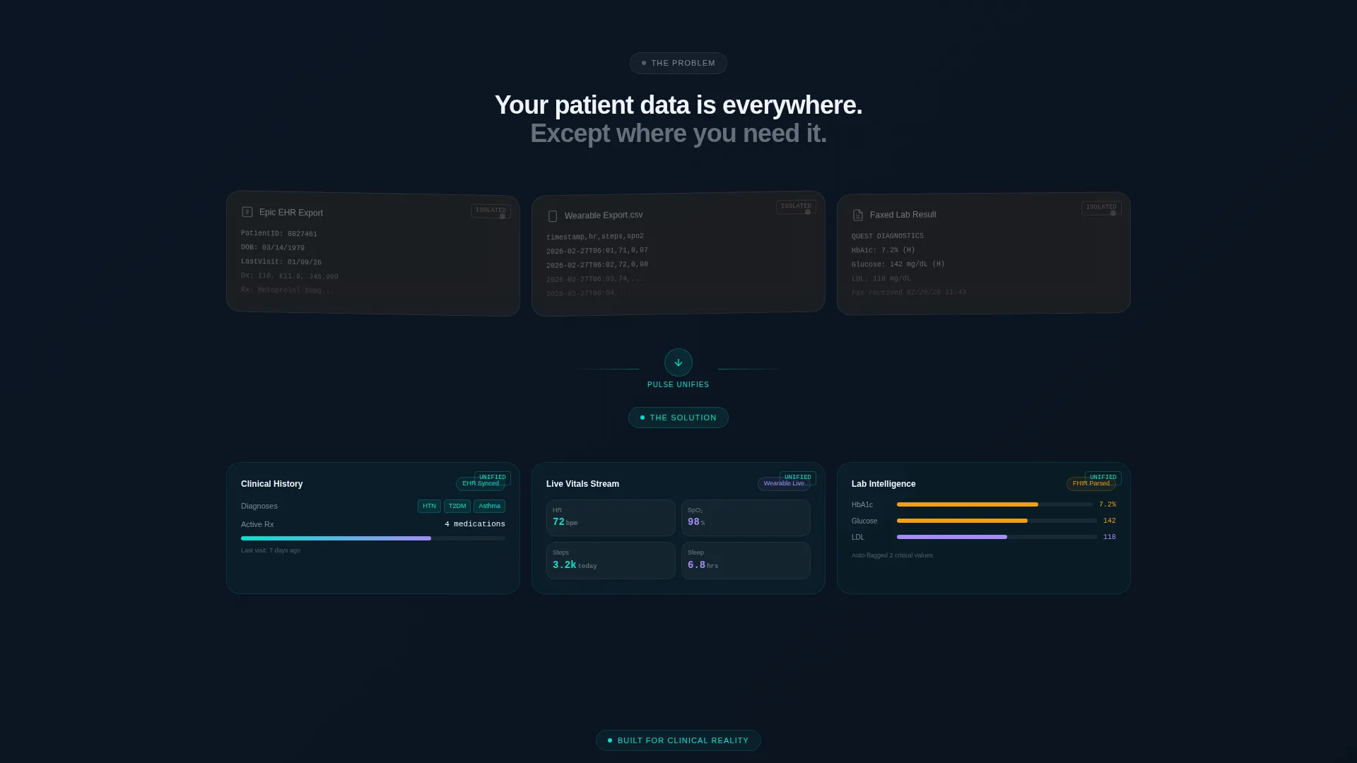
The first bento row shows the fragmented status quo using desaturated, slightly skewed cards. The second row shows the same data unified inside the product interface, with color flooding back in as cards snap to alignment. This visual contrast makes the product value immediately clear.
Zero-Friction Demo Path
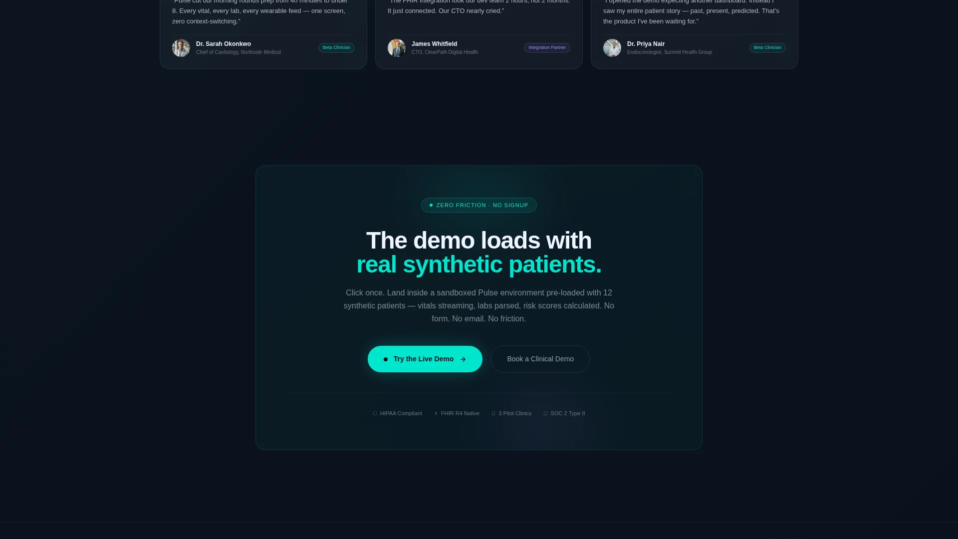
The primary call to action lands visitors directly inside a sandboxed demo pre-loaded with synthetic patient data. No form, no fields, no signup required. The product sells itself the moment it loads.
Sticky Product Hunt Bar
A persistent bottom bar carries the Product Hunt upvote counter and the PH cat icon. It stays visible throughout the scroll, giving social-proof-driven visitors a constant secondary action path without interrupting the main narrative.
Page sections overview
| Section | Purpose |
|---|---|
| Dashboard Header | Anchors attention with a live clinical data preview and headline |
| Ghost Button call to action | Introduces the demo path early, before the sale is fully made |
| Fragmented Data Row | Shows the broken status quo through desaturated bento cards |
| Unified Solution Row | Demonstrates product clarity as cards realign and color returns |
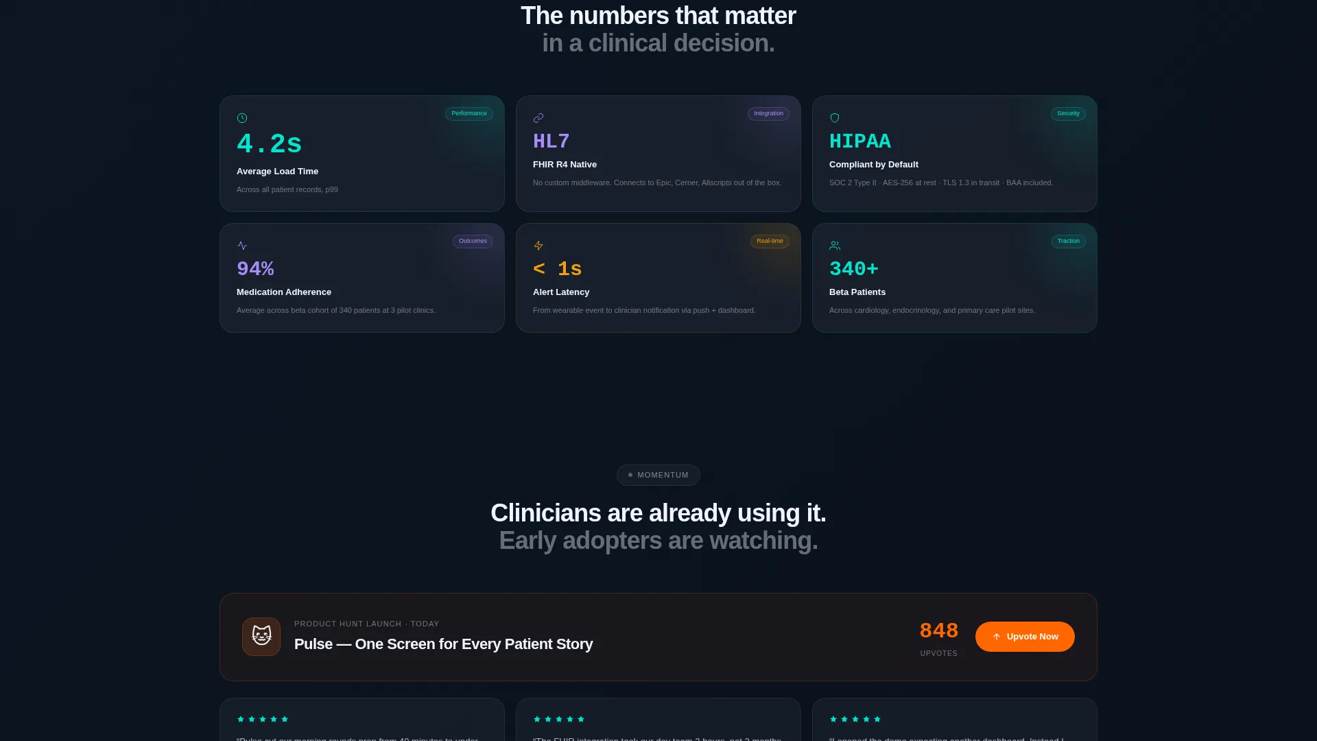
| Proof Metrics Row | Delivers key stats in individual frosted tiles with teal accents |
| Social Proof Row | Combines a live upvote counter with beta clinician testimonials |
| Filled call to action Button | Solidifies the demo action after the transformation is visible |
| Sticky Bottom Bar | Persists the Product Hunt upvote path across the full scroll |
Design & branding system
The Pulse template uses a Dashboard Pro theme executed through a glassmorphic color system. Every visual decision reinforces the idea that clinical data tools should feel precise, not playful.
- Base layer in deep surgical black (#0B0F19), frosted-glass card surfaces at #FFFFFF with 8 percent opacity, electric teal (#00E5CC) on live-data accents and hover states, and clinical lavender (#A78BFA) for secondary badges and graph gradients
- Typography uses a medium-weight sans-serif for the headline, keeping the tone authoritative without feeling heavy
- Card depth is created through Z-axis rotation on the dashboard header and subtle desaturation on the problem-row cards, making the before-and-after contrast feel spatial
Mobile & speed optimization
The bento grid structure is designed to reflow cleanly across screen sizes. The layout priorities ensure the dashboard header and call-to-action elements remain prominent on smaller viewports.
- Bento cards are structured to stack vertically on mobile without losing the problem-to-solution narrative sequence
- The sticky bottom bar is sized and positioned to stay usable on touch screens without blocking key content
- The frosted-glass card style is built with CSS-level transparency, keeping the visual system lightweight to implement
How this template helps you convert
Pulse is engineered around a single conversion goal: get the right visitor into the live demo with as little friction as possible. Every layout decision supports that outcome.
- The ghost-button call to action appears in the header before any scrolling, planting the demo option early for visitors who are already sold on arrival.
- The problem-to-solution bento arc earns trust visually before the filled teal call to action appears, so the click feels like a natural next step rather than a push.
- The sticky Product Hunt bar gives a second, lower-commitment action to visitors who are not ready to demo but are willing to show support, keeping them engaged and on the page.
Other information about this template
Pulse is purpose-built for the intersection of healthtech startup launches and the Product Hunt audience. A few additional details are worth noting for teams evaluating this template.
- The template references HL7 FHIR native support and HIPAA compliance as stat badges in the proof metrics row, consistent with clinical-audience credibility signals
- The sandboxed demo path is pre-loaded with synthetic patient data, meaning no real patient information is required to run a convincing product demo
- The bento grid style aligns with how technical audiences consume dashboards, making it a natural fit for clinic CTOs and healthtech product teams
- This template is categorized under Startup and Launch, specifically within the HealthTech Startup subcategory, and is optimized for a Product Hunt launch day context
Theme
Dashboard Pro
Creative direction
Problem→Solution Arc
Color system
Glassmorphic
Style
Bento Grid
Direction
Click-Through
Page Sections
Bento Grid Layout System
Glassmorphic Dark User Interface Design
Living Dashboard Header
Problem-to-solution Scroll Arc
Zero-friction Demo Call to Action System
Sticky Product Hunt Upvote Bar
Related questions
Who is this landing page template designed for?
Does the template include a live product demo setup?
Can I customize the colors and dashboard preview content?
What makes this template different from a generic startup landing page?
Is this template suitable for a launch outside of Product Hunt?



