Fitness Thought Leadership Blog Landing Page Template
Pulse is a fitness thought leadership landing page template built for coaches, gym owners, and serious athletes who want to share deep ideas, not just workout tips. The asymmetric 60/40 grid, warm artisan palette, and day-arc scroll design create an unhurried reading experience that earns trust before asking for an email address.
by Rocket studio
Quick summary
Pulse is a single-page fitness blog and newsletter lead generation template. It uses a 60/40 asymmetric grid, a warm parchment-and-walnut color system, and a day-in-the-life scroll arc to present long-form coaching essays. Two gated calls to action convert engaged readers into newsletter subscribers or PDF framework downloaders.
Who this template is for
This template is built for fitness professionals who write with substance. It suits anyone whose ideas go deeper than a caption and who wants a home for that thinking online.
- Certified personal trainers looking to publish programming philosophy and attract serious clients
- Gym owners who want to share a training culture and draw like-minded members
- Experienced athletes and coaches who have outgrown influencer content and want to write with authority
What problem this template solves
Most fitness websites feel like a sales floor. They push products, stack testimonials, and rush the visitor toward a purchase. Pulse solves the opposite problem: it gives thoughtful fitness writing a visual home that matches its quality.
- Generic fitness templates force deep content into layouts designed for quick hits and short attention spans
- Readers who want programming depth or coaching philosophy bounce when the design feels hollow or rushed
- Newsletter signups placed too early feel pushy; this template earns the click by letting the writing demonstrate value first
What you get with this template
You get a fully designed single-page layout that guides the reader through a structured reading experience before presenting any calls to action. Every section is crafted to feel like a different hour inside a working gym.
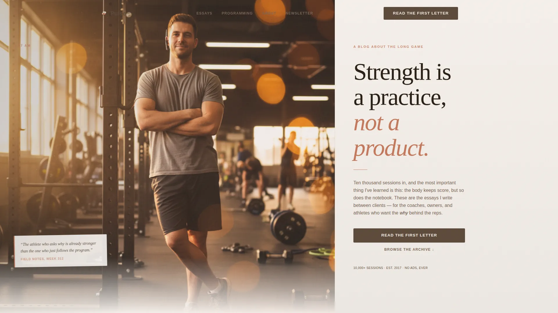
- A cinematic hero section with a 60/40 photo and serif headline, followed by essay excerpt cards, a bento-grid programming section, and a narrative client section
- Two conversion paths: a newsletter signup card and a PDF download form, both revealed after the reader has moved through at least two essay excerpts
- A warm artisan visual identity using Fraunces serif display type, DM Sans body text, and a four-color palette of fog gray, warm parchment, smoked walnut, and muted terracotta
Feature list
A brief note on what makes Pulse distinct as a template: every feature listed here is built around the reading experience, not a feature checklist.
Asymmetric 60/40 Hero Layout
The hero section splits into a wide left column holding a full golden-hour photograph and a narrower right column carrying a hand-set serif headline and an opening paragraph written like the first line of a letter. The composition draws the eye and sets the tone immediately.
Day-Arc Scroll Design
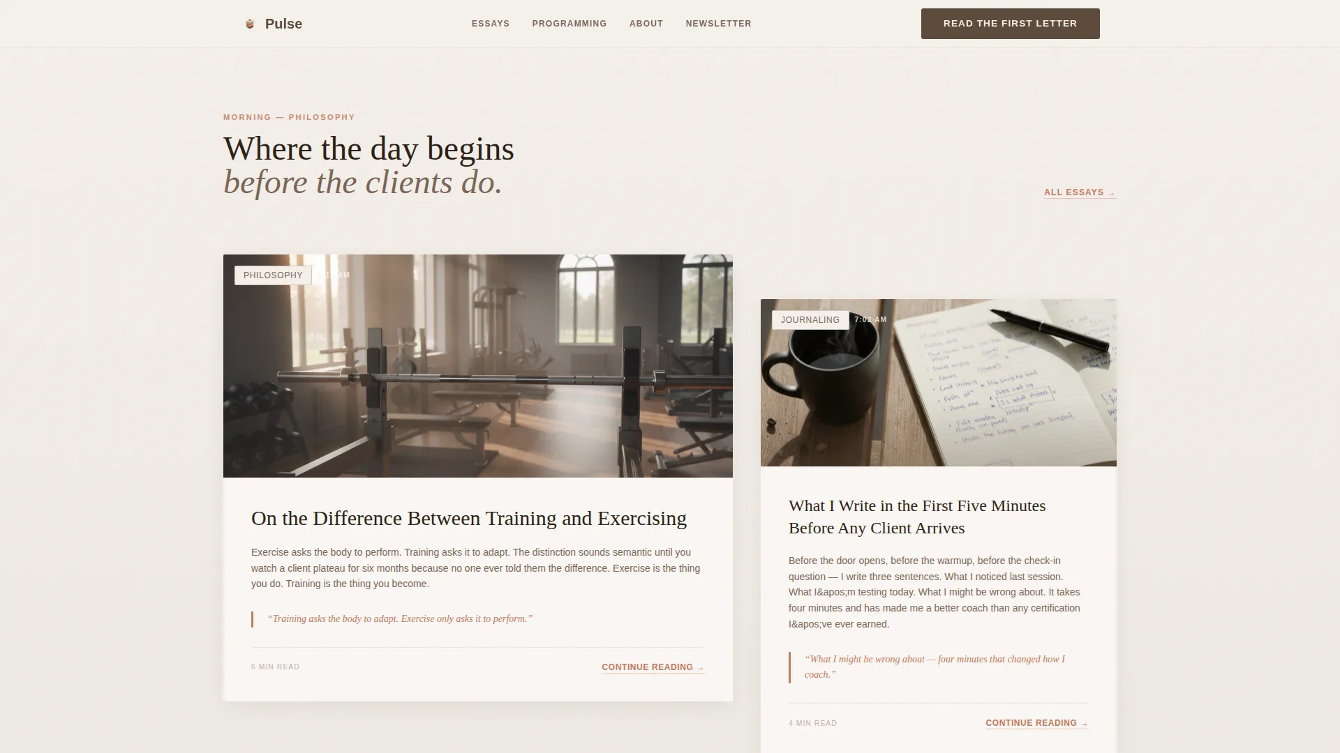
As the visitor scrolls, the background tones shift gradually from warm parchment through mid-tone fog gray toward deeper walnut shadow. This visual arc mirrors the passage of a coaching day, giving the page a sense of time and atmosphere that generic layouts cannot replicate.
Dual Call-to-Action Forms
Two distinct conversion paths sit side by side after the essay content. The primary form captures a first name and email for the weekly essay newsletter. The secondary form adds a role selector (coach, gym owner, athlete, or curious human) for a free downloadable programming framework PDF.
Scroll-Depth Call-to-Action Reveal
Both forms are hidden until the visitor has scrolled through at least two full essay excerpts on the page. This approach earns the ask rather than forcing it, which improves trust and reduces friction for the reader.
Essay Excerpt Expansion
Philosophy cards and programming breakdown cards include expandable excerpt areas. Readers can open a longer passage inline before deciding whether to subscribe, giving them a taste of the writing depth before committing their email address.
Handwritten-Note Bento Grid
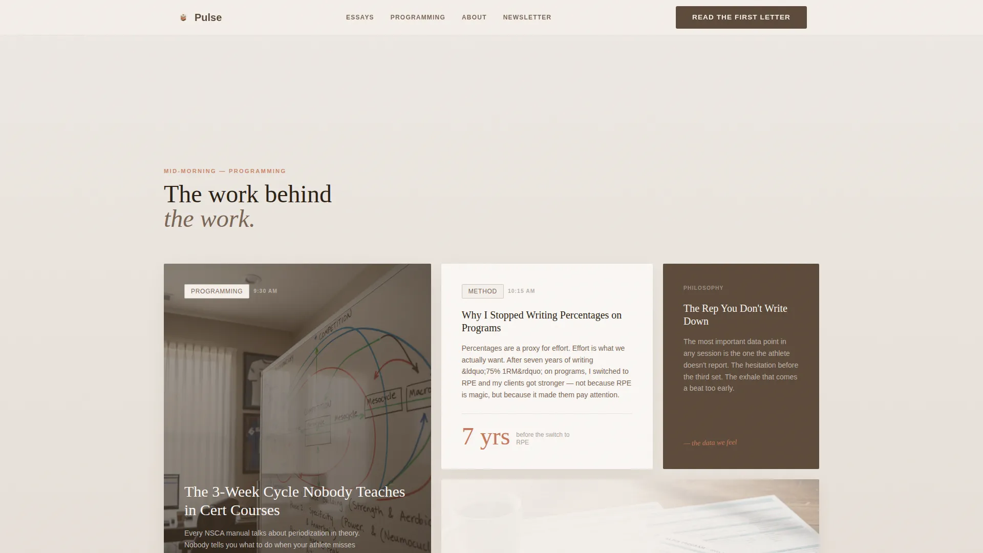
The programming depth section uses a bento-style grid with a handwritten margin-note aesthetic. It breaks down training concepts visually in a way that feels tactile and personal rather than clinical or templated.
Page sections overview
| Section | Purpose |
|---|---|
| Hero photo + text | Cinematic opener with serif headline and opening-letter paragraph |
| Morning essay cards | Philosophy excerpts with pull-quotes in asymmetric layout |
| Programming depth grid | Bento grid with handwritten-note aesthetic for training breakdowns |
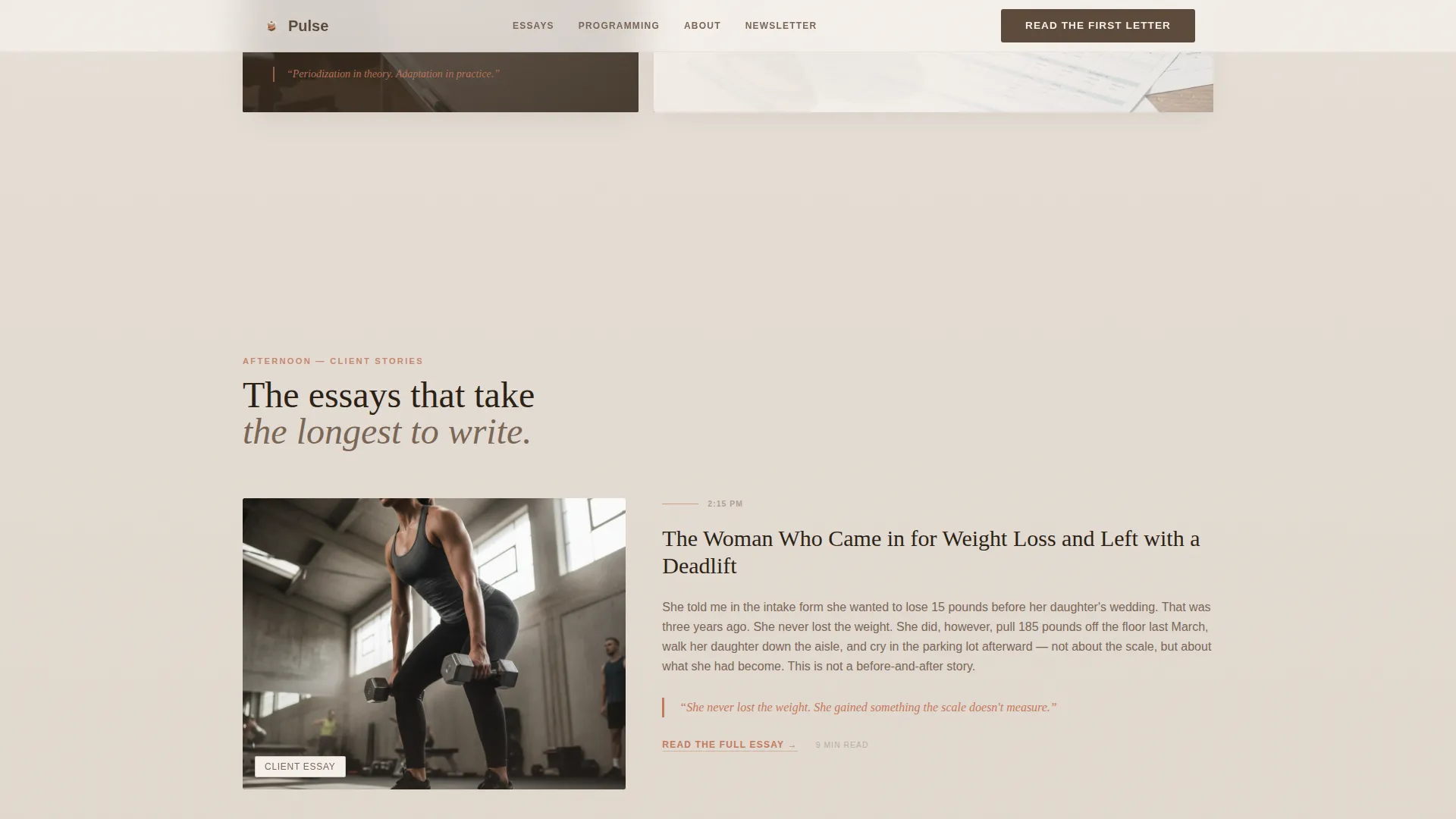
| Client narrative essays | Afternoon-arc narrative format, credential-backed transformation stories |
| Dual call-to-action block | Newsletter signup and PDF download forms, scroll-depth revealed |
| Ultra-minimal footer | Horizontal flow footer with essential links only |
Design & branding system
The visual identity follows a Warm Artisan theme. The palette is drawn from the feeling of early studio light falling on a linen training journal. Nothing here is loud or clinical.
- Four-color Soft Mist palette: morning fog gray (#E8E4DF), warm parchment (#F5F0EB), smoked walnut (#5C4A3A), and muted terracotta (#C4785B) used for links, pull-quotes, and hover states
- Typography pairs Fraunces, a variable serif display face, with DM Sans for body text; the combination feels editorial and readable without being stiff
- Torn-notebook card aesthetic on the call-to-action forms, hand-drawn border styling, and pull-quote treatments in terracotta reinforce the tactile, human character of the page
Mobile & speed optimization
Pulse is designed desktop-first for long-form readers, with full mobile support built in from the start. The layout reflows cleanly without losing its editorial character at smaller screen sizes.
- Server Components handle static content sections, and lazy image loading keeps the page responsive as users scroll through the photo-heavy hero and narrative sections
- Native CSS smooth scroll is used throughout, keeping the day-arc transition and scroll-reveal behavior fluid without heavy overhead
- GSAP ScrollTrigger powers the parallax photo effect, section reveals, and background warmth shift, giving the page a cinematic feel that holds on both desktop and mobile viewports
How this template helps you convert
Pulse is not built around a hard sell. It is built around demonstrated depth. The conversion strategy is woven into the structure of the page itself.
- The essay excerpts and programming cards do the persuading first, so by the time the call-to-action forms appear, the reader already trusts the writing and is motivated to stay connected.
- Two distinct paths (newsletter and PDF download) match different reader intentions, letting a gym owner grab the framework while a trainer signs up for the weekly essay without either feeling like the wrong choice.
Other information about this template
Pulse fits naturally into a content strategy where the blog or newsletter is the primary product, not an afterthought. It is a strong starting point for any fitness professional building a writing-led brand.
- The role selector on the PDF download form supports segmented follow-up, letting you understand whether your readers identify as coaches, gym owners, athletes, or general learners
- The template is localized for English (US) and uses no currency symbols or e-commerce components
- Animation is set at a medium intensity level, using GSAP ScrollTrigger reveals, a parallax photo effect on the hero, magnetic call-to-action button behavior, and a day-arc background warmth shift that deepens as the reader scrolls toward the evening sections
- The footer follows an ultra-minimal horizontal flow pattern, keeping the close of the page clean and distraction-free
Theme
Warm Artisan
Creative direction
Day-in-the-Life
Color system
Soft Mist
Style
Asymmetric Grid (60/40)
Direction
Lead Generation
Page Sections
Asymmetric 60/40 Hero Layout
Day-arc Background Warmth Shift
Dual Call-to-action Forms
Scroll-depth Call to Action Reveal
Essay Excerpt Expansion
Handwritten-note Bento Grid
Related questions
Can I use this template for a fitness newsletter without a separate blog site?
Do both call-to-action forms collect the same information?
Is the template suitable for a gym owner rather than an individual coach?
Can I replace the essay excerpts with my own writing?
How is the scroll-depth reveal for the call-to-action forms triggered?



