Cerebral Physics Journal Landing Page Template
Quanta is a single-page editorial landing page built for a physics and quantum science journal. It combines an asymmetric 60/40 grid layout with a warm cerebral visual identity, guiding visitors through a day-in-the-life narrative arc. The primary goal is newsletter sign-ups via a smart two-option preference toggle, all wrapped in a design that feels like a physicist's office at dusk.
by Rocket studio
Quick summary
Quanta is an editorial landing page template for a physics and quantum science journal. It uses an asymmetric 60/40 grid, a Soft Mist color palette, and a scroll-driven day-in-the-life narrative. The page moves visitors naturally from a full-bleed hero to a newsletter sign-up, with a preference toggle that segments readers between math and metaphor.
Who this template is for
This template is built for creators and publishers who take physics writing seriously. It suits anyone running a science publication where rigor and readability must coexist.
- Graduate students and arXiv readers who want to publish a journal with real intellectual depth
- Science journalists and armchair cosmologists seeking a trustworthy editorial presence online
- Working physicists or research communicators launching a long-form essay newsletter
What problem this template solves
Most blog templates flatten serious scientific writing into generic news layouts. Quanta solves the gap between academic credibility and engaging digital presentation.
- Generic templates lack the visual grammar to carry equations, pull quotes, and long-form essays together
- Standard newsletter landing pages give readers no reason to trust the publication before subscribing
- Single-column layouts cannot support the marginalia-style sidebar context that deep readers expect
What you get with this template
You get a fully structured editorial landing page with every section pre-built and ready to customize. The layout does the heavy lifting so you can focus on the writing.
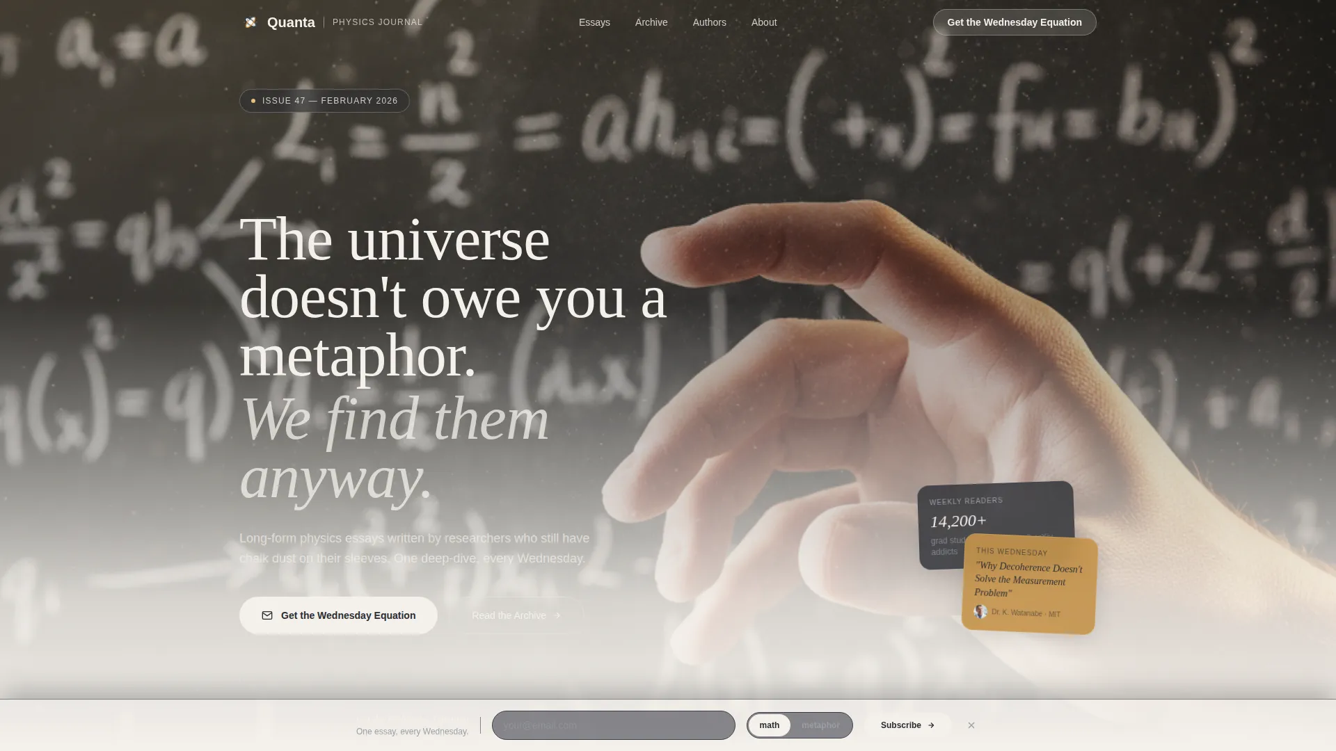
- A full-bleed hero section with a chalk-white serif headline and floating annotation cards
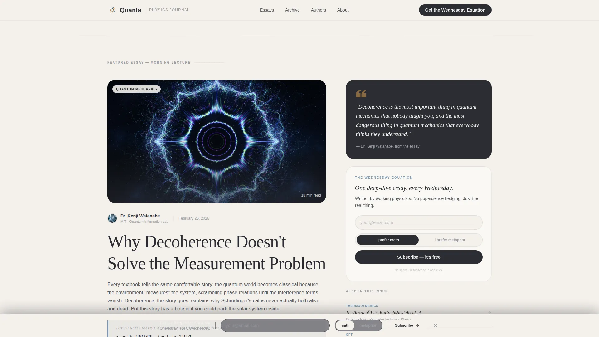
- An asymmetric 60/40 grid carrying body content on the wide column and pull quotes on the narrow one
- A newsletter sign-up form with a math-or-metaphor preference toggle and a fixed bottom bar that appears after 60 percent scroll
Feature list
This template ships with a set of purposeful, editorial-grade features drawn directly from the design brief.
Asymmetric 60/40 Editorial Grid
The wide 60-column carries body text, essay excerpts, and hero imagery on a warm off-white background. The narrow 40-column holds pull quotes, author bios, and sidebar annotations in blackboard slate. Together they recreate the visual rhythm of a printed academic journal.
Day-in-the-Life Narrative Arc
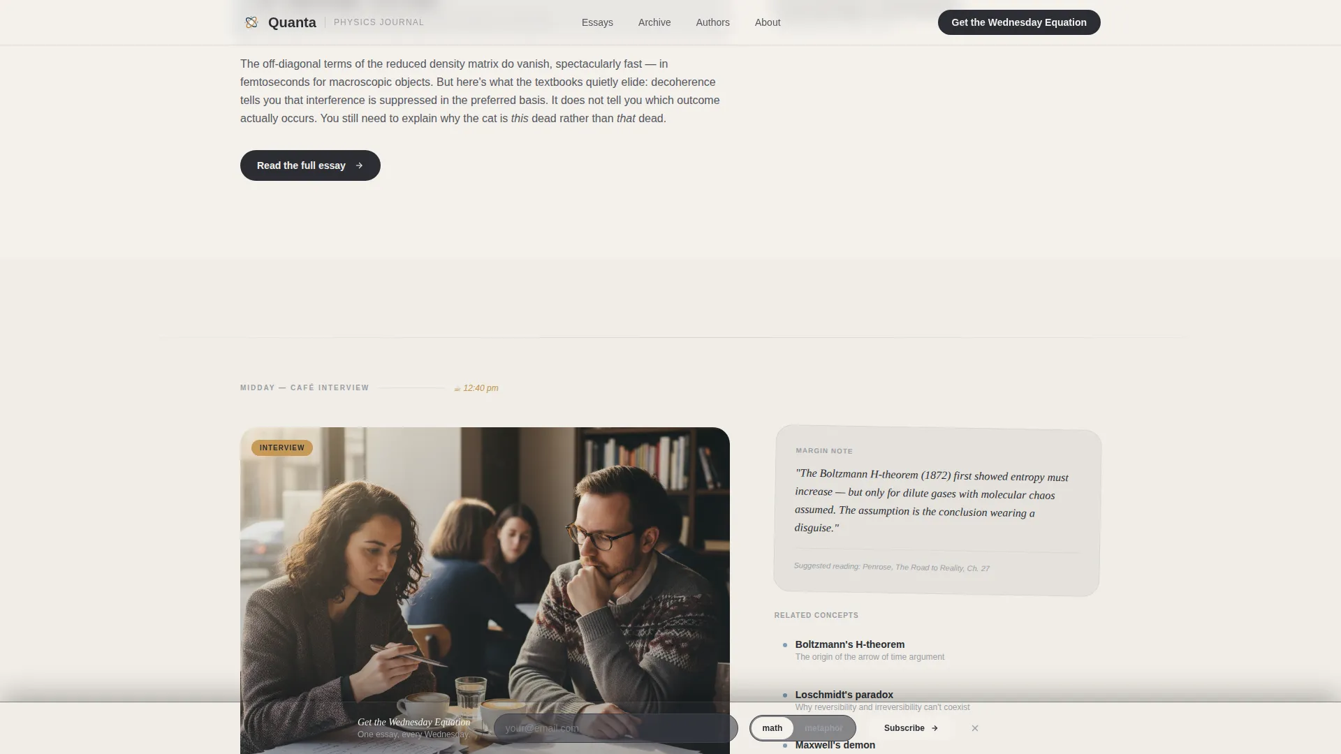
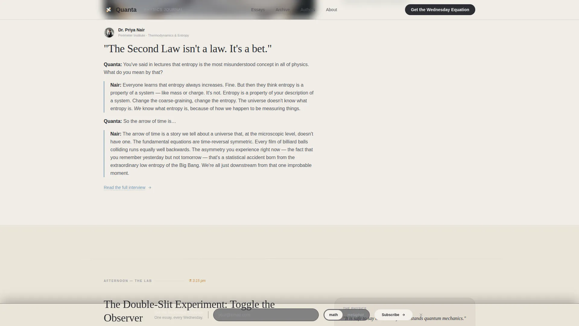
The scroll follows a physicist's day from morning lecture hall to late-night telescope. Each panel in the arc covers a different content type: featured essay, café interview excerpt, lab interactive, curated reading list, and personal night essay. The palette shifts subtly from cool morning graphite toward amber evening warmth as the user scrolls.
Interactive Double-Slit Toggle Widget
A dedicated lab section includes an interactive widget where visitors can toggle a double-slit simulation. This feature gives the page genuine interactivity beyond static text and images. It signals editorial depth to technically minded readers before they subscribe.
Smart Newsletter Preference Toggle
The sign-up form asks for an email address and one toggle: "I prefer math" or "I prefer metaphor." This micro-segmentation flatters the reader's identity and creates a personalized first impression. The toggle appears both in the sidebar and in the fixed bottom bar after 60 percent scroll.
Filterable Archive Grid
A bento-style archive grid displays past issues with filter controls. Visitors can browse by topic before committing to subscribe, building trust through visible volume. This section acts as a secondary conversion path before circling back to the main sign-up prompt.
Full-Bleed Photo Hero
The hero opens with a close-up blackboard photograph, shallow depth of field, and natural tungsten lighting. A single serif headline fades in over the soft-focus region after a brief beat. Floating annotation cards layer contextual detail over the image without cluttering the composition.
Page sections overview
| Section | Purpose |
|---|---|
| Hero & Headline | Opens with full-bleed blackboard photo, chalk serif headline, floating annotation cards, and newsletter call to action |
| Featured Article Grid | Asymmetric 60/40 essay excerpt with inline equation display and author bio sidebar |
| Café Interview Panel | Conversational article excerpt representing the mid-morning narrative arc segment |
| Lab Interactive Panel | Double-slit toggle widget giving visitors hands-on engagement with a physics concept |
| Desk Reading List | Curated reading list with handwritten-style annotations representing the afternoon desk segment |
| Night Essay Panel | Personal long-form essay section with warmer amber tone representing the late-night arc |
| Archive Bento Grid | Filterable grid of past issues building credibility through content volume |
| Wednesday Equation call to action | Full-width newsletter sign-up with math/metaphor preference toggle |
| Footer | Pattern 1 linear footer layout with publication links |
Design & branding system
The visual identity follows an Editorial Magazine theme built on the Soft Mist color system. Every color choice references the physical texture of academic work: chalk, blackboard, graphite, and the blue ink of a margin note.
- Core palette: chalk-dust white (#F4F1EC) for backgrounds, blackboard slate (#2B2D33) for primary text, pencil-graphite gray (#9B9EA6) for secondary text, and margin-note blue (#7A9BB5) for links and interactive accents
- Typography uses Fraunces as the display serif for headlines and pull quotes, paired with DM Sans for body text and interface elements
- Scroll-linked warmth shift drifts the palette from cool morning graphite toward amber (#C4924A) evening glow as the visitor scrolls through the day arc
Mobile & speed optimization
The template is designed desktop-first, matching the reading habits of its primary audience. Mobile support is built in as a solid secondary experience.
- Static-first build approach with images optimized and interactive Client Components scoped only to widgets that require them
- Hover animations include rotating cards and floating elements, all designed at a medium intensity that does not slow the reading experience
- Fixed bottom bar appears after 60 percent scroll on both desktop and mobile, keeping the newsletter prompt visible without blocking content
How this template helps you convert
Every design decision in Quanta is oriented toward one outcome: turning a curious visitor into a Wednesday Equation subscriber.
- The math-or-metaphor toggle flatters the reader's self-image on first interaction, lowering the psychological barrier to submitting an email address
- The archive grid exposes content volume before the subscribe prompt, so visitors arrive at the sign-up form already convinced the publication is worth their inbox
Other information about this template
Quanta is a strong fit for any science content creator who wants a publication that looks as serious as its writing. A few additional details worth knowing before you build with it.
- Social proof slots are built into the layout for subscriber counts, writer affiliations, and archive volume figures
- The template is categorized under Blog & Editorial with a Science & Research Blog subcategory, making it a precise fit for physics and quantum science publishing
- The day-in-the-life creative direction is a structural choice baked into the scroll sequence, not a cosmetic theme you apply afterward
- The header concept is a full-bleed photo layout, so high-quality blackboard or laboratory photography will have the most visual impact in the hero section
Theme
Editorial Magazine
Creative direction
Day-in-the-Life
Color system
Soft Mist
Style
Asymmetric Grid (60/40)
Direction
Lead Generation
Page Sections
Asymmetric 60/40 Editorial Grid
Day-in-the-life Scroll Narrative
Interactive Double-slit Toggle Widget
Math or Metaphor Preference Toggle
Filterable Archive Bento Grid
Full-bleed Photo Hero with Animated Headline
Related questions
Who is this landing page template designed for?
What is the Wednesday Equation newsletter form?
Does the template include the interactive double-slit widget?
Can I customize the colors and fonts?
Is this template suitable for mobile readers?



