Advanced Legal & Policy Blog Privacy Policy & Terms Website Template
Redact is an editorial landing page template built for privacy and data law publications. It combines a cinematic full-bleed hero, an asymmetric 60/40 editorial grid, a live enforcement timeline, and a sticky subscription bar into one authoritative, beautifully typeset content hub designed to convert practitioner readers into engaged weekly subscribers.
by Rocket studio
Quick summary
Redact is a single-page editorial template for privacy and data law journals. It pairs a full-bleed photographic hero with a curated 60/40 asymmetric grid, a live enforcement timeline, and a friction-light subscription bar. The design feels like a cloth-bound legal quarterly brought to screen, warm, authoritative, and built for practitioners who read carefully.
Who this template is for
This template is designed for editors and publishers running practitioner-focused legal media. It serves audiences who demand depth over volume and trust over clicks.
- In-house counsel at software-as-a-service companies managing consent flows and audit readiness
- Data protection officers at mid-market firms translating regulation into operational records
- Startup founders navigating their first data subject access request or approaching an initial compliance audit
What problem this template solves
Most blog templates treat legal content like lifestyle content. They prioritize visual flair over editorial credibility, and they ask for an email address before proving any value. Redact is built around the opposite logic.
- Readers distrust publications that look generic; this template establishes authority through editorial typesetting, warm-stone tones, and a curated content structure
- Practitioners need jurisdiction-specific signals before they subscribe; the enforcement timeline and article previews deliver proof before the ask
- Generic grid layouts cannot support mixed content formats; the asymmetric 60/40 structure separates long-reads from regulatory alerts in a single coherent scroll
What you get with this template
You get a complete, section-led landing page optimized for editorial authority and email subscription conversion. Every section is purposeful and mapped to a stage in the reader's trust journey.
- A full-bleed hero section with a serif headline overlay and no call-to-action pressure
- An asymmetric editorial grid that separates flagship long-reads from a tight regulatory alert rail
- A sticky subscription bar with a jurisdiction selector, a gated compliance checklist download, and a live enforcement timeline
Feature list
This template includes six tightly scoped, prompt-backed features that work together to establish credibility and drive subscriptions.
Asymmetric 60/40 Editorial Grid
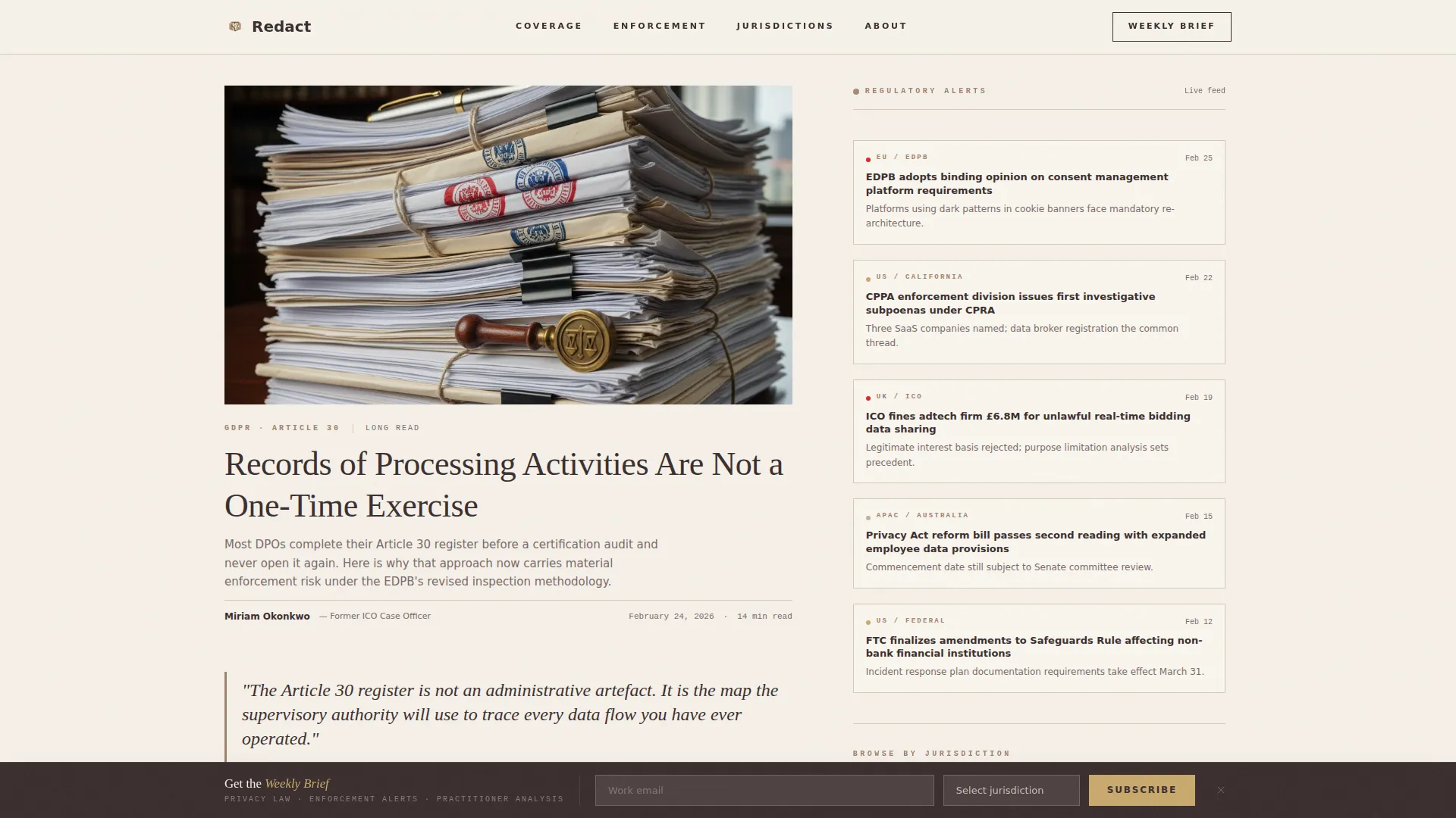
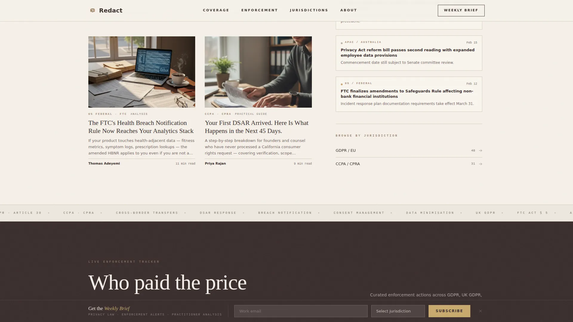
The main content area divides into a wide 60-column panel for flagship long-reads with large editorial illustrations and two-line article summaries. The narrower 40-column rail carries regulatory alert cards, enforcement tracker entries, and jurisdiction quick-links. Each content cluster opens with a single editorial sentence in brass italic, so the page reads like a table of contents written by a human editor.
Full-Bleed Cinematic Hero
The hero is an overhead photograph of a broad oak desk scattered with redlined documents, a fountain pen, and a laptop open to a regulatory portal. Morning light rakes across the surface. The image is desaturated just enough to feel timeless. A single serif headline in deep walnut fades up over the image with no button or form attached.
Live Enforcement Timeline
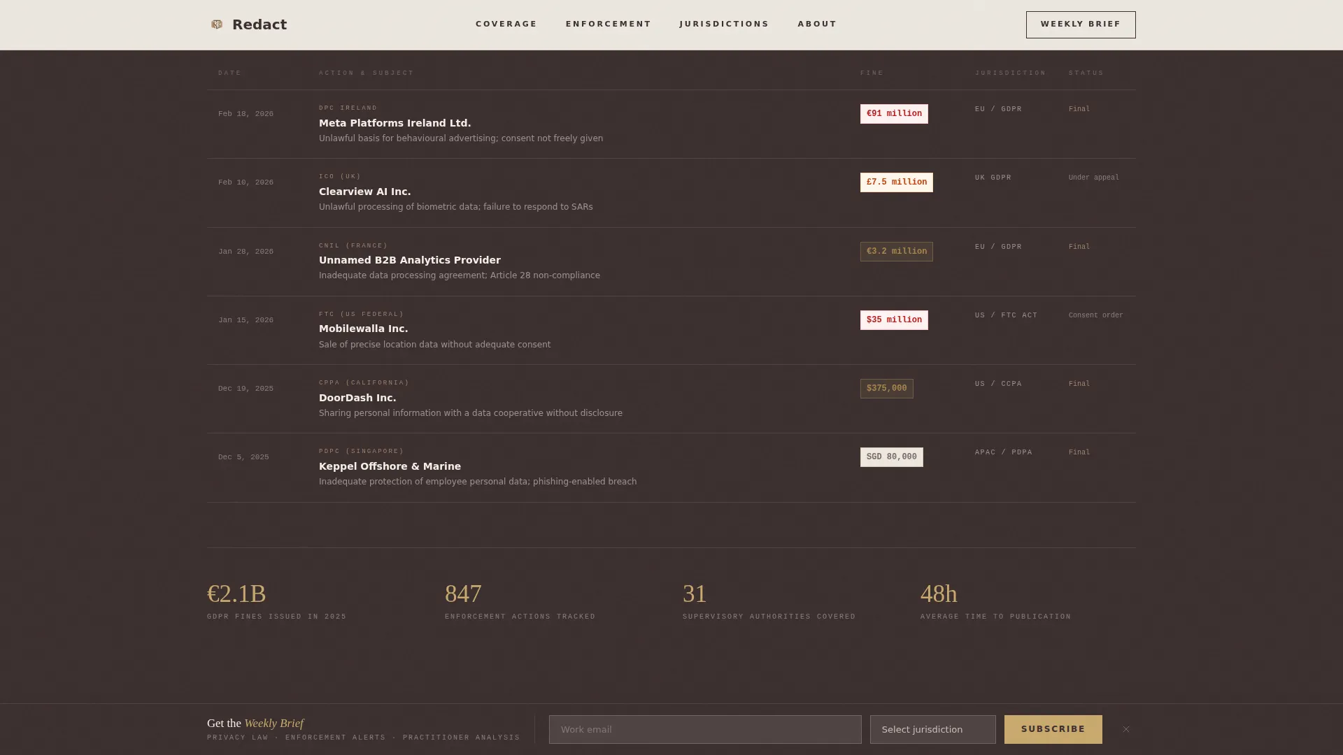
A dedicated section displays named enforcement cases, regulator identities, and fine amounts. This section appears before any subscription request, functioning as credibility proof that demonstrates the publication's editorial depth and jurisdictional range.
Sticky Weekly Brief Bar
After the reader scrolls past the second content cluster, a sticky subscription bar appears. It asks for a work email address and a jurisdiction of interest selected from EU, US Federal, US State, APAC, or Global. The bar is unobtrusive and earns its appearance by letting the reader experience three article previews first.
Gated Compliance Checklist Download
A secondary conversion path offers a downloadable compliance checklist behind the same single-field form used for the Weekly Brief subscription. This gives readers a tangible, role-specific reason to share their contact details without encountering a separate gate.
GSAP ScrollTrigger Animations
The template uses GSAP ScrollTrigger reveals for section entrances, a parallax effect on the hero image, a marquee divider between content clusters, and a smooth sticky bar entrance. Interactive states include hover effects on article cards and an animated enforcement timeline.
Page sections overview
| Section | Purpose |
|---|---|
| Full-Bleed Hero | Sets editorial tone with a cinematic image and a single serif question headline |
| 60/40 Editorial Grid | Separates flagship long-reads from the regulatory alert and enforcement tracker rail |
| Live Enforcement Timeline | Displays named cases and fine amounts to prove editorial depth before any subscription ask |
| Sticky Weekly Brief | Collects work email and jurisdiction preference after the reader has seen substantive content |
| Jurisdiction Quick-Links | Provides role-specific navigation paths and hosts the gated compliance checklist download |
| Editorial Footer | Minimal horizontal-flow footer in keeping with the publication's quiet, authoritative identity |
Design & branding system
The visual identity follows an Editorial Magazine theme using a Warm Stone color palette. Typography combines a classic display serif with a clean body face and a monospaced citation style, producing the feel of a barrister's desk brought to screen.
- Limestone cream (#F5F0E8) fills wide content panels; deep walnut (#3B2F2F) handles all body text and headlines; fired clay (#A0826D) marks category labels and pull-quote rules; quiet brass (#C9A96E) activates on hover states and linked citations
- Display type uses Fraunces, a high-contrast serif that reads like ink pressed into cotton stock; body copy uses DM Sans for clean legibility; citations and code references use IBM Plex Mono for precision
- Rhythm alternates between dense editorial clusters and generous whitespace, keeping the eye moving across the scroll without fatigue
Mobile & speed optimization
The template is built desktop-first to serve practitioners reading at a desk. A responsive mobile fallback ensures the editorial structure holds on smaller screens without losing hierarchy.
- Server Components handle editorial content delivery; Client Components are scoped to the sticky bar and animation layers only
- The asymmetric grid collapses gracefully on narrower viewports, preserving the separation between long-reads and the alert rail
- GSAP animations are limited to medium complexity, keeping the experience smooth without adding unnecessary weight to the page
How this template helps you convert
Redact is designed around a trust-first conversion model. The page earns the subscription before asking for it.
- Three full-length article previews and a live enforcement timeline appear before any subscription form, so the reader understands the publication's depth and credibility before being asked to act.
- The sticky Weekly Brief bar appears only after the second scroll cluster, reducing friction and framing the subscription as a natural next step rather than a barrier.
- The gated compliance checklist offers a second, tangible conversion path for readers who want an immediate, role-specific deliverable alongside the newsletter.
Other information about this template
This template is built for legal and policy editorial brands that take their visual identity as seriously as their arguments. A few additional details worth knowing before you build.
- The footer follows a minimal horizontal-flow pattern that keeps the page's quiet authority intact at every scroll depth
- The jurisdiction selector covers EU, US Federal, US State, APAC, and Global, making the template immediately useful for multi-jurisdictional publications
- The template is designed as a single landing page, not a multi-page site; additional article or archive pages would require separate template files
- Editorial sentence introductions for each content cluster are written in brass italic and are fully editable, allowing you to set the editorial voice without touching layout code
- The Warm Stone color system and Fraunces display serif are chosen to evoke a cloth-bound legal quarterly, distinguishing the publication visually from generic news or tech blog templates

Theme
Editorial Magazine
Creative direction
Curated Collection
Color system
Warm Stone
Style
Asymmetric Grid (60/40)
Direction
Content/Resource
Page Sections
Asymmetric 60/40 Editorial Grid
Full-bleed Cinematic Hero
Live Enforcement Timeline
Sticky Weekly Brief Subscription Bar
Gated Compliance Checklist Download
GSAP Scrolltrigger Animations
Related questions
Who is this template designed for?
Does the template include a subscription form?
How does the asymmetric grid work?
Can I use this template without animation?
Is this template suitable for a multi-page publication?



