Cinematic Film Analysis Newsletter Landing Page
Reel is a cinematic dark landing page template built for film and cinema analysis newsletters. It combines a masonry grid layout with a rich editorial structure, hero title card, parallax origin story, staggered issue cards, subscriber pull-quotes, and inline sample issues, designed to earn the subscribe before asking for it.
by Rocket studio
Quick summary
Reel is a single-page landing page template for a weekly cinema analysis newsletter. It opens with a full-viewport anamorphic hero, flows into a personal origin story, then blooms into a masonry grid of past issues. Three fully readable sample issues sit on-page. The design is cinematic dark, unhurried, and built to convert obsessive film readers into subscribers.
Who this template is for
This template is designed for writers and editors who publish serious, technical cinema analysis. If your readers pause films to study blocking, this is your page.
- Film school graduates and working editors or cinematographers who write for peers
- Cinephiles publishing long-form newsletter analysis with a strong editorial voice
- Independent film critics building a subscriber base around frame-level craft writing
What problem this template solves
Most newsletter landing pages ask for the subscribe before proving they deserve it. For a niche, high-taste audience like film analysis readers, that leap of faith kills conversions. This template solves that problem directly.
- It gives analysis away first: three full sample issues are readable on-page before any commitment
- It builds credibility through range: the masonry grid shows decades, genres, and global cinema in one scroll
- It replaces generic newsletter clichés with a cinematic experience that signals the quality of the writing inside
What you get with this template
You get a fully structured, single-page content hub that doubles as a subscription funnel. Every section is purposefully sequenced to earn trust and then convert.
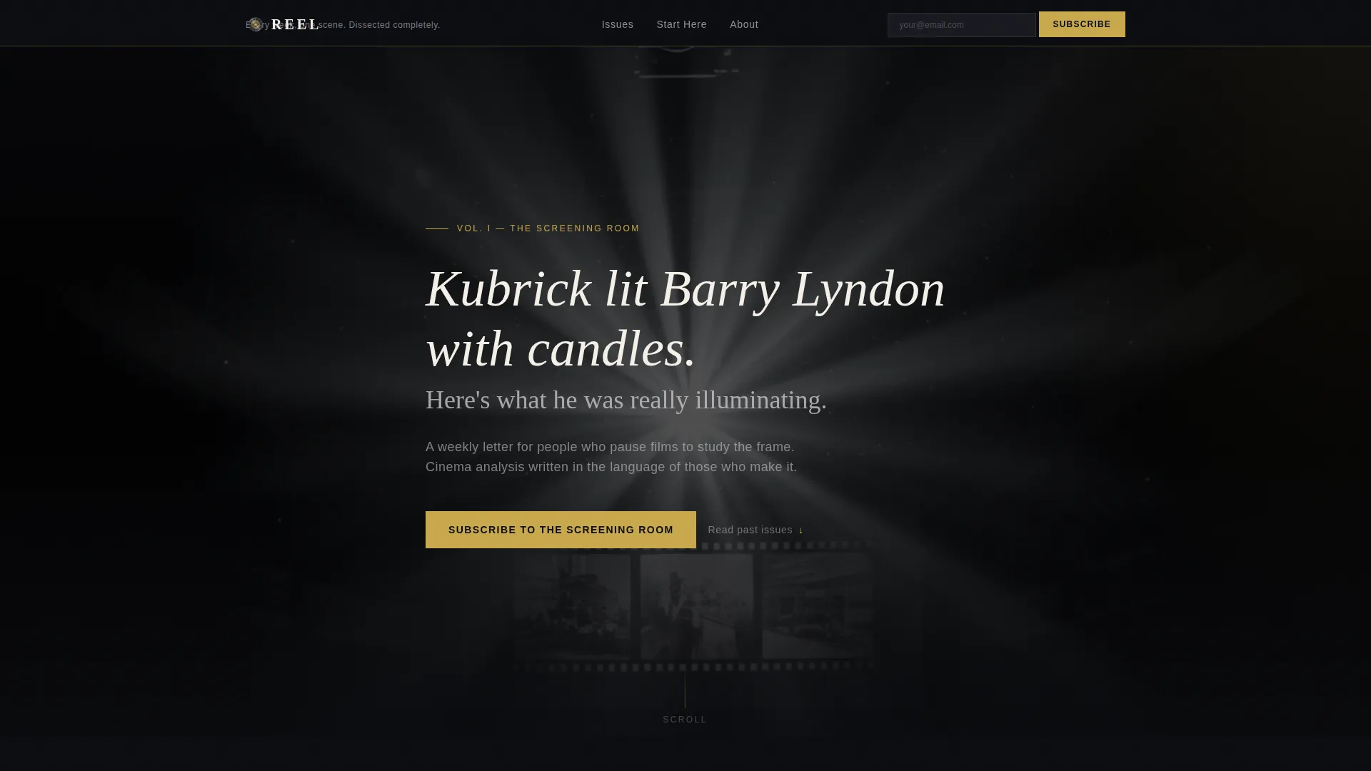
- A full-viewport hero with a large serif title card overlay and a provocative single-line analysis hook
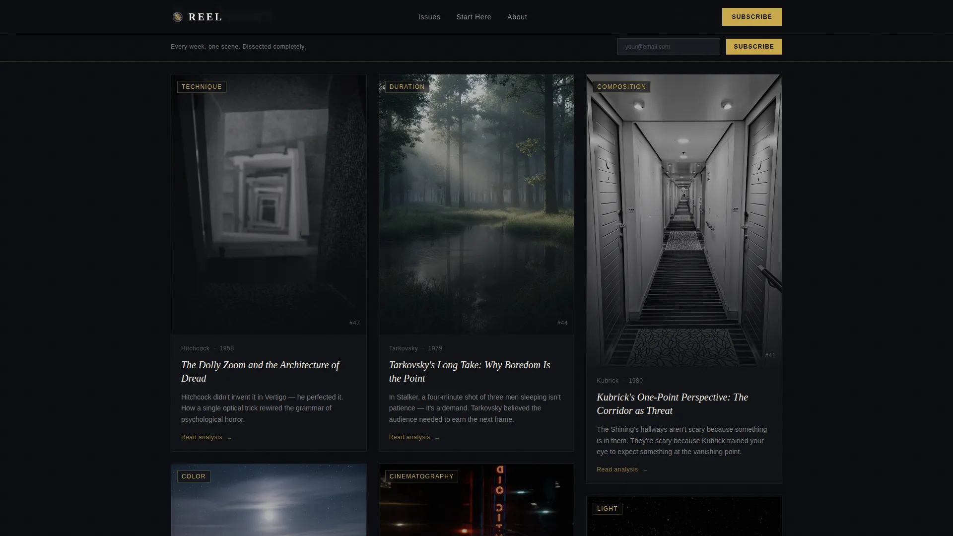
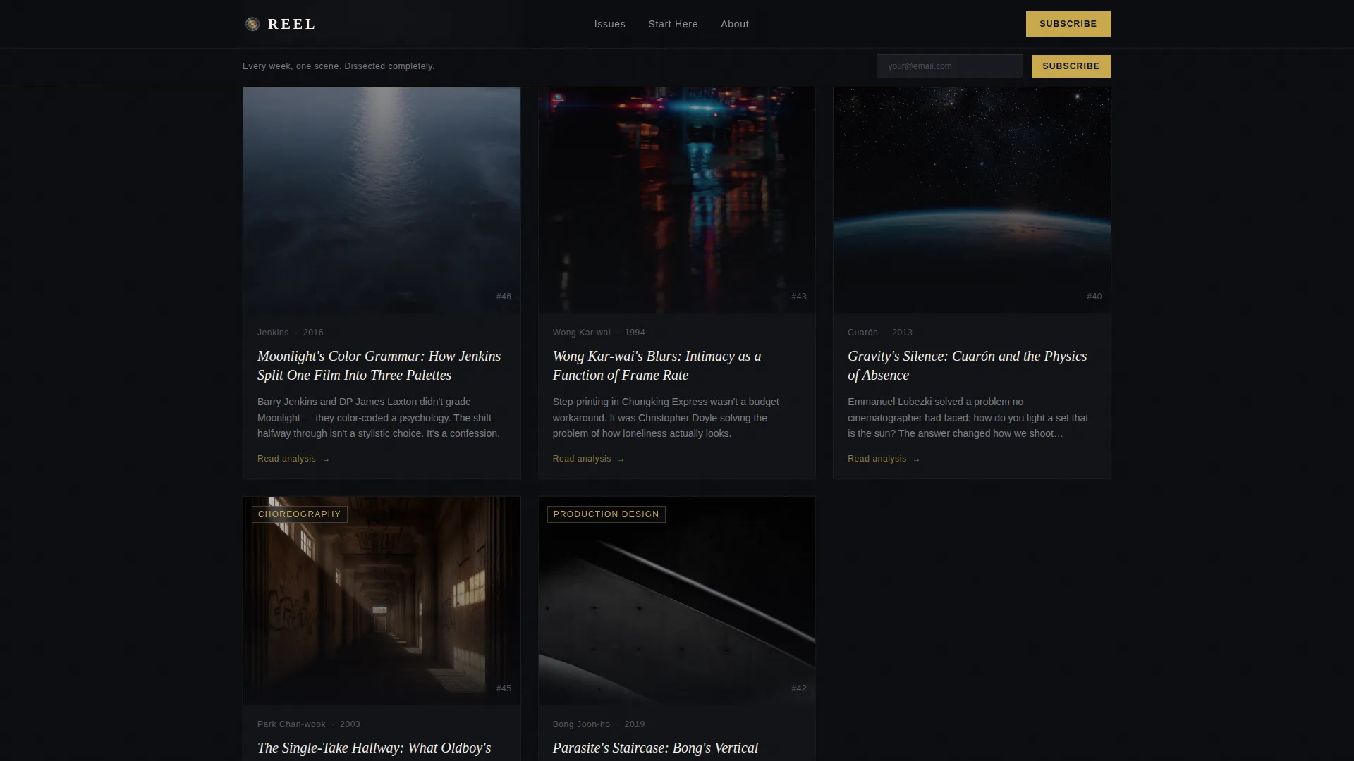
- A masonry grid of past issue cards with cinematic stills, issue titles, and teaser lines at staggered heights
- Three fully readable free sample issues on-page, each followed by an inline email subscribe field
Feature list
This template includes a focused set of layout and interaction features drawn directly from the brief.
Full-Viewport Anamorphic Hero
The hero occupies the entire screen in a widescreen anamorphic ratio. A high-contrast, near-monochrome film still sits behind large tracked-out serif type, presenting a provocative line of analysis as the first thing a visitor reads. The gold subscribe bar pins itself after the first scroll.
Parallax Origin Story Section
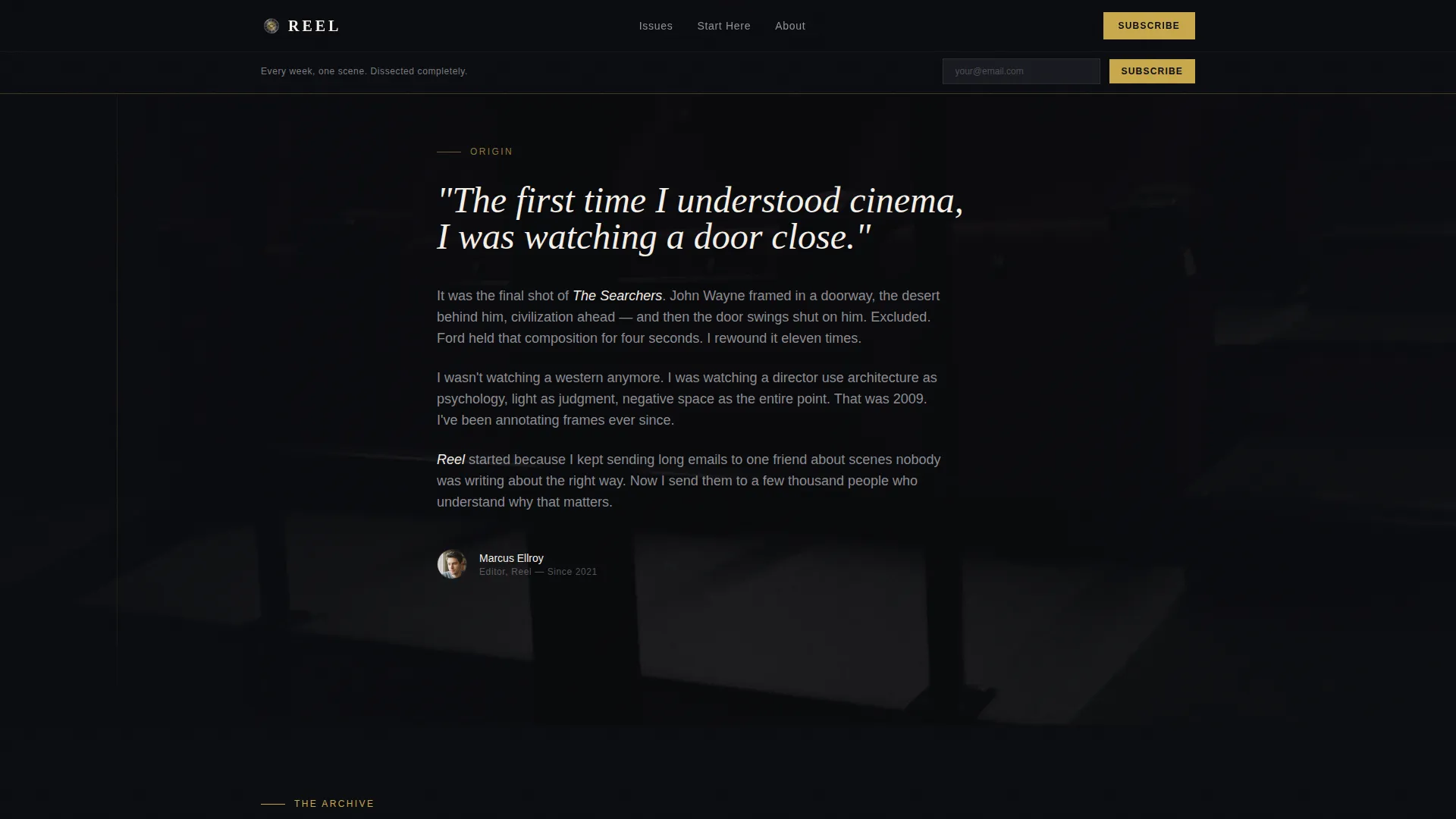
Directly below the hero, a first-person narrative section scrolls over a slowly parallaxing cinematic still. This section tells the editor's personal moment of obsession, a specific film, a specific scene, giving the newsletter a human voice before the content grid appears.
Staggered Masonry Issue Grid
Past issues are arranged in a Pinterest-style masonry layout at varied tile heights. Each card shows a cropped cinematic still, the issue title, and a single teaser line. Subscriber pull-quotes and short animated scene GIFs are interspersed between grid rows, making the scroll feel active and editorial.
Curated Start Here Collection
A dedicated section surfaces the five most-shared analyses as a curated entry point for new visitors. This gives first-time readers an immediate reason to stay and explore before deciding to subscribe.
Inline Sample Issues With Subscribe Prompts
Three complete sample issues are fully readable directly on the page. Each sample ends with a single email input field and a "Send Me the Next Issue" button, so the subscribe moment arrives naturally after the reader has already seen the value.
Sticky Subscribe Bar
A slim gold-on-black subscribe bar pins to the viewport after the visitor scrolls past the hero. The call to action reads "Subscribe to the Screening Room" and stays visible throughout the rest of the page without interrupting the reading experience.
Page sections overview
| Section | Purpose |
|---|---|
| Hero Title Card | Opens with a full-viewport anamorphic film still and a large provocative analysis line in serif type |
| Origin Story Parallax | First-person editor narrative over a parallaxing still, building personal connection before the content grid |
| Masonry Issue Grid | Staggered past-issue cards with cinematic stills, teaser lines, pull-quotes, and animated GIFs |
| Start Here Collection | Five curated top-performing analyses to anchor new visitors immediately |
| Sample Issues Inline | Three full readable issues on-page, each followed by an inline email subscribe field |
| Sticky Subscribe Bar | Slim gold-on-black bar pinned after first scroll with primary call-to-action text |
| Footer | Ultra-minimal horizontal footer on dark background |
Design & branding system
The visual identity follows a Luxe Minimal approach built on a cinematic dark color palette. Every design decision reinforces the feeling of settling into an empty arthouse theater moments before a film begins.
- Colors: screening-room black (#0B0C10) dominates all surfaces; projector-beam silver (#C8C8CC) carries body text; film-stock warm gray (#3A3A42) provides mid-tone depth; festival-program gold (#C9A84C) is reserved for links, hover states, and the subscribe button
- Typography: Fraunces serif is used for headlines and title cards, delivering an unhurried, confident editorial presence; DM Sans handles body text and interface elements for clarity
- The hero image is desaturated nearly to monochrome; cream white (#F5F0E8) text floats over it like a title card; gold appears sparingly, the way a practical lamp pulls the eye in a dark frame
Mobile & speed optimization
The template is built desktop-first, reflecting the long-form reading habits of its target audience. Scroll-linked animations and masonry layouts are handled with client-side components to keep interactions smooth.
- Scroll-linked animations, including the parallax hero and staggered masonry card reveals, use client components so they do not block static content loading
- Static sections such as the sample issues and the Start Here collection use server components for faster initial rendering
- The masonry grid is responsive enough to remain readable on tablet and mobile, even though the primary design priority is a wide desktop viewport
How this template helps you convert
This template is structured around a single conversion philosophy: earn the subscribe rather than demand it. Every section moves the visitor forward without pressure.
- The hero pulls readers in with an intellectually provocative analysis line, immediately signaling that this newsletter speaks their language and is worth a few more seconds of attention
- The masonry grid and subscriber pull-quotes build social proof and editorial range across a single scroll, showing depth of archive before any subscribe prompt appears
- Three fully readable free sample issues close the trust gap entirely, by the time the visitor reaches the email field, the subscribe feels like a natural next step rather than a risk
Other information about this template
This template is part of a broader Blog and Editorial category, specifically matched to the Film and Cinema Analysis Newsletter niche. A few additional details worth knowing before you start building:
- The template style is Masonry and Pinterest layout, making it well-suited for content-rich newsletters with a deep back-catalogue of issues
- The creative direction is Origin Story, meaning the personal hook precedes the content grid intentionally, this sequencing is built into the layout, not optional
- The header concept is Type Over Image, so strong editorial copy placed directly on the hero frame is a core structural requirement, not decoration
- The landing page direction is Content and Resource Hub, which means the page functions as both a showcase and a subscribe funnel simultaneously
- The color system is labeled Cinematic Dark; all four hex values are provided in the brief and mapped to specific use cases across the layout
- Animation intensity is set to high in the brief, covering parallax hero behavior, staggered masonry card reveals, and scroll-linked transitions throughout the page
Theme
Luxe Minimal
Creative direction
Origin Story
Color system
Cinematic Dark
Style
Masonry/Pinterest
Direction
Content/Resource
Page Sections
Full-viewport Anamorphic Hero
Parallax Origin Story Section
Staggered Masonry Issue Grid
Curated Start Here Collection
Inline Sample Issues with Subscribe Prompts
Sticky Subscribe Bar
Related questions
Who is this template designed for?
Do I need a large back catalogue to use the masonry grid?
Can I change the color palette or typography?
Is the sticky subscribe bar always visible?
What makes this different from a standard newsletter landing page?



