Cinematic Film Analysis Blog Landing Page Template
Reel is a cinematic film analysis landing page built for blogs that take cinema seriously. It combines a scrapbook collage header, contributor spotlight sections, and a waitlist form into one warm, analog-feeling page. The design uses cream, mahogany, and amber tones to evoke the feeling of a Criterion booklet. It is built to capture early signups from film students, cinephiles, and screenwriters.
by Rocket studio
Quick summary
Reel is a hub and spoke landing page for a film and cinema analysis blog. It is designed as a waitlist and coming soon page that captures signups from serious film lovers. The layout orbits a roster of contributors, each with a distinct critical voice. Warm artisan design and scrapbook visuals set the tone before a single word is read.
Who this template is for
This template is built for writers, editors, and creators launching a film criticism or cinema analysis publication. It suits anyone who wants to build anticipation before going live and needs to collect an audience first.
- Film school graduates or students starting a long-form essay blog about cinema craft
- Screenwriters, cinephiles, and film critics building a contributor-led editorial platform
- Independent publishers who want a coming soon page that already feels like a destination
What problem this template solves
Most coming soon pages feel empty. They ask for an email and offer nothing back. For a film analysis blog, that blankness kills the mood before anyone has read a word.
- There is no sense of voice, community, or editorial identity on a generic waitlist page
- Prospective readers have no reason to trust the blog or feel curious about its contributors
- A plain form misses the chance to qualify passionate readers before launch
What you get with this template
You get a complete single-page layout that communicates editorial identity, introduces your contributor roster, and collects waitlist signups. Every section has a defined purpose and a visual treatment that matches the warm, analog theme.
- A scrapbook collage hero with a torn-paper call to action button labeled "Save My Seat"
- Three contributor spoke sections, each introducing a writer with a distinct critical obsession
- A sticky footer waitlist bar and an inline email form with an optional personal question field
Feature list
This template includes six purpose-built sections and a cohesive set of design and interactive elements drawn directly from the source brief.
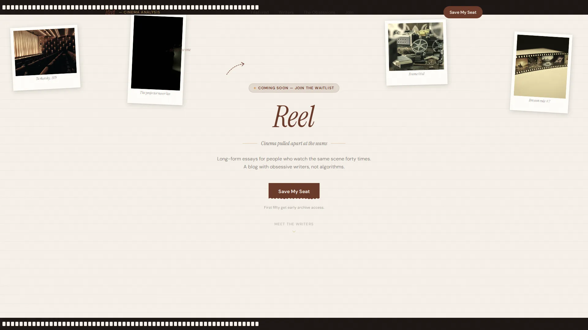
Scrapbook Collage Hero
The header layers overlapping film stills at skewed angles, a 35mm film strip curling across the top corner, and handwritten-style annotations in a loose serif. A pencil-sketch arrow points to the blog name, scrawled in mahogany as if underlined twice. The "Save My Seat" button appears on a torn-paper shape inside the collage.
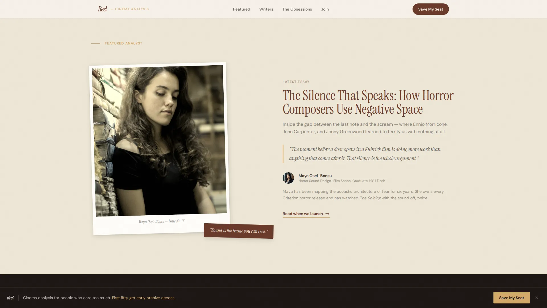
Creator Spotlight Section
Below the header, a rotating featured analyst section displays a grain-heavy duotone photo, the analyst's latest essay title, and a single pull-quote. The pull-quote is written to hook like a first line of a great film review. This section introduces the editorial voice before the contributor spokes begin.
Hub and Spoke Contributor Sections
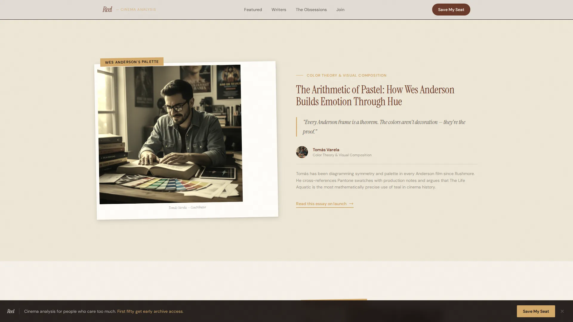
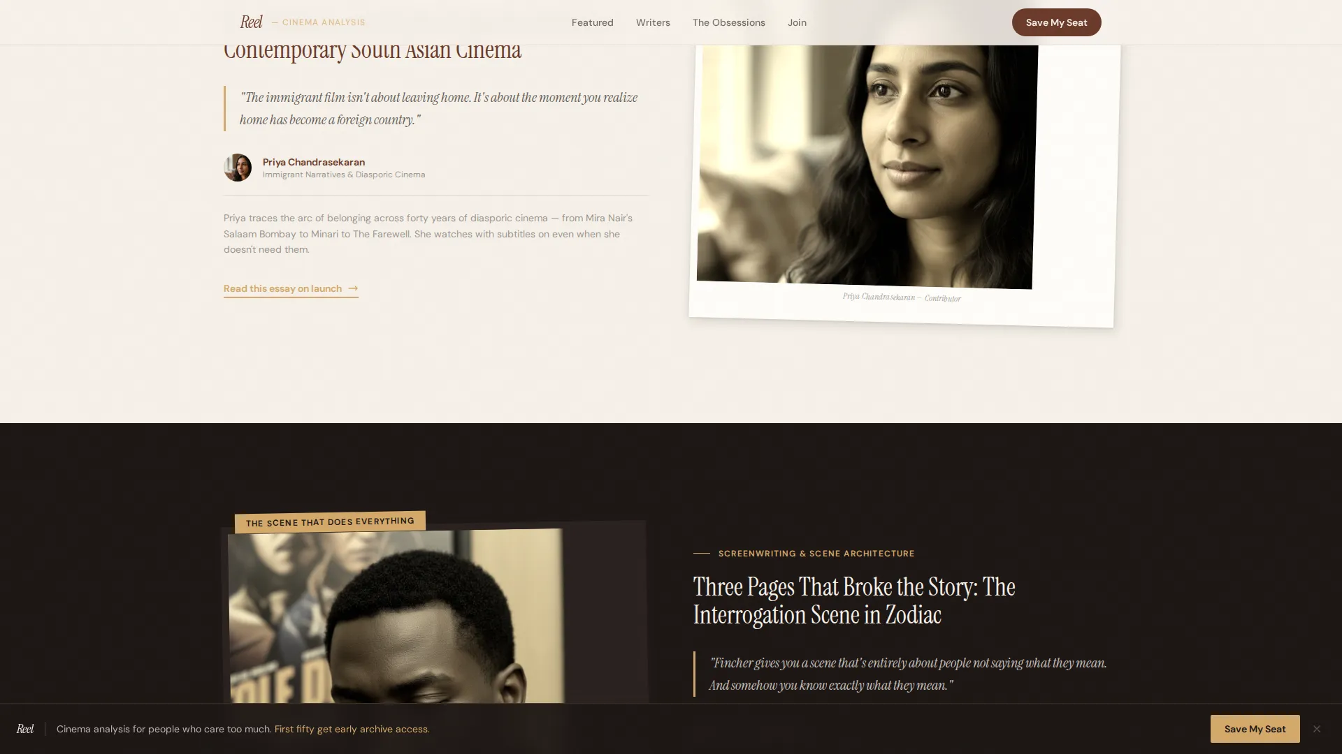
Three individual contributor sections each introduce one writer and their critical obsession. One focuses on horror sound design, one maps color theory across a specific director's filmography, and one traces immigrant narratives across decades of cinema. Each spoke makes a reader want to follow a person, not just browse a topic.
Scrolling Film Marquee
A horizontally scrolling ticker runs a sequence of iconic film titles across the page. It adds motion and cinematic atmosphere without distracting from the editorial content above and below it.
Waitlist Form with Personal Question
The email form includes one required field and one optional field. The optional field asks: "Name a film you could talk about forever." This question qualifies passionate readers and makes signing up feel like starting a conversation. A line beneath the form reads "First fifty get early archive access," adding gentle scarcity without a countdown timer.
Sticky Footer Call to Action Bar
A persistent footer bar repeats the "Save My Seat" call to action throughout the scroll. It stays visible without interrupting the reading experience, giving readers a consistent way to sign up at any point on the page.
Page sections overview
| Section | Purpose |
|---|---|
| Hero collage header | Establishes visual identity and presents the primary "Save My Seat" call to action |
| Featured analyst spotlight | Introduces the editorial voice with a duotone photo, essay title, and pull-quote |
| Contributor spoke one | Showcases the horror sound design writer with obsession context |
| Contributor spoke two | Showcases the color theory writer focused on a director's visual palette |
| Contributor spoke three | Showcases the immigrant narrative writer and their essay focus |
| Scrolling film marquee | Adds cinematic atmosphere with a ticker of iconic film titles |
| Waitlist form section | Captures signups with an email field and the personal film question |
| Sticky footer bar | Repeats the "Save My Seat" call to action persistently during scroll |
Design & branding system
The visual identity follows a Warm Artisan theme built on the Soft Mist color system. Every color choice references analog film culture, from aged projection light to worn bookshop ink.
- Cream (#F5F0E8) covers the background like aged paper stock, mahogany (#6B3A2A) anchors headlines and pull-quotes, and amber (#D4A96A) warms hover states and navigation highlights
- Charcoal (#3B3533) handles long-form body text so extended reading never strains the eye
- Typography pairs Instrument Serif for headlines with DM Sans for body copy, keeping the editorial tone warm but legible
Mobile & speed optimization
The template is built desktop-first with a responsive layout that adapts to mobile screens. Animations and interactive details are handled with CSS and browser-native scroll observation, keeping the experience fluid across device sizes.
- CSS animations power the marquee, scroll reveals, and grain overlay without heavy external dependencies
- Intersection Observer controls when elements appear during scroll, reducing unnecessary rendering
- Skewed collage elements and hover states are designed to adapt gracefully on smaller viewports
How this template helps you convert
The page is engineered to turn curious visitors into committed waitlist signups by building editorial trust at every scroll point.
- The scrapbook hero and contributor spotlights establish credibility and voice before any ask is made, so readers arrive at the form already engaged
- The personal question in the waitlist form lowers resistance by making signup feel like joining a community rather than a mailing list
- The sticky footer bar and inline form work together to keep the call to action reachable at any moment without forcing it
Other information about this template
This template is part of a broader collection of editorial and blog landing page templates. It is designed for the film and cinema analysis niche but can support other long-form, contributor-led publications that share a similar editorial model.
- The template uses the Hub and Spoke anchor navigation structure, meaning each contributor section is reachable via the page's own navigation links
- The Collage and Scrapbook header concept is a deliberate design choice for this niche, not a generic layout, and requires the skewed, layered visual assets described in the brief
- The "First fifty get early archive access" line is built into the form section as a social proof and scarcity element, requiring no countdown mechanism
- The footer follows a horizontal pattern layout suited to a minimal editorial footer with essential links
Theme
Warm Artisan
Creative direction
Creator Spotlight
Color system
Soft Mist
Style
Hub & Spoke (Anchor Nav)
Direction
Waitlist/Coming Soon
Page Sections
Scrapbook Collage Hero with Torn-paper Call to Action
Grain Duotone Contributor Spotlights
Hub and Spoke Anchor Navigation
Scrolling Film Title Marquee
Waitlist Form with Qualifying Question
Sticky Footer Signup Bar
Related questions
Can I add more contributor sections beyond the three included?
Does the waitlist form connect to an email platform automatically?
Can I use this template for a blog that is already live?
What makes the personal question in the signup form effective?
Is the scrapbook header difficult to customize?


