Bold Plastic-Free Living Blog Landing Page Template
Refuse is a bold, editorial landing page template built for plastic-free living blogs. It pairs a newspaper-style masthead with a manifesto-driven hub-and-spoke layout, guiding readers through four content pillars, Swaps, Science, Community, and Shop Reviews, before a warm, low-friction email signup. The warm matte palette and elegant serif typography make every section feel intentional and unhurried.
by Rocket studio
Quick summary
Refuse is a hub-and-spoke landing page template for plastic-free living blogs. It opens with a full-width newspaper masthead, flows through a declarative manifesto, and fans into four anchor-nav content pillars. Three full articles are readable in-page before any email ask, building trust with the reader before the newsletter signup appears.
Who this template is for
This template is built for editorial voices in the zero-waste and sustainability space. It suits content creators who want their layout to feel as considered as their writing.
- Plastic-free living bloggers who want a broadsheet-quality editorial presence online
- Zero-waste shop owners who need a content hub to support product curation and reviews
- New sustainability writers serving audiences like new parents or office workers just starting out
What problem this template solves
Most blog templates treat layout as an afterthought. They push a signup form at the top before earning any trust, and the design undercuts the editorial credibility the writer has spent years building.
- Visitors leave before reading because the page feels rushed and cluttered
- Email forms appear too early, before the reader has any reason to hand over their inbox
- The visual style of generic blog templates clashes with a slow, intentional editorial brand
What you get with this template
You get a fully structured, single-page content hub that leads readers through your editorial world from masthead to call to action. Every section is designed to feel earned and intentional.
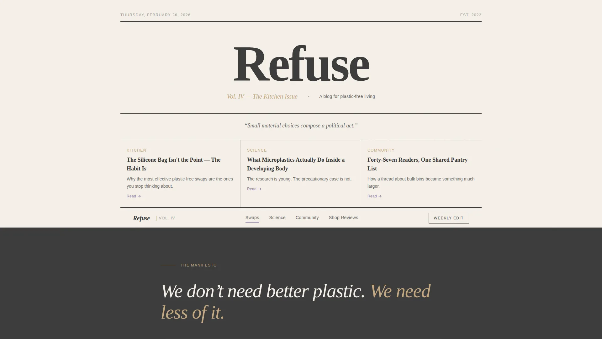
- A newspaper-style masthead header with editorial subhead, dateline, and columnar headline links
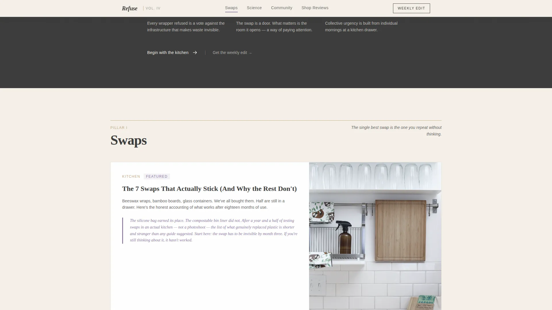
- Four anchor-nav content pillars (Swaps, Science, Community, Shop Reviews) each introduced by a one-sentence conviction
- A primary email signup with interest-area toggles and a secondary PDF gate for a downloadable Starter Kit
Feature list
This template includes a focused set of editorial and conversion-ready components, each grounded in the broadsheet metaphor and plastic-free living niche.
Newspaper Masthead Header
The header spans the full viewport in pure typography. The blog name is set in a tall display serif, accompanied by a dateline, an editorial volume subhead, and three headline links in a columnar layout. No imagery is used; the whitespace and type carry all the visual weight.
Manifesto Opening Statement
The page opens with a single declarative belief statement that sets the editorial tone for everything that follows. This conviction-first approach orients new readers immediately and signals to returning visitors that the content has a clear point of view.
Hub-and-Spoke Anchor Navigation
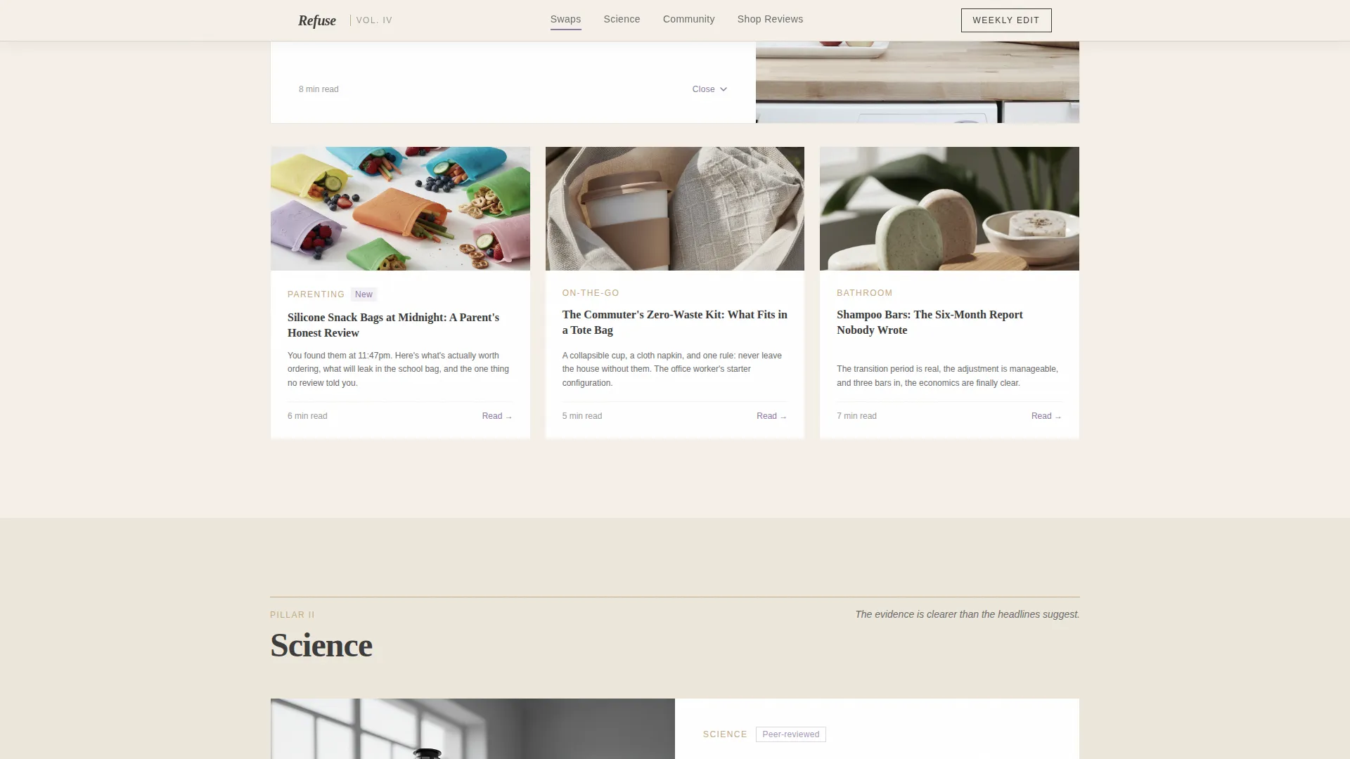
Four content pillars, Swaps, Science, Community, and Shop Reviews, are each reachable via anchor navigation. Each pillar opens with a one-sentence conviction before fanning into article cards, creating a natural reading rhythm that builds from gentle invitation to collective urgency.
In-Page Featured Articles
Three full-length featured articles are readable directly on the page before any email capture appears. This approach lets readers experience the editorial voice firsthand, so trust is established before the newsletter ask.
Email Signup with Interest Toggles
The primary call to action is a "Get the Weekly Edit" email signup with a single email field and a toggle for four interest areas: Kitchen, Bathroom, On-the-Go, and Parenting. The secondary conversion is a "Download the Starter Kit" PDF gate that requires only a first name.
Pull-Quotes and Community Voices
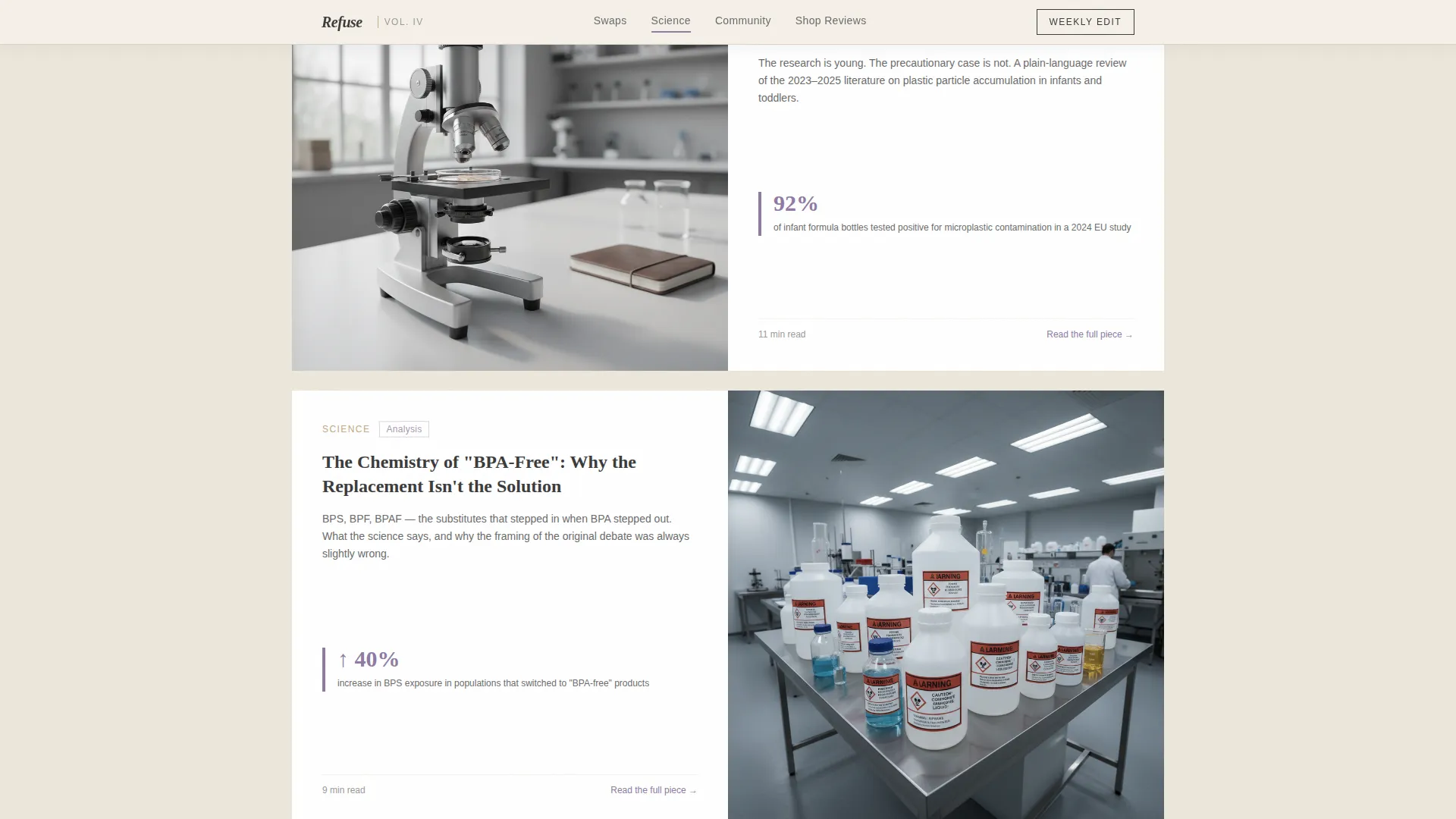
Inline pull-quotes and community voice segments are woven throughout the page as social proof. A visible reader count reinforces credibility without disrupting the editorial flow.
Page sections overview
| Section | Purpose |
|---|---|
| Newspaper Masthead Header | Sets editorial identity with full-viewport typography, dateline, volume subhead, and columnar headline links |
| Manifesto Statement | Anchors the entire page with a single declarative belief that orients every content pillar below |
| Swaps Pillar | Article card grid covering Kitchen, Bathroom, On-the-Go, and Parenting swap categories |
| Science and Community | Evidence-based articles paired with a community voices bento layout and reader social proof |
| Shop Reviews | Curated product cards presenting plastic-free alternatives reviewed in editorial voice |
| Call to Action | Weekly Edit email signup with interest toggles and Starter Kit PDF gate |
| Footer | Horizontal flow footer pattern with navigation and publication details |
Design & branding system
The visual identity follows an Atelier Studio theme built around the Cloud Canvas color system. Every surface is warm, matte, and deliberately un-digital, evoking a hand-bound sketchbook left open beside a ceramic mug.
- Color palette: unbleached cotton (#F5F0E8) background, graphite pencil (#3B3B3B) body text, kiln-fired clay (#C4A882) accents, and pressed wildflower violet (#8E7AA2) for anchor nav highlights and pull-quotes
- Typography: Fraunces display serif for headings and the masthead, paired with DM Sans for all body text
- Animation style: low-to-medium intensity with unhurried, intentional scroll reveals that match the broadsheet pacing
Mobile & speed optimization
The template is designed desktop-first to honour the broadsheet metaphor, with a graceful mobile stack that preserves the editorial hierarchy on smaller screens.
- Desktop-first layout with columnar sections that reflow cleanly into a single-column mobile stack
- Minimal JavaScript footprint using server components for static content sections
- Accordion interactivity for condensed mobile reading without sacrificing content depth
How this template helps you convert
Conversion is built into the editorial architecture rather than bolted on at the end. The sequence is designed to earn trust before asking for anything.
- Three full in-page articles let readers experience the editorial voice before any email capture, so the signup feels like a natural next step rather than an interruption.
- The interest-area toggle on the email form (Kitchen, Bathroom, On-the-Go, Parenting) makes the newsletter feel personally relevant, increasing the likelihood that a visitor completes the signup.
- The secondary Starter Kit PDF gate asks only for a first name, keeping the barrier to the second conversion point low enough that hesitant readers still engage.
Other information about this template
This template is built for the plastic-free living niche but adapts naturally to any slow, editorial, sustainability-focused content brand. A few additional details worth knowing before you build:
- The creative direction is Manifesto, meaning the tone escalates from gentle invitation to collective urgency as the reader scrolls deeper into the page
- The header concept is Newspaper/Publication, with the template style following a Hub and Spoke anchor navigation structure
- The landing page direction is Content/Resource hub, prioritising value delivery before conversion
- The template is categorised under Blog and Editorial, with a specific fit for the Environment and Sustainability Blog subcategory
- Localisation is English (US) with editorial dates and no currency formatting built in
Theme
Atelier Studio
Creative direction
Manifesto
Color system
Cloud Canvas
Style
Hub & Spoke (Anchor Nav)
Direction
Content/Resource
Page Sections
Newspaper Masthead Header
Manifesto Opening Statement
Hub-and-spoke Anchor Navigation
In-page Featured Articles
Email Signup with Interest Toggles
Pull-quotes and Social Proof
Related questions
Can I use this template for a sustainability blog that is not focused on plastic-free living?
Do I need design experience to update the colors and fonts?
How does the in-page article reading experience work?
What is included in the email signup section?
Is this template suitable for a desktop audience?



