Cinematic Home Renovation Blog Landing Page Template
Reno is a cinematic editorial landing page built for home renovation blogs. It pairs long-form chapter-style content with a moody dark design system, guiding readers from a striking hero image through data-rich overviews and expert-led chapters. The primary conversion is an email capture for a downloadable renovation playbook, backed by a secondary spreadsheet tool offer.
by Rocket studio
Quick summary
Reno is a single-page editorial template designed for home renovation content creators, bloggers, and educators. It delivers long-form renovation intelligence in a magazine-quality format, combining cinematic photography, oversized serif typography, and a chapter-driven reading experience. The conversion goal is simple: earn trust through genuinely useful content, then invite readers to download a full renovation playbook.
Who this template is for
This template is built for renovation content publishers who want their page to feel as authoritative as the knowledge they share. It works best when the audience arrives with real problems and needs more than a quick tip.
- Home renovation bloggers publishing deep-dive guides on costs, contractors, and permits
- Content educators creating downloadable resources for first-time homeowners or property flippers
- DIY and home improvement publishers who want a premium editorial identity, not a generic blog layout
What problem this template solves
Most blog templates treat long-form content like a liability. They break up depth with aggressive sidebar ads, weak typography, and layout patterns that punish the scroll. Readers who arrive with serious renovation questions leave without answers because the reading experience collapses before the value arrives.
- No dedicated structure for chapter-driven, long-form editorial content
- No built-in conversion flow that earns trust before asking for an email
- No design system that matches the seriousness renovation readers bring to the page
What you get with this template
Reno gives you a complete single-page layout that opens with a cinematic hero and unfolds like a flagship annual feature. Every section is purpose-built to move the reader deeper into the content before presenting any ask.
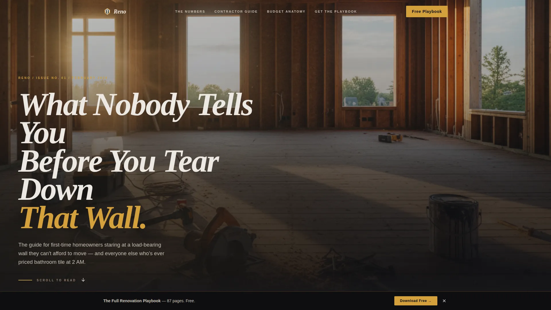
- A hero section with a full-bleed moody photograph and a dominant editorial serif headline
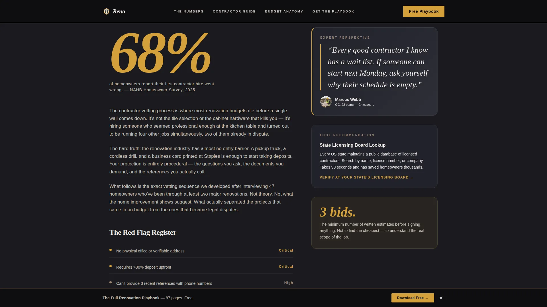
- Two full long-form content chapters with supporting data, sidebar expert quotes, and tool recommendations
- Two strategically placed email capture moments: one inline after chapter two, one as a sticky download bar after chapter four
Feature list
This template includes a focused set of design and layout features drawn directly from its editorial and conversion brief.
Type Over Image Hero
A wide-angle, desaturated renovation photograph fills the entire hero area. A large Fraunces serif headline sits low-left over the image in warm plaster white, positioned like a magazine cover line. There is no button or form in the hero, only the promise of depth.
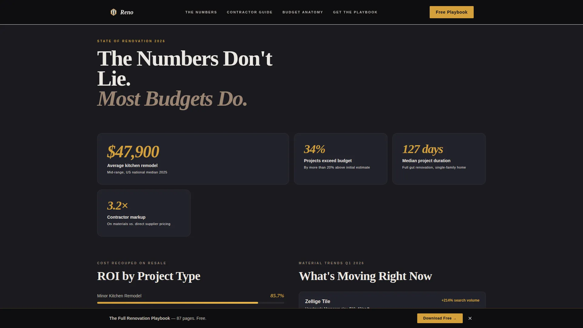
State-of-Renovation Data Grid
The opening content section presents renovation data in a bento-style grid layout. Average project costs, return on investment by project type, and trending materials are displayed as scannable data points before the reader reaches chapter one.
Chapter-Driven Long-Form Layout
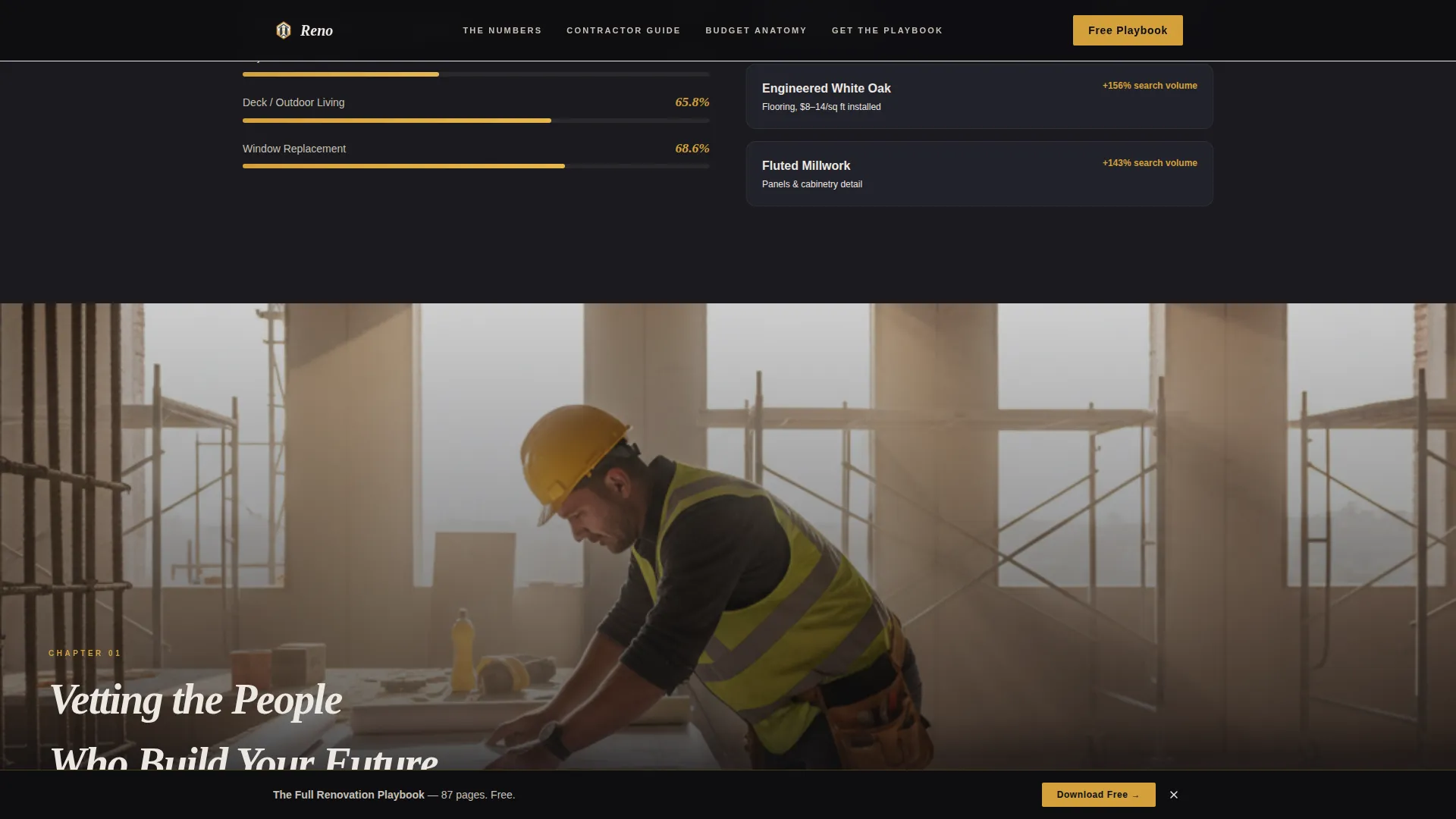
Each content chapter opens with a full-bleed renovation photograph and a single oversized statistic in saffron accent type. Dense editorial copy follows, supported by sidebar pull quotes from experts and inline tool recommendations. The rhythm alternates between reading-heavy sections and visual breathing room.
Dual Conversion Path Design
The primary call to action, downloading the full renovation playbook, appears first after chapter two and again as a sticky bar after chapter four. A secondary offer for a budget calculator spreadsheet gives visitors a lower-commitment entry point without disrupting the reading flow.
Scroll-Reveal Animation System
Section entries use medium-weight scroll-reveal animations with cubic-bezier easing. Chapter markers stagger into view as the reader scrolls, reinforcing the sense of progressive depth. The sticky download bar activates at the correct scroll depth without interrupting earlier reading.
Minimal Email Capture Form
The inline capture form asks for a first name and email address only. The saffron-colored submit button is consistent with the accent system used throughout the page, keeping the conversion moment visually connected to the editorial identity rather than feeling like an interruption.
Page sections overview
| Section | Purpose |
|---|---|
| Hero photograph | Cinematic entry with editorial headline |
| Renovation data grid | Cost, return on investment, and materials overview |
| Chapter one: Contractor Vetting | Full-bleed photo, oversized stat, dense copy |
| Chapter two: Budget Anatomy | Split layout with expert sidebar quote |
| Playbook capture form | First email capture after chapter two |
| Sticky download bar | Persistent capture after chapter four |
| Footer row | Single-row linear footer |
Design & branding system
The visual identity uses an Atelier Studio editorial approach rendered in a Cinematic Dark color system. The palette feels like a renovation photographed at golden hour, deep shadows, warm ambient light, exposed surfaces.
- Color palette: deep charcoal (#1A1A1E) as the dominant background, warm plaster white (#EDE8E2) for body and headline text, muted clay (#9B8574) for supporting elements, and saffron (#D4A03C) reserved for pull quotes, hover states, chapter markers, and call-to-action buttons
- Typography: Fraunces serif for all display and chapter headlines, DM Sans for body copy and interface elements
- Dark backgrounds dominate throughout, letting full-bleed photography and large serif type breathe like spreads in a European architecture journal
Mobile & speed optimization
The template is built desktop-first to prioritize the long-form reading experience, and it is fully responsive across screen sizes. Scroll animations use server and client component separation to keep static content lightweight.
- Desktop-first layout with responsive stacking for tablet and mobile viewports
- Server Components handle static content sections; Client Components manage scroll-triggered animations and the sticky bar
- Scroll animations use cubic-bezier easing curves for smooth, non-jarring transitions on all devices
How this template helps you convert
Reno is designed around a deliberate trust-first conversion sequence. The page demonstrates value before it ever asks for anything, which reduces resistance at the email capture moment.
- Readers consume two full chapters of actionable renovation content before seeing any call to action, so the playbook offer feels like a natural next step rather than a cold ask.
- A secondary budget calculator offer gives hesitant visitors a lower-friction path, capturing leads who are not yet ready for the full guide.
- The sticky download bar after chapter four re-engages readers who scrolled past the first capture form, creating a second conversion opportunity without adding a separate page or pop-up.
Other information about this template
This template is part of the Atelier Studio theme family and uses the Cinematic Dark color system as its foundational design language. It is categorized under Blog and Editorial, specifically within the DIY and Home Improvement Blog subcategory targeting the home renovation niche.
- The template style is Editorial and Magazine, consistent with long-form content publishing conventions
- The header concept is Type Over Image, a format familiar from print editorial and flagship digital features
- The landing page direction is Content and Resource delivery, meaning conversion is tied to gated content rather than a product sale
- The creative direction follows an Industry Report format, where the scroll experience mirrors reading a curated annual feature
- Designed for English-language audiences using USD pricing references and US date formatting conventions
Theme
Atelier Studio
Creative direction
Industry Report
Color system
Cinematic Dark
Style
Editorial/Magazine
Direction
Content/Resource
Page Sections
Type Over Image Hero Section
Renovation Data Bento Grid
Chapter-style Long-form Content
Dual-path Email Conversion Flow
Scroll-reveal Animation System
Minimal First-name and Email Form
Related questions
Who is this landing page template best suited for?
Can I adapt the chapter structure to different renovation topics?
What does the email capture form collect?
Does the page include a secondary conversion option?
Is this template designed for mobile users?



