Resin Art & Craft Content Blog Website Template
Resin is a masonry-style landing page for resin art and craft blogs. It blends a warm Atelier Studio aesthetic with a data-driven content layout, giving hobbyists, Etsy sellers, and woodworkers a research-grade resource hub. Technique cards, pull quote interrupts, and a sticky email capture bar work together to build trust and convert curious readers into subscribers.
by Rocket studio
Quick summary
Resin is a single-page content hub built for resin art bloggers who want to do more than just inspire, they want to be trusted. The template pairs a collage-style hero with a Pinterest masonry grid, turning tested technique data into a browsable inspiration board that earns email sign-ups card by card.
Who this template is for
This template was designed for craft and DIY content creators who publish technique-led resin art content. It works best when expertise needs to be visible before an audience is asked to subscribe.
- Hobbyists and intermediate Etsy crafters who publish resin tutorials and need a layout that communicates tested, reliable data
- Woodworkers crossing into live-edge resin pours who want a content home that handles cure-time specifics and ratio guides
- Resin art bloggers running a content resource hub who want a primary email capture path without gating their full tutorial archive
What problem this template solves
Most blog templates make resin art content look like a generic lifestyle feed. They bury the data that practitioners actually need, and they ask for an email before proving they have anything worth reading. This template flips that model entirely.
- Technique data stays visible and scannable, so visitors see credibility before they ever reach a sign-up prompt
- The ungated tutorial archive lets readers browse freely, building trust before the sticky call-to-action bar appears
- The masonry layout organizes content by category and complexity, so beginners and advanced crafters both find an entry point
What you get with this template
You get a fully structured single-page layout built around a content-first conversion model. Every section has a defined job, and the visual system reinforces the workshop character of the content.
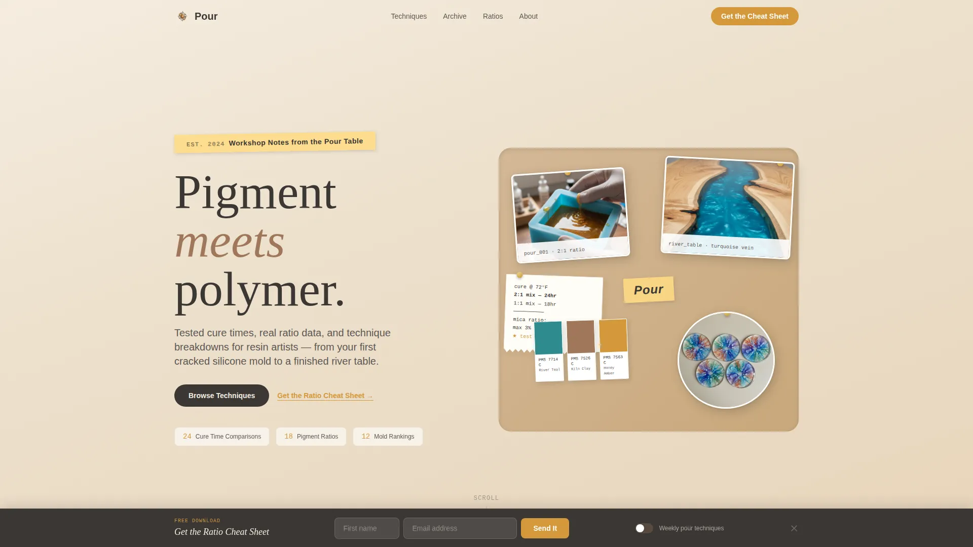
- A collage-style hero with overlapping photos, torn notebook pages, Pantone-style color chips, and a hand-lettered blog name strip
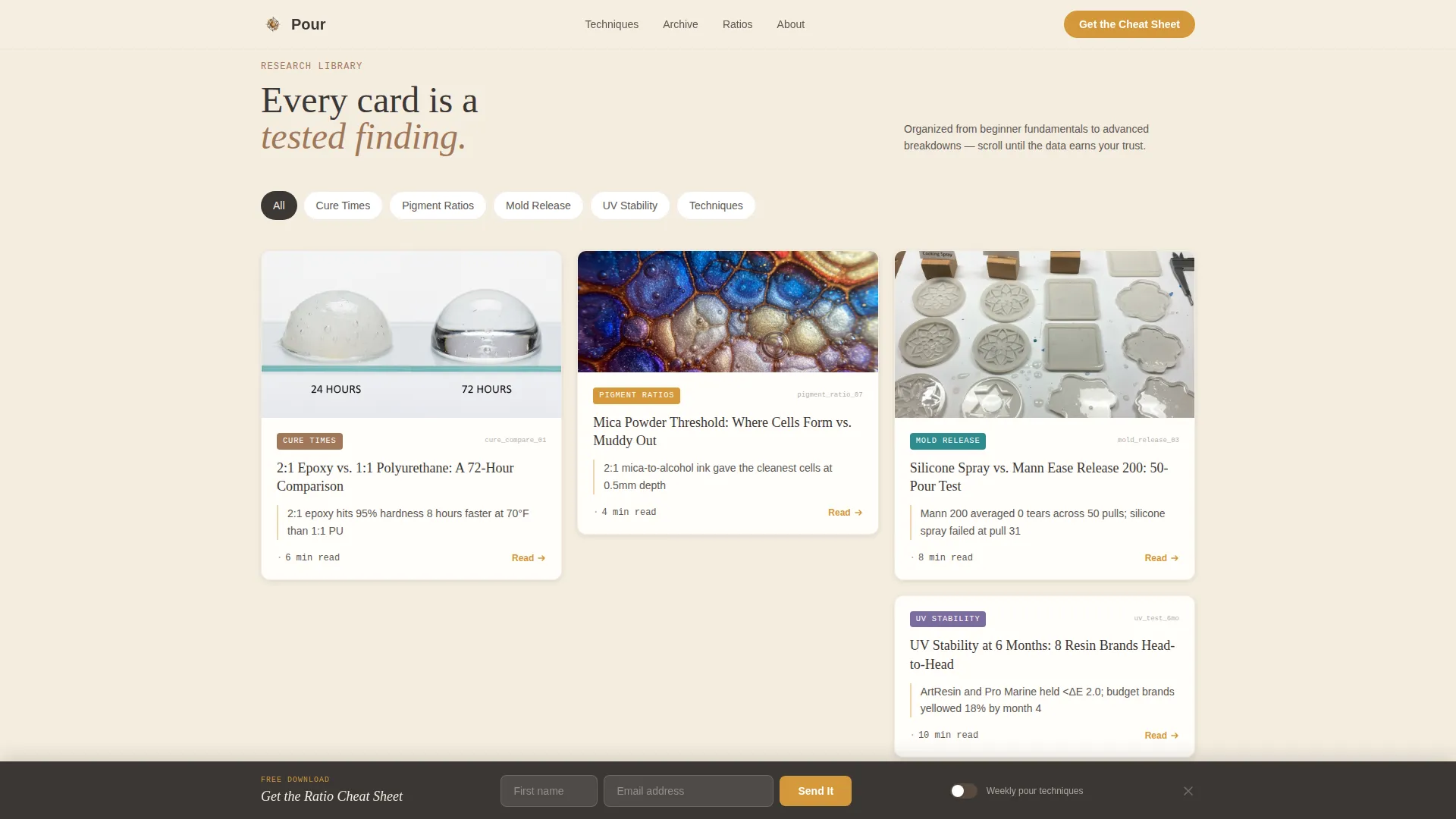
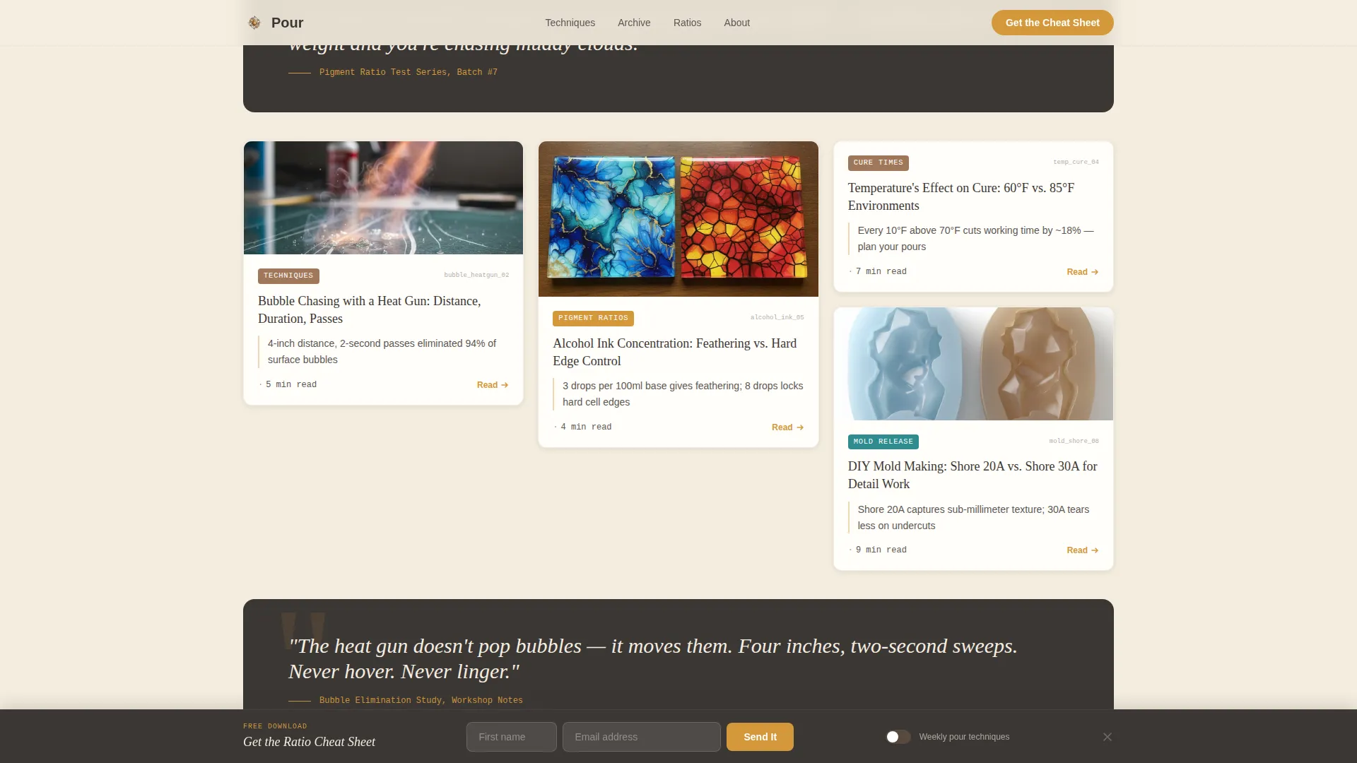
- A responsive masonry card grid organized by category, with read-time estimates and full-width pull quote interrupts every third row
- A sticky "Get the Ratio Cheat Sheet" call-to-action bar in honey amber, a minimal email form, and an ungated secondary browse path
Feature list
This template ships with a tightly scoped set of interactive and visual features drawn directly from the workshop brief.
Collage Scrapbook Hero
The header layers overlapping photographs of mid-pour moments, torn notebook pages with handwritten cure-time notes, and Pantone-style resin-tinted color chips. Elements are slightly rotated with physical drop shadows, giving the impression of a corkboard pinned with real studio material.
Category-Organized Masonry Grid
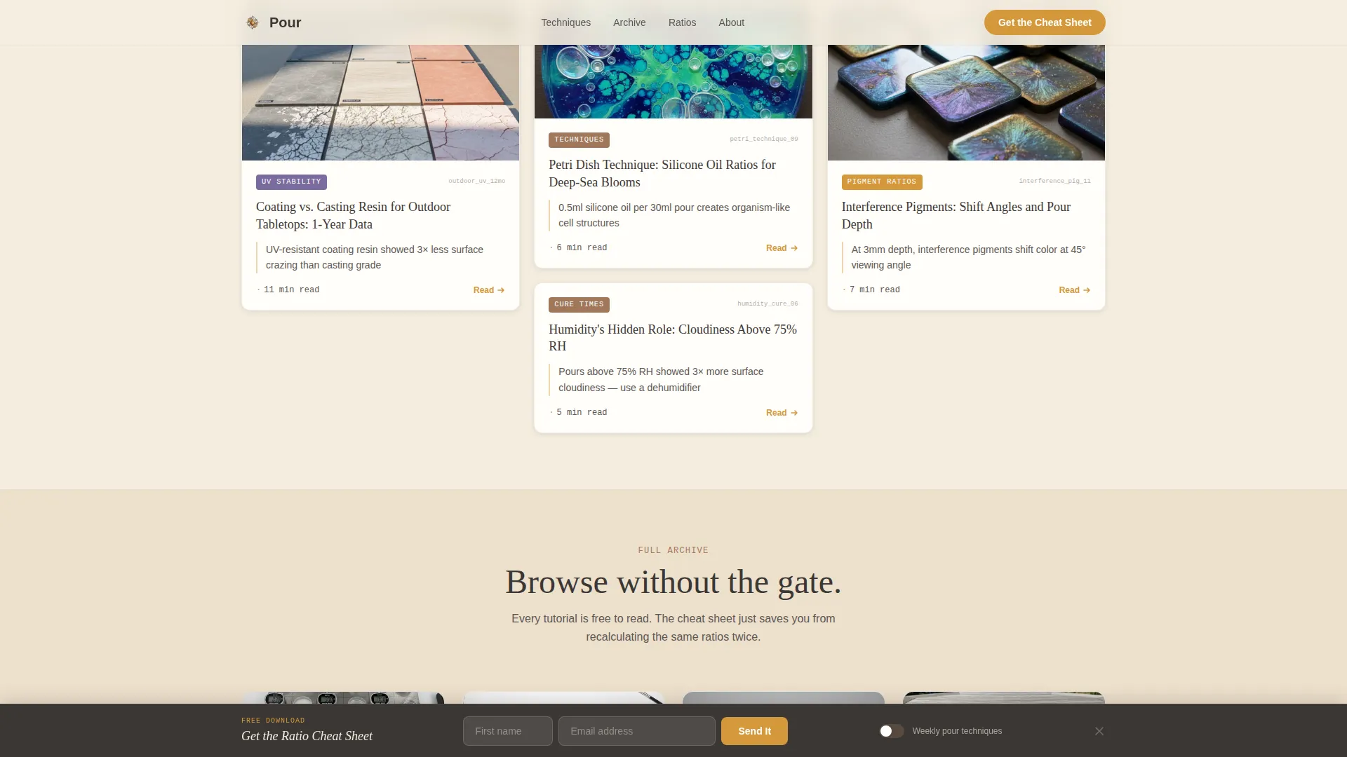
Content cards are grouped into categories such as Cure Time Comparisons, Pigment-to-Resin Ratios, Mold Release Rankings, and UV Stability Tests. Each card carries a thumbnail, a one-line finding, and a read-time estimate. Complexity escalates from beginner fundamentals to advanced technique breakdowns as the visitor scrolls.
Full-Width Pull Quote Interrupts
Every third row of the masonry grid breaks into a full-width pull quote drawn from a tested technique. These interruptions ground the visual layout in evidence and reinforce the data-driven credibility of the content hub.
Sticky Ratio Cheat Sheet Bar
After the second scroll fold, a honey amber sticky bar slides in with the primary call to action: "Get the Ratio Cheat Sheet." The form asks only for a first name and email, with a toggle to opt into weekly pour technique updates.
Ungated Tutorial Archive Browse
A secondary content path lets visitors browse the full tutorial archive without submitting their email. Tab-based category filters help readers navigate by topic. This builds trust before the sign-up ask rather than demanding it upfront.
Scroll-Linked Card Reveal Animations
Cards enter the viewport with a staggered scroll-linked reveal. Hovering a card triggers a subtle scale effect. The sticky bar animates in on a slide. These medium-intensity interactions keep the page lively without overwhelming the content.
Page sections overview
| Section | Purpose |
|---|---|
| Collage Hero Header | Establishes workshop identity with layered photos, color chips, and hand-lettered blog name |
| Masonry Content Grid | Displays technique cards by category with thumbnails, findings, and read-time estimates |
| Pull Quote Rows | Interrupts the grid every third row with a full-width tested technique statement |
| Sticky call to action Bar | Slides in after second scroll fold to capture email in exchange for the Ratio Cheat Sheet |
| Email Capture Form | Minimal first name and email form with a weekly techniques opt-in toggle |
| Tutorial Archive Browse | Ungated secondary path with tab filtering across all content categories |
| Page Footer | Horizontal flow footer pattern completing the single-page layout |
Design & branding system
The visual identity follows an Atelier Studio theme grounded in the Warm Stone color system. Every color choice feels like something found on a worktable dusted with sanding powder beside a golden-hour window.
- Four-color palette: kiln-fired clay (#A0785A) as the primary, raw linen (#F5EDE0) as the background, charcoal graphite (#3B3735) for body text, and liquid honey amber (#D4983B) for accent links, hover states, and the sticky call-to-action bar
- Typography uses Fraunces for serif display headings, DM Sans for body copy, and JetBrains Mono for data values and measurements, giving ratio cards a legible, technical character
- Card shadows, slight element rotations, and physical-feeling drop shadows across the hero reinforce the tactile, unhurried workshop aesthetic throughout the page
Mobile & speed optimization
The template is built desktop-first, and the masonry grid is designed to collapse gracefully as viewport width decreases. The interaction layer stays purposeful rather than heavy across all screen sizes.
- Masonry columns reflow responsively so card layouts remain readable on tablets and smaller desktop breakpoints
- Images across the grid and hero use lazy loading so the page does not front-load all visual assets at once
- CSS scroll behavior is set to smooth, and all animations are scroll-linked rather than autoplay, keeping motion intentional and controlled
How this template helps you convert
The conversion model is trust-first. Visitors earn the right to be asked for an email only after the content has already proven itself card by card.
- The masonry grid surfaces tested data immediately, so a visitor's first impression is expertise rather than a sign-up wall, making them more receptive to the sticky bar when it appears after the second scroll fold.
- The ungated tutorial archive gives readers a complete, frictionless browse path that reinforces the value of the cheat sheet as a curated shortcut rather than a paywall substitute.
- The minimal email form with only a first name and email field, plus the optional weekly techniques toggle, lowers commitment anxiety and increases the likelihood of a completed submission.
Other information about this template
This template is well suited for resin art content creators who publish regularly and want a layout that grows with their archive. A few practical notes for setting up and extending the template:
- The JetBrains Mono font handles data-heavy cards cleanly, making cure-time tables and ratio values easy to read at small sizes
- Pull quote content can be updated to reflect any tested findings specific to your own workshop experiments
- The tab filter system in the tutorial archive supports additional category labels as your content library expands
- The footer uses a horizontal flow pattern, keeping the page base clean and consistent with the overall single-column editorial feel
- The template is built in English with imperial measurements in mind, matching the primary audience's localization expectations
Theme
Atelier Studio
Creative direction
Industry Report
Color system
Warm Stone
Style
Masonry/Pinterest
Direction
Content/Resource
Page Sections
Collage Scrapbook Hero Section
Category-organized Masonry Grid
Full-width Pull Quote Interrupts
Sticky Ratio Cheat Sheet Call to Action Bar
Ungated Tutorial Archive with Tab Filters
Scroll-linked Card Reveal Animations
Related questions
Can I add more card categories to the masonry grid?
How does the sticky call-to-action bar work?
Is the tutorial archive open to visitors without signing up?
Does the template include the Ratio Cheat Sheet PDF content?
Who is this template best suited for?



