Hobby & Passion Content Pre-Launch Website Template
Pluck is a horizontal scroll landing page template built for a front-porch banjo community blog. Rendered in an Ink & Paper aesthetic with parchment cream, pencil gray, and rosin amber, it guides visitors through a hand-journal-style narrative across six panels and ends on a warm waitlist signup that feels less like a form and more like an RSVP to something worth attending.
by Rocket studio
Quick summary
Pluck is a coming-soon landing page template designed for a niche banjo blog and community gathering place. It uses a horizontal scroll layout that moves like turning pages in a hand-bound journal, carrying visitors through a vision-and-mission narrative and delivering them to a warm, confident waitlist call to action. The aesthetic is Ink & Paper: textured, personal, and unhurried.
Who this template is for
This template speaks directly to the kind of person whose banjo leans against the wall between practice sessions and whose idea of a good night involves a porch, a tune, and no audience to impress. It is built for creators who want to launch a folk music community, a banjo-focused editorial blog, or a gathering space for players who learn by ear. If you want your online presence to feel as lived-in as a well-loved fakebook, Pluck was made with you in mind.
- Clawhammer and old-time enthusiasts launching a blog or newsletter for the banjo-playing community
- Folk music writers, educators, or pickers who want to build a waitlist before a full site launch
- Community organizers running porch jams, local festivals, or casual workshops who need a warm, low-friction signup page
What problem this template solves
Most templates built for musicians lean toward the concert poster aesthetic: bold, loud, designed to fill a stage. That energy is right for some projects. It is completely wrong for a community of players who tune up by ear on hot days, argue about bridge height over morning coffee, and pass songs down without ever writing the lyrics on paper. Pluck solves the mismatch between standard music templates and the quieter, more personal world of folk music hobbyists.
- Generic music landing page templates feel impersonal and performance-focused, leaving no room for the story of why a community exists
- Waitlist pages built on plain form tools give visitors no reason to trust the project or feel like they already belong
- Folk music creators struggle to find templates that can hold both editorial warmth and a clean conversion goal without sacrificing either
What you get with this template
You get a fully built, six-panel horizontal scroll landing page that takes visitors from first contact to email signup through a narrative that earns the conversion before it asks for it. Every design detail, from the textured paper background to the rosin amber accent that intensifies panel by panel, serves the story. You do not need to write filler copy. The template ships with suggested language, structural panels, and a visual rhythm that does the emotional heavy lifting for you.
- A six-panel horizontal scroll layout with a full-viewport manifesto header, five story panels, and a centered waitlist call to action
- An Ink & Paper visual system using parchment cream, pencil-sketch gray, faded ink wash, and rosin amber across all panels
- Keyboard and trackpad horizontal scroll support, scroll-linked parallax, ink-stroke typewriter animation, and staggered reveal effects
Feature list
This section breaks down the core built-in features of the Pluck template. Each one is grounded in the design brief and reflects what you will find inside the template file.
Full-Viewport Manifesto Header
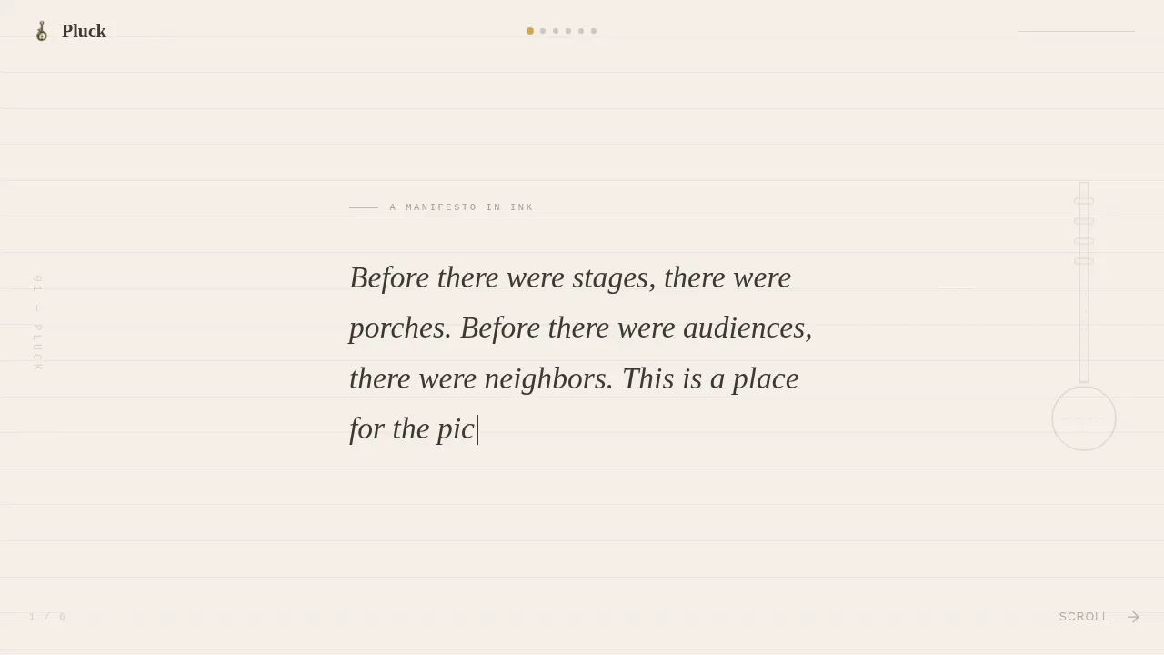
The opening panel fills the entire screen with a hand-lettered manifesto quote set against a textured paper background that shows real fiber and tooth. The type appears as though written with a steel-nib pen, ink pooling slightly at the downstrokes. A faint ruled line sits beneath each row, barely visible, giving the words the gravity of something meant to last. There is no hero image, no illustration, and no distraction. Just words, paper, and the silence that folk music knows how to hold.
Six-Panel Horizontal Scroll Journey
Visitors scroll sideways through six distinct panels, each carrying one idea from the community's story. Panel two introduces the origin of why this place exists. Panel three names what the community refuses to become. Panel four paints a portrait of the reader. Panel five previews what is being built. Panel six delivers the waitlist call to action. Each panel is a chapter in a hand-bound journal, and the horizontal scroll makes the reading feel like turning a page rather than skimming a feed. Keyboard and trackpad navigation are both supported.
Rosin Amber Accent System
The rosin amber color, referenced as #D4A24E in the design system, is used as a single, deliberate accent across links, pull-quotes, and the final waitlist button. Its use intensifies panel by panel, so by the time a visitor reaches the signup frame, the amber glow feels earned rather than arbitrary. This is not decoration. It is a pacing device that signals arrival and warmth to anyone who has made it through the full scroll.
Ink & Paper Mixed Typography
The template combines a serif display typeface for headings with a clean sans-serif for body text and a monospace face for floating tab fragments in the margins. This combination mirrors the experience of reading a well-annotated sheet music book: formal where it needs authority, loose where it needs personality. The hand-drawn heading style shifts naturally across panels, so the page never feels like a single repeated layout.
Waitlist Conversion Panel
The final horizontal panel stops the scroll and centers the entire screen on a single email input field and a button labeled "Save Me a Seat on the Porch." Below the button, a line of pencil-gray text reads: "No spam. Just a note when the screen door opens." The frame is designed so that the visitor has already been welcomed before they are asked for anything. The call to action feels like an RSVP rather than a gate.
Scroll-Linked Parallax and Animation
High-fidelity animations run throughout the template. The opening manifesto uses an ink-stroke typewriter animation that draws words onto the screen. Panel transitions use scroll-linked parallax. Banjo neck sketches appear in margins, and tab fragments float beside paragraphs as the visitor moves through the story. Staggered reveals keep each panel feeling fresh. The animation approach is built to work smoothly as a horizontal scroll experience on desktop, with a vertical fallback for smaller screens.
Page sections overview
| Section | Purpose |
|---|---|
| Manifesto Hero Panel | Opens the scroll with the full-viewport hand-lettered quote on textured paper |
| Why This Exists | Shares the origin story of the community through editorial prose and margin art |
| What We Refuse | Defines the community's identity by naming what it will never become |
| Who This Is For | Paints a warm, specific portrait of the reader to create immediate belonging |
| What's Being Built | Previews upcoming content and community features as the amber accent intensifies |
| Waitlist Call to Action | Centers the email input and "Save Me a Seat on the Porch" button to close the scroll |
Design & branding system
The design language of Pluck is called Ink & Paper, and it is built around the Cloud Canvas color system. Every color decision is intentional. The parchment cream background (#F5F0E8) gives the page the warmth of aged paper rather than the coldness of a white screen. The pencil-sketch gray (#6B6560) carries body text with the weight of a soft pencil mark, not a printed font. The faded ink wash (#3A3632) anchors headings and gives the darker type the gravity of words written to last. The rosin amber (#D4A24E) is used sparingly and deliberately, reserved for links, pull-quotes, and the final button, so that every use carries meaning. Typography combines Fraunces for serif display headings, DM Sans for body copy, and IBM Plex Mono for floating tab fragments. The visual result feels like a well-loved fakebook left open on a music stand: pages yellowed, margins full of scribbled chord shapes, held together by devotion rather than binding.
- Color palette: parchment cream, pencil-sketch gray, faded ink wash, and rosin amber used as a single intensifying accent across all six panels
- Typography stack: Fraunces (serif display), DM Sans (body text), IBM Plex Mono (tab fragments and marginal notation)
- Texture and illustration: textured paper background with visible fiber, pencil-sketch banjo neck drawings in panel margins, floating tab fragments beside paragraphs, and faint ruled lines beneath manifesto type
Mobile & speed optimization
The Pluck template is designed desktop-first to deliver the full horizontal scroll experience as intended. A dedicated vertical fallback layout is built in for mobile visitors, so users accessing the page from their phones while sitting on porches or at festivals will still experience a coherent, readable, and emotionally complete version of the narrative. The animation system is built to perform efficiently, using CSS-first animations and IntersectionObserver for the vertical fallback to keep the experience smooth across contexts.
- Desktop-first horizontal scroll with full keyboard and trackpad navigation support, including IntersectionObserver-based vertical fallback for mobile
- CSS-first animation architecture covering ink-stroke typewriter effects, scroll-linked parallax, and staggered panel reveals
- Mobile layout preserves the full six-panel narrative and waitlist conversion flow in a vertical reading order
How this template helps you convert
The conversion goal of Pluck is to grow an email waitlist for a banjo community blog before the full site launches. The template earns that conversion by making visitors feel they have already found their people before they ever see the signup field. Storytelling in music is one of the most powerful ways musicians convey personal experiences and cultural narratives, and this template is built around that principle. The emotional connection between the community's story and the visitor's lived experience does the conversion work that a standard call-to-action button never could.
- The horizontal scroll structure delivers the community's vision and mission as a narrative journey, so each panel builds trust and desire before the waitlist panel arrives. By the time visitors reach the email field, the amber accent is glowing and the invitation feels genuine.
- The manifesto header creates immediate emotional resonance. When a visitor reads "Before there were stages, there were porches," and recognizes their own life in those words, the decision to sign up is already forming. The call to action simply gives that feeling somewhere to go.
- The waitlist panel uses specific, warm language rather than generic form copy. "Save Me a Seat on the Porch" and "No spam. Just a note when the screen door opens" signal that the community behind this page understands the reader's world. That specificity builds the kind of trust that participation counts and testimonials can only approximate.
Other information about this template
The Pluck template sits within a broader landscape of community landing page templates designed to help music creators launch meaningful gathering spaces online. Understanding how this template fits into that landscape can help you decide whether it is the right starting point for your project.
Folk music communities have long relied on word of mouth, festival bulletin boards, handwritten flyers tucked inside a guitar case, and the kind of trust that comes from showing up at the same jam session for years. Translating that warmth to a digital format is genuinely difficult. Most platforms offer templates that work well for performers with a new album to promote or a concert tour to announce, but they are not built for the quieter, more editorial rhythm of a folk music blog.
The Pluck template is one of the first horizontal scroll landing page designs built specifically for this kind of community. It was not designed to mimic a music venue's promotional page. It was designed to feel like finding a handwritten letter tucked inside a used banjo case. That distinction matters when your visitors are not ticket buyers but neighbors, and when your conversion goal is not a sale but a relationship.
Community landing page templates, in general, are most effective when they reflect the real culture of the community they represent. Templates that feel generic, however well-built, tend to produce waitlists full of people who signed up out of mild curiosity rather than genuine belonging. The Pluck template is designed to filter in the right people by being specific about what the community is and, just as importantly, what it refuses to become.
From a practical standpoint, this template gives you a launch artifact that you can share via social media, email, or a link in a festival program. Leveraging social media is one of the key strategies for promoting music events and building audiences before a full platform launches. The template's single-page format makes sharing easy and the story complete enough that a visitor who finds it from a repost or a referral can understand the community's purpose within the first panel. Utilizing email marketing effectively, once the waitlist is live, can keep those early subscribers engaged until the screen door opens.
The design aesthetic draws from the same visual culture that has shaped folk music for generations. Realistic textures like aged paper and pencil sketches evoke an authentic porch feel far more effectively than wood-grain stock photography. Warm, natural, and rustic color choices anchor the page in a visual language that folk music communities already recognize and trust. The amber accent, inspired by rosin and old instrument varnish, ties the design to the physical experience of playing rather than watching.
For creators who have spent years in a town where the folk music scene lives in living rooms and backyards rather than on a concert stage, this template gives that scene its first proper digital home. Whether you are the founding member of a picking circle that has been meeting for decades or a young woman who just picked up a banjo and wants to connect with others who play, Pluck is designed to welcome you in before you've even tuned up.
The template also supports the kind of storytelling that music communities depend on. Storytelling in music bridges generational gaps, connecting listeners with their cultural heritage. A community blog built on Pluck can grow into a record of who played what, where the songs came from, how the melodies changed over time, and why certain tunes survived while others were lost. That kind of cultural preservation is something a form tool or a generic template can never carry on its own.
If you are comparing this template to others in the market: platforms like Bandzoogle offer templates for folk music that integrate audio, video, and event calendars, and Bandzoogle provides highly adaptable designs that fit a rustic, community-driven vibe for banjo plucking. Squarespace is frequently cited as a top choice for musicians due to its visually driven, no-code layouts, and Wix allows users to search for community-focused templates that feature gatherings and meetings. Pluck differs from all of those by being purpose-built as a coming-soon narrative experience rather than a functional site template. It is not trying to do everything. It is trying to do one thing exceptionally well: make the right people feel so seen that signing up feels obvious.
The broader culture of banjo playing stretches across old-time, blues, country, bluegrass, and even jazz-adjacent territory. A community that genuinely honors that range needs a template that doesn't flatten it into a single genre label. Pluck's editorial approach, its refusal to be louder than necessary, and its visual restraint make it a home for the full spectrum of players who might not share a school of technique but share a love of strings, a respect for the history of the music, and a willingness to sit on a porch and play until the night gets dark.
- Ideal for use as a pre-launch waitlist page before a full folk music blog or community platform goes live
- Fully customizable panel copy, allowing you to tailor the origin story, differentiation message, and reader portrait to your specific community
- The template's minimal footer design follows an extreme-minimal pattern that keeps the focus on the narrative and the signup, removing unnecessary navigation and links
- Segmented content features within the panel structure allow you to address different skill levels, whether you are writing for first-time pickers or players with decades of practice
- The amber-glowing waitlist panel is designed to function as a clear call to action, comparable to event-focused prompts like "Grab a Chair & Pick a Tune" or "RSVP for the Next Pickin'" in energy and specificity



Theme
Ink & Paper
Creative direction
Vision & Mission
Color system
Cloud Canvas
Style
Horizontal Scroll
Direction
Waitlist/Coming Soon
Page Sections
Full-viewport Manifesto Header
Six-panel Horizontal Scroll Layout
Rosin Amber Accent System
Ink & Paper Mixed Typography
Waitlist Conversion Panel
Scroll-linked Parallax and Staggered Reveals
Related questions
What kind of creator is Pluck designed for?
Does this template include a working email signup form?
Can I customize the panel copy and color accents?
Is this template suitable for mobile visitors?
How does this template handle the conversion goal without aggressive tactics?



